intoli / Antd Scss Theme Plugin
Programming Languages
Projects that are alternatives of or similar to Antd Scss Theme Plugin
antd-scss-theme-plugin


antd-scss-theme-plugin is a Webpack plugin which allows you to effectively use Ant Design in a project with SCSS styling.
With it you can:
- Customize Ant Design by specifying theme variable overrides through a single
theme.scssfile. -
@importAnt Design's theme and color variables from yourtheme.scssfile. - Hot reload your project when
theme.scsschanges.
📖 For a more detailed overview of the plugin and its usage, check out the Using Ant Design in Sass-Styled Projects article on Intoli's blog.
Table of Contents
-
Installation - Instructions about installing this Webpack plugin from
npm. -
Configuration
-
Step 1. Configure Ant Design to Use Less Stylesheets - Instructions for configuring
antdto use Less instead of pre-compiled CSS. -
Step 2. Use
antd-scss-theme-pluginin Your Webpack Setup - Instructions for enabling this plugin.
-
Step 1. Configure Ant Design to Use Less Stylesheets - Instructions for configuring
-
Usage
- Customize Ant Design's Theme - How to specify theme variable overrides in SCSS.
- Use Ant Design's Customized Color and Theme Variables - How to import (customized) theme variables in SCSS files throughout your project.
- Live Reload Components when Ant Design Styles Change - A reminder that hot-reloading works with this plugin.
Installation
This plugin is published as antd-scss-theme-plugin on npm:
npm install --save-dev antd-scss-theme-plugin
It extends the functionality of a antd, less-loader and sass-loader to accomplish its goals.
These are listed as peerDependencies in package.json, and you can install them with:
npm install --save antd
npm install --save-dev less-loader sass-loader
Configuration
To use antd-scss-theme-plugin, you need to configure Ant Design to use Less stylesheets when loading components, and to connect a few loaders with the plugin in your Webpack setup.
You can find a fully configured project in the example directory.
Step 1. Configure Ant Design to Use Less Stylesheets
In order to customize Ant Design's theme, you need to configure antd to load its components with Less stylesheets instead of with pre-compiled CSS.
The official documentation explains this to some degree, but here are the explicit steps you should take.
-
Install babel-plugin-import, a package published by the makers of
antd. -
Modify the plugin section of your Babel setup to use this package with
antd:"plugins": [ ["import", { "libraryName": "antd", "style": true }] ]
The
"style": trueoption is what enables the use of Less components. -
Configure
less-loaderto compileantdcomponents. This can be done by adding something like the following to your Webpack config'sloadersarray:{ test: /\.less$/, use: [ { loader: 'style-loader', options: { sourceMap: process.env.NODE_ENV !== 'production', }, }, { loader: 'css-loader', options: { importLoaders: 1, sourceMap: process.env.NODE_ENV !== 'production', }, }, 'less-loader', ], }
Obviously, this also requires you to install
style-loaderandcss-loader.
With that setup, you can import self-contained antd components with lines like following:
import { Button } from 'antd';
So, in addition to enabling styling customizations, this has the potential to reduce the size of your Webpack bundle.
Step 2. Use antd-scss-theme-plugin in Your Webpack Setup
First, initialize the plugin by passing your theme file's path to the plugin's constructor, and add the plugin to your Webpack config's plugins array:
import AntdScssThemePlugin from 'antd-scss-theme-plugin';

const webpackConfig =  {
  // ...
  plugins: [
    new AntdScssThemePlugin('./theme.scss'),
  ],
};
Second, wrap your less-loader and sass-loader Webpack configs with AntdScssThemeFile.themify().
For example, in the config from Step 1, you would change the line
'less-loader',
to
AntdScssThemePlugin.themify('less-loader'),
This works even when your loader has options, e.g., you would change
{
  loader: 'sass-loader',
  options: {
    sourceMap: process.env.NODE_ENV !== 'production',
  },
}
to
AntdScssThemePlugin.themify({
  loader: 'sass-loader',
  options: {
    sourceMap: process.env.NODE_ENV !== 'production',
  },
})
Usage
Customize Ant Design's Theme
With the project configured, you can customize Ant Design's theme by specifying Ant Design theme variables in your SCSS theme file (e.g., theme.scss).
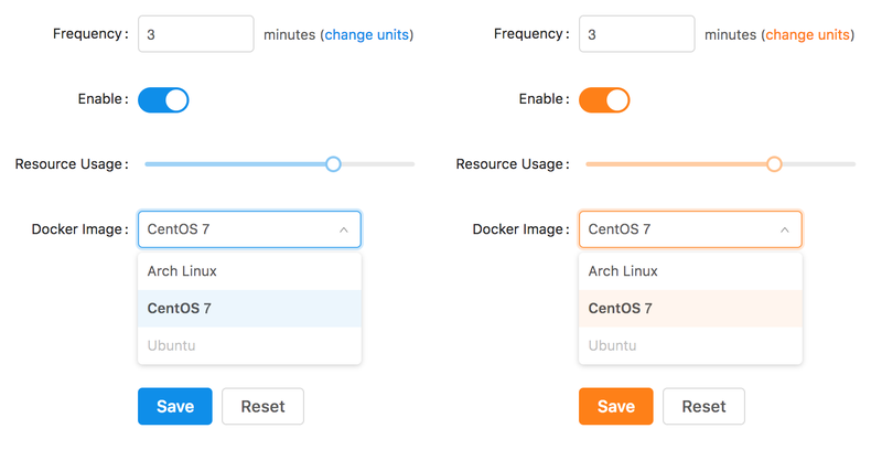
For example, if theme.scss has the following contents
/* theme.scss */
$primary-color: #fe8019;
then the interface will no longer be based off of the default blue #1890ff, but rather a louder orange #fe8019:
You can customize any Less variable that antd uses in this way: just relace @ with a $, e.g., @info-color becomes $info-color.
Use Ant Design's Customized Color and Theme Variables
Importing theme.scss in some SCSS file gives it access all of Ant Design's theme and color variables.
This is true even if you specify only a subset of the available theme variables in theme.scss.
For instance, with theme.scss containing only a $primary-color definition as above, you would still be able to do something like:
@import '../theme.scss';

.header {
  color: $blue-10; /* From colors.less */
  padding: $padding-lg; /* From themes/default.less */
}
Live Reload Components when Ant Design Styles Change
Since antd-scss-theme-plugin registers your theme file as a watched dependency with Webpack, changes in the theme file will result in recompilations of components that use it.
To learn how to set up your project to use live reloading, see the working example.