carbon-native / Carbon Native
Licence: mit
A set of UI components for building React Native apps
Stars: ✭ 213
Programming Languages
javascript
184084 projects - #8 most used programming language
Projects that are alternatives of or similar to Carbon Native
Startup Landing
Collection of free top of the line startup landing templates built using react/nextjs/gatsby. Free to download, simply edit and deploy! Updated weekly!
Stars: ✭ 176 (-17.37%)
Mutual labels: ui-components
Truly Ui
Truly-UI - Web Angular UI Components for Desktop Applications (Electron, NW, APP JS)
Stars: ✭ 195 (-8.45%)
Mutual labels: ui-components
Stpopuppreview
An alternative peek preview for non 3D Touch devices. Inspired by Instagram.
Stars: ✭ 202 (-5.16%)
Mutual labels: ui-components
Precise Ui
📐 React UI Component Library powered by ZEISS.
Stars: ✭ 192 (-9.86%)
Mutual labels: ui-components
Boomerang Free Bootstrap Ui Kit
Boomerang is a high quality UI Kit built on top of the well known Bootstrap 4 Framework. This theme was designed as its own extended version of Bootstrap with multiple functionalities and controls added, extended color palette and beautiful typography.
Stars: ✭ 196 (-7.98%)
Mutual labels: ui-components
Springy facebook rebound
Springy makes Android Property animation easy to use.
Stars: ✭ 176 (-17.37%)
Mutual labels: ui-components
Bit
A tool for component-driven application development.
Stars: ✭ 14,443 (+6680.75%)
Mutual labels: ui-components
Jim Knopf
⭕️ small JavaScript library to create knobs using SVG
Stars: ✭ 193 (-9.39%)
Mutual labels: ui-components
Komponents Deprecated
📦 React-inspired UIKit Components - ⚠️ Deprecated
Stars: ✭ 202 (-5.16%)
Mutual labels: ui-components
Gradio
Create UIs for your machine learning model in Python in 3 minutes
Stars: ✭ 4,358 (+1946.01%)
Mutual labels: ui-components
Ej2 Vue Ui Components
Syncfusion Vue UI component library offer more than 50+ cross-browser, responsive, and lightweight vue UI controls for building modern web applications.
Stars: ✭ 182 (-14.55%)
Mutual labels: ui-components
Underexpress
A free, responsive, ready to use website ui kit, built with bootstrap 4.
Stars: ✭ 205 (-3.76%)
Mutual labels: ui-components
Jetquotes
🔖 A Quotes Application built to Demonstrate the Jetpack Compose UI
Stars: ✭ 179 (-15.96%)
Mutual labels: ui-components
Honeycombview
HoneycombView is the iOS UIView for displaying like Honeycomb layout written by swift
Stars: ✭ 196 (-7.98%)
Mutual labels: ui-components
Css Mint
Lightweight and simple to use UI Kit. Fully responsive, just 3KB gzipped.
Stars: ✭ 209 (-1.88%)
Mutual labels: ui-components
Heyui
🎉UI Toolkit for Web, Vue2.0 http://www.heyui.top
Stars: ✭ 2,373 (+1014.08%)
Mutual labels: ui-components
Awesome Wpf
A collection of awesome WPF resources, libraries and UI controls.
Stars: ✭ 196 (-7.98%)
Mutual labels: ui-components
Carbon Native
A set of UI components for building React Native apps


Demo App
Get Started
yarn add carbon-native
Components
- [x] Badge
- [x] Buttons
- [x] Card
- [x] Container
- [x] Content
- [x] Icons
- [x] List
- [x] Range
- [x] Toggle
- [x] Toolbar
- [x] Typography
- [x] H1
- [x] H2
- [x] H3
- [x] H4
- [x] H5
- [x] H6
- [x] P
- [x] A
- [x] BR
- [x] Em
- [x] Small
- [x] Strong
- [x] S
- [x] U
- [x] Mark
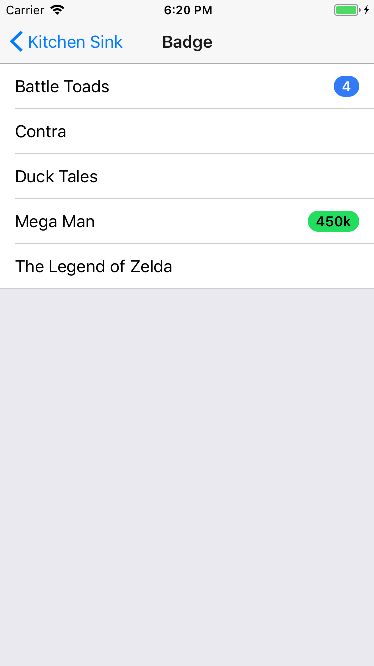
Badge
import {
  Badge,
} from 'carbon-native';

<Badge
  color="primary"
  text="4"
/>
Buttons
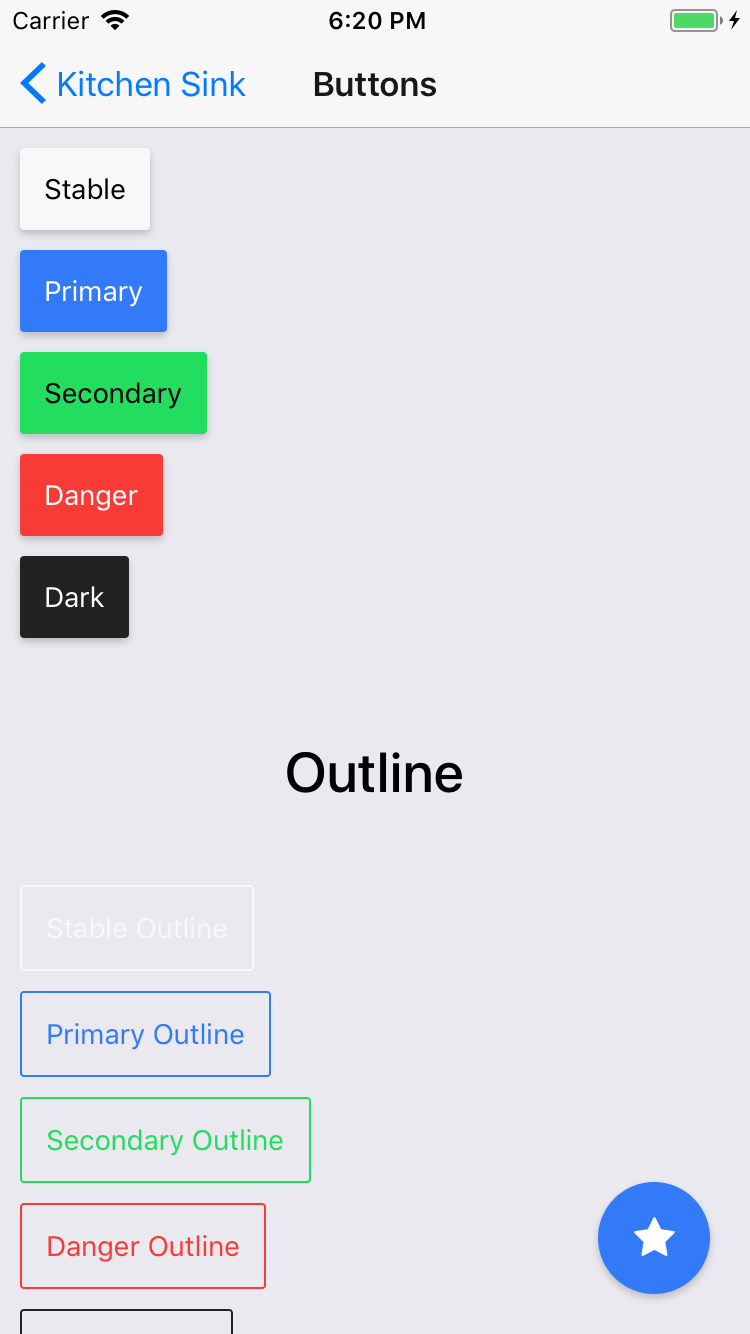
import {
  Button,
} from 'carbon-native';

<Button
  color="stable"
  text="Regular Button"
/>

<Button
  color="primary"
  text="Outline Button"
  outline
/>

<Button
  color="secondary"
  text="Clear Button"
  clear
/>
Card
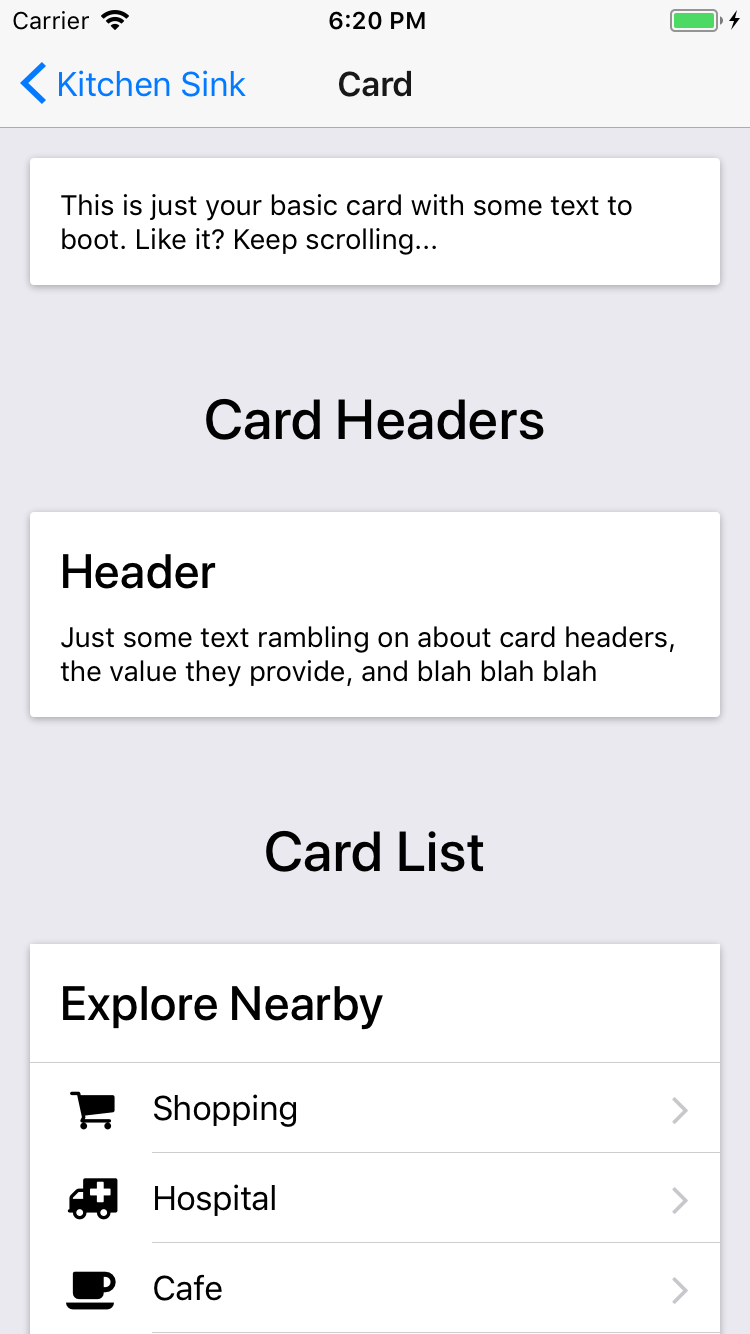
import {
  Card,
  H4,
} from 'carbon-native';

<Card>
  <H4>Header</H4>
  <Text>
    Just some text rambling on.
  </Text>
</Card>
Icons
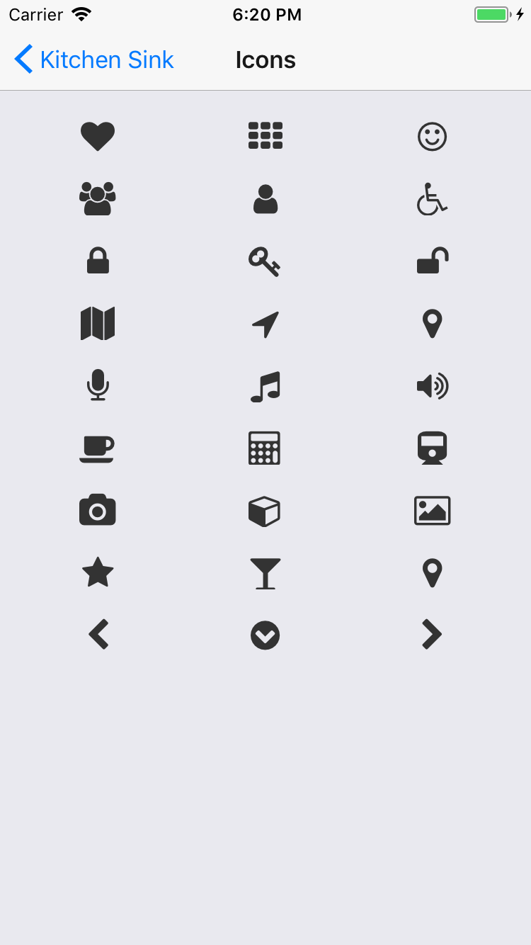
npm install react-native-vector-icons --save
rnpm link
import Icon 'react-native-vector-icons/FontAwesome';

<Icon
  name="volume-down"
  size={24}
/>
List
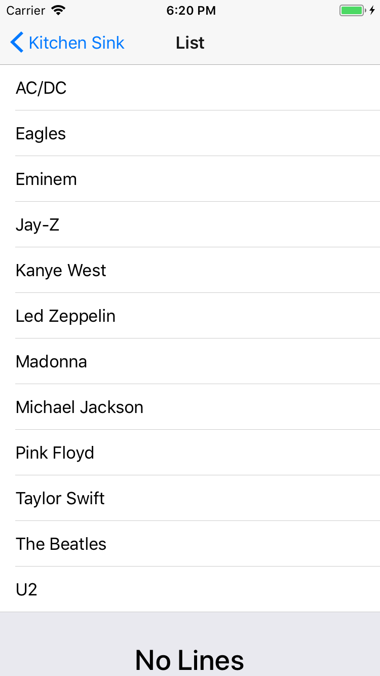
import {
  List,
  Item,
  ItemIcon,
  ItemContent,
  ItemText,
  Note,
} from 'carbon-native';

<List>
  <Item>
    <ItemIcon>
      <Icon name="bolt" size={24} />
    </ItemIcon>
    <ItemContent>
      <ItemText>Harry</ItemText>
      <Note>The boy who lived</Note>
    </ItemContent>
  </Item>
</List>
Range
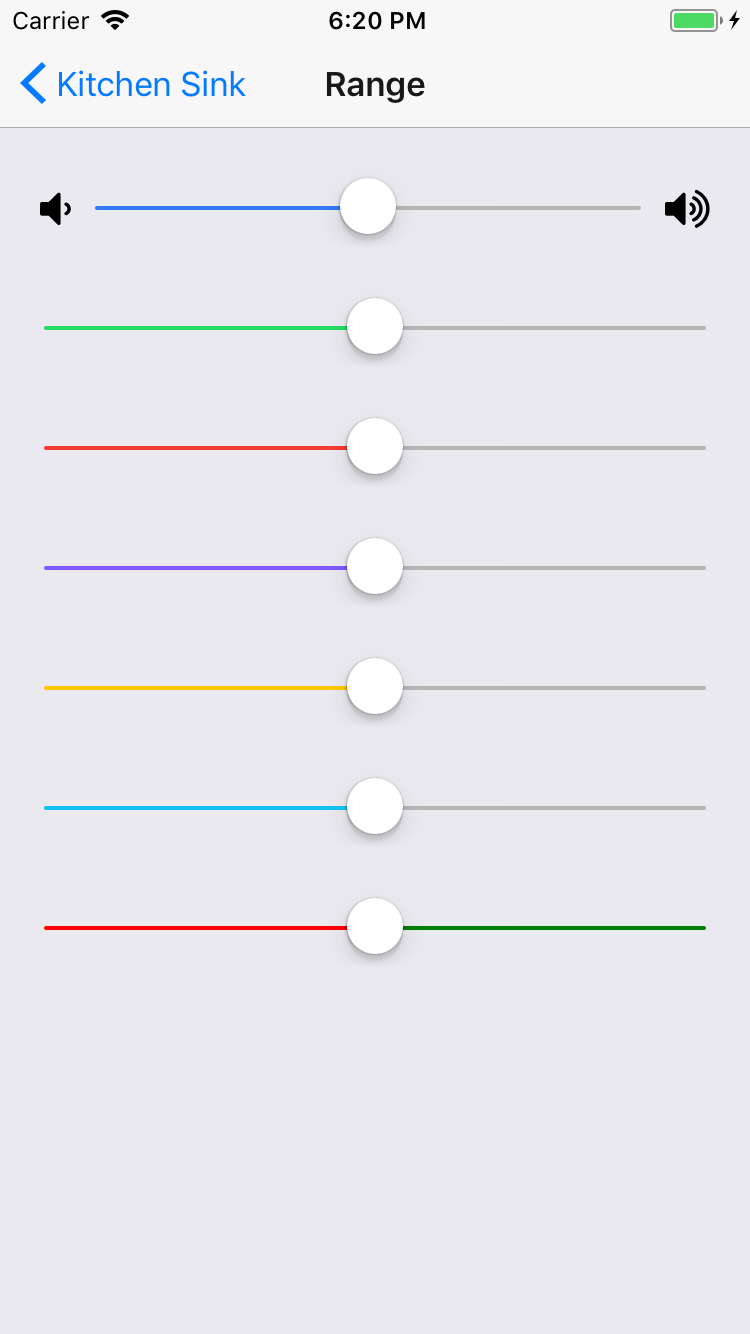
import {
  Range,
} from 'carbon-native';

<Range
  value={this.state.value}
  onValueChange={(value) => this.setState({ value })}
/>
Toggle
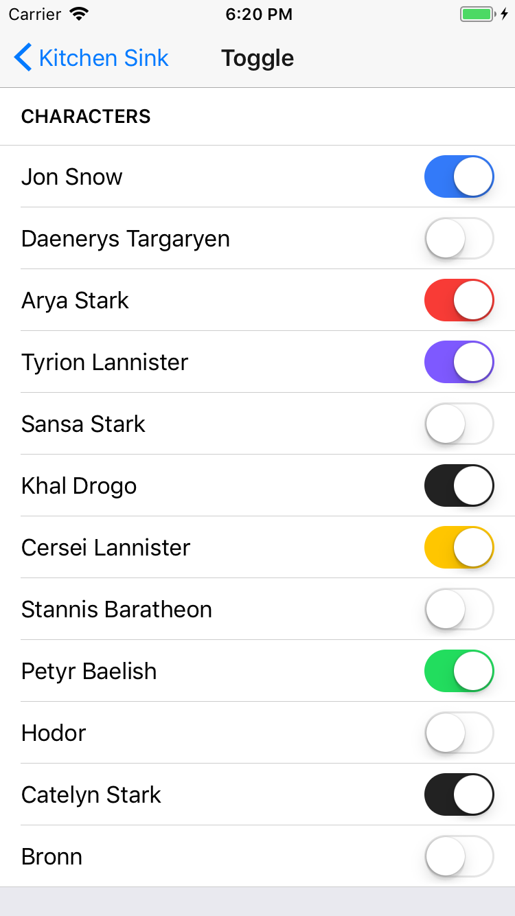
import {
  Toggle,
} from 'carbon-native';

<Toggle
  color="primary"
  onValueChange={(value) => this.setState({ toggleState: value })}
  value={this.state.toggleState}
/>
Toolbar
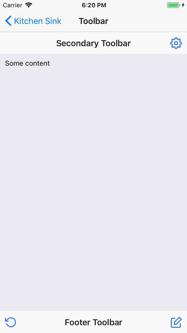
import {
  Toolbar,
  ToolbarTitle,
} from 'carbon-native';

<Toolbar color="primary">
  <ToolbarTitle color="light">Primary</ToolbarTitle>
</Toolbar>
Typography
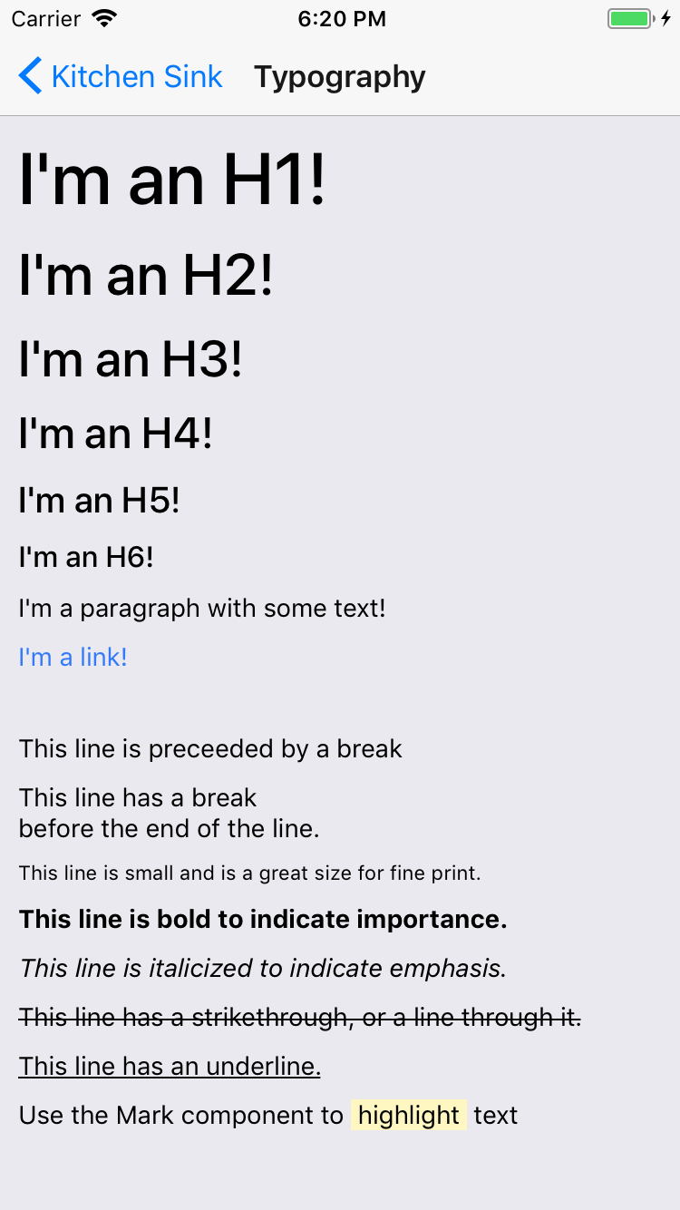
import {
  H1,
  H2,
  H3,
  H4,
  H5,
  H6,
  P,
  BR,
  Em,
  Small,
  Strong,
  S,
  U,
} from 'carbon-native';

<H1>I'm an H1!</H1>
<H2>I'm an H2!</H2>
<H3>I'm an H3!</H3>
<H4>I'm an H4!</H4>
<H5>I'm an H5!</H5>
<H6>I'm an H6!</H6>
<P>I'm a paragraph with some text!</P>
<BR />
<P>This line is preceeded by a break</P>
<P>
  This line has a break<BR />
  before the end of the line.
</P>
<P>
  <Small>This line is small and is a great size for fine print.</Small>
</P>
<P>
  <Strong>This line is bold to indicate importance.</Strong>
</P>
<P>
  <Em>This line is italicized to indicate emphasis.</Em>
</P>
<P>
  <S>This line has a strikethrough, or a line through it.</S>
</P>
<P>
  <U>This line has an underline.</U>
</P>
<P>
  Use the Mark component to <Mark>highlight</Mark> text
</P>
Contribute
Contribution guidelines for this project
License
Note that the project description data, including the texts, logos, images, and/or trademarks,
for each open source project belongs to its rightful owner.
If you wish to add or remove any projects, please contact us at [email protected].