skydoves / Colorpickerpreference
Programming Languages
Projects that are alternatives of or similar to Colorpickerpreference
ColorPickerPreference

A library that lets you implement ColorPickerView, ColorPickerDialog, ColorPickerPreference.
Could get HSV color, RGB values, Html color code from your gallery pictures or custom images just by touching.


Including in your project


Gradle
Add below codes to your root build.gradle file (not your module build.gradle file).
allprojects {
    repositories {
        mavenCentral()
    }
}
And add a dependency code to your module's build.gradle file.
dependencies {
    implementation "com.github.skydoves:colorpickerpreference:2.0.5"
}
Usage
Add following XML namespace inside your XML layout file.
xmlns:app="http://schemas.android.com/apk/res-auto"
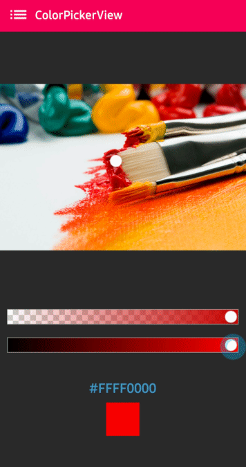
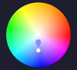
ColorPickerView in XML layout
We can use ColorPickerView without any customized attributes.
This ColorPickerView will be initialized with the default HSV color palette and default selector.
<com.skydoves.colorpickerview.ColorPickerView
   android:id="@+id/colorPickerView"
   android:layout_width="300dp"
   android:layout_height="300dp" />
Attribute descriptions
We can customize the palette image and selector or various options using the below attributes.
app:palette="@drawable/palette" // sets a custom palette image.
app:selector="@drawable/wheel" // sets a custom selector image.
app:selector_size="32dp" // sets a width & height size of the selector.
app:alpha_selector="0.8" // sets an alpha of thr selector.
app:alpha_flag="0.8" // sets an alpha of the flag.
app:actionMode="last" // sets action mode 'always' or 'last'.
app:preferenceName="MyColorPicker" // sets a preference name.
app:debounceDuration="200" // sets a debounce duration of the invoking color listener.
ColorListener
ColorListener is invoked when tapped by a user or selected a position by a function.
colorPickerView.setColorListener(new ColorListener() {
    @Override
    public void onColorSelected(int color, boolean fromUser) {
        LinearLayout linearLayout = findViewById(R.id.linearLayout);
        linearLayout.setBackgroundColor(color);
    }
});
ColorEnvelope
ColorEnvelope is a wrapper class of color models for providing more variety of color models.
We can get HSV color value, Hex string code, ARGB value from the ColorEnvelope.
colorEnvelope.getColor() // returns a integer color.
colorEnvelope.getHexCode() // returns a hex code string.
colorEnvelope.getArgb() // returns a argb integer array.
ColorEnvelope Listener
ColorEnvelopeListener extends ColorListener and it provides ColorEnvelope as a parameter.
colorPickerView.setColorListener(new ColorEnvelopeListener() {
    @Override
    public void onColorSelected(ColorEnvelope envelope, boolean fromUser) {
        linearLayout.setBackgroundColor(envelope.getColor());
        textView.setText("#" + envelope.getHexCode());
    }
});
Palette
If we do not set any customized palette, the default palette drawable is the ColorHsvPalette.
We can move and select a point on the palette using a specific color using the below methods.
colorPickerView.selectByHsvColor(color);
colorPickerView.selectByHsvColorRes(R.color.colorPrimary);
We can change the default palette as a desired image drawable using the below method.
But if we change the palette using another drawable, we can not use the selectByHsvColor method.
colorPickerView.setPaletteDrawable(drawable);
If we want to change back to the default palette, we can change it using the below method.
colorPickerView.setHsvPaletteDrawable();
ActionMode
ActionMode is an option restrict to invoke the ColorListener by user actions.
colorPickerView.setActionMode(ActionMode.LAST); // ColorListener will be invoked when the finger is released.
Debounce
Only emits color values to the listener if a particular timespan has passed without it emitting using debounceDuration attribute.
We can set the debounceDuration on our xml layout file.
app:debounceDuration="150"
Or we can set it programmatically.
colorPickerView.setDebounceDuration(150);
Create using builder
This is how to create ColorPickerView's instance using ColorPickerView.Builder class.
ColorPickerView colorPickerView = new ColorPickerView.Builder(context)
      .setColorListener(colorListener)
      .setPreferenceName("MyColorPicker");
      .setActionMode(ActionMode.LAST)
      .setAlphaSlideBar(alphaSlideBar)
      .setBrightnessSlideBar(brightnessSlideBar)
      .setFlagView(new CustomFlag(context, R.layout.layout_flag))
      .setPaletteDrawable(ContextCompat.getDrawable(context, R.drawable.palette))
      .setSelectorDrawable(ContextCompat.getDrawable(context, R.drawable.selector))
      .build();
Restore and save
This is how to restore the state of ColorPickerView.
setPreferenceName() method restores all of the saved states (selector, color) automatically.
colorPickerView.setPreferenceName("MyColorPicker");
This is how to save the states of ColorPickerView.
setLifecycleOwner() method saves all of the states automatically when the lifecycleOwner is destroy.
colorPickerView.setLifecycleOwner(this);
Or we can save the states manually using the below method.
ColorPickerPreferenceManager.getInstance(this).saveColorPickerData(colorPickerView);
Manipulate and clear
We can manipulate and clear the saved states using ColorPickerPreferenceManager.
ColorPickerPreferenceManager manager = ColorPickerPreferenceManager.getInstance(this);
manager.setColor("MyColorPicker", Color.RED); // manipulates the saved color data.
manager.setSelectorPosition("MyColorPicker", new Point(120, 120)); // manipulates the saved selector's position data.
manager.clearSavedAllData(); // clears all of the states.
manager.clearSavedColor("MyColorPicker"); // clears only saved color data.
manager.restoreColorPickerData(colorPickerView); // restores the saved states manually.
Palette from Gallery
Here is how to get a bitmap drawable from the gallery image and set it to the palette.

Declare below permission on your AndroidManifest.xml file.
<uses-permission android:name="android.permission.READ_EXTERNAL_STORAGE"/>
The below codes will start the Gallery and we can choose the desired image.
Intent photoPickerIntent = new Intent(Intent.ACTION_PICK);
photoPickerIntent.setType("image/*");
startActivityForResult(photoPickerIntent, REQUEST_CODE_GALLERY);
In the onActivityResult, we can get a bitmap drawable from the gallery and set it as the palette. And We can change the palette image of the ColorPickerView using the setPaletteDrawable method.
try {
  final Uri imageUri = data.getData();
  final InputStream imageStream = getContentResolver().openInputStream(imageUri);
  final Bitmap selectedImage = BitmapFactory.decodeStream(imageStream);
  Drawable drawable = new BitmapDrawable(getResources(), selectedImage);
  colorPickerView.setPaletteDrawable(drawable);
} catch (FileNotFoundException e) {
  e.printStackTrace();
}
ColorPickerPreference
ColorPickerPreference is used in PreferenceScreen and shows ColorPickerDialog if be clicked.
<com.skydoves.colorpickerpreference.ColorPickerPreference
    android:key="@string/ToolbarColorPickerPreference"
    android:title="Toolbar Color"
    android:summary="changes toolbar color"
    app:preference_attachAlphaSlideBar="false" // attach an alpha slide bar or not.
    app:preference_attachBrightnessSlideBar="true" // attach a brightness slide bar or not.
    app:preference_colorBox_radius="26dp" // radius of the color box. we can make it circular using this.
    app:preference_dialog_negative="@string/cancel" // string for closing the dialog.
    app:preference_dialog_positive="@string/confirm" // string for confirming the dialog.
    app:preference_dialog_title="Toolbar ColorPickerDialog" // title string to the dialog.
    app:preference_palette="@drawable/palettebar" // a palette drawable to the ColorPickerView.
    app:preference_selector="@drawable/wheel" // a selector drawable to the ColorPickerView.
customizing
If you want to customizing ColorPickerDialog in ColorPickerPreference, you could get ColorPickerDialog.Builder
using getColorPickerDialogBuilder() method.
ColorPickerPreference colorPickerPreference_toolbar = (ColorPickerPreference) findPreference(getActivity().getString(R.string.ToolbarColorPickerPreference));
ColorPickerDialog.Builder builder_toolbar = colorPickerPreference_toolbar.getColorPickerDialogBuilder();
builder_toolbar.setFlagView(new CustomFlag(getActivity(), R.layout.layout_flag));
AlphaSlideBar
AlphaSlideBar changes the transparency of the selected color.

AlphaSlideBar in XML layout
<com.skydoves.colorpickerview.sliders.AlphaSlideBar
   android:id="@+id/alphaSlideBar"
   android:layout_width="match_parent"
   android:layout_height="wrap_content"
   app:selector_AlphaSlideBar="@drawable/wheel" // sets a customized selector drawable.
   app:borderColor_AlphaSlideBar="@android:color/darker_gray" // sets a color of the border.
   app:borderSize_AlphaSlideBar="5"/> // sets a size of the border.
We can attach and connect the AlphaSlideBar to our ColorPickerView using attachAlphaSlider method.
AlphaSlideBar alphaSlideBar = findViewById(R.id.alphaSlideBar);
colorPickerView.attachAlphaSlider(alphaSlideBar);
We can make it vertically using the below attributes.
android:layout_width="280dp" // width must set a specific width size.
android:layout_height="wrap_content"
android:rotation="90"
BrightnessSlideBar
BrightnessSlideBar changes the brightness of the selected color.
BrightnessSlideBar in XML layout
<com.skydoves.colorpickerview.sliders.BrightnessSlideBar
   android:id="@+id/brightnessSlide"
   android:layout_width="match_parent"
   android:layout_height="wrap_content"
   app:selector_BrightnessSlider="@drawable/wheel" // sets a customized selector drawable.
   app:borderColor_BrightnessSlider="@android:color/darker_gray" // sets a color of the border.
   app:borderSize_BrightnessSlider="5"/> // sets a size of the border.
We can attach and connect the BrightnessSlideBar to our ColorPickerView using attachBrightnessSlider method.
BrightnessSlideBar brightnessSlideBar = findViewById(R.id.brightnessSlide);
colorPickerView.attachBrightnessSlider(brightnessSlideBar);
We can make it vertically using the below attributes.
android:layout_width="280dp" // width must set a specific width size.
android:layout_height="wrap_content"
android:rotation="90"
ColorPickerDialog
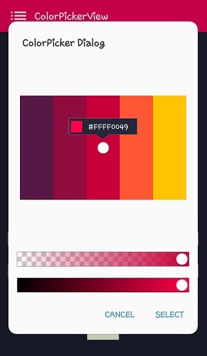
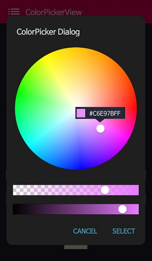
ColorPickerDialog can be used just like an AlertDialog and it provides colors by tapping from any drawable.
new ColorPickerDialog.Builder(this)
      .setTitle("ColorPicker Dialog")
      .setPreferenceName("MyColorPickerDialog")
      .setPositiveButton(getString(R.string.confirm),
          new ColorEnvelopeListener() {
              @Override
              public void onColorSelected(ColorEnvelope envelope, boolean fromUser) {
                  setLayoutColor(envelope);
              }
          })
       .setNegativeButton(getString(R.string.cancel),
          new DialogInterface.OnClickListener() {
              @Override
              public void onClick(DialogInterface dialogInterface, int i) {
                  dialogInterface.dismiss();
              }
           })
      .attachAlphaSlideBar(true) // the default value is true.
      .attachBrightnessSlideBar(true)  // the default value is true.
      .setBottomSpace(12) // set a bottom space between the last slidebar and buttons.
      .show();
we can get an instance of ColorPickerView from the ColorPickerView.Builder and we can customize it.
ColorPickerView colorPickerView = builder.getColorPickerView();
colorPickerView.setFlagView(new CustomFlag(this, R.layout.layout_flag)); // sets a custom flagView
builder.show(); // shows the dialog
FlagView
We can implement showing a FlagView above and below on the selector.
This library provides BubbleFlagView by default as we can see the previews.
Here is the example code for implementing it.
BubbleFlag bubbleFlag = new BubbleFlag(this);
bubbleFlag.setFlagMode(FlagMode.FADE);
colorPickerView.setFlagView(bubbleFlag);
We can also fully customize the FlagView like below.
First, We need a customized layout like below.
<?xml version="1.0" encoding="utf-8"?>
<LinearLayout xmlns:android="http://schemas.android.com/apk/res/android"
    xmlns:tools="http://schemas.android.com/tools"
    android:layout_width="100dp"
    android:layout_height="40dp"
    android:background="@drawable/flag"
    android:orientation="horizontal">

    <LinearLayout
        android:id="@+id/flag_color_layout"
        android:layout_width="20dp"
        android:layout_height="20dp"
        android:layout_marginTop="6dp"
        android:layout_marginLeft="5dp"
        android:orientation="vertical"/>

    <TextView
        android:id="@+id/flag_color_code"
        android:layout_width="wrap_content"
        android:layout_height="wrap_content"
        android:layout_marginTop="6dp"
        android:layout_marginLeft="10dp"
        android:layout_marginRight="5dp"
        android:textSize="14dp"
        android:textColor="@android:color/white"
        android:maxLines="1"
        android:ellipsize="end"
        android:textAppearance="?android:attr/textAppearanceSmall"
        tools:text="#ffffff"/>
</LinearLayout>
Second, we need to create a class that extends FlagView. Here is an example code.
public class CustomFlag extends FlagView {

    private TextView textView;
    private AlphaTileView alphaTileView;

    public CustomFlag(Context context, int layout) {
        super(context, layout);
        textView = findViewById(R.id.flag_color_code);
        alphaTileView = findViewById(R.id.flag_color_layout);
    }

    @Override
    public void onRefresh(ColorEnvelope colorEnvelope) {
        textView.setText("#" + colorEnvelope.getHexCode());
        alphaTileView.setPaintColor(colorEnvelope.getColor());
    }
}
And last, set the FlagView to the ColorPickerView using the setFlagView method.
colorPickerView.setFlagView(new CustomFlag(this, R.layout.layout_flag));
FlagMode
FlagMode is an option to decides the visibility action of the FlagView.
colorPickerView.setFlagMode(FlagMode.ALWAYS); // showing always by tapping and dragging.
colorPickerView.setFlagMode(FlagMode.LAST); // showing only when finger released.
AlphaTileView
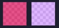
AlphaTileView visualizes ARGB colors over the view.
If we need to represent ARGB colors on the general view, it will not be showing accurately. Because a color will be mixed with the parent view's background color. so if we need to represent ARGB colors accurately, we can use the AlphaTileView.
<com.skydoves.colorpickerview.AlphaTileView
     android:id="@+id/alphaTileView"
     android:layout_width="55dp"
     android:layout_height="55dp"
     app:tileSize="20" // the size of the repeating tile
     app:tileEvenColor="@color/tile_even" // the color of even tiles
     app:tileOddColor="@color/tile_odd"/> // the color of odd tiles
ColorPickerView Methods
| Methods | Return | Description |
|---|---|---|
| getColor() | int | gets the last selected color. |
| getColorEnvelope() | ColorEnvelope | gets the ColorEnvelope of the last selected color. |
| setPaletteDrawable(Drawable drawable) | void | changes palette drawable manually. |
| setSelectorDrawable(Drawable drawable) | void | changes selector drawable manually. |
| setSelectorPoint(int x, int y) | void | selects the specific coordinate of the palette manually. |
| selectByHsvColor(@ColorInt int color) | void | changes selector's selected point by a specific color. |
| selectByHsvColorRes(@ColorRes int resource) | void | changes selector's selected point by a specific color using a color resource. |
| setHsvPaletteDrawable() | void | changes the palette drawable as the default drawable (ColorHsvPalette). |
| selectCenter() | void | selects the center of the palette manually. |
| setActionMode(ActionMode) | void | sets the color listener's trigger action mode. |
| setFlagView(FlagView flagView) | void | sets FlagView on ColorPickerView. |
| attachAlphaSlider | void | linking an AlphaSlideBar on the ColorPickerView. |
| attachBrightnessSlider | void | linking an BrightnessSlideBar on the ColorPickerView. |
ColorPickerPreference
| Methods | Return | Description |
|---|---|---|
| setColorPickerDialogBuilder(ColorPickerDialog.Builder builder) | void | sets ColorPickerDialog.Builder as your own build |
| getColorPickerDialogBuilder() | ColorPickerDialog.Builder | returns ColorPickerDialog.Builder |
Posting & Blog
- Android Weekly #297
- 25 new Android libraries, projects and tools worthy to check in Spring 2018
- Colour Wheel – Part 1
- Using ColorPickerPreference library in Android Studio - Youtube
Find this library useful? ❤️
Support it by joining stargazers for this repository. ⭐️
Supports ☕️
If you feel like support me a coffee for my efforts, I would greatly appreciate it.

License
Copyright 2018 skydoves

Licensed under the Apache License, Version 2.0 (the "License");
you may not use this file except in compliance with the License.
You may obtain a copy of the License at

   http://www.apache.org/licenses/LICENSE-2.0

Unless required by applicable law or agreed to in writing, software
distributed under the License is distributed on an "AS IS" BASIS,
WITHOUT WARRANTIES OR CONDITIONS OF ANY KIND, either express or implied.
See the License for the specific language governing permissions and
limitations under the License.