nitishmakhija / Easytipview
Projects that are alternatives of or similar to Easytipview
Description
EasyTipView is a fully customisable support for EasyTipView written in Swift.
(https://github.com/teodorpatras/EasyTipView)
Contents
- Features
- Installation
- Usage
- Customising the appearance
- Customising the presentation and dismissal animations
- Public interface
## Features
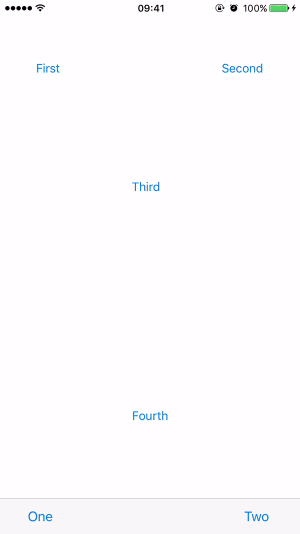
- Can be shown pointing to any
UIBarItemorUIViewsubclass. - support for any arrow direction
←, →, ↑, ↓ - Automatic orientation change adjustments.
- Fully customisable appearance.
- Fully customisable presentation and dismissal animations.
Installation
Manually
Drag drop Source folder in your project
Pods
To integrate EasyTipView into your Xcode project using CocoaPods, specify it in your Podfile:
pod 'NMEasyTipView', '~> 1.2'
Then, run the following command:
$ pod install
Usage
- First you should customize the preferences:
    UIButton *button = [UIButton buttonWithType:UIButtonTypeCustom];
    button.frame = CGRectMake(50, 100, 100, 50);
    [button setTitle:@"Click Me" forState:UIControlStateNormal];
    [button setTitleColor:[UIColor blueColor] forState:UIControlStateNormal];
    [self.view addSubview:button];


    [button addTarget:self action:@selector(handle:) forControlEvents:UIControlEventTouchUpInside];

    RCEasyTipPreferences *preferences = [[RCEasyTipPreferences alloc] initWithDefaultPreferences];
    preferences.drawing.backgroundColor = [UIColor purpleColor];
    preferences.drawing.arrowPostion = Top;
    preferences.animating.showDuration = 1.5;
    preferences.animating.dismissDuration = 1.5;
    preferences.animating.dismissTransform = CGAffineTransformMakeTranslation(0, -15);
    preferences.animating.showInitialTransform = CGAffineTransformMakeTranslation(0, -15);

    RCEasyTipView *tipView = [[RCEasyTipView alloc] initWithPreferences:preferences];
    tipView.text = @"Lorem Ipsum is simply dummy text of the printing and typesetting industry. Lorem Ipsum has been the industry's standard dummy text ever since the 1500s, when an unknown printer took a galley of type and scrambled it to make a type specimen book.";
    [tipView showAnimated:YES forView:button withinSuperView:self.view];
Customising the appearance
In order to customise the EasyTipView appearance and behaviour, you can play with the Preferences structure which encapsulates all the customizable properties of the EasyTipView. These preferences have been split into three structures:
-
Drawing- encapsulates customisable properties specifying howEastTipViewwill be drawn on screen. -
Positioning- encapsulates customisable properties specifying whereEasyTipViewwill be drawn within its own bounds. -
Animating- encapsulates customisable properties specifying howEasyTipViewwill animate on and off screen.
| Drawing attribute | Description |
|----------|-------------|------|
|cornerRadius| The corner radius of the tip view bubble.|
|arrowHeight| The height of the arrow positioned at the top or bottom of the bubble.|
|arrowWidth| The width of the above mentioned arrow.|
|foregroundColor| The text color.|
|backgroundColor| The background color of the bubble.|
|arrowPosition| The position of the arrow. This can be:
+ Top: on top of the bubble
+ Bottom: at the bottom of the bubble.
+ Left: on the left of the bubble
+ Right: on the right of the bubble
+ Any: use this option to let the EasyTipView automatically find the best arrow position.
If the passed in arrow cannot be applied due to layout restrictions, a different arrow position will be automatically assigned.|
|textAlignment| The alignment of the text.|
|borderWidth| Width of the optional border to be applied on the bubble.|
|borderColor| Color of the optional border to be applied on the bubble. In order for the border to be applied, borderColor needs to be different that [UIColor clear] and borderWidth > 0|
|font| Font to be applied on the text. |
| Positioning attribute | Description |
|----------|-------------|------|
|bubbleHInset| Horizontal bubble inset witin its container.|
|bubbleVInset| Vertical bubble inset within its container.|
|textHInset| Text horizontal inset within the bubble.|
|textVInset| Text vertical inset within the bubble.|
|maxWidth| Max bubble width.|
| Animating attribute | Description |
|----------|-------------|------|
|dismissTransform| CGAffineTransform specifying how the bubble will be dismissed. |
|showInitialTransform| CGAffineTransform specifying the initial transform to be applied on the bubble before it is animated on screen. |
|showFinalTransform| CGAffineTransform specifying how the bubble will be animated on screen. |
|springDamping| Spring animation damping.|
|springVelocity| Spring animation velocity.|
|showInitialAlpha|Initial alpha to be applied on the tip view before it is animated on screen.|
|dismissFinalAlpha|The alpha to be applied on the tip view when it is animating off screen.|
|showDuration|Show animation duration.|
|dismissDuration|Dismiss animation duration.|
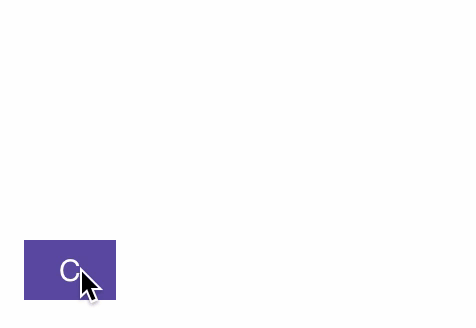
Customising the presentation or dismissal animations
The default animations for showing or dismissing are scale up and down. If you want to change the default behaviour, you need to change the attributes of the animating property within the preferences. An example could be:
preferences.drawing.arrowPostion = Top;
preferences.animating.showDuration = 1.5;
preferences.animating.dismissDuration = 1.5;
preferences.animating.dismissTransform = CGAffineTransformMakeTranslation(0, -15);
preferences.animating.showInitialTransform = CGAffineTransformMakeTranslation(0, -15);
This produces the following animations:
Public interface
#Delegate
EasyTipViewDelegate is a custom protocol which defines one method to be called on the delegate after the EasyTipView has been dismissed.
@protocol RCEasyTipViewDelegate <NSObject>
@optional

- (void)willShowTip:(RCEasyTipView *)tipView;
- (void)didShowTip:(RCEasyTipView *)tipView;

- (void)willDismissTip:(RCEasyTipView *)tipView;
- (void)didDismissTip:(RCEasyTipView *)tipView;

@end