knownasilya / Ember Toggle
Programming Languages
Projects that are alternatives of or similar to Ember Toggle
ember-toggle
Checkbox based Toggle Switch component with swipe/drag support for Ember.
Based on this codepen. Here's the official demo using this component.
Compatibility
- Ember.js v3.12 or above
- Ember CLI v2.13 or above
- Node.js v10 or above
Install
ember install ember-toggle
Basic Usage
<XToggle
  @value={{this.myValue}}
  @onToggle={{fn (mut this.myValue)}}
/>
Themes
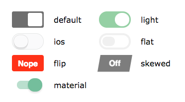
There are many themes which change the visual appearance of the toggle.
Check the demo for interactive examples.
'default''ios''light''flat''flip''skewed''material'
Use it along with the @variant='auto' or @variant='dark' option to get a dark themed version, works only with 'ios', 'flat' and 'material' theme.
Example of changing the theme
<XToggle
  @theme='ios'
  @variant='dark'
  @value={{this.toggled}}
  @onToggle={{fn (mut this.toggled)}}
/>
Note: By default all themes are included, see the Configuration section to change which themes are included/excluded.
Size
You can also adjust the size of the widget by use of the size property. Valid sizes are:
'small''medium''large'
This option is available on all themes but is a less sensible choice for those themes which actually
include the label within the control (e.g., skew and flip).
Labels
You can customize labels (The text the user sees for the two states) and their associated values:
<XToggle
  @onLabel='Enabled'
  @offLabel='Disabled'
  @showLabels={{true}}
  @value={{this.myValue}}
  @onToggle={{fn (mut this.myValue)}}
/>
If you want your labels to be displayed, then you must set showLabels to true.
Available Options
-
value- The state of the switch, can betrueorfalse. Defaults tofalse. -
onToggle- The action that should change the state ofvalue. -
theme- One of 'light', 'ios', 'flat', 'material', 'flip', 'skewed', 'default'. -
variant- One ofdarkorauto. Useautofor system dependent light/dark theme. Works only withios,flatandmaterialtheme. Defaults to 'default' if not specified. -
size- One of 'small', 'medium', 'large'. Defaults to 'medium' if not specified. -
onLabel- The label for the on state. Defaults to 'On'. -
offLabel- The label for the off state. Defaults to 'Off'. -
showLabels- Defaults to 'false', if 'true' will display labels on left and ride side of toggle switch -
disabled- Defaults tofalse, which means you can click the toggle. Whentrue, an.x-toggle-disabledclass is set on the toggle and an.x-toggle-container-disabledclass is set on the component. -
name- A name to differentiate multiple toggles, gets passed to thetoggleaction. Defaults to 'default'.
Configuring
Add a configuration for ember-toggle to include only the themes that
you will use, as well as any other default settings that apply to all toggles
in your app. These defaults can be overriden on a per toggle basis
(except the options regarding themes being added to your app's build step).
This configuration is located in config/environment.js.
The following is an example of how you can configure this addon:
ENV['ember-toggle'] = {
  includedThemes: ['light', 'default', 'flip'],
  excludedThemes: ['flip'],
  excludeBaseStyles: false, // defaults to false
  defaultShowLabels: true, // defaults to false
  defaultTheme: 'light', // defaults to 'default'
  defaultSize: 'small', // defaults to 'medium'
  defaultOffLabel: 'False', // defaults to 'Off'
  defaultOnLabel: 'True', // defaults to 'On'
};
note: the IOS theme is referred to as just
iosnotios7as was indicated in the originating CSS source
To exclude (not include) a theme, means that it's css styles will not be bundled with your application, keeping your app's css bundle size smaller.
Note: including a blank array e.g.
includeThemes: []will not include any themes, leaving you to define your own theme styles. See thevendor/ember-toggle/themesdirectory for reference. Note: you may also want to setexcludeBaseStyles: trueso that this addon doesn't include the styles used by all the themes.
Advanced Usage
If you need custom labels, additional markup, or non-standard behavior, you are in the right section.
The x-toggle component also provides a composable component API.
<XToggle
  @showLabels={{true}}
  @value={{this.value}}
  @onToggle={{fn (mut this.value)}}
as |toggle|>
  <toggle.offLabel/>
  <toggle.switch/>
  <toggle.onLabel/>
</XToggle>
The above is a simple example that returns a basic toggle, but you can see how this could be used to wrap the switch or the labels in custom markup or logic.
Single Label
This format allows greater flexibility with labels, like the single label use-case.
<XToggle
  @showLabels={{true}}
  @value={{this.value}}
  @onToggle={{fn (mut this.value)}}
  as |toggle|
>
  <toggle.label @value={{not this.value}}>
    <b>turn {{if this.value 'off' 'on'}}</b>
  </toggle.label>

  <toggle.switch
    @theme='flip'
    @onLabel='diff on'
    @offLabel='diff off'
  />
</XToggle>
Note: The
nothelper is a custom Ember helper in the above example.
Contributing
See the Contributing guide for details.
License
MIT


