davidanaya / Flutter Circular Slider
Licence: mit
A customizable circular slider for Flutter.
Stars: ✭ 183
Programming Languages
dart
5743 projects
Projects that are alternatives of or similar to Flutter Circular Slider
React Viewport Slider
react-viewport-slider is a react component (obviously) that displays a sequence of contents using 100% of the viewport with and height.
Stars: ✭ 144 (-21.31%)
Mutual labels: slider
Rangeseekbar
A beautiful and powerful SeekBar what supports single、 range、steps、vetical、custom( 一款美观强大的支持单向、双向范围选择、分步、垂直、高度自定义的SeekBar)
Stars: ✭ 2,037 (+1013.11%)
Mutual labels: slider
Carousel View
CarouselView for android with showing horizontal and vertical, auto scrolling (with pause/resume), slider mode/ carousel mode options
Stars: ✭ 131 (-28.42%)
Mutual labels: slider
Widget
A set of widgets based on jQuery&&javascript. 一套基于jquery或javascript的插件库 :轮播、标签页、滚动条、下拉框、对话框、搜索提示、城市选择(城市三级联动)、日历等
Stars: ✭ 1,579 (+762.84%)
Mutual labels: slider
Svelte Carousel
A super lightweight, super simple Carousel for Svelte 3
Stars: ✭ 144 (-21.31%)
Mutual labels: slider
Niui
Lightweight, feature-rich, accessible front-end library
Stars: ✭ 152 (-16.94%)
Mutual labels: slider
Openslider
A 3-axis 3D printed camera slider project that utilizes Marlin and is made with common components.
Stars: ✭ 140 (-23.5%)
Mutual labels: slider
React Responsive Carousel
React.js Responsive Carousel (with Swipe)
Stars: ✭ 1,962 (+972.13%)
Mutual labels: slider
Vue Slider Component
🌡 A highly customized slider component
Stars: ✭ 2,158 (+1079.23%)
Mutual labels: slider
Jocircularslider
A highly customisable and reusable circular slider for iOS applications.
Stars: ✭ 128 (-30.05%)
Mutual labels: slider
Wormtabstrip
🐛 WormTabStrip ViewPager for iOS written in Swift, which gives continuous feedback to the user when scrolling
Stars: ✭ 145 (-20.77%)
Mutual labels: slider
Hgcircularslider
A custom reusable circular / progress slider control for iOS application.
Stars: ✭ 2,240 (+1124.04%)
Mutual labels: slider
Slider
Touch swipe image slider/slideshow/gallery/carousel/banner mobile responsive bootstrap
Stars: ✭ 2,046 (+1018.03%)
Mutual labels: slider
Flutter app
🔥🔥🔥本项目包括各种基本控件使用(Text、TextField、Icon、Image、Listview、Gridview、Picker、Stepper、Dialog、Slider、Row、Appbar、Sizebox、BottomSheet、Chip、Dismissible、FlutterLogo、Check、Switch、TabBar、BottomNavigationBar、Sliver等)、豆瓣电影、tubitv、每日一文、和天气、百姓生活、随机诗词、联系人、句子迷、好奇心日报、有道精品课、高德定位、音乐播放器🎵、追书神器等板块
Stars: ✭ 2,140 (+1069.4%)
Mutual labels: slider
flutter_circular_slider
A customizable circular slider for Flutter.
Getting Started
Installation
Add
flutter_circular_slider : ^lastest_version
to your pubspec.yaml, and run
flutter packages get
in your project's root directory.
Basic Usage
Create a new project with command
flutter create myapp
Edit lib/main.dart like this:
import 'package:flutter/material.dart';

import 'package:flutter_circular_slider/flutter_circular_slider.dart';

void main() => runApp(MyApp());

class MyApp extends StatelessWidget {
  @override
  Widget build(BuildContext context) {
    return MaterialApp(
      theme: ThemeData(
        primarySwatch: Colors.blue,
      ),
      home: MyHomePage(),
    );
  }
}

class MyHomePage extends StatelessWidget {
  @override
  Widget build(BuildContext context) {
    return Scaffold(
        backgroundColor: Colors.blueGrey,
        body: Center(
          child: Container(child: DoubleCircularSlider(100, 0, 20)),
        ));
  }
}
There are two different options:
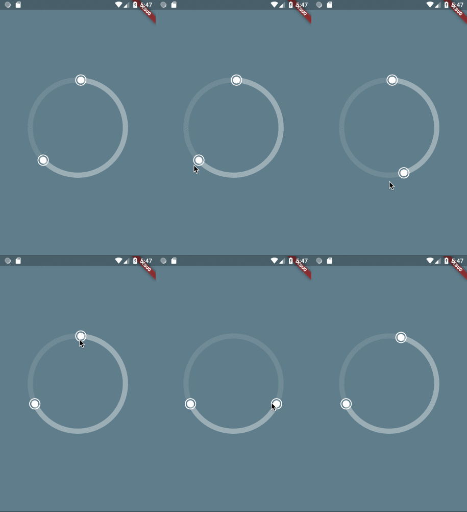
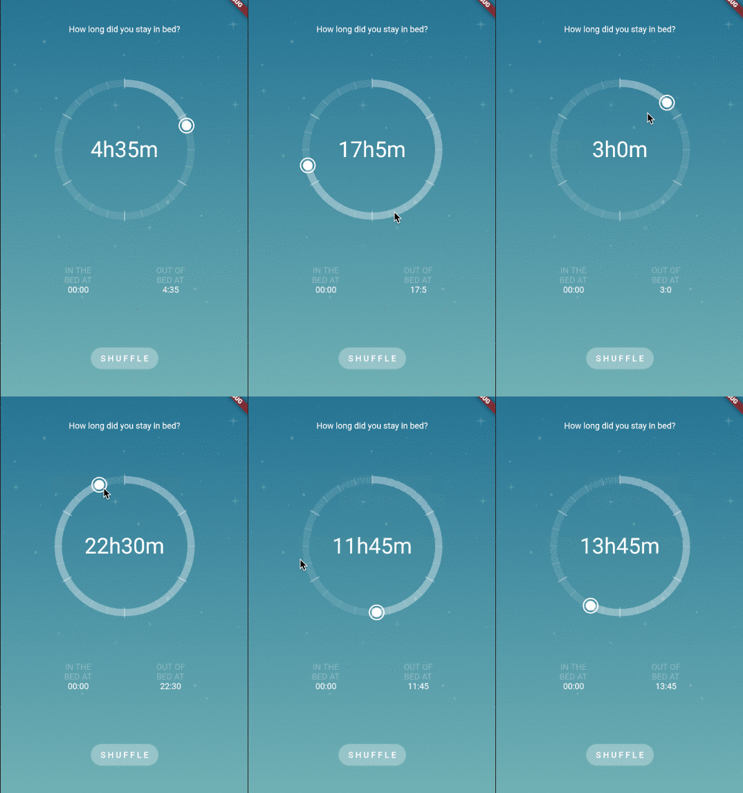
- SingleCircularSlider: has only one handler and can be moved either dragging the handler or just by clicking on different parts of the slider.
- DoubleCircularSlider: has two handlers and both have to be moved by dragging them.
Constructor
| Parameter | Default | Description |
|---|---|---|
| divisions | The number of sections in which the circle will be divided for selection. | |
| init | (Only for DoubleCircularSlider) The initial value in the selection. Has to be bigger than 0 and smaller than divisions. | |
| end | (Only for DoubleCircularSlider) The end value in the selection. Has to be bigger than 0 and smaller than divisions. | |
| position | (Only for SingleCircularSlider) The selection. Has to be bigger than 0 and smaller than divisions. | |
| height | 220.0 | Height of the canvas where the slider is rendered. |
| width | 220.0 | Width of the canvas where the slider is rendered. |
| primarySectors | 0 | Number of sectors painted in the base circle. Painted in selectionColor. |
| secondarySectors | 0 | Number of secondary sectors painted in the base circle. Painted in baseColor. |
| child | null | Widget that will be inserted in the center of the circular slider. |
| onSelectionChange | void onSelectionChange(int init, int end, int laps) | Triggered every time the user interacts with the slider and changes the init and end values, and also laps. |
| onSelectionEnd | void onSelectionEnd(int init, int end, int laps) | Triggered every time the user finish one interaction with the slider. |
| baseColor | Color.fromRGBO(255, 255, 255, 0.1) | The color used for the base of the circle. |
| selectionColor | Color.fromRGBO(255, 255, 255, 0.3) | The color used for the selection in the circle. |
| handlerColor | Colors.white | The color used for the handlers. |
| handlerOutterRadius | 12.0 | The radius for the outter circle around the handler. |
| showRoundedCapInSelection | false | (Only for SingleCircularSlider) Shows a rounded cap at the edge of the selection slider with no handler. |
| showHandlerOutter | true | If true will display an extra ring around the handlers. |
| sliderStrokeWidth | 12.0 | The stroke width for the slider (thickness). |
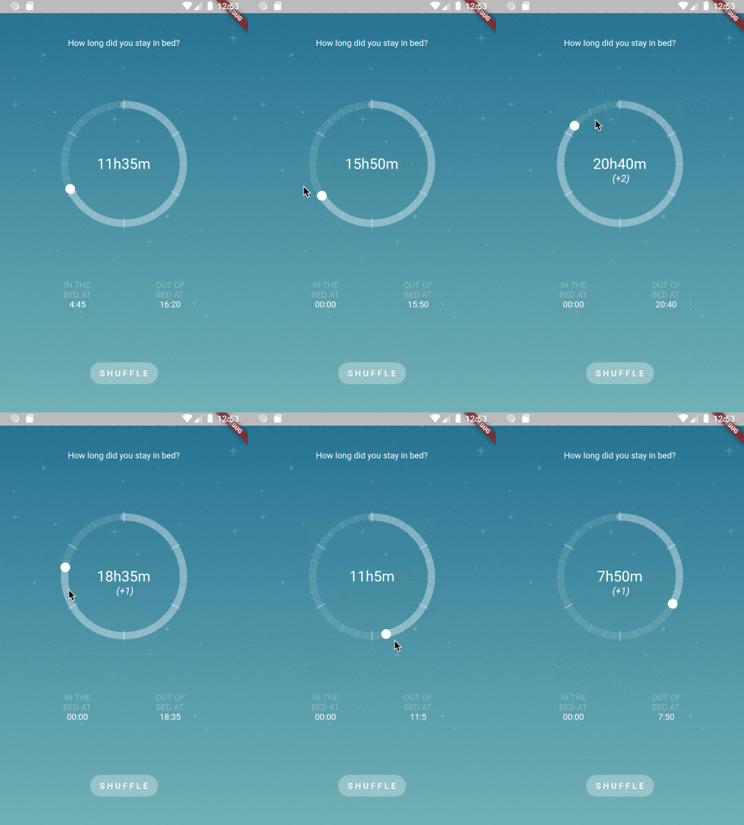
| shouldCountLaps | false | If true, onSelectionChange will also return the updated number of laps. |
Use Cases
Move complete selection
Single Handler
Laps
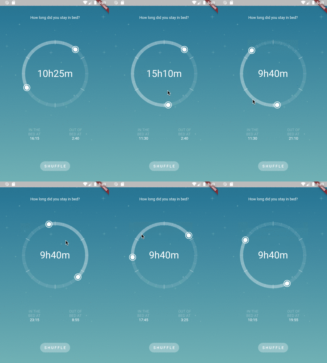
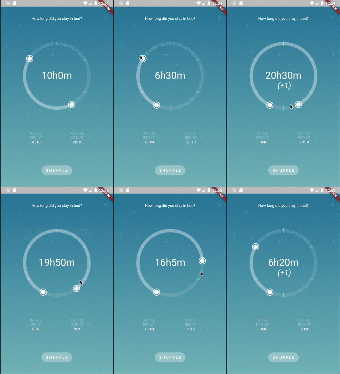
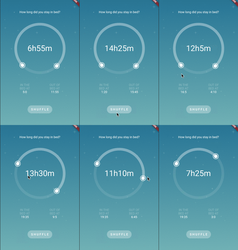
Sleep Time Selection
import 'dart:math';

import 'package:flutter/material.dart';

import 'package:flutter_circular_slider/flutter_circular_slider.dart';

void main() => runApp(MyApp());

class MyApp extends StatelessWidget {
  @override
  Widget build(BuildContext context) {
    return MaterialApp(
      theme: ThemeData(
        primarySwatch: Colors.blue,
      ),
      home: MyHomePage(),
    );
  }
}

class MyHomePage extends StatelessWidget {
  @override
  Widget build(BuildContext context) {
    return Scaffold(
        body: SafeArea(
      child: Container(
          decoration: BoxDecoration(
            image: DecorationImage(
              image: AssetImage('images/background_morning.png'),
              fit: BoxFit.cover,
            ),
          ),
          child: SleepPage()),
    ));
  }
}

class SleepPage extends StatefulWidget {
  @override
  _SleepPageState createState() => _SleepPageState();
}

class _SleepPageState extends State<SleepPage> {
  final baseColor = Color.fromRGBO(255, 255, 255, 0.3);

  int initTime;
  int endTime;

  int inBedTime;
  int outBedTime;

  @override
  void initState() {
    super.initState();
    _shuffle();
  }

  void _shuffle() {
    setState(() {
      initTime = _generateRandomTime();
      endTime = _generateRandomTime();
      inBedTime = initTime;
      outBedTime = endTime;
    });
  }

  void _updateLabels(int init, int end) {
    setState(() {
      inBedTime = init;
      outBedTime = end;
    });
  }

  @override
  Widget build(BuildContext context) {
    return Column(
      mainAxisAlignment: MainAxisAlignment.spaceEvenly,
      children: [
        Text(
          'How long did you stay in bed?',
          style: TextStyle(color: Colors.white),
        ),
        DoubleCircularSlider(
          288,
          initTime,
          endTime,
          height: 260.0,
          width: 260.0,
          primarySectors: 6,
          secondarySectors: 24,
          baseColor: Color.fromRGBO(255, 255, 255, 0.1),
          selectionColor: baseColor,
          handlerColor: Colors.white,
          handlerOutterRadius: 12.0,
          onSelectionChange: _updateLabels,
          sliderStrokeWidth: 12.0,
          child: Padding(
            padding: const EdgeInsets.all(42.0),
            child: Center(
                child: Text('${_formatIntervalTime(inBedTime, outBedTime)}',
                    style: TextStyle(fontSize: 36.0, color: Colors.white))),
          ),
        ),
        Row(mainAxisAlignment: MainAxisAlignment.spaceEvenly, children: [
          _formatBedTime('IN THE', inBedTime),
          _formatBedTime('OUT OF', outBedTime),
        ]),
        FlatButton(
          child: Text('S H U F F L E'),
          color: baseColor,
          textColor: Colors.white,
          shape: RoundedRectangleBorder(
            borderRadius: BorderRadius.circular(50.0),
          ),
          onPressed: _shuffle,
        ),
      ],
    );
  }

  Widget _formatBedTime(String pre, int time) {
    return Column(
      children: [
        Text(pre, style: TextStyle(color: baseColor)),
        Text('BED AT', style: TextStyle(color: baseColor)),
        Text(
          '${_formatTime(time)}',
          style: TextStyle(color: Colors.white),
        )
      ],
    );
  }

  String _formatTime(int time) {
    if (time == 0 || time == null) {
      return '00:00';
    }
    var hours = time ~/ 12;
    var minutes = (time % 12) * 5;
    return '$hours:$minutes';
  }

  String _formatIntervalTime(int init, int end) {
    var sleepTime = end > init ? end - init : 288 - init + end;
    var hours = sleepTime ~/ 12;
    var minutes = (sleepTime % 12) * 5;
    return '${hours}h${minutes}m';
  }

  int _generateRandomTime() => Random().nextInt(288);
}
Note that the project description data, including the texts, logos, images, and/or trademarks,
for each open source project belongs to its rightful owner.
If you wish to add or remove any projects, please contact us at [email protected].


