kokohuang / Flutter_easyloading
Licence: mit
✨A clean and lightweight loading/toast widget for Flutter, easy to use without context, support iOS、Android and Web
Stars: ✭ 455
Projects that are alternatives of or similar to Flutter easyloading
flutter easyloading
✨A clean and lightweight loading/toast widget for Flutter, easy to use without context, support iOS、Android and Web
Stars: ✭ 1,021 (+124.4%)
Mutual labels: widget, toast, loading, indicator, flutter-plugin
Flutter fluid slider
A fluid design slider that works just like the Slider material widget.
Stars: ✭ 232 (-49.01%)
Mutual labels: widget, flutter-plugin
Flutter Unity View Widget
Embeddable unity game engine view for Flutter. Advance demo here https://github.com/juicycleff/flutter-unity-arkit-demo
Stars: ✭ 961 (+111.21%)
Mutual labels: widget, flutter-plugin
Fluttertoast
Android Toast Plugin for Flutter
Stars: ✭ 957 (+110.33%)
Mutual labels: flutter-plugin, toast
Flutter spinkit
✨ A collection of loading indicators animated with flutter. Heavily Inspired by http://tobiasahlin.com/spinkit.
Stars: ✭ 2,411 (+429.89%)
Mutual labels: flutter-plugin, loading
vercel-toast
💬 Framework-agnostic vercel design's toast component (≈1KB Gzipped)
Stars: ✭ 67 (-85.27%)
Mutual labels: widget, toast
Jhud
A full screen of the HUD when loading the data (Objective-C).
Stars: ✭ 1,003 (+120.44%)
Mutual labels: toast, loading
loading-indicator
🚦 Simple and customizable command line loading indicator
Stars: ✭ 18 (-96.04%)
Mutual labels: loading, indicator
iakit
无依赖 mini 组件库,只封装了 alert, toast, loading, actionSheet 等使用频率较高的组件。适用于类似 H5 活动页的简单移动端项目,不必为了使用这些组件而引入一个大而全的 UI 库和框架。
Stars: ✭ 38 (-91.65%)
Mutual labels: toast, loading
Tfpopup
🚀🚀🚀TFPopup不生产弹框,它只是弹框的弹出工🚀🚀🚀默认支持多种动画方式一行调用,支持完全自定义动画.
Stars: ✭ 182 (-60%)
Mutual labels: toast, loading
Notiflix
Notiflix is a JavaScript library for client-side non-blocking notifications, popup boxes, loading indicators, and more that makes your web projects much better.
Stars: ✭ 172 (-62.2%)
Mutual labels: toast, loading
Table calendar
Highly customizable, feature-packed Flutter Calendar with gestures, animations and multiple formats
Stars: ✭ 897 (+97.14%)
Mutual labels: widget, flutter-plugin
Aiforms.dialogs
AiForms.Dialogs for Xamarin.Forms
Stars: ✭ 143 (-68.57%)
Mutual labels: toast, loading
React Native Indicator
🌀 A friendly loading indicator component for React Native
Stars: ✭ 280 (-38.46%)
Mutual labels: loading, indicator
Bot toast
A really easy to use flutter toast library
Stars: ✭ 551 (+21.1%)
Mutual labels: toast, loading
Motion-Tab-Bar
A beautiful animated flutter widget package library. The tab bar will attempt to use your current theme out of the box, however you may want to theme it.
Stars: ✭ 237 (-47.91%)
Mutual labels: widget, flutter-plugin
BalloonPopup
Forget Android Toast! BalloonPopup displays a round or squared popup and attaches it to a View, like a callout. Uses the Builder pattern for maximum ease. The popup can automatically hide and can persist when the value is updated.
Stars: ✭ 32 (-92.97%)
Mutual labels: toast, indicator
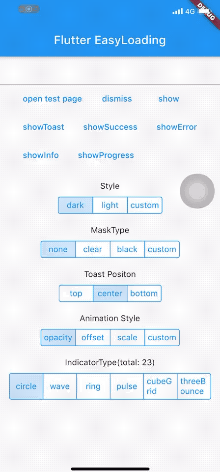
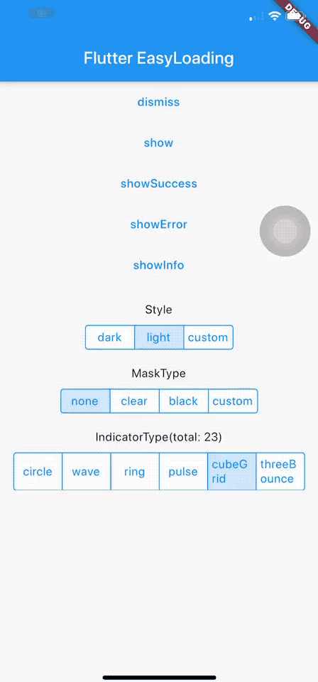
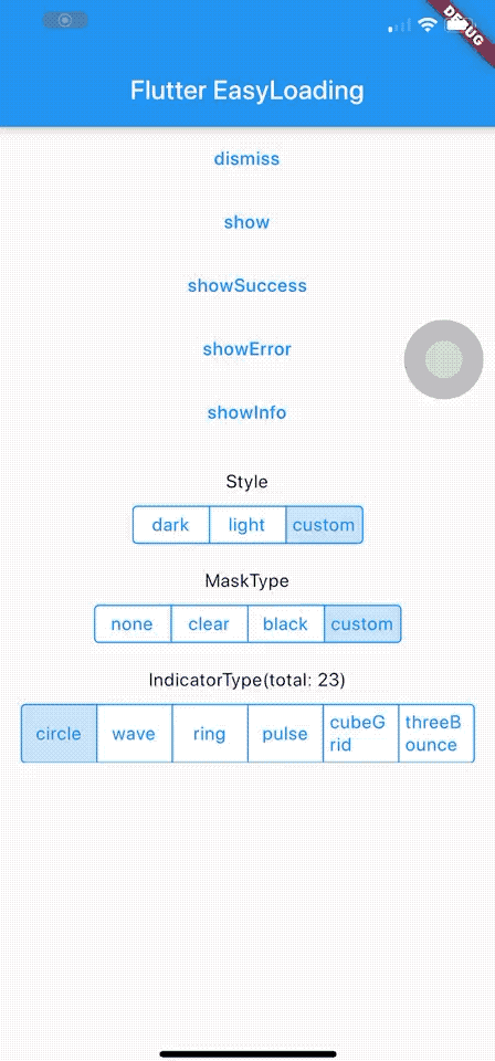
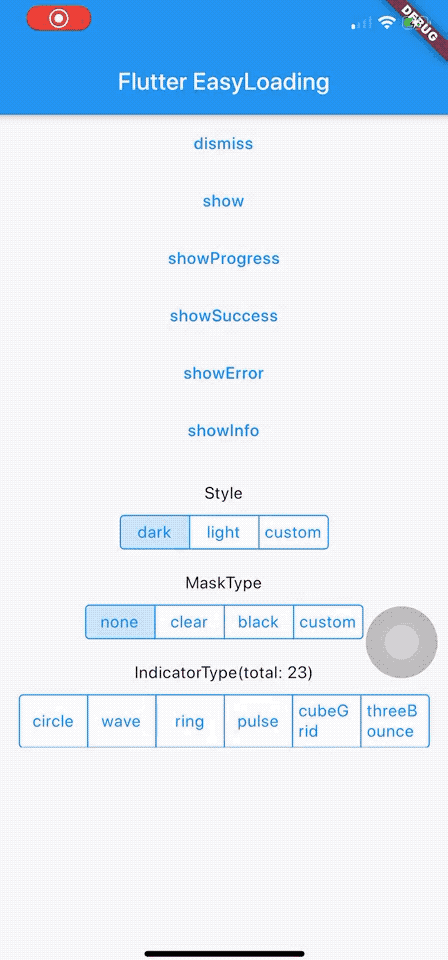
Flutter EasyLoading


English | 简体中文
Live Preview
👉 https://kokohuang.github.io/flutter_easyloading
Installing
Add this to your package's pubspec.yaml file:
dependencies:
  flutter_easyloading: ^3.0.0
Import
import 'package:flutter_easyloading/flutter_easyloading.dart';
How to use
First, initialize EasyLoading in your MaterialApp/CupertinoApp:
class MyApp extends StatelessWidget {
  // This widget is the root of your application.
  @override
  Widget build(BuildContext context) {
    return MaterialApp(
      title: 'Flutter EasyLoading',
      theme: ThemeData(
        primarySwatch: Colors.blue,
      ),
      home: MyHomePage(title: 'Flutter EasyLoading'),
      builder: EasyLoading.init(),
    );
  }
}
Then, enjoy yourself:
EasyLoading.show(status: 'loading...');

EasyLoading.showProgress(0.3, status: 'downloading...');

EasyLoading.showSuccess('Great Success!');

EasyLoading.showError('Failed with Error');

EasyLoading.showInfo('Useful Information.');

EasyLoading.showToast('Toast');

EasyLoading.dismiss();
Add loading status callback
EasyLoading.addStatusCallback((status) {
  print('EasyLoading Status $status');
});
Remove loading status callback(s)
EasyLoading.removeCallback(statusCallback);

EasyLoading.removeAllCallbacks();
Customize
❗️Note:
-
textColor、indicatorColor、progressColor、backgroundColoronly used forEasyLoadingStyle.custom. -
maskColoronly used forEasyLoadingMaskType.custom.
/// loading style, default [EasyLoadingStyle.dark].
EasyLoadingStyle loadingStyle;

/// loading indicator type, default [EasyLoadingIndicatorType.fadingCircle].
EasyLoadingIndicatorType indicatorType;

/// loading mask type, default [EasyLoadingMaskType.none].
EasyLoadingMaskType maskType;

/// toast position, default [EasyLoadingToastPosition.center].
EasyLoadingToastPosition toastPosition;

/// loading animationStyle, default [EasyLoadingAnimationStyle.opacity].
EasyLoadingAnimationStyle animationStyle;

/// loading custom animation, default null.
EasyLoadingAnimation customAnimation;

/// textAlign of status, default [TextAlign.center].
TextAlign textAlign;

/// textStyle of status, default null.
TextStyle textStyle;

/// content padding of loading.
EdgeInsets contentPadding;

/// padding of [status].
EdgeInsets textPadding;

/// size of indicator, default 40.0.
double indicatorSize;

/// radius of loading, default 5.0.
double radius;

/// fontSize of loading, default 15.0.
double fontSize;

/// width of progress indicator, default 2.0.
double progressWidth;

/// width of indicator, default 4.0, only used for [EasyLoadingIndicatorType.ring, EasyLoadingIndicatorType.dualRing].
double lineWidth;

/// display duration of [showSuccess] [showError] [showInfo], default 2000ms.
Duration displayDuration;

/// animation duration of indicator, default 200ms.
Duration animationDuration;

/// color of loading status, only used for [EasyLoadingStyle.custom].
Color textColor;

/// color of loading indicator, only used for [EasyLoadingStyle.custom].
Color indicatorColor;

/// progress color of loading, only used for [EasyLoadingStyle.custom].
Color progressColor;

/// background color of loading, only used for [EasyLoadingStyle.custom].
Color backgroundColor;

/// mask color of loading, only used for [EasyLoadingMaskType.custom].
Color maskColor;

/// should allow user interactions while loading is displayed.
bool userInteractions;

/// should dismiss on user tap.
bool dismissOnTap;

/// indicator widget of loading
Widget indicatorWidget;

/// success widget of loading
Widget successWidget;

/// error widget of loading
Widget errorWidget;

/// info widget of loading
Widget infoWidget;
Because of EasyLoading is a singleton, so you can custom loading style any where like this:
EasyLoading.instance
  ..displayDuration = const Duration(milliseconds: 2000)
  ..indicatorType = EasyLoadingIndicatorType.fadingCircle
  ..loadingStyle = EasyLoadingStyle.dark
  ..indicatorSize = 45.0
  ..radius = 10.0
  ..progressColor = Colors.yellow
  ..backgroundColor = Colors.green
  ..indicatorColor = Colors.yellow
  ..textColor = Colors.yellow
  ..maskColor = Colors.blue.withOpacity(0.5)
  ..userInteractions = true
  ..dismissOnTap = false
  ..customAnimation = CustomAnimation();
More indicatorType can see in 👉 flutter_spinkit showcase
Custom Animation
example: 👉 Custom Animation
Todo
-
[x] add progress indicator
-
[x] add custom animation
Changelog
License
❤️❤️❤️
Thanks to flutter_spinkit ❤️
Supported by JetBrains Open Source

Note that the project description data, including the texts, logos, images, and/or trademarks,
for each open source project belongs to its rightful owner.
If you wish to add or remove any projects, please contact us at [email protected].