Cricin / Folivora
Programming Languages
Projects that are alternatives of or similar to Folivora
English | 中文
Why Folivora
For most android develpers, it is usual to set Views background or ImageViews src by reference a drawable, which required to define a drawable.xml under drawable folder, but some drawable files may be only referenced once, or only to used as a round corner backgrond. more and more drawables may lead to develop and maintain hardly, is there a way to create and use drawables in layout.xml? yeah, Folivora can do this work for you.
What does Folivora can do?
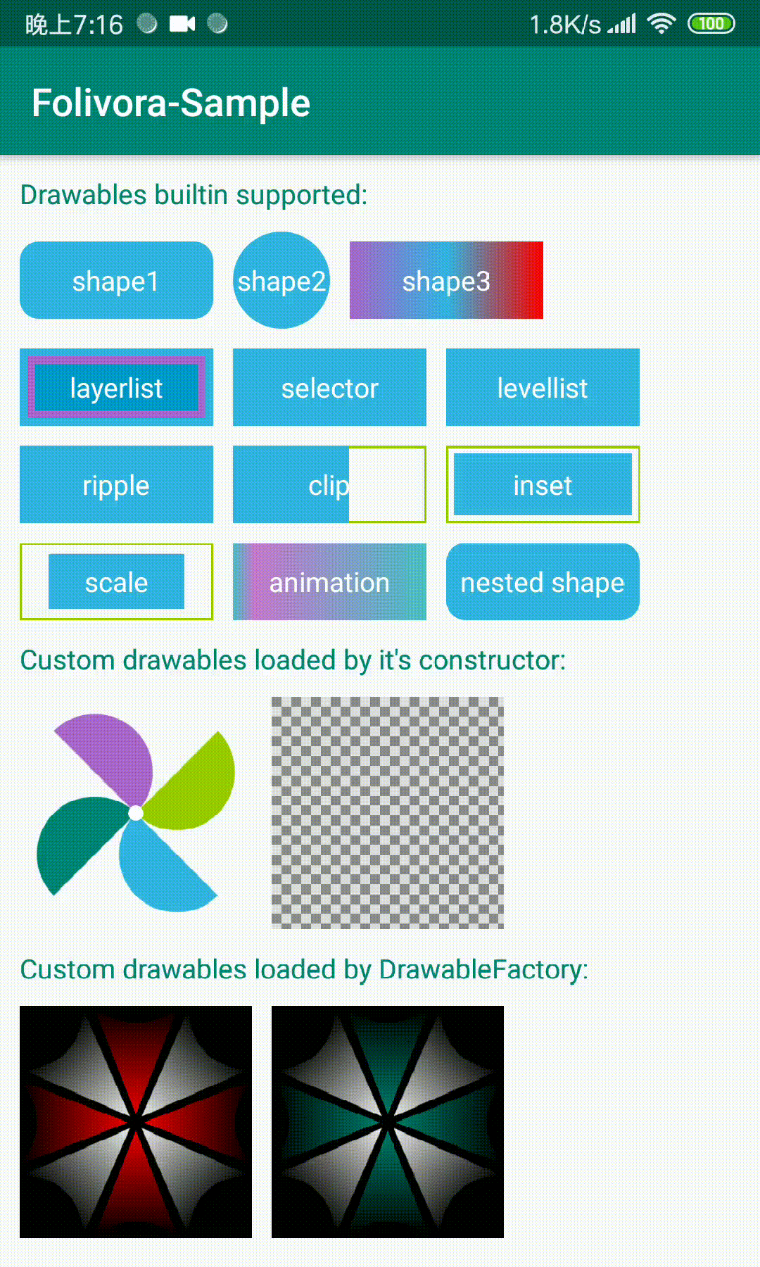
Folivora sets a View's background, foreground or ImageView's src in your layout.xml files, currently supported drawables are:
- shape (GradientDrawable)
- selector (StateListDrawable)
- ripple (RippleDrawable)
- layerlist (LayerListDrawable)
- levellist (LevelListDrawable)
- inset (InsetDrawable)
- clip (ClipDrawable)
- scale (ScaleDrawable)
- animation (AnimationDrawable)
- custom drawable (newly supported)
Usage
- STEP1 : gradle dependency, add below in your project's build.gradle
  dependencies {
    implementation 'cn.cricin:folivora:0.1.0'
  }
- STEP2 : write down the attribute provided by folivora, tell folivora how to create drawable, prefix of drawables folivora builtin supported are:
- shape -> shape
- selectror -> selector
- layer-list -> layer
- level-list -> level
- clip -> clip
- scale -> scale
- inset -> inset
- ripple -> ripple
- animation -> anim
for example, all attributes prefix of a GradientDrawable is shape, like shapeSolidColor, shapeCornerRadius, IDE will gives you all available attributes after you write down drawableType and typed the drawable prefix.
shape

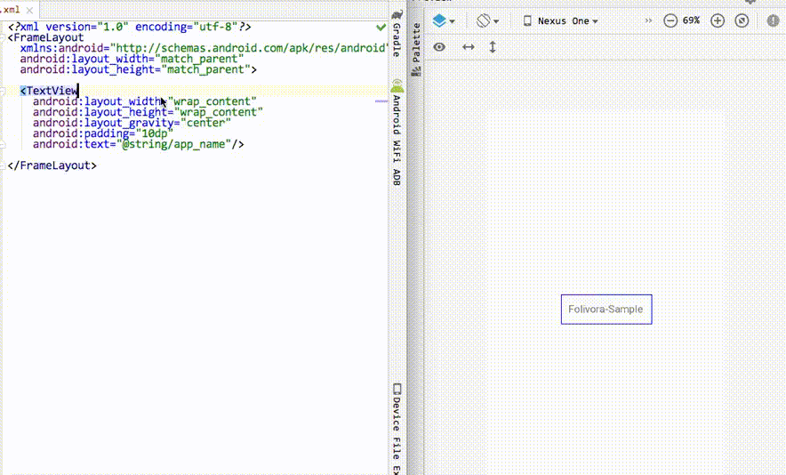
let's try to write down some code to introduce how folivora works with the first view above
<TextView
  android:layout_width="100dp"
  android:layout_height="40dp"
  android:text="shape1"
  android:gravity="center"
  android:textColor="@android:color/white"
  app:drawableType="shape"
  app:shapeCornerRadius="6dp"
  app:shapeSolidColor="@color/blue_light"/>
here are some other supported drawable usages:
layerlist

<TextView
  android:layout_width="100dp"
  android:layout_height="40dp"
  android:text="layerlist"
  android:gravity="center"
  android:textColor="@android:color/white"
  app:drawableType="layer_list"
  app:layerItem0Drawable="@color/blue_light"
  app:layerItem1Drawable="@color/blue_dark"
  app:layerItem1Insets="4dp"
  app:layerItem2Drawable="@color/blue_bright"
  app:layerItem2Insets="8dp"/>
levellist

<!-- this level-list level is 95, levelItem1 matches -->
<TextView
  android:layout_width="100dp"
  android:layout_height="40dp"
  android:gravity="center"
  android:text="levellist"
  android:textColor="@android:color/white"
  app:drawableType="level_list"
  app:levelCurrentLevel="95"
  app:levelItem0Drawable="@color/green_dark"
  app:levelItem1Drawable="@color/blue_light"
  app:levelItem1MaxLevel="100"
  app:levelItem1MinLevel="90"/>
selector

<TextView
  android:layout_width="100dp"
  android:layout_height="40dp"
  android:textColor="@android:color/white"
  android:gravity="center"
  android:text="selector"
  app:drawableType="selector"
  app:selectorStateNormal="@color/blue_light"
  app:selectorStatePressed="@color/blue_dark"/>
since 0.0.7,Folivora added support about complicated state selector,use app:selectorItemXStates to set state flags,and use app:selectorItemXDrawable set corresponding drawable to the states(X can be 0,1,2,3,4),now we can use the new way to describe drawable above。
<TextView
  android:layout_width="100dp"
  android:layout_height="40dp"
  android:textColor="@android:color/white"
  android:gravity="center"
  android:text="selector"
  app:drawableType="selector"
  app:selectorItem0States="pressed"
  app:selectorItem0Drawable="@color/blue_dark"
  app:selectorStateNormal="@color/blue_light"/>
Note:it is recommended to not mixed two selector definitions,just use the new way is better,which is ordered when add in selector by item index, constraint is only support 5 items for now, which is enough for usual selectors.
ripple

<TextView
  android:layout_width="100dp"
  android:layout_height="40dp"
  android:textColor="@android:color/white"
  android:gravity="center"
  android:text="ripple"
  app:drawableType="ripple"
  app:rippleColor="@android:color/white"
  app:rippleContent="@color/blue_light"/>
much cooler after used ripple drawable, but ripple effect is introduced in lollipop, if the device platform version is lower than lolipop, folivora provided a RippleFallback for you, you can provide a substitude drawable if ripple is unavailable, let's try a create a selector instead of ripple:
Folivora.setRippleFallback(new RippleFallback()){
  @Override
  public Drawable onFallback(ColorStateList ripple, Drawable content, Drawable mask, Context ctx){
    StateListDrawable sld = new StateListDrawable();
    sld.addState(new int[]{android.R.attr.state_pressed}, new ColorDrawable(ripple.getDefaultColor()));
    sld.addState(new int[0], content);
    return sld;
  }
}
clip

<TextView
  android:layout_width="100dp"
  android:layout_height="40dp"
  android:gravity="center"
  android:text="clip"
  android:textColor="@android:color/white"
  app:clipDrawable="@color/blue_light"
  app:clipLevel="6000"
  app:drawableType="clip"/>
inset

<TextView
  android:layout_width="100dp"
  android:layout_height="40dp"
  android:gravity="center"
  android:text="inset"
  android:textColor="@android:color/white"
  app:drawableType="inset"
  app:insetAll="4dp"
  app:insetDrawable="@color/blue_light"/>
scale

<TextView
  android:layout_width="100dp"
  android:layout_height="40dp"
  android:gravity="center"
  android:text="scale"
  android:textColor="@android:color/white"
  app:drawableType="scale"
  app:scaleDrawable="@color/blue_light"
  app:scaleGravity="center"
  app:scaleHeight="0.3"
  app:scaleWidth="0.3"/>
animation

<TextView
  android:id="@+id/animation"
  android:layout_width="100dp"
  android:layout_height="40dp"
  android:gravity="center"
  android:text="animation"
  android:textColor="@android:color/white"
  app:animAutoPlay="true"
  app:animDuration="300"
  app:animFrame0="@drawable/animation0"
  app:animFrame1="@drawable/animation1"
  app:animFrame2="@drawable/animation2"
  app:animFrame3="@drawable/animation3"
  app:animFrame4="@drawable/animation4"
  app:animFrame5="@drawable/animation5"
  app:animFrame6="@drawable/animation6"
  app:animFrame7="@drawable/animation7"
  app:animFrame8="@drawable/animation8"
  app:animFrame9="@drawable/animation9"
  app:drawableType="animation"/>
Note: Popular IDE's (Android Studio, IntelliJ) will likely mark this as an error despite being correct. You may want to add tools:ignore="MissingPrefix" to either the View itself or its parent ViewGroup to avoid this. You'll need to add the tools namespace to have access to this "ignore" attribute. xmlns:tools=" http://schemas.android.com/tools". See https://code.google.com/p/android/issues/detail?id=65176.
- STEP3 : enable folivora in your app, there are two ways:
public class MainActivity extends Activity {
  @Override
  protected void attachBaseContext(Context newBase) {
    super.attachBaseContext(Folivora.wrap(newBase));
  }
}
or
public class MainActivity extends Activity {
  @Override
  protected void onCreate(Bundle savedInstanceState) {
    super.onCreate(savedInstanceState);
    Folivra.installViewFactory(this);
    setContentView(R.layout.your_layout_xml_name);
  }
}
Use nested shape
Folivora now support nest shape in drawable, except animation, all drawable's child drawable can use @drawable/xxx, a color, or one of shape/shape1/shape2/shape3/shape4, you can use this prefix combine with the shape attrs, let's define two round corner shape nested in selector:
<TextView
  android:layout_width="100dp"
  android:layout_height="40dp"
  android:gravity="center"
  android:text="selector"
  android:textColor="@android:color/white"
  app:drawableType="selector"
  app:selectorStateNormal="shape"
  app:shapeSolidColor="@color/blue_light"
  app:shapeCornerRadius="10dp"
  app:selectorStatePressed="shape1"
  app:shape1SolidColor="@color/blue_dark"
  app:shape1CornerRadius="10dp"/>
effect is:

Use custom drawable
since 0.0.4,Folivora support use custom drawable, makes it easyly to use custom drawables just like custom views,for example, let's write a WindmillDrawable which draws a paper windmill:
- first, write down some attrs we needed for
WindmillDrawable, just like the way of custom view:
<declare-styleable name="WindmillDrawable">
    <attr name="wdSize" format="dimension"/> <!-- default size -->
    <attr name="wdColor0" format="color"/> <!-- first leaf color -->
    <attr name="wdColor1" format="color"/> <!-- second leaf color -->
    <attr name="wdColor2" format="color"/> <!-- third leaf color -->
    <attr name="wdColor3" format="color"/> <!-- forth leaf color -->
    <attr name="wdCenterDotRadius" format="dimension"/> <!-- center dot radius -->
    <attr name="wdCenterDotColor" format="color"/> <!-- center dot color -->
    <attr name="wdRotateDegrees" format="integer"/> <!-- rotation degrees -->
  </declare-styleable>
Note: declare-styleable name must equals with the drawable's simple class name, so folivora will support code completion about the custom attrs.
- Create a
WindmillDrawable,extendsDrawable, provide apublic WindmillDrawable(Context ctx, AttributeSet attrs)constructor,you can retrieve custom attrs here, like this:
public WindmillDrawable(Context ctx, AttributeSet attrs) {
  TypedArray a = ctx.obtainStyledAttributes(attrs, R.styleable.WindmillDrawable);
  int count = a.getIndexCount();
  for (int i = 0; i < count; i++) {
    int index = a.getIndex(i);
    switch (index) {
      case R.styleable.WindmillDrawable_wdSize:
        mSize = a.getDimensionPixelSize(index, mSize);
        break;
      case R.styleable.WindmillDrawable_wdColor0:
        mColors[0] = a.getColor(index, mColors[0]);
        break;
      case R.styleable.WindmillDrawable_wdColor1:
        mColors[1] = a.getColor(index, mColors[1]);
        break;
      ...
      default://no-op unexpected attr index
        break;
    }
  }
  a.recycle();
}
this is samilar to costom View,the main purpose is to add a constructor that takes a Context and AttributeSet as parameter, other code is emitted here, for more details,click to view source code
- use
WindmillDrawablein your layout files,Folivora provided adrawableNameattr,you can declare the drawable name here:
<View
  andorid:layout_width="120dp"
  android:layout_height="120dp"
  app:drawableName="cn.cricin.folivora.sample.drawable.WindmillDrawable"
  app:wdColor0="@color/blue_light"
  app:wdColor1="@color/green_dark"
  app:wdColor2="@color/green_light"
  app:wdColor3="@color/purple"
  app:wdRotateDegrees="45"/>
at runtime, the drawable is created by folivora and get worked:

you may ask, the drawable's name is to long to remember, it's difficult to write down,don't worry at it,folivora will gives the candidate of custom drawables if you typed down drawableName attr, attrs about the specific drawable is also will have code completion support.
Support of custom drawables do not have the constructor which recieves
ContextandAttributeSetas parameter
Folivora take concerned it, source code of some drawables is not permited to modify, so,we provided a DrawableFactory interface,assume WindmillDrawable only have a constructor takes no parameter,but provided some methods to modify it, to support WindmillDrawable,we can do this:
Folivora.addDrawableFactory(new Folivora.DrawableFactory() {
  @Override
  public Drawable newDrawable(Context context, AttributeSet attrs) {
    TypedArray a = context.obtainStyledAttributes(attrs, R.styleable.WindmillDrawable);
    WindmillDrawable d = new WindmillDrawable();
    d.setColor0(a.getColor(R.styleable.WindmillDrawable_wdColor0, Color.BLACK));
    d.setRotateDegrees(a.getInt(R.styleable.WindmillDrawable_wdRotateDegrees, 0));
    ...
    a.recycle();
    return d;
  }

  @Override
  public Class<? extends Drawable> drawableClass() {
    return WindmillDrawable.class;
  }
});
If you are using custom drawable,and your drawable contains other drawables, it is recommended to use
Folivora.getDrawable(Context ctx, TypedArray a, AttributeSet attrs, int attrIndex)to get a drawable, this method will take care about nested shape creation, also you can do not follow this tip if you do not need nested shape support。
Drawable caches
In previous releases,Folivora will create drawables according to attrs from view tag, a new instance is created for per view, which is waste resources, now Folivora supported drawable caching(LruCache,max = 128), usage is very simple,just add app:drawableId attr,set a id(string type,not android's id type) to drawable is ok。Folivora will lookup cache to find a cached drawable, which means,if in a layout.xml,a drawable should be referenced multi places, define it at first occurrence, then at other place, use the same drawableId to reference this drawable.
<LinearLayout
  android:layout_width="wrap_content"
  android:layout_height="wrap_content">

    <TextView
      android:layout_width="100dp"
      android:layout_height="40dp"
      android:text="shape1"
      android:gravity="center"
      android:textColor="@android:color/white"
      app:drawableId="shape_rounded_6dp"
      app:drawableType="shape"
      app:shapeCornerRadius="6dp"
      app:shapeSolidColor="@color/blue_light"/>

    <TextView
      android:layout_width="100dp"
      android:layout_height="40dp"
      android:text="shape2"
      android:gravity="center"
      android:textColor="@android:color/white"
      app:drawableId="shape_rounded_6dp"/>

</LinearLayout>
It is recommended to set drawableId to drawable which is reusable or inside a frequently used layout files, which makes a better performance.
Download Sample APK
Design time preview
preview result
after you added folivora in gradle and sync project,preview would been enabled by default, if unavailable, try to build your project.
Attrs Reference
Common Attrs
| attr | value | desc |
|---|---|---|
| app:setAs | background(default) | src | foreground | set drawable as backgrond or src or foreground |
| app:drawableType | shape | layer_list | selector | ripple | clip | scale | animation | level_list | drawable type |
| app:drawableName | string | fq class name of custom drawable |
| app:drawableId | string | drawable unique id for cache use |
Shape Attrs
| attr | value | desc |
|---|---|---|
| app:shapeType | rectangle(default)|oval|line|ring | |
| app:shapeSolidSize | dimension | |
| app:shapeSolidWidth | dimension | |
| app:shapeSolidHeight | dimension | |
| app:shapeSolidColor | color | |
| app:shapeStokeWidth | dimension | |
| app:shapeStokeDashWidth | dimension | |
| app:shapeStokeDashGap | dimension | |
| app:shapeCornerRadius | dimension | |
| app:shapeCornerRadiusTopLeft | dimension | |
| app:shapeCornerRadiusTopRight | dimension | |
| app:shapeCornerRadiusBottomLeft | dimension | |
| app:shapeCornerRadiusBottomRight | dimension | |
| app:shapeGradientType | linear | radial | sweep | |
| app:shapeGradientAngle | tb | tr_bl | rl | br_tl | bt | bl_tr | lr | tl_br | |
| app:shapeGradientStartColor | color | |
| app:shapeGradientCenterColor | color | |
| app:shapeGradientEndColor | color | |
| app:shapeGradientRadius | dimension | |
| app:shapeGradientCenterX | float(default 0.5) | |
| app:shapeGradientCenterY | float(default 0.5) |
Selector Attrs
| attr | value | desc |
|---|---|---|
| app:selectorStateFirst | reference | color | |
| app:selectorStateMiddle | reference | color | |
| app:selectorStateLast | reference | color | |
| app:selectorStateActive | reference | color | |
| app:selectorStateActivated | reference | color | |
| app:selectorStateAccelerate | reference | color | |
| app:selectorStateChecked | reference | color | |
| app:selectorStateCheckable | reference | color | |
| app:selectorStateEnabled | reference | color | |
| app:selectorStateFocused | reference | color | |
| app:selectorStatePressed | reference | color | |
| app:selectorStateNormal | reference | color |
LayerList Attrs
| attr | value | desc |
|---|---|---|
| app:layerItem0Drawable | reference | color | drawable innermost |
| app:layerItem0Insets | dimension | margin for drawable |
| app:layerItem0Left | dimension | left margin |
| app:layerItem0Right | dimension | right margin |
| app:layerItem0Top | dimension | top margin |
| app:layerItem0Bottom | dimension | bottom margin |
...
layerlist supports at most 5 children drawables, just substitute the digit
Ripple Attrs
| attr | value | desc |
|---|---|---|
| app:rippleColor | color | ripple color when touched |
| app:rippleMask | reference | color | mask for ripple |
| app:rippleContent | reference | color | content for ripple |
LevelList Attrs
| attr | value | desc |
|---|---|---|
| app:levelCurrentLevel | integer | current level |
| app:levelItem0Drawable | reference | color | drawable for item0 |
| app:levelItem1MinLevel | integer | min level for item0 |
| app:levelItem1MaxLevel | integer | max level for item0 |
...
levellist supports at most 5 children drawables, just substitute the digit
Clip Attrs
| attr | value | desc |
|---|---|---|
| app:clipDrawable | reference | color | drawable to be clipped |
| app:clipGravity | same as View's layout_gravity | gravity to clip |
| app:clipOrientation | vertical | horizontal | clip orientation |
| app:clipLevel | integer | current level(used to clip the drawable) |
Scale Attrs
| attr | value | desc |
|---|---|---|
| app:scaleDrawable | reference | color | drawable to be scaled |
| app:scaleGravity | same as View's layout_gravity | gravity to scale |
| app:scaleWidth | float[0,1] or -1() | scale ratio for width |
| app:scaleHeight | float[0,1] or -1() | scale ratio for height |
| app:scaleLevel | integer[0,10000] | current level(used to scale the drawable) |
Inset Attrs
| attr | value | desc |
|---|---|---|
| app:insetDrawable | reference | color | drawable to be inseted |
| app:insetAll | dimension | all inset |
| app:insetLeft | dimension | inset of left |
| app:insetTop | dimension | inset of top |
| app:insetRight | dimension | inset of right |
| app:insetBottom | dimension | inset of bottom |
Animation Attrs
| attr | value | desc |
|---|---|---|
| app:animAutoPlay | boolean | play animation automaticly |
| app:animDuration | int(millisecond) | displayed duration per frame |
| app:animOneShot | boolean | play just once |
| app:animFrame0 | reference | color | first frame's drawable |
| app:animDuration0 | int(millisecond) | first frame displayed duration |
animation supports at most 10 frames, just substitute the digit
License
Copyright 2019 Cricin
Licensed under the Apache License, Version 2.0 (the "License"); you may not use this file except in compliance with the License. You may obtain a copy of the License at
http://www.apache.org/licenses/LICENSE-2.0
Unless required by applicable law or agreed to in writing, software distributed under the License is distributed on an "AS IS" BASIS, WITHOUT WARRANTIES OR CONDITIONS OF ANY KIND, either express or implied. See the License for the specific language governing permissions and limitations under the License.