All Projects → Foundry376 → Mailspring Theme Starter

Foundry376 / Mailspring Theme Starter

Licence: mit
A starting point for creating your own custom Mailspring themes!

Labels

Projects that are alternatives of or similar to Mailspring Theme Starter

Markdown Resume
Generate a responsive CSS3 and HTML5 resume with Markdown, with optional PDF output.
Stars: ✭ 1,659 (+991.45%)
Mutual labels:  less
Glup
Some of the gulp tutorial -《gulp笔记》
Stars: ✭ 136 (-10.53%)
Mutual labels:  less
Hexo Theme Concise
Hexo 简约主题,响应式设计支持 PC、平板、手机等设备,代码高亮使用 monokai-sublime 风格,支持亮/暗色主题跟随系统。可以最低兼容到 IE8。
Stars: ✭ 146 (-3.95%)
Mutual labels:  less
Ng Packagr
Compile and package Angular libraries in Angular Package Format (APF)
Stars: ✭ 1,730 (+1038.16%)
Mutual labels:  less
Admin Theme
Primefaces admin theme based on Admin LTE and Bootstrap
Stars: ✭ 136 (-10.53%)
Mutual labels:  less
Gridea Theme Pure
一款专为 Gridea 设计的主题 - 简约、漂亮。
Stars: ✭ 137 (-9.87%)
Mutual labels:  less
Skin
Pure CSS framework designed & developed by eBay for a branded, e-commerce marketplace.
Stars: ✭ 126 (-17.11%)
Mutual labels:  less
Kirby Webpack
💪 A Kirby CMS starter-kit with modern frontend tools
Stars: ✭ 150 (-1.32%)
Mutual labels:  less
Material Color
🔆 The colour palette, based on Google's Material Design, for use in your project.
Stars: ✭ 135 (-11.18%)
Mutual labels:  less
Peep
The CLI text viewer tool that works like less command on small pane within the terminal window.
Stars: ✭ 139 (-8.55%)
Mutual labels:  less
Lesscpy
Python LESS compiler
Stars: ✭ 133 (-12.5%)
Mutual labels:  less
Dianpinplus
从零开始使用React全家桶开发电商系统
Stars: ✭ 135 (-11.18%)
Mutual labels:  less
Fossasia.org
FOSSASIA Website https://fossasia.org
Stars: ✭ 1,821 (+1098.03%)
Mutual labels:  less
Fonts
Free and open fonts for the Atom editor
Stars: ✭ 131 (-13.82%)
Mutual labels:  less
React Admin
🎉 A magical react admin
Stars: ✭ 149 (-1.97%)
Mutual labels:  less
Vscode Deploy Reloaded
Recoded version of Visual Studio Code extension 'vs-deploy', which provides commands to deploy files to one or more destinations.
Stars: ✭ 129 (-15.13%)
Mutual labels:  less
Vuepress Theme Yur
Next: base on VuePress2.x
Stars: ✭ 137 (-9.87%)
Mutual labels:  less
Reactql
Universal React+GraphQL starter kit: React 16, Apollo 2, MobX, Emotion, Webpack 4, GraphQL Code Generator, React Router 4, PostCSS, SSR
Stars: ✭ 1,833 (+1105.92%)
Mutual labels:  less
Vscode Powertools
A swiss army knife with lots of tools, extensions and (scriptable) enhancements for Visual Studio Code.
Stars: ✭ 150 (-1.32%)
Mutual labels:  less
Halo Theme Xue
追求个性与至简
Stars: ✭ 139 (-8.55%)
Mutual labels:  less

Mailspring Theme Starter

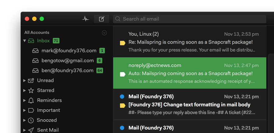
The Mailspring Theme Starter is a basic starting point for creating a theme for the Mailspring email client.

Getting Started

Creating a new theme in Mailspring is easy! Here's how you can do it.

  1. Fork this repo or download the code. Add a name, display name, title, and description for your theme to package.json, and change the directory name to match.

  2. Open Mailspring and install the theme by going to Mailspring > Install New Theme... and selecting the directory.

  3. Choose Developer > Run With Debug Flags for easier debugging.

  4. Now, you can start playing with the theme! It's installed in ~/Library/Application Support/Mailspring/packages/THEME_NAME (on macOS), so open it from there. Most of Mailspring's React components are derived from the core variables defined in ui-variables.less, and any changes you make there will override the defaults for Mailspring. You can also add more LESS files in styles (ideally, separated into logical components like thread-list.less) to make your own specific changes. To reload the theme, just open the console (Developer > Toggle Developer Tools) and type

    AppEnv.themes.setActiveTheme('ui-light');
    AppEnv.themes.setActiveTheme('your-theme-name');
    
  5. Once you're happy with your theme, check how it looks in the theme picker (Mailspring > Change Theme...). We use your UI variables to pull the colors, but if you want to add your own selections to the color palette, create a theme-colors.less file that includes any of the variables that you want to change, and they'll only affect the theme preview. Here are the variables, on the left, with the part of the theme preview that they match:

    @background-secondary:     BACKGROUND_COLOR
    @text-color:               TEXT_COLOR, FIRST_SWATCH_COLOR
    @component-active-color:   MIDDLE_SWATCH_COLOR
    @toolbar-background-color: LAST_SWATCH_COLOR
    @panel-background-color:   STRIP_COLOR
    

Structure

.
├── styles                 # All stylesheets
|   ├── index.less             # Main LESS file to import your stylesheets
│   ├── ui-variables.less  # UI variables that override N1's defaults
│   ├── theme-colors.less  # Theme colors for theme preview (optional)
├── package.json           # Metadata about the theme
├── LICENSE.md             # License with usage rights
└── README.md              # Info about your theme and how to use it
Note that the project description data, including the texts, logos, images, and/or trademarks, for each open source project belongs to its rightful owner. If you wish to add or remove any projects, please contact us at [email protected].