CapnKitten / Material Discord
Material design theme for Discord
Stars: ✭ 127
Projects that are alternatives of or similar to Material Discord
Material Design Theme
🎨 A ex-theme for Discord according to Google's Material design Guidelines. Now moved to https://github.com/rauenzi/Nox
Stars: ✭ 50 (-60.63%)
Mutual labels: discord, material, design
Flutter Neumorphic
A complete, ready to use, Neumorphic ui kit for Flutter, 🕶️ dark mode compatible
Stars: ✭ 988 (+677.95%)
Mutual labels: material, design
Singledateandtimepicker
You can now select a date and a time with only one widget !
Stars: ✭ 921 (+625.2%)
Mutual labels: material, design
Material Bottom Nav
A bottom navigation bar adhering to the Material Design specification.
Stars: ✭ 41 (-67.72%)
Mutual labels: material, design
Steppers
Steppers view library for Android, based on Google Material design guidelines
Stars: ✭ 786 (+518.9%)
Mutual labels: material, design
Materialdesigninxamltoolkit
Google's Material Design in XAML & WPF, for C# & VB.Net.
Stars: ✭ 11,603 (+9036.22%)
Mutual labels: material, design
Fiftyshadesof
An elegant context-care loading placeholder for Android
Stars: ✭ 1,110 (+774.02%)
Mutual labels: material, design
Chips Input Layout
A customizable Android ViewGroup for displaying Chips (specified in the Material Design Guide).
Stars: ✭ 591 (+365.35%)
Mutual labels: material, design
Materialdesigndemo
A beautiful app designed with Material Design.
Stars: ✭ 1,391 (+995.28%)
Mutual labels: material, design
Kotlinpleaseanimate
Kotlin, please, can you animate my views ?
Stars: ✭ 541 (+325.98%)
Mutual labels: material, design
Aiflatswitch
Nicely animated flat design switch alternative to UISwitch
Stars: ✭ 904 (+611.81%)
Mutual labels: material, design
Tutoshowcase
A simple and Elegant Showcase view for Android
Stars: ✭ 499 (+292.91%)
Mutual labels: material, design
Material Framework
[Unmaintained] An easy to use material design based framework.
Stars: ✭ 383 (+201.57%)
Mutual labels: material, design
Md Date Time Picker
An implementation of Material Design Picker components in vanilla CSS, JS, and HTML
Stars: ✭ 272 (+114.17%)
Mutual labels: material, design
Fabsmenu
A simple library to use a menu of FloatingActionButtons from Design Support Library that follow Material Design Guidelines
Stars: ✭ 324 (+155.12%)
Mutual labels: material, design
Materialdesigncolor
This project shows the color in material design
Stars: ✭ 55 (-56.69%)
Mutual labels: material, design
Material Design For Bootstrap
Important! A new UI Kit version for Bootstrap 5 is available. Access the latest free version via the link below.
Stars: ✭ 9,463 (+7351.18%)
Mutual labels: material, design
Material Discord Theme - 

A theme based on Google's Material Design
Current version: v3.0.3 (24/02/2021) - Download | Old messages add-on: Download | Status picker add-on: Download
Assets located at: https://github.com/CapnKitten/BetterDiscord/tree/master/Themes/Material-Discord
Previews
(Previews are subject to be out of date / Animations in the GIFs are sped up)
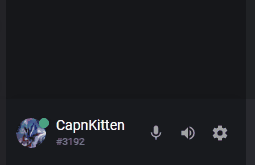
Changing status
Changing user roles

Audio notification
Main chat area

User server info

User info popout

User settings


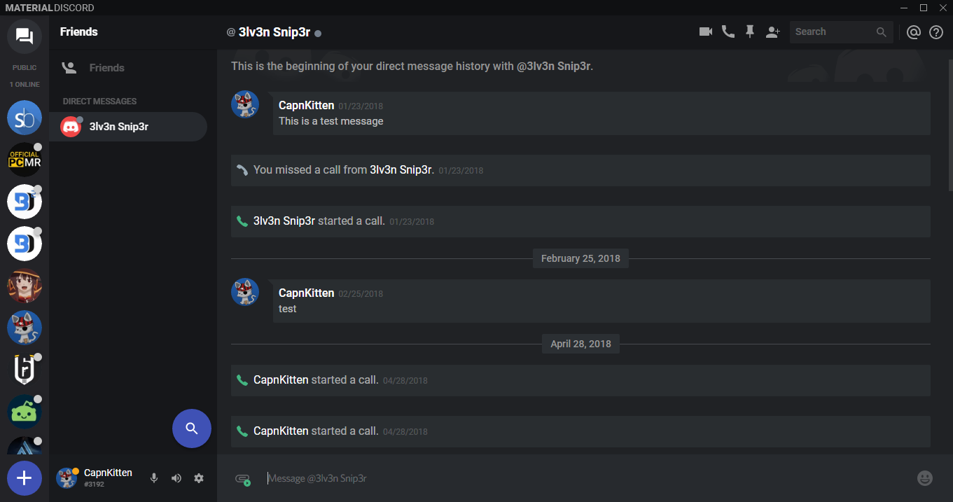
DMs
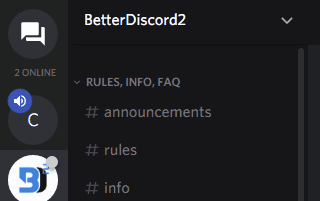
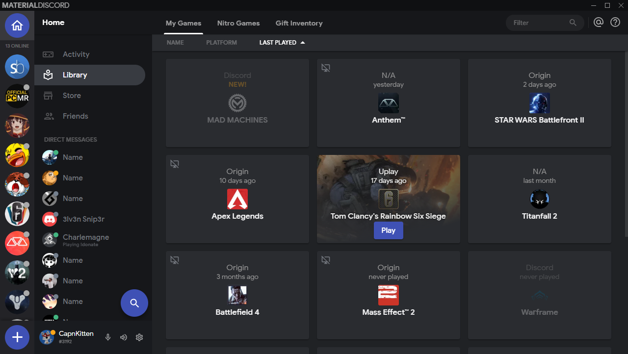
Home tab

Variables
App elements
-
--app-bg- The background for the entire Discord app. Default:var(--main-alt) -
--main-color- The background color for main content areas like in the settings menu. Default:#16171a-#e8eaeb** -
--main-alt- An alternative background color for main content areas. Default:#0f1012-#ddd** -
--server-color- The background color for the servers list. Default:#232327-#eee** -
--status-picker-color- The background color for the status picker popout. Default:#181a1d-#dee0e0** -
--sidebar-panel-color- The background color for the sidebar panels in the channels list. Default:#111114-#d4d6d6** -
--chat-color- The background color the main chat area. Default:#202225-#fff**
Accent elements
-
--accent-color- The main accent color for the theme. Default:#3f51b5 -
--accent-rgb- The accent color RGB values for elements that require an opacity. Default:63,81,181 -
--accent-button-action- The color used for the hover and active states for accent buttons. Default:#fff -
--accent-button-action-hover- The opacity for the accent button hover state. Default:0.06 -
--accent-button-action-active- The opacity for the accent button active state. Default:0.12 -
--accent-text-color- The text color for buttons and other various elements with the accent background color. Default:#fff
Message elements
-
--message-color- The background color for message bubbles. Default:#292d30-#edeff0** -
--message-color-alt- An alternative background color for message bubbles. Default:#1c1e21-#e8e8e8** -
--message-radius- The border radius for the message bubbles. Default:19px -
--attachment-color- The background color for all attachments. Default:rgb(0,0,0,0.325)-rgba(0,0,0,0.1)** -
--main-textarea-color- The background color for the main chat text box. Default:#303338-#fff** -
--main-textarea-color-alt- An alternative background color for the main chat text box. Default:#3b3f42-#ccc** -
--main-textarea-border- The border color for the main chat text box. Default:#3e434a-#dadce0** -
--main-textarea-radius- The border radius for the main chat text box. Default:24px -
--typing-color- The background color for the typing indicator. Default:rgba(32,34,37,0.9)-rgba(255,255,255,0.8)**
Popout menu elements
-
--popout-color- The background color for popout menus and modals. Default:#2c2f33-#fff** -
--popout-color-alt- An alternative background color for popout menus and modals. Default:#202225-#e5e5e5** -
--popout-header-border- The border color for popout menu headers. Default:#444-#aaa** -
--separator-color- The background color for the separator lines in various popout menus. Default:#444-#ccc** -
--popout-radius- The border radius for popout menus. Default:5px -
--popout-radius-big- The bigger border radius for modals. Default:10px
Card elements
-
--card-color- The background color for cards. Default:transparent-transparent** -
--card-color-hover- The background color for hovering over cards. Default:#292b2f-#eee** -
--card-color-alt- An background color for cards. Default:#2a2c30-transparent** -
--card-color-alt-hover- An background color for hovering over cards. Default:#35383d-#d4d4d4** -
--card-header-text-color- The text color for card headers. Default:#dcddde-#333** -
--card-radius- The border radius for cards. Default:5px -
--card-radius-big- The bigger border radius for cards. Default:10px
Button elements
-
--button-radius- The border radius for buttons. Default:5px -
--button-link-color- The background color for transparent buttons. Default:255,255,255-0,0,0** -
--button-link-text-color- The text color for transparent buttons. Default:#fff-#333**
Slider and switch elements
-
--slider-color- The background color for sliders. Default:#4f545c-#999** -
--switch-knob-color- The background color for the knob on switches. Default:#777-#fff** -
--switch-slider-color- The background color for the background slider on switches. Default:rgba(65,65,65,0.65)-rgba(0,0,0,0.2)**
Input elements
-
--input-color- The background color for text fields that don't have the animated border. Default:rgba(255,255,255,0.075)-#d2d4d4** -
--input-border-color- The border color for text fields. Default:#444-#aaa**
Various elements
-
--md-ripple-color- The color of the ripple effect. Default:255,255,255-0,0,0** -
--emoji-category-header- The background color for the headers in the emoji panel. Default:rgba(44,47,51,0.95)-rgba(255,255,255,0.9)** -
--scrollbar-color- The background color for scrollbars. Default:255,255,255-0,0,0**
** Indicates that it has two values for both the dark and light themes of Discord. Instead of using :root, use .theme-dark or .theme-light.
Changelog
v3.0.3 (24/02/2021)
- Font changed to Google Sans
- Delete message modal updated
Note that the project description data, including the texts, logos, images, and/or trademarks,
for each open source project belongs to its rightful owner.
If you wish to add or remove any projects, please contact us at [email protected].