PandaWhisperer / Meteor Yelp Clone
Programming Languages
Projects that are alternatives of or similar to Meteor Yelp Clone
Meteor Tutorial: Building a React-Yelp-Clone Clone
Status
This tutorial should currently be considered to be in beta stage. It's mostly feature complete, but there may be some minor errors. If you find any errors (spelling or otherwise), feel free to file an issue.
Motivation
Someone over at CodeBuddies' Slack Channel recently linked me to Fullstack.io's React tutorial. Initially I was excited, as learning React has been on my to-do list for a while now. But as I started following along, I quickly got frustrated by how much work was involved. After half an hour, I still hadn't written a single line of actual app code, but I had already installed about 20 NPM packages, and written copious amounts of arcane configuration files.
Long story short, after scrolling forward for a bit and realizing I would still be spending at least another 20 minutes on my setup, I got impatient and decided to do this project in Meteor instead. This is the story of what happened next.
Overview
This is a long document, so I've split it up in smaller, bite sized chunks. Here is an overview of all the steps, with links for quick access.
- Creating the App
- Font Awesome
- Setting up Testing
- Creating the Directory Structure
- Setting up Routing
- Building a Google Maps Component
- Writing a Test for the Map Component
- Adding Place Search to our Map Component
- Adding Markers to the Map
- Excursion: Creating a PlaceSearch Component
- Writing Tests for the PlaceSearch Component
- Using the PlaceSearch Component in our App
- Adding a Header Component
- Creating a Menu Component
- Wiring up Menu and PlaceSearch with Routes
- Writing a Rating Component
- Integrating the Rating Component
- Creating a PlaceDetail Component
- Styling the PlaceDetail Component
- Summary and Outlook
Creating the App
First, we'll ask Meteor to create a new project for us. This couldn't be any simpler:
meteor create meteor-yelp-clone
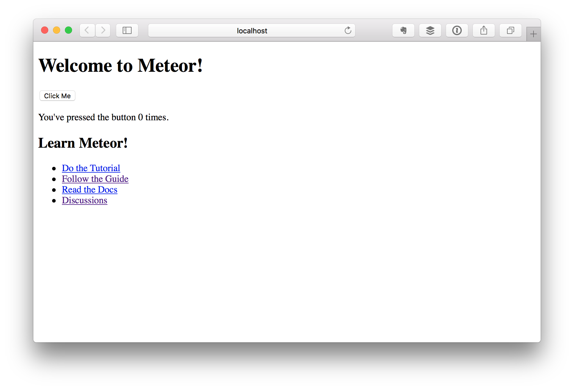
Now, we simply cd into the new directory and run meteor, and we already have a working server that we can visit in the browser.
cd meteor-yelp-clone
meteor
Compare that to the React version, which spends the first 10 minutes setting up the build environment. Granted, there isn't much to see here either, but at least there's a little button we can click on that increases a counter. Even an npm start script is already pre-configured for us.
The score so far: Meteor: 1, React: 0.
Font Awesome
Again, this is pretty simple. There's already a number of pre-built packages available, so all we have to do here is run
meteor add fortawesome:fontawesome
and we're good to go. We don't even need to restart the server, it automatically detects the new package and loads it for us. Awesome.
To test that this is working, we can add a little <i class="fa fa-star"></i> to our main.html. And while the React Tutorial is still explaining postcss and CSS modules, we're already moving on to the next step. Meteor: 2 - React: 0.
Setting up Testing
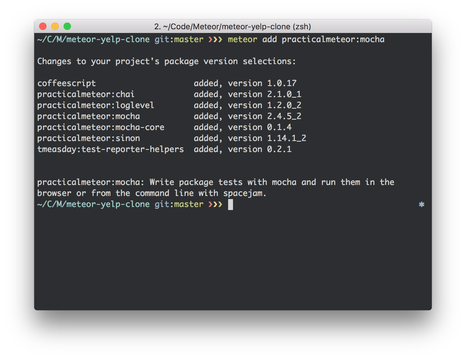
Testing in Meteor has drastically changed with version 1.3, and for the first time since the project's inception, there is actually official test support. For basic unit and integration tests, we'll want to start with the practicalmeteor:mocha package.
meteor add practicalmeteor:mocha
This conveniently also adds Sinon and Chai for mocking and expectations.
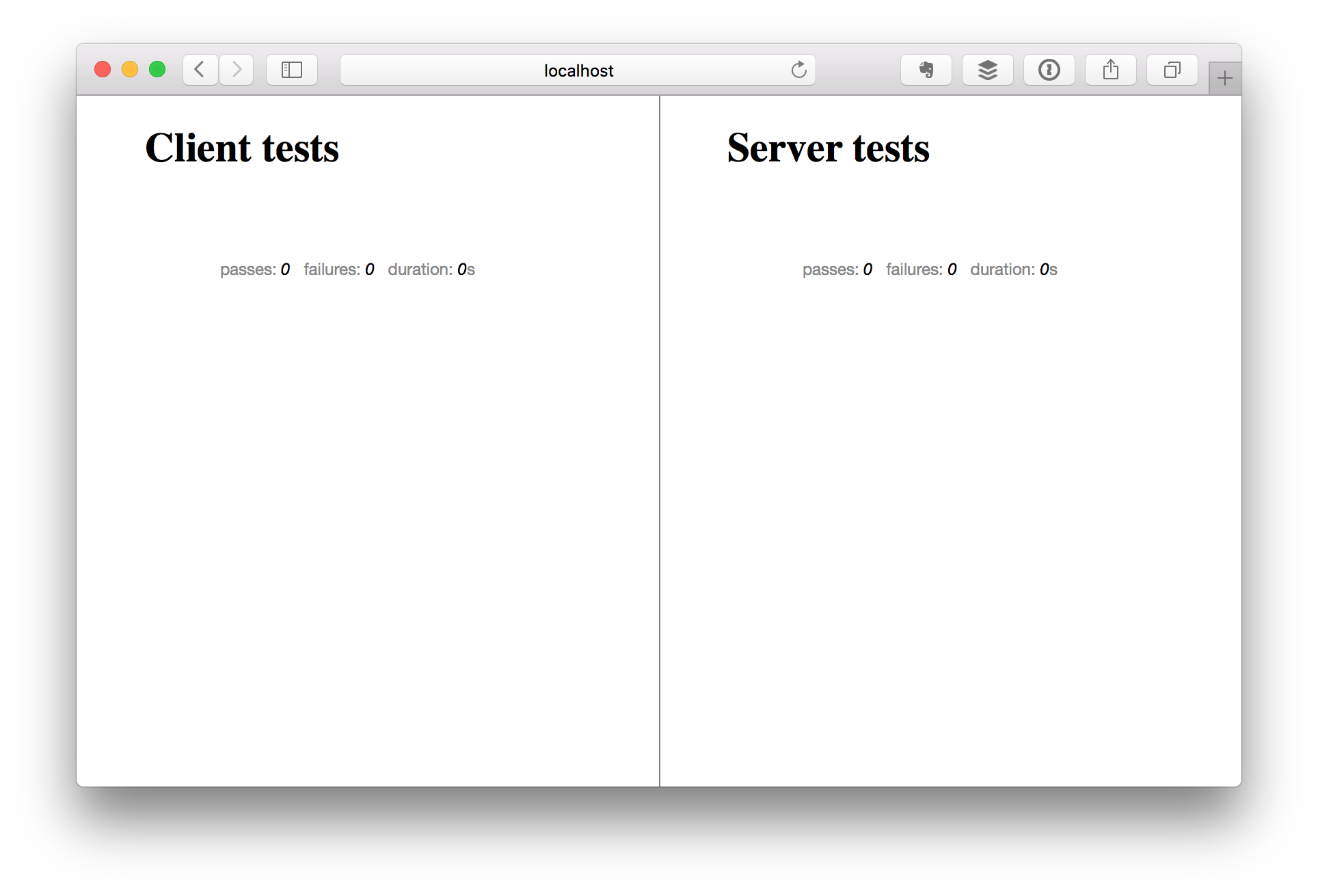
Apart from the Mocha test framework, this package provides a driver that can be used in Meteor's test mode to actually run our tests. This driver will start a separate Meteor server instance that will automatically refresh when tests are added or updated, and it displays the result in a web app in the browser.
Because you'll usually want a Meteor server running in the development phase (so you can see the changes you're making), you'll usually want to run the meteor test on a different port like this:
meteor test --driver-package=practicalmeteor:mocha --port 3030
You may also want to add the dispatch:mocha-phantomjs package, which runs your tests in a headless browser (the famous PhantomJS) and shows the output on the console. This is useful for integrating with CI tools such as Travis or Circle. You can run it by simply specifying this as the driver package (we also add --once to make Meteor exit once the tests are done):
meteor test --once --driver-package dispatch:mocha-phantomjs --port 3030
Because we don't want to have to remember this and type it each time we want to run tests, we'll set up some aliases in our package.json. Just update the "scripts" section as follows:
  "scripts": {
    "start": "meteor run",
    "test": "meteor test --once --driver-package dispatch:mocha-phantomjs --port 3030",
    "test-watch": "meteor test --driver-package=practicalmeteor:mocha --port 3030"
  }
Now you can run tests on the terminal via npm test, and launch the web app using npm run test:watch. And while the React folks are still tweaking their karma.conf.js, we're off to the next step. Meteor: 3 - React: still 0.
Creating the Directory Structure
Now before we start building our actual app, lets take a moment and create the directory structure we'll be using. For this article, I decided to go with the recommendation in the official Meteor Guide. This means we will be using ES2015 modules, and most of our application code will live in various subdirectories of the the imports directory.
mkdir -p imports/{startup,api,ui}
mkdir -p imports/startup/{client,server}
mkdir -p imports/ui/{components,layouts,pages}
Setting up Routing
We'll also need a way to route different URLs to different views, therefore we require a router. Again, we'll go with the recommendation from the official guide and use kadira:flow-router. We'll also need the kadira:blaze-layout package, so let's install both right now:
meteor add kadira:flow-router kadira:blaze-layout
Again, going with the recommendation, we'll store our routes in imports/startup/client/routes.js. We'll start with just one route for the main URL, which we'll call home.
import { FlowRouter } from 'meteor/kadira:flow-router'
import { BlazeLayout } from 'meteor/kadira:blaze-layout';

FlowRouter.route('/', {
  name: 'home',
  action() {
    BlazeLayout.render("mainLayout", { content: "home" });
  }
});
This creates a route named "home", which renders a template named "home" within a layout named "mainLayout". Now we just need to create those two files. Let's start with the layout, which we'll store in imports/ui/layouts/main.html:
<template name="mainLayout">
  <header>
    {{>Template.dynamic template=header}}
  </header>

  <main>
    {{>Template.dynamic template=content}}
  </main>

  <footer>
    {{>Template.dynamic template=footer}}
  </footer>
</template>
And now here's our "home" template, imports/ui/pages/home.html (don't worry about the missing templates for header and footer for now, we'll be adding those later):
<template name="home">
  Hello from the import side
</template>
I know, we've going for a dangerously long time now without seeing anything happen in the browser, so let's fix that right now. For this purpose, we'll create a file named imports/startup/client/index.js with the following contents:
// routes
import './routes.js';

// templates
import '../../ui/layouts/main.html';
import '../../ui/pages/home.html';
This file basically pulls together all the stuff we need on the client, so we can easily import it in our client/main.js file. Now we simply delete all the pre-generated content in that file and simply replace it with this line:
import '/imports/startup/client';
We'll also have to delete the default client/main.html, because otherwise, Meteor will still end up rendering that.
rm client/main.html
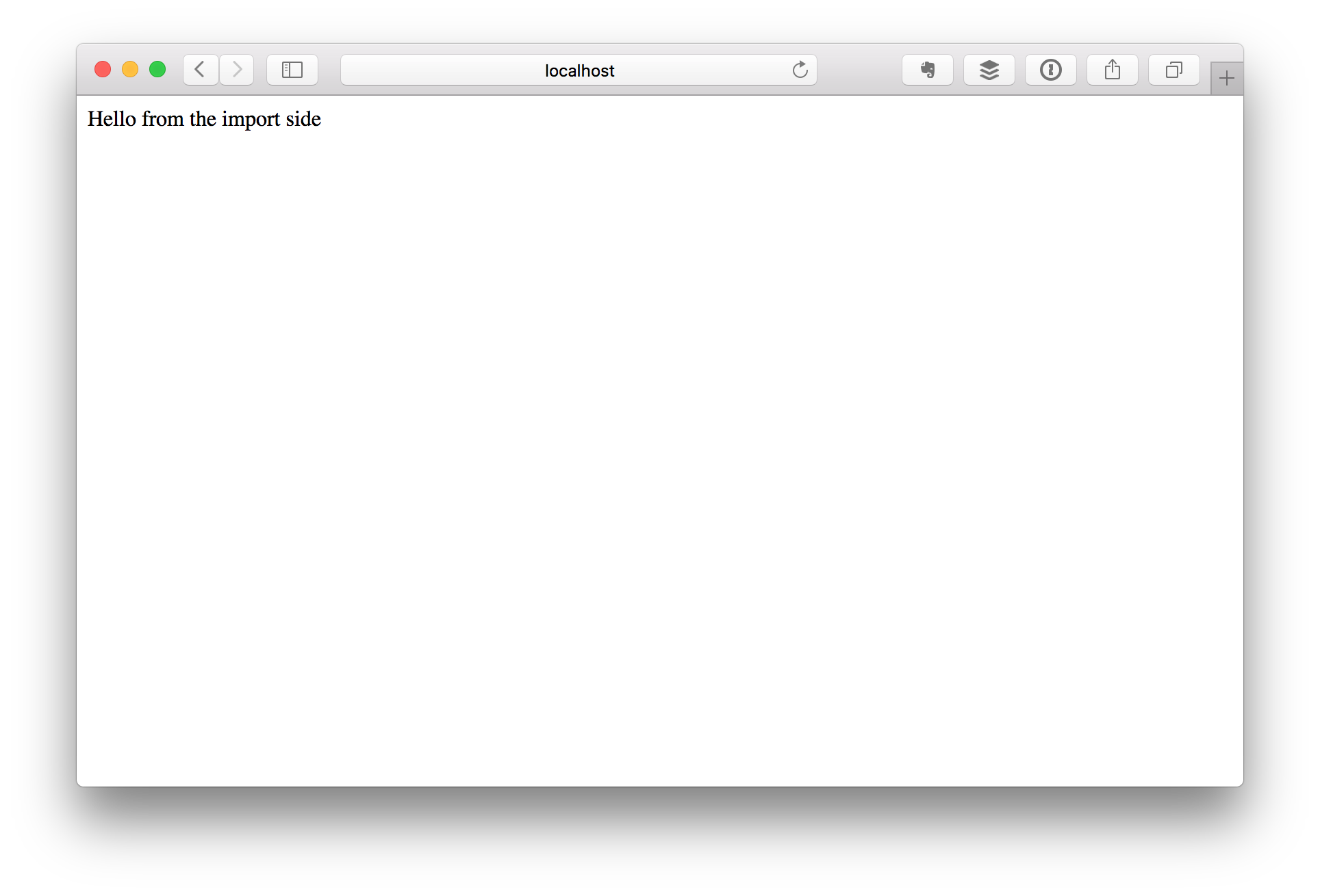
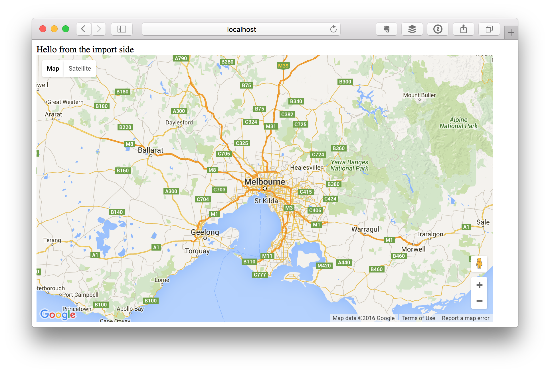
If you did everything correctly, your browser should now show this:
Let's see how the React folks are doing, shall we? There's probably still configuring the router. Let's skip ahead for a bit and do something more fun. Looks like they're going to be working on the Google Maps integration next.
Building a Google Maps Component
So, over at Fullstack React, they are using a pre-built React component, so I'm sure it won't be considered cheating if we do the same. We'll use the dburles:google-maps package, which can be installed by running
meteor add dburles:google-maps
Now, let's create a Blaze component to use that map. First, we'll need a new directory to hold the files:
mkdir imports/ui/components/map
The component has two parts: a (HTML) template and some JavaScript. First, here's the template, imports/ui/components/Map/Map.html:
<template name="Map">
  <div class="map-container">
    {{> googleMap name="map" options=mapOptions}}
  </div>
</template>
NOTE
As a convention, I'm going to be naming all of my components starting with an uppercase letter, while I'm going to be naming my pages starting with a lowercase letter.
Now, here's the JavaScript part, imports/ui/components/Map/Map.js:
import { Meteor } from 'meteor/meteor';
import { Template } from 'meteor/templating';

import './Map.html';

Template.Map.onRendered(function() {
  GoogleMaps.load({
    key: Meteor.settings.public.googleApiKey
  });
})

Template.Map.helpers({
  mapOptions() {
    const { center, zoom } = Template.currentData();

    if (GoogleMaps.loaded()) {
      return {
        center: new google.maps.LatLng(center.lat, center.lng),
        zoom: zoom
      };
    }
  }
})
Here, we are using Meteor.settings to inject our Google API key into the component. This is Meteor's way of storing configuration data. In order for this to work, we'll need to create a settings file, and then point the server to that file when we start it. Let's do that now.
First, here's the settings file, settings/development.json:
{
  "public": {
    "googleApiKey": "YOUR_GOOGLE_API_KEY_HERE"
  }
}
Obtaining a Google API Key
In order to use the Google Maps API, you'll need an API key. If you've never done this before, here's how to get one: First, sign into the Google Developers Console with your Google Account (create one if necessary). Now, create a new project, then activate the Google Maps API for that project.
Then, copy the newly created API key and place it in your
settings/development.jsonby replacing the stringYOUR_GOOGLE_API_KEY_HEREwith the actual key.
Restart the server if it's running so that the new settings are loaded (they only get read on startup), and maps should be working.
Now, in order to have the server load this file on startup, we need to run it with the --settings=settings/development.json option. Since we don't want to have to remember to do that every time, we'll just put this into the scripts section of our package.json.
"scripts": {
  "start:dev": "meteor run --settings=settings/development.json",
  "test": "meteor test --settings=settings/test.json --driver-package=practicalmeteor:mocha --port 3030"
}
As you can see, we also added this option to our npm test script, so that our tests have access to the settings as well. For now, the settings/test.json file is simply a copy of settings/development.json.
cp settings/development.json settings/test.json
Now we'll have to stop our currently running server and restart it again by typing
npm run start:dev
And we're off to the races again. Now, all we have left to do is use our new component. First, we will add it to our imports/startup/client/index.js file so it is available in our app:
// components
import '../../ui/components/Map/Map.js';
Then, we'll add it to our "home" template by modifying it as follows:
<template name="home">
  Hello from the import side

  {{> Map center=mapCenter zoom=defaultZoom}}
</template>
Finally, we need to add some helpers for this template, to pass in the map center and the default zoom level. We need to create a new file, imports/ui/pages/home.js with the following content:
import { Template } from 'meteor/templating';

import './home.html';

Template.home.helpers({
  mapCenter() {
    return { lat: -37.8136, lng: 144.9631 }
  },

  defaultZoom() {
    return 8
  }
})
Now, back in imports/startup/client/index.js, we simply change the line
import '../../ui/pages/home.html';
to end in .js instead of .html:
import '../../ui/pages/home.js';
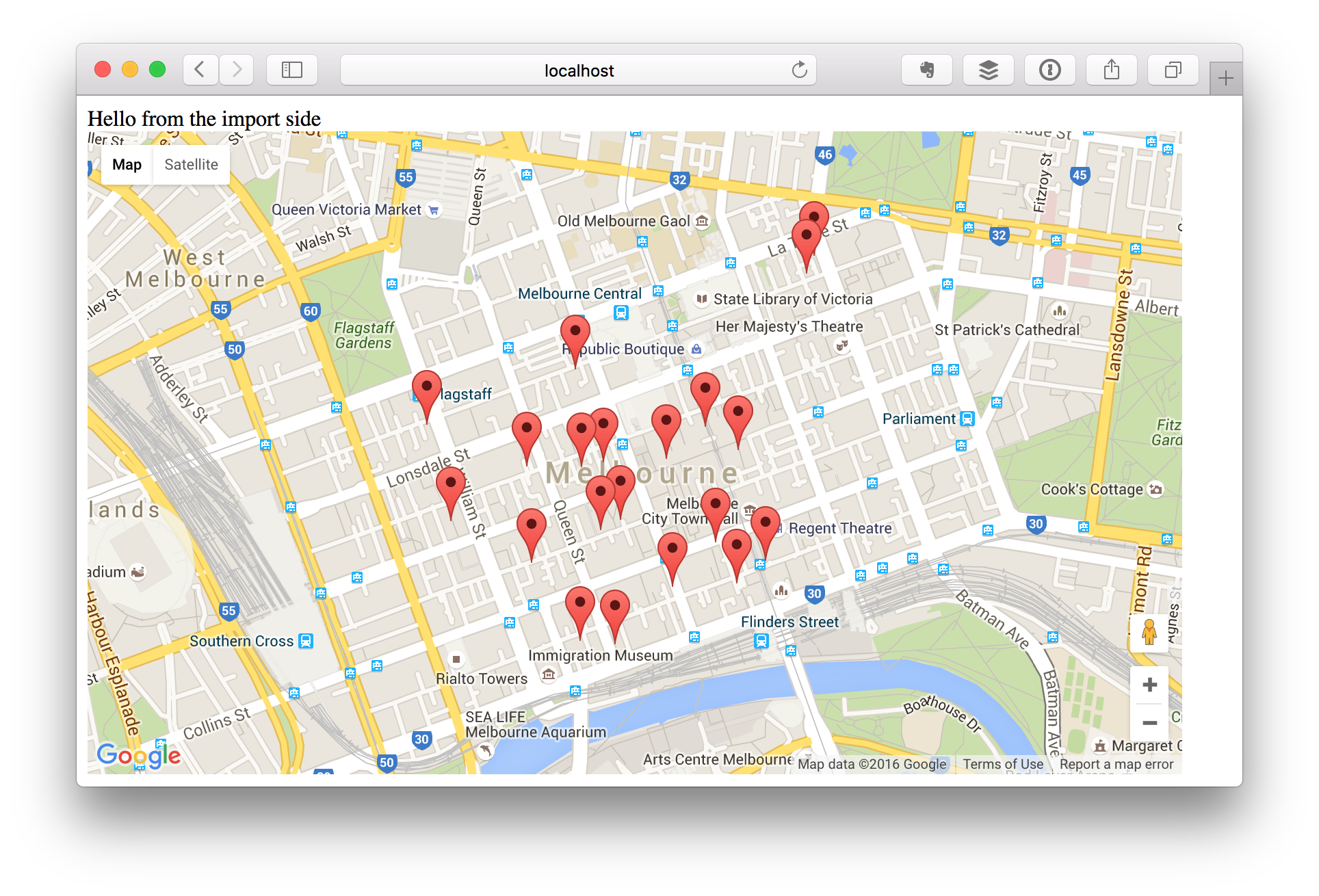
Here's what you should be seeing now in your browser:
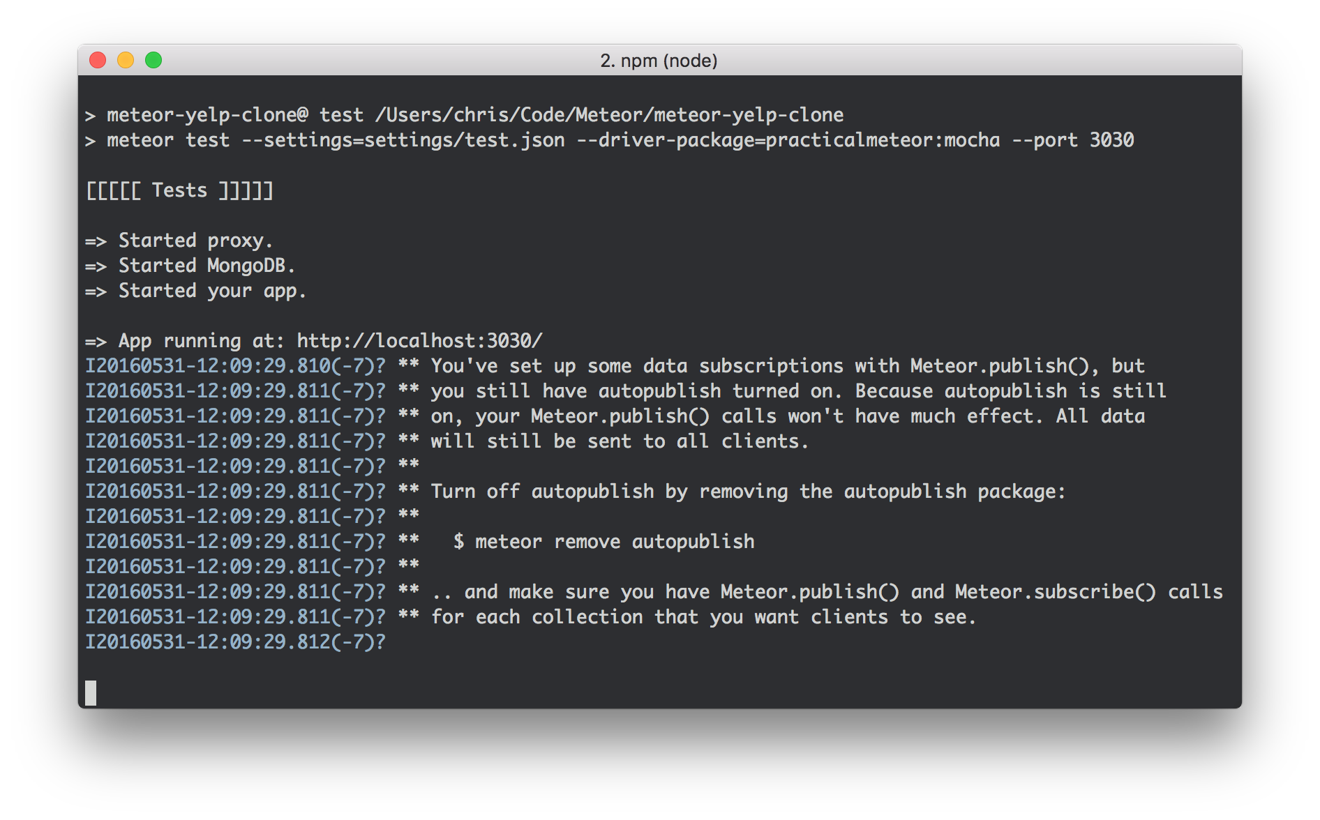
At this point, you may have noticed that the meteor test command is trying to warn us about still having the autopublish package enabled. Since we're only working on the frontend, we don't really need it anyways, so let's just remove it along with the insecure package (which makes all collections publicly writable by default).
Simply run
meteor remove insecure autopublish
And the warning will disappear.
Writing a Test for the Map Component
So, we've finally achieved some significant functionality. Time to write a test! Again, we'll take a page from the Meteor Guide and implement a simple unit test for our component. Before we do this, we'll need to add the imports/ui/test-helpers.js mentioned in that guide. I won't reproduce the file here, since you can find it at the link above.
Now we can go ahead and write the test in imports/ui/components/Map/client/Map.tests.js as follows:
/* eslint-env mocha */
/* eslint-disable func-names, prefer-arrow-callback */

import { chai } from 'meteor/practicalmeteor:chai';
import { Template } from 'meteor/templating';
import { $ } from 'meteor/jquery';

import { withRenderedTemplate } from '../../../test-helpers.js';
import '../Map.js';

describe('Map component', function () {
  it('renders correctly with simple data', function () {
    const center = { lat: -37.8136, lng: 144.9631 };
    const zoom = 8;
    const data = { center, zoom };

    withRenderedTemplate('Map', data, el => {
      chai.assert.equal($(el).find('.map-canvas').length, 1);
    });
  });
});
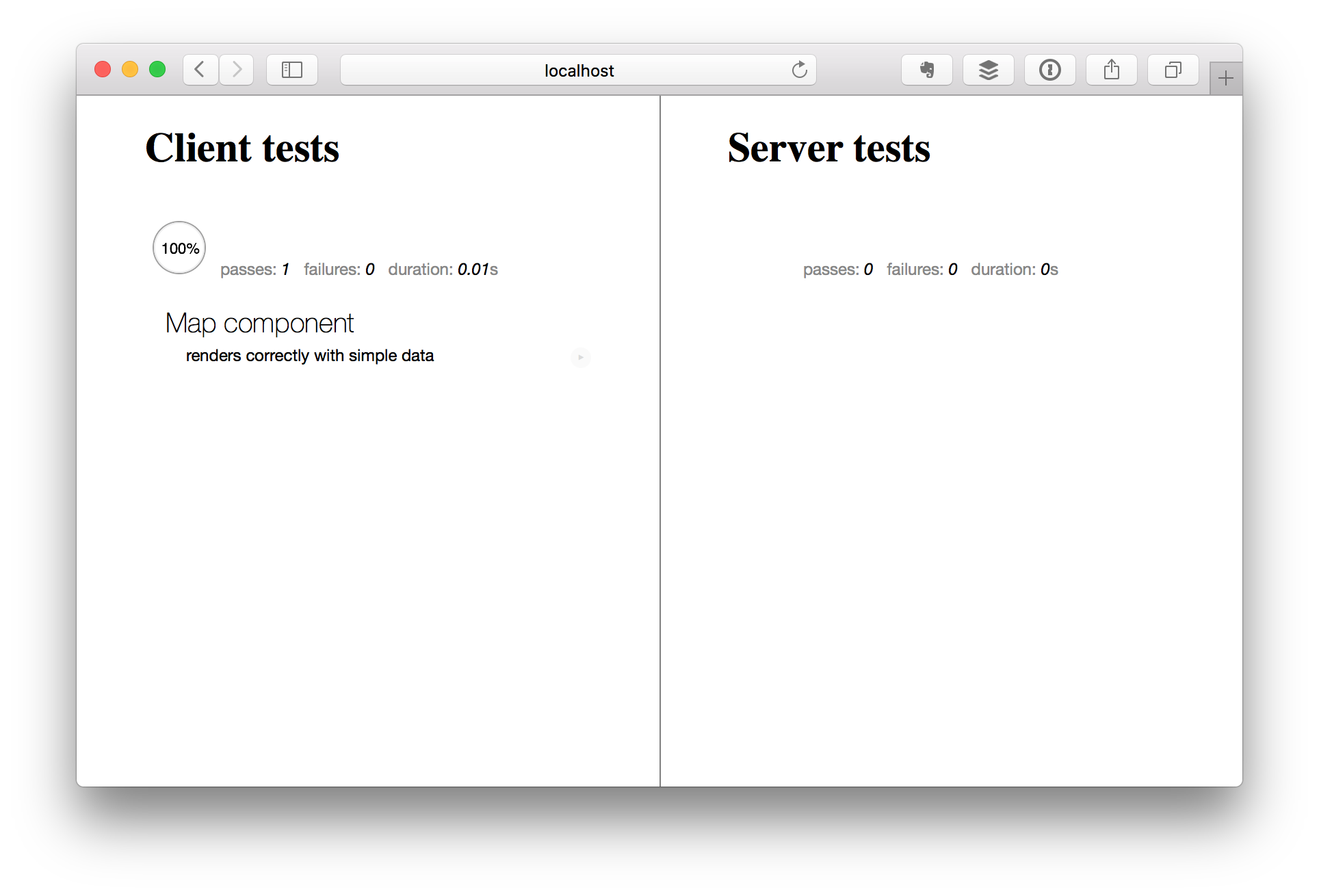
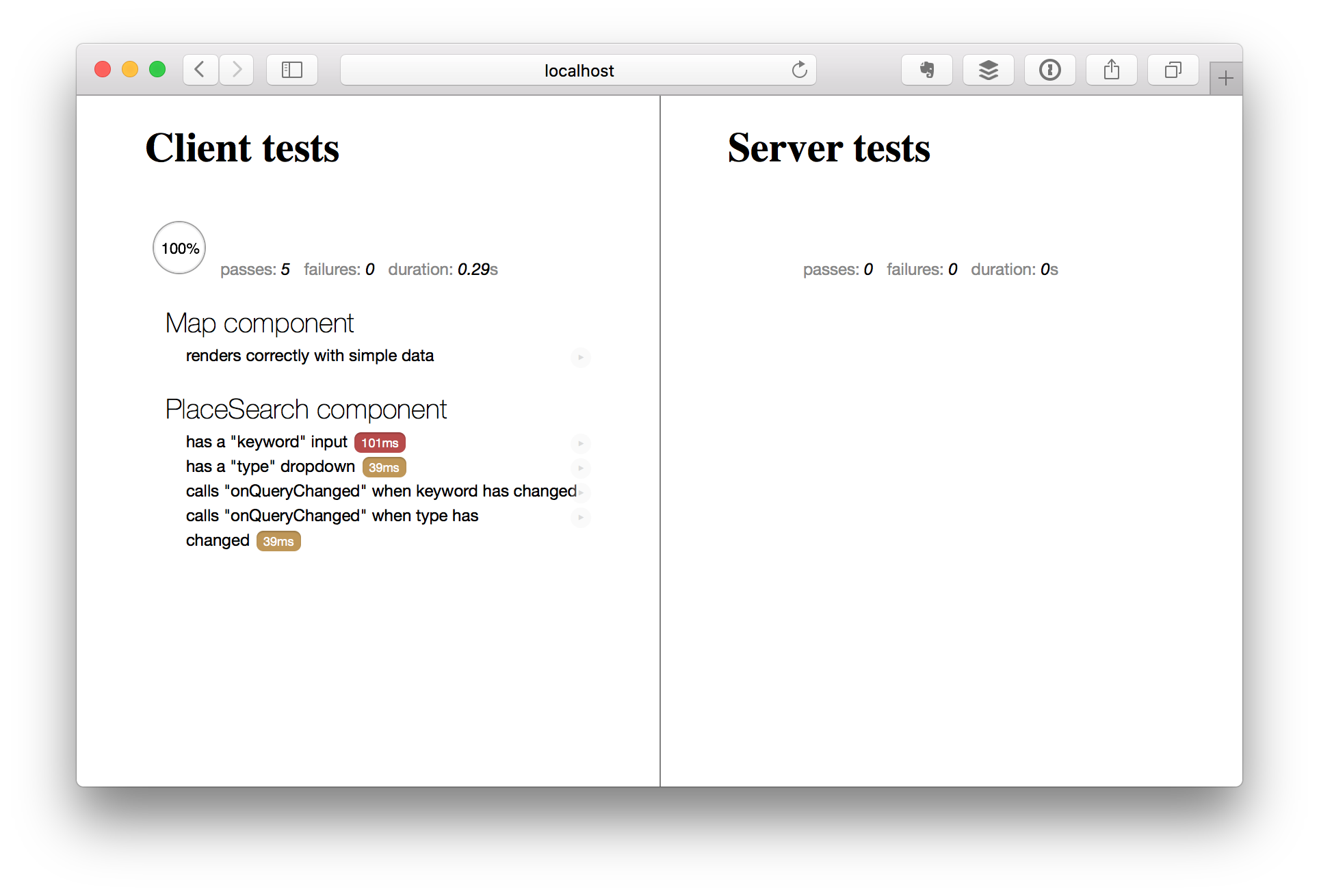
If you did everything right, the test runner should now show a passing test:
Adding Place Search to our Map Component
Next, we want our Map component to be able to search for and display places matching a certain query. Since we want to keep all the Google Maps handling code local to our component (to ensure proper encapsulation), we need to implement this functionality inside the component.
We'll start by changing the onRendered callback in our Map component to load the places API alongside with Google Maps. We'll also store the map object that the API returns in a ReactiveVar that's scoped to the template:
import { ReactiveVar } from 'meteor/reactive-var';

Template.Map.onCreated(function () {
  this.map = new ReactiveVar();
})

Template.Map.onRendered(function() {
  GoogleMaps.load({
    key: Meteor.settings.public.googleApiKey,
    libraries: 'places'
  });

  GoogleMaps.ready('map', (map) => {
    this.map.set(map);
  });
})
This ensures that whenever the GoogleMaps.ready() callback is called, the map instance is attached to the template, and anything that depends on it will automatically be re-computed thanks to Meteor's reactivity tracker.
Now, we'll create a helper function to let us run an arbitrary query against a given Google Maps object (this will be a private function, so just drop it at the bottom of Map.js):
function searchNearby(map, query) {
  const service = new google.maps.places.PlacesService(map.instance);

  service.nearbySearch(query, (results, status, pagination) => {
    if (status == google.maps.places.PlacesServiceStatus.OK) {
      console.log(results)
    } else {
      console.log(status)
    }
  })
}
As you can see, this function creates a new PlaceService instance and runs the query against that. When the results are ready, a callback is called that prints them out to the terminal. We can immediately test this by adding the following code to the bottom of our onCreated callback:
this.autorun(() => {
  const map = this.map.get();
  const query = {
	center: map.options.center,
	radius: 500,
	type: 'cafe'
  };
  if (map) {
    searchNearby(map, query);
  }
})
Using this.autorun() ensures that Meteor will automatically detect any reactive dependencies used in the callback (that's why we made this.map a ReactiveVar) and re-run the callback when those dependencies change.
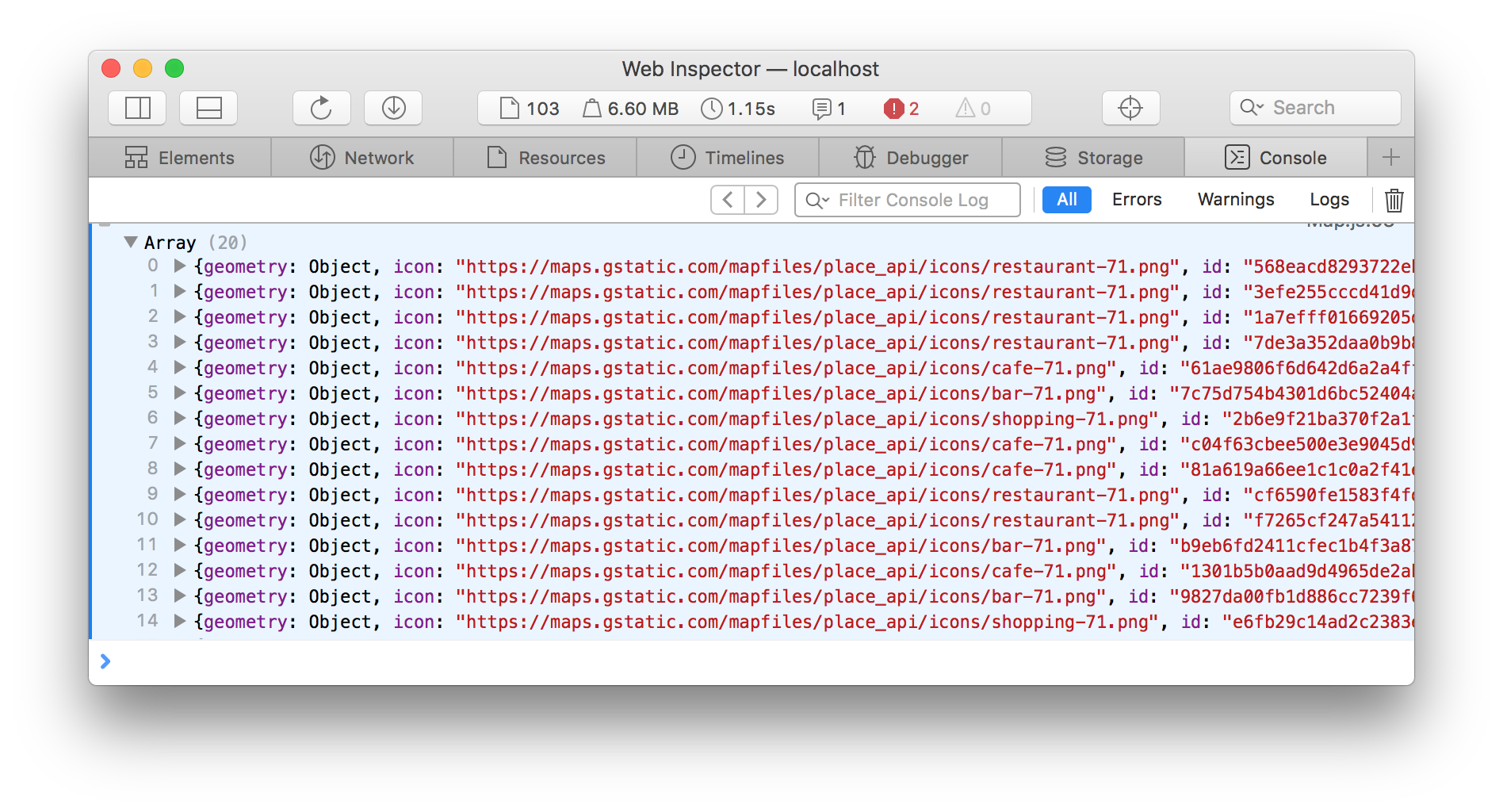
Once you saves this change, you should be able to see your Meteor app reload automatically, and if you open your browser's JavaScript console, you'll see the results of the place search logged there:
Adding Markers to the Map
Now that we have a basic place search functionality going, it would be cool if our app was able to display the results on a map, instead of printing them to the console (where no user would ever bother to look). Let's do that next.
First, we'll create a couple more helper functions to work with markers (we'll add them to the end of our imports/ui/components/Map/Map.js file):
// Creates a marker from a place, but doesn't add it to a map
function createMarker(place) {
  return new google.maps.Marker({
    position: place.geometry.location,
    title: place.name
  });
}

// Adds a marker to the given map
function addMarker(map, marker) {
  if (!(marker instanceof google.maps.Marker)) {
    marker = createMarker(marker);
  }
  marker.setMap(map.instance);

  return marker;
}

// Removes a marker from a map
function removeMarker(marker) {
  marker.setMap(null);
}
It's worthwhile to note that the addMarker function is flexible and will accept a place object instead of a marker as its second argument for convenience.
Now, we want our searchNearby function to create place markers whenever there are results available. However, in the interest of not letting this function become too complex, we'll handle this a bit differently. First, we'll add another ReactiveVar to our component. This one will store the place results.
Template.Map.onCreated(function () {
  this.map = new ReactiveVar();
  this.places = new ReactiveVar([]);

  this.autorun(() => { /* ... */ });
});
Next, we'll update the searchNearby function to store the results in this variable. We'll simply pass in the ReactiveVar as a third parameter, and have the function update its contents like this:
function searchNearby(map, query, places) {
  const service = new google.maps.places.PlacesService(map.instance);

  service.nearbySearch(query, (results, status, pagination) => {
    if (status == google.maps.places.PlacesServiceStatus.OK) {
      console.log(results)
      places.set(results)
    } else {
      console.log(status)
    }
  });
}
Now, we change our this.autorun() callback to pass this parameter along:
 if (map) {
   searchNearby(map, query, this.places);
 }
NOTE
It it important to realize that even though
this.placesis aReactiveVar, simply passing it along as a reference tosearchNearbydoes NOT cause theautoruncallback to be re-evaluated. A dependency is only created if we call.get()on that variable. Otherwise, we would be creating an endless loop here.
Next, we'll want to create place markers each there are new place results. For this, we'll add another this.autorun() block to our onCreated callback:
  // automatically add markers to map when places have changed
  let markers = [];
  this.autorun(() => {
    const map = this.map.get();
    const places = this.places.get();
    // remove old markers from map before adding new ones
    markers.forEach((marker) => removeMarker(marker));
    markers = places.map((place) => addMarker(map, place));
  });
This block depends on both the this.map and the this.places reactive vars (it is helpful to declare them at the top of the block so the dependencies are immediately obvious). Since we'll have to remove the old markers before adding new ones (otherwise, the old ones will stay around forever, crowding up the map), we need to store them somewhere. We use a local variable called markers for this purpose, whose contents we overwrite each time the block is re-evaluated. Note that this variable has to be declared outside the callback.
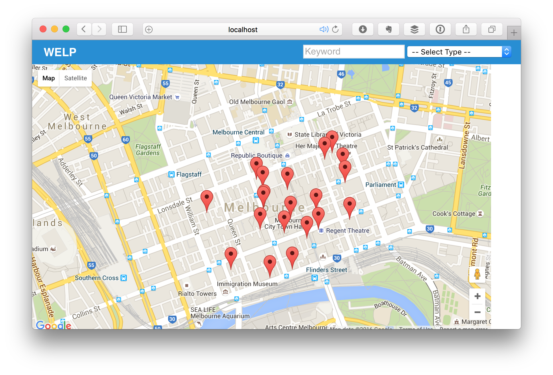
If you did everything right, when your app has reloaded, you should now see the map being populated with markers:
NOTE
You'll noticed I've changed the default zoom setting here, so we can actually tell the different markers apart. Since we did a radius search, Google will prioritize places that are closes to the center of the map to those that are further away. The zoom level in this picture is set to
15, which can be changed inimports/ui/pages/home.js.
Finally, in order for our component to be even more useful, we want it to be able to communicate with the outside world. For instance, instead of using a static query, we'd like the ability to pass in a query through the template parameters, and when the search results are available, have a callback called with the new results.
For the first part, all we have to do is change the first autorun() block as follows:
  // automatically search places if query has changed
  this.autorun(() => {
    const map = this.map.get();
    const { query } = Template.currentData();

    if (map && query) {
      query.bounds = map.instance.getBounds();
      searchNearby(map, query, this.places);
    }
  });
This code simply extracts the query object from the template's data using Template.currentData(), and if both the map and the query are defined, runs our searchNearby function to retrieve the results. Note that I've also changed the search to apply to only the visible map area, instead of doing a radius search around the map's center. This changes the sort order a bit, but ensures that all places will always be in the visible part of the map.
Finally, in order to notify outside observer about our changes, we'll add another this.autorun() block inside our onCreated callback. This one reads as follows:
  // notify observers when places have changed
  const { onPlacesChanged } = Template.currentData();
  this.autorun(() => {
    const places = this.places.get();
    typeof onPlacesChanged === 'function' && onPlacesChanged(places);
  });
In other words, whenever the the this.places reactive variable has been updated, and the onPlacesChanged template parameter is a function, we call that function with the new list of places.
Finally, we need to update our home template to pass in a query from the outside, so we can still see the map populate. Change the line in imports/ui/pages/home.html that loads our map component to read as follows:
{{> Map center=mapCenter zoom=defaultZoom query=query}}
Then add the following helper to imports/ui/pages/home.js:
  query() {
    return { type: 'cafe' }
  }
Now the app should load and behave just like before, although it may show slightly different results (because we changed from a radius search to a map bounds search).
Excursion: Creating a Place Search Component
At this point, I had wanted to write a test case for the place search callback behavior, but I had difficulties getting that to work. So, while the FullStack guys are moving ahead with building header and sidebar components, I decided to take a bit of a detour and make the map more interactive first, by adding a component to allow me to perform arbitrary place searches on the map.
Here's the idea: I want a text input field to search for keywords, and a dropdown with all the place types to narrow results by category. And in order to practice building reusable components (and exchanging data between them), I want this to be a component as well.
Let's start with the template, imports/ui/components/PlaceSearch/PlaceSearch.html:
<template name="PlaceSearch">
  <input name="keyword" placeholder="Keyword">
  <select name="type">
    <option value="">-- Select Type --</option>
    {{#each placeTypes}}
      <option value={{type}}>{{display}}</option>
    {{/each}}
  </select>
</template>
Here we can see the text input and the dropdown. The latter obviously will require a placeTypes helper to provide a list of place types. The full list is available here. I simply copied and pasted it from Google's Developer documentation and converted it to JSON by hand. You can see the full JSON file here. Note that all of these are lower case and contain underscores. Some of them are followed by (*), which means that according to the Google docs, they are deprecated and will be removed on February 16, 2017. I left these in for now, but we'll have to treat them specially, as we'll see in just a minute.
Let's start with our template helpers (in imports/ui/components/PlaceSearch/PlaceSearch.js):
import { Template } from 'meteor/templating';
import { humanize, titleize } from 'underscore.string';
import PlaceTypes from './PlaceTypes.json';

import './PlaceSearch.html';

Template.PlaceSearch.helpers({
  placeTypes() {
    return PlaceTypes.map((type) => {
      return { type, display: titleize( humanize(type) ) };
    });
  }
});
Our placeTypes helper simply iterates over the entire list of place types and turns them into objects with a type and a display property. The latter is automatically computed from the former, using two functions, humanize and titleize from a package called underscore.string. These get rid of the underscores and capitalize every word, respectively.
Sure, I could have simply used a regular expression here, but this gives us a chance to try out Meteor's new NPM integration. Also, this code is arguably much easier to read. Since version 1.3, Meteor has full support for NPM packages. All we need to do is install the package using the following command:
meteor npm install --save underscore.string
NOTE
If you have Node.js installed separately from Meteor, you can also simply run
npm install --save underscore.string.
Now, similar to our map component, we would like this component to run a callback whenever its internal state (in this case, the values of the form fields) changes. So lets hook that up with an event handler now:
Template.PlaceSearch.events({
  'change input, change select'(event, instance) {
    const { onQueryChanged } = Template.currentData();
    const query = {
      keyword: instance.$('input[name=keyword]').val(),
      type:    instance.$('select[name=type]').val()
    };

    if (typeof onQueryChanged === 'function') {
      onQueryChanged(query);
    }
  }
});
This is pretty similar to what we've done in the map component, the only new thing is using jQuery to extract the values from the form fields. Note that we're using instance.$ to scope the lookup to the current template instance, as recommended by the Meteor guide.
Writing Tests for the Place Search Component
Now, before we actually wire up this component into the rest of the app, let's write some tests for it. I'm going to omit the import and setup code here for brevity and focus on the actual test cases. You can find the full test in the repository.
First, let's write some tests to ensure that both our form fields are present:
  it('has a "keyword" input', function() {
    withRenderedTemplate('PlaceSearch', {}, el => {
      chai.assert.equal($(el).find('input[name=keyword]').length, 1);
    });
  });

  it('has a "type" dropdown', function() {
    withRenderedTemplate('PlaceSearch', {}, el => {
      chai.assert.equal($(el).find('select[name=type]').length, 1);
    });
  });
Next, we're going to write some tests to ensure that the callback is called when we expect it (i.e. when one of the inputs has changed):
  it('calls "onQueryChanged" when keyword has changed', function(done) {
    const data = {
      onQueryChanged(query) {
        chai.assert.equal(query.keyword, 'test');
        done();
      }
    };

    withRenderedTemplate('PlaceSearch', data, el => {
      $(el).find('input[name=keyword]').val('test').change();
    });
  });

  it('calls "onQueryChanged" when type has changed', function(done) {
    const data = {
      onQueryChanged(query) {
        chai.assert.equal(query.type, 'airport');
        done();
      }
    };

    withRenderedTemplate('PlaceSearch', data, el => {
      $(el).find('select[name=type]').val('airport').change();
    });
  });
Note we're making use of Mocha's support for asynchronous code here. Let's quickly check our test runner to make sure everything is in order:
Looks like we're good to go. Now before we move on to the next step, let's just clean up the code a little bit. As you may have noticed, the two pairs of tests we wrote look awfully similar.
From the first pair, we can extract the following helper (which we'll store in imports/ui/test-helpers.js:
export const ensureElement = function ensureElement(template, data, selector, count=1) {
  withRenderedTemplate(template, data, el => {
    chai.assert.equal($(el).find(selector).length, count);
  });
};
With this, we can write the first pair of tests as follows:
  it('has a "keyword" input', function() {
    ensureElement('PlaceSearch', {}, 'input[name=keyword]');
  });

  it('has a "type" dropdown', function() {
    ensureElement('PlaceSearch', {}, 'select[name=type]');
  });
The next pair is a bit more difficult. Here, we need to pass in a callback that will run the final assertion to make the test pass (again, using Mocha's support for asynchronous code). The helper simply merges the callback into the data, renders the template, and triggers the event that will kick off the callback:
export const ensureCallbackOnElementChange = function ensureCallbackOnElementChange(template, data, selector, callback, value) {
  data = Object.assign(data, callback);

  withRenderedTemplate(template, data, el => {
    $(el).find(selector).val(value).trigger('change');
  });
};
With this, we can rewrite the second pair of tests like this:
  it('calls "onQueryChanged" when keyword has changed', function(done) {
    ensureCallbackOnElementChange('PlaceSearch', {}, 'input[name=keyword]', { onQueryChanged(query) {
      chai.assert.equal(query.keyword, 'test');
      done();
    }}, 'test');
  });

  it('calls "onQueryChanged" when type has changed', function(done) {
    ensureCallbackOnElementChange('PlaceSearch', {}, 'select[name=type]', { onQueryChanged(query) {
      chai.assert.equal(query.type, 'airport');
      done();
    }}, 'airport');
  });
Much better.
Using the Place Search Component in our App
Okay, time to actually use our brand new component! First, we'll add it to our imports/startup/client/index.js to ensure it is loaded and available to our app:
// components
import '../../ui/components/Map/Map.js';
import '../../ui/components/PlaceSearch/PlaceSearch.js';
Then, we'll change our imports/ui/pages/home.html template to include the new component:
<template name="home">
  Search for something:

  {{> PlaceSearch onQueryChanged=queryChanged }}
  {{> Map center=mapCenter zoom=defaultZoom query=query}}
</template>
Let's think this through for a second: obviously, we'll need a callback here, so we can receive updates when the query parameters have changed. But when that is the case, we need the query helpers value to update automatically, so that the map component can update itself. Sounds like another job for our trusty friend, ReactiveVar:
import { ReactiveVar } from 'meteor/reactive-var';

Template.home.onCreated(function() {
  this.query = new ReactiveVar({});
});
Now, we just update our query helper, and add a queryChanged helper as follows:
 query() {
   return Template.instance().query.get();
 },

 queryChanged() {
   const instance = Template.instance();
   return (query) => { instance.query.set(query); }
 }
Instead of a static value, query now simply returns the contents of the this.query reactive variable, so its value will automatically change when the query changes. The queryChanged helper, on the other hand, returns a function that will update said reactive variable.
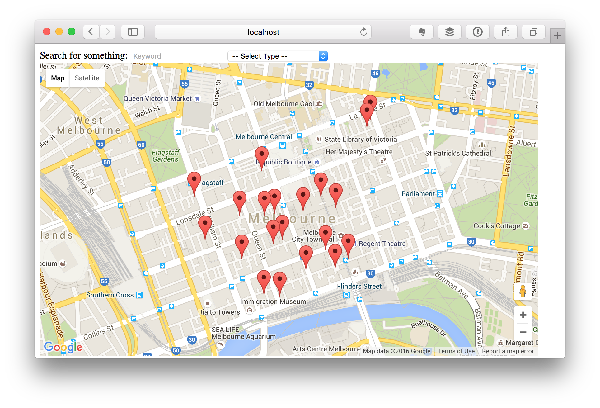
Wait for the app to reload again, and we should see our new component rendered above the map:
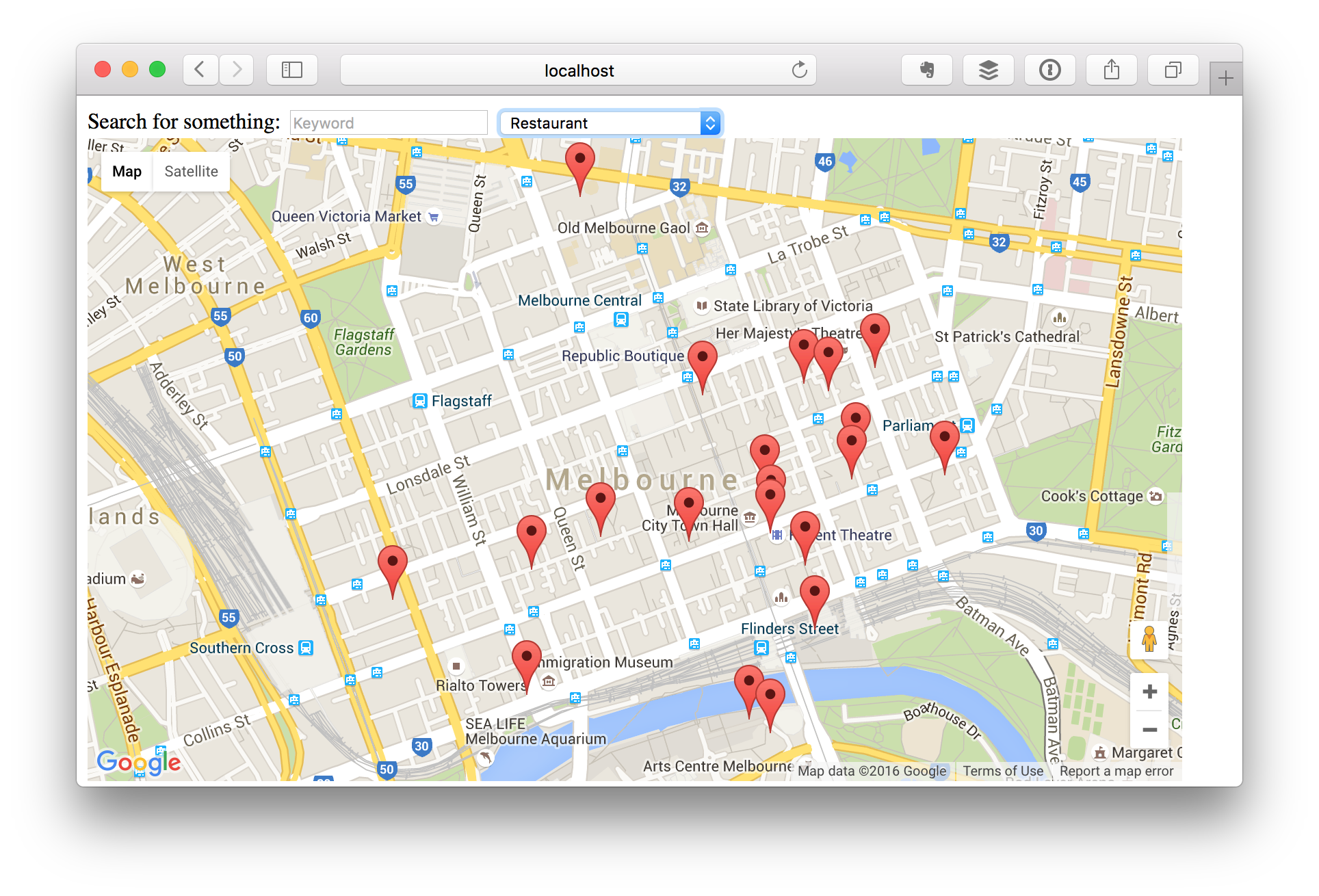
Now, make a change in the place search component, and you should see the markers update:
Violà – that concludes our little excursion.
Adding a Header Component
Back to our regularly scheduled programming – we're going to build a nice header component, which will hold the application title and the PlaceSearch component we've just built.
Let's start with the template, imports/ui/components/Header/Header.html:
<template name="Header">
  <div class="pure-menu pure-menu-horizontal">
    {{#if title}}
      <a class="pure-menu-heading app-title" href="/">{{title}}</a>
    {{/if}}

    <div class="pure-menu-heading align-right">
      {{> PlaceSearch onQueryChanged=queryChanged }}
    </div>
  </div>
</template>
Next, we have the JavaScript code, imports/ui/components/Header/Header.js:
import { Template } from 'meteor/templating';

import './Header.html';

Template.Header.helpers({
  title() {
    return Template.currentData().title ||
           Meteor.settings.public.appTitle;
  }
});
Everything here is pretty straightforward, the only notable thing is the title() helper, which does something interesting: it accesses the template's data context to see if a property called title has been passed to the template. If so, it will return that. Otherwise, it will look in the application's settings (passed in via the --settings command line option) for a public property named appTitle and return that.
Finally, here are the tests for this component (in imports/ui/components/Header/client/Header.tests.js):
/* eslint-env mocha */
/* eslint-disable func-names, prefer-arrow-callback */

import { chai } from 'meteor/practicalmeteor:chai';
import { Template } from 'meteor/templating';
import { $ } from 'meteor/jquery';

import { ensureElement } from '../../../test-helpers.js';
import '../Header.js';

describe('Header component', function() {
  const data = { title: 'Welp' };

  it('has a title', function() {
    ensureElement('Header', data, '.app-title:contains(Welp)');
  });

  it('renders a horizontal menu', function() {
    ensureElement('Header', data, '.pure-menu.pure-menu-horizontal');
  });
});
Nothing new here either, we're simply checking that the component renders a title and a horizontal menu component (which contains the PlaceSearch component).
If everything went well, your app should look something like this:
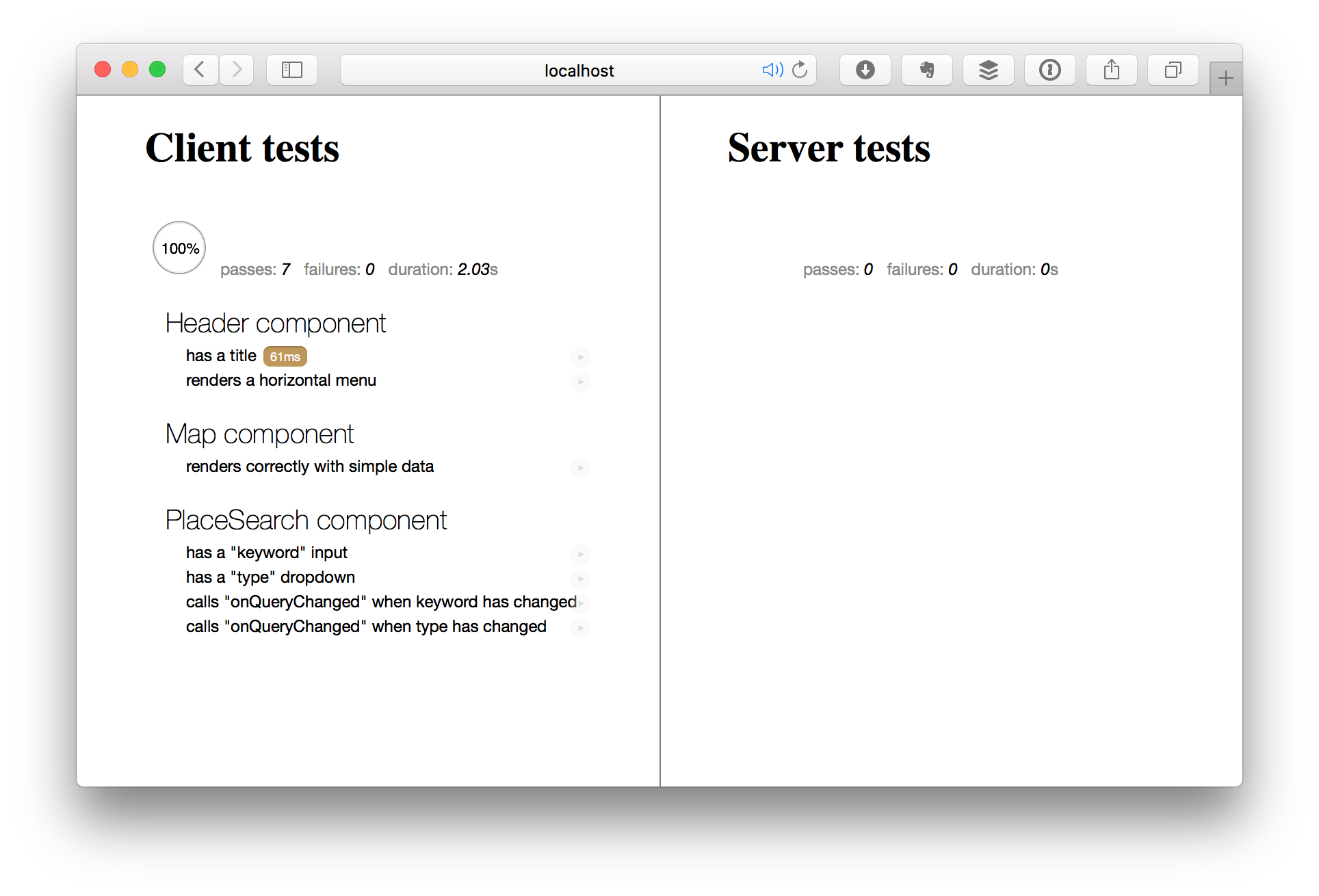
Also, you should have two more passing tests:
Take a little break for a job well done, and then we'll continue.
Creating a Menu Component
Next, we'll add a sidebar menu to our app. We'll eventually use it to show a list of places that match the current search, but for now, it will simply display static content.
Here's the template:
<template name="Menu">
  <div class="pure-menu">
    {{#if title}}
      <a class="pure-menu-heading" href="#">{{title}}</a>
    {{/if}}

    <ul class="pure-menu-list">
      {{#each item in menuItems}}
        <li class="pure-menu-item {{isActive item}}">
          <a href="{{item.link}}" class="pure-menu-link">{{item.title}}</a>
        </li>
      {{/each}}
    </ul>
  </div>
</template>
And here's the code:
import { Template } from 'meteor/templating';

import './Menu.html';

Template.Menu.helpers({
  menuItems() {
    return Template.currentData().menuItems || [
      { title: 'Home',     link: '#' },
      { title: 'About',    link: '#' },
      { title: 'Services', link: '#' , active: true },
      { title: 'Contact',  link: '#' }
    ];
  },
  isActive(item) {
    return item.active ? 'menu-item-divided pure-menu-selected' : '';
  }
});
Of course, we're going to write some tests for this as well:
/* eslint-env mocha */
/* eslint-disable func-names, prefer-arrow-callback */

import { chai } from 'meteor/practicalmeteor:chai';
import { Template } from 'meteor/templating';
import { $ } from 'meteor/jquery';

import { ensureElement } from '../../../test-helpers.js';
import '../Menu.js';

describe('Menu component', function() {
  const title = 'Welp';
  const menuItems = [
    { title: 'Home',     link: '#' },
    { title: 'About',    link: '#' },
    { title: 'Services', link: '#' , active: true },
    { title: 'Contact',  link: '#' }
  ];

  it('renders a menu', function() {
    const data = { title, menuItems };
    ensureElement('Menu', data, '.pure-menu');
  });

  it('has a title', function() {
    const data = { title, menuItems };
    ensureElement('Menu', data, '.pure-menu-heading:contains(Welp)');
  });

  it('has a list of menu items', function() {
    const data = { title, menuItems };
    ensureElement('Menu', data, '.pure-menu-list');
    menuItems.forEach(item => {
      ensureElement('Menu', data, `.pure-menu-link:contains(${item.title})`);
    });
  });
});
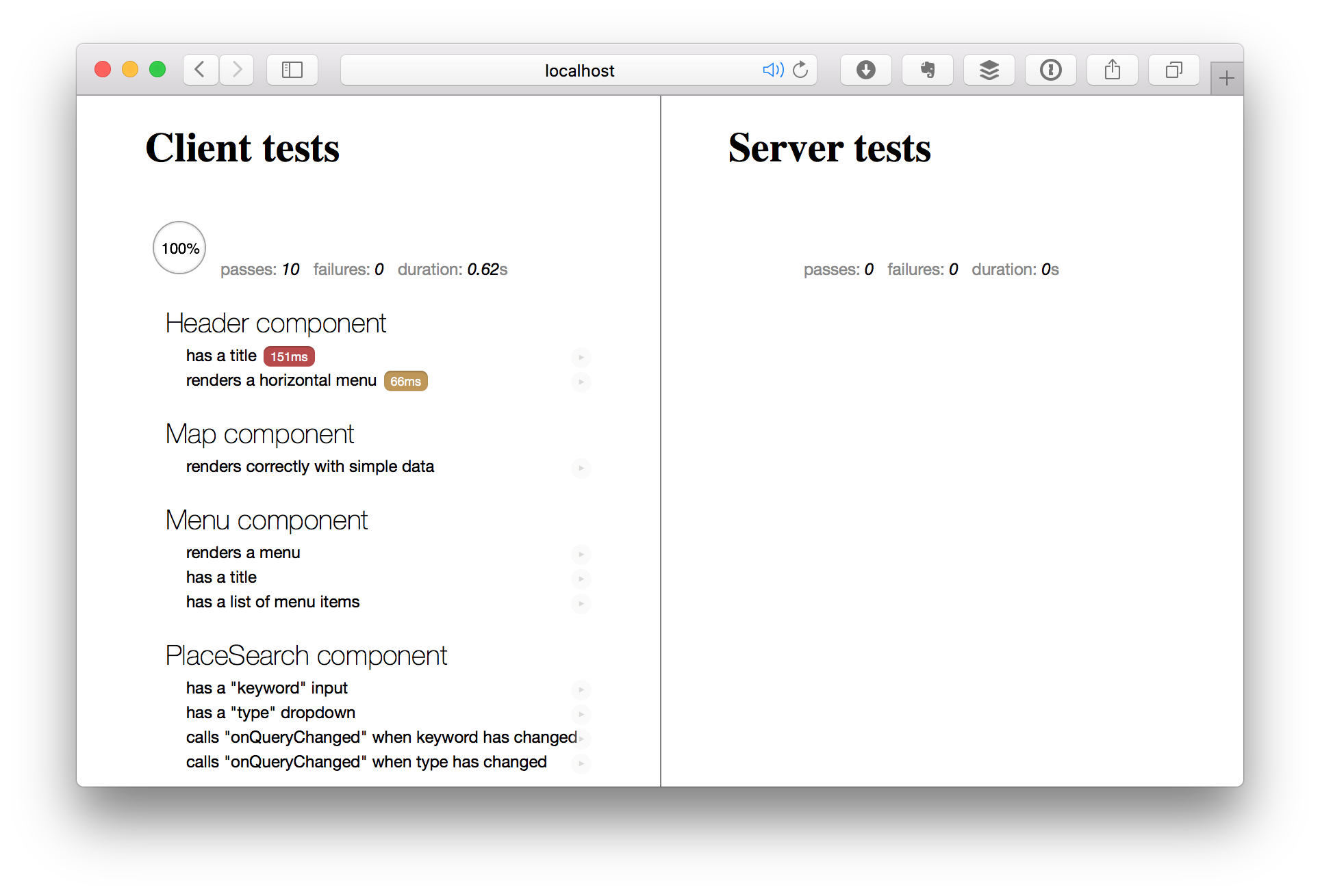
Let's make sure the tests are passing:
Now, for a visual test, we'll add the new component to show in our app as well. First, we'll need to add the component to our list of imports in imports/ui/startup/client/index.js:
// components
import '../../ui/components/Header/Header.js';
import '../../ui/components/Map/Map.js';
import '../../ui/components/Menu/Menu.js';
import '../../ui/components/PlaceSearch/PlaceSearch.js';
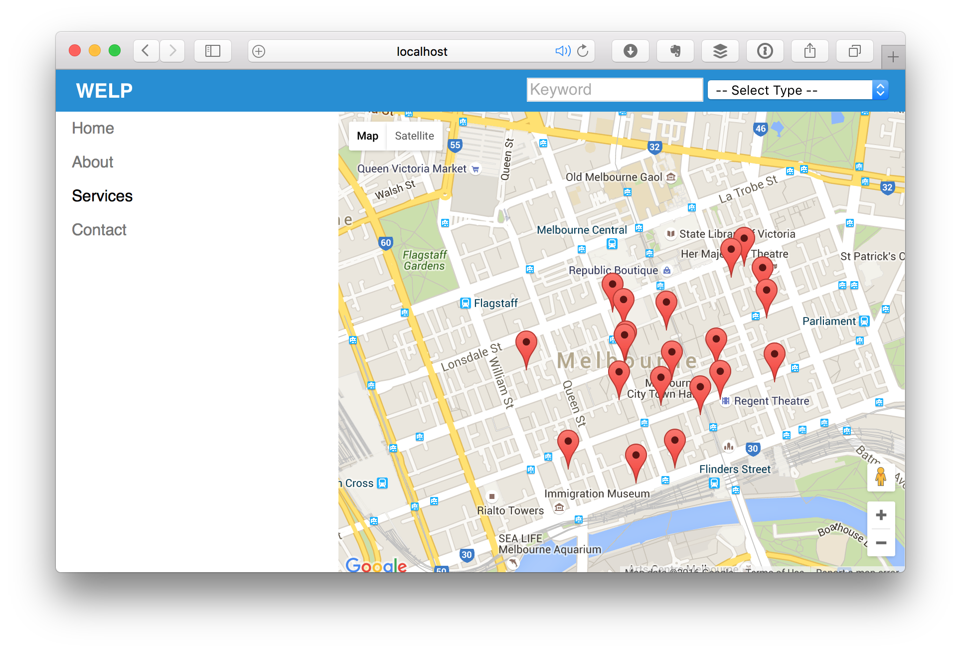
And then, we'll update our imports/ui/pages/home.html template to show the Map and Menu components side-by-side (using Pure.css's awesome grid classes):
<template name="home">
  <div class="pure-g">
    <div class="pure-u-1-3">
      {{> Menu}}
    </div>
    <div class="pure-u-2-3">
      {{> Map center=mapCenter zoom=defaultZoom query=query}}
    </div>
  </div>
</template>
Finally, let's update our CSS so that both the menu and the map will take up all the remaining available vertical space:
.app-menu {
  height: calc(100vh - 42px);
  overflow-x: hidden;
  overflow-y: scroll;
}

.map-container {
  height: calc(100vh - 42px);
  max-width: 100%;
}
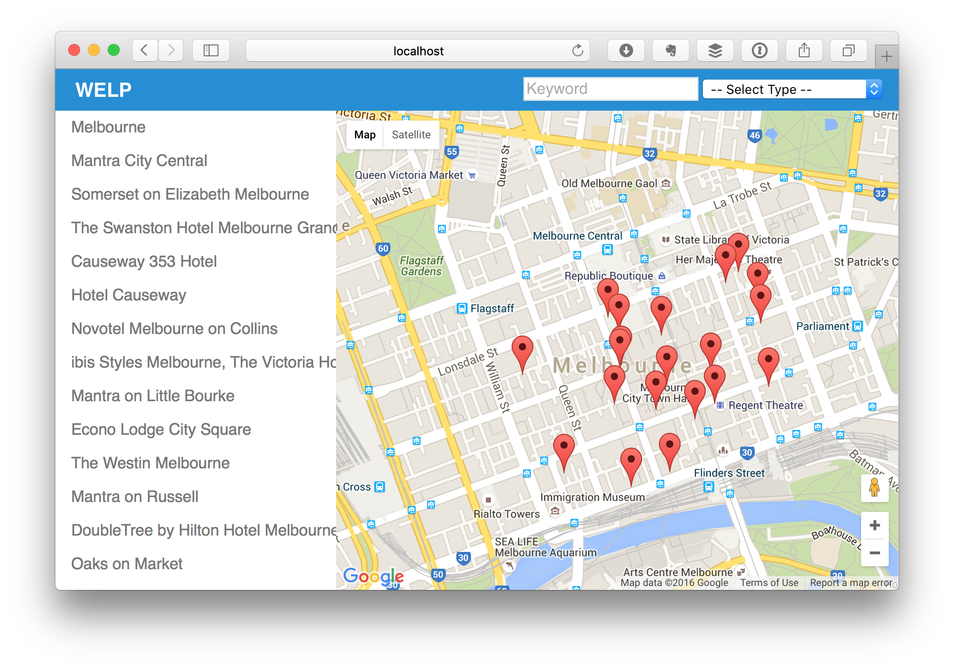
In your browser, this should look something like this:
Make yourself another coffee, we'll be right back to wire everything up.
Wiring Up Menu and Place Search with Routes
Okay, the next step is going to require us to take a step back and look at the app as a whole rather than the sum of its pieces. Our goal is to have the menu on the left display a list of place names (corresponding to the markers shown on the map), that is updated whenever we perform a new search (such as selecting a different category from the place search form). On top of that, we'll want to be able to click on a result in the menu and show more details for a place – such as its address and perhaps some photos.
Rather than having the PlaceSearch component talk directly to the map, we'll use routes to achieve this objective. This gives us the advantage of being able to navigate through our search history using the browser's back and forward buttons, and sharing URLs with friends.
Let's see how this might look like. Currently, we have two pieces of search information: category and keyword. A keyword search can be performed whether we have a category selected or not. Here's how our routes might look like:
| Route | Description |
|---|---|
/?keyword=test |
Keyword search w/o category |
/category/:name/ |
Browse category w/o keyword |
/category/:name/?keyword=test |
Category and keyword search combined |
So, first we'll need to create a new route, category.show as follows:
FlowRouter.route('/category/:category', {
  name: 'category.show',
  action() {
    BlazeLayout.render("mainLayout", { content: "home", header: "Header" });
  }
});
You'll notice the route looks exactly the same as our existing one, save for the name and path. This is because parameters in the path have to be defined explicitly. Also, note that query parameters don't have to be defined explicitly.
Next, we'll update the imports/ui/pages/home.html template to pass a menuItems parameter to our Menu component. We'll also pass an onPlacesChanged callback to our Map component.
<template name="home">
  <div class="pure-g">
    <div class="pure-u-1-3">
      {{> Menu menuItems=menuItems}}
    </div>
    <div class="pure-u-2-3">
      {{> Map center=mapCenter zoom=defaultZoom query=query onPlacesChanged=placesChanged}}
    </div>
  </div>
</template>
Next, we'll create those two new helpers we just used in the template (in imports/ui/pages/home.js. But first, we'll need a new ReactiveVar to store the current places. We can also get rid of the old query variable, because we're no longer going to use it. Don't forget to import FlowRouter so we can use it:
import { FlowRouter } from 'meteor/kadira:flow-router';

Template.home.onCreated(function() {
  this.places = new ReactiveVar([]);
});
Now, we can change the query helper to take its parameters from the current route, and add the other two helpers we need as follows:
Template.home.helpers({
  // ... removed for brevity ...

  query() {
    return {
      type:    FlowRouter.getParam('category'),
      keyword: FlowRouter.getParam('keyword')
    }
  },

  menuItems() {
    const places = Template.instance().places.get();
    return places.map((place) => ({ title: place.name }));
  },

  placesChanged() {
    const places = Template.instance().places;
    return (results) => { places.set(results); }
  }
});
The placesChanged() helper returns a function that takes some results and stores it in an instance variable called places. The menuItems() helper takes those results and transforms them into a format that the Menu component can understand.
Finally, we'll have to update the Header component so that when the query changes, it will update the current route appropriately:
import { Template } from 'meteor/templating';
import { FlowRouter } from 'meteor/kadira:flow-router';

import './Header.html';

Template.Header.onCreated(function() {
  this.setQuery = (query) =>
    FlowRouter.go(query.type ? 'category.show' : 'home',
      { category: query.type },
      { keyword: query.keyword });
});

Template.Header.helpers({
  // ... title() helper omitted ...

  queryChanged() {
    const instance = Template.instance();
    return (query) => { instance.setQuery(query); }
  }
});
As you can see, the queryChanged() helper returns a function that will be called with the current query, and calls another function that uses FlowRouter.go() to send the browser to the appropriate route (category.show if there is a category, and home otherwise), passing along the category parameter in the path parameters, and the keyword parameter in the query parameters.
Finally, we just need to remove the menuItems() helper from imports/ui/components/Menu/Menu.js so that we can pass in our menu items from the home template instead. If you did everything right, your app should look something like this:
Writing a Rating Component
We're getting pretty close to the finish line. Can you smell victory yet? Now, it's finally time to put Font Awesome to good use. We're going to build a Rating component, so we can display ratings in the menu.
This one is fairly simple, and since we've been getting better at testing, let's try to write the tests first:
import { ensureElement } from '../../../test-helpers.js';
import '../Rating.js';

describe('Rating component', function() {
  const tests = {
    3.2:       { full: 3, half: 0, empty: 2 },
    3.5:       { full: 3, half: 1, empty: 1 },
    3.5:       { full: 3, half: 1, empty: 1 },
    4.4:       { full: 4, half: 1, empty: 0 },
    undefined: { full: 0, half: 0, empty: 5 }
  };

  Object.keys(tests).forEach(function(rating) {
    describe(`with ${rating} rating`, function() {
      const { full, half, empty } = tests[rating];
      const data = { rating };

      it(`shows ${full} full star(s)`, function() {
        ensureElement('Rating', data, 'i.fa.fa-star', full);
      });

      it(`shows ${half} half star(s)`, function() {
        ensureElement('Rating', data, 'i.fa.fa-star-half-o', half);
      });

      it(`shows ${empty} empty star(s)`, function() {
        ensureElement('Rating', data, 'i.fa.fa-star-o', empty);
      });
    });
  });
});
Here, we're using a technique to dynamically generate tests based on a set of predefined test data, since otherwise, all of our tests would be fairly repetitive. The test process itself should be fairly self-explanatory: for each of the given ratings (including undefined, which simulates the absence of a rating), we expect the component to show a certain number of full, half, and empty stars.
We're also making use of another new feature in ES6: template literals. This lets us interpolate variables into string literals without awkwardly chaining them together using the + operator.
Now that we the tests out of the way, it's time to write our component. First, here's the template, imports/ui/components/Rating/Rating.html:
<template name="Rating">
  {{#each stars}}
    <i class="fa fa-star"></i>
  {{/each}}
  {{#each halfStars}}
    <i class="fa fa-star-half-o"></i>
  {{/each}}
  {{#each remainder}}
    <i class="fa fa-star-o"></i>
  {{/each}}
</template>
Tis is pretty simple: for each of stars, halfStars, and remainder, we simply generate the respective star symbol using Font Awesome. Finally, here's the component's JavaScript code, imports/ui/components/Rating/Rating.js:
import { Template } from 'meteor/templating';
import './Rating.html';

Template.Rating.onCreated(function() {
  this.rating = () => Math.round( Template.currentData().rating*2 ) / 2 || 0;
});

Template.Rating.helpers({
  stars() {
    let rating = Template.instance().rating();
    return new Array( Math.floor(rating) ).fill(1);
  },
  halfStars() {
    const rating = Template.instance().rating();
    return new Array( Math.ceil(rating) - Math.floor(rating) ).fill(1);
  },
  remainder() {
    const rating = Template.instance().rating();
    return new Array( 5 - Math.ceil(rating) ).fill(1);
  }
});
Two things to notice here: first, we're defining another template instance function named rating that will return the rating, rounded to the nearest 0.5. If no rating was provided, it will return 0.
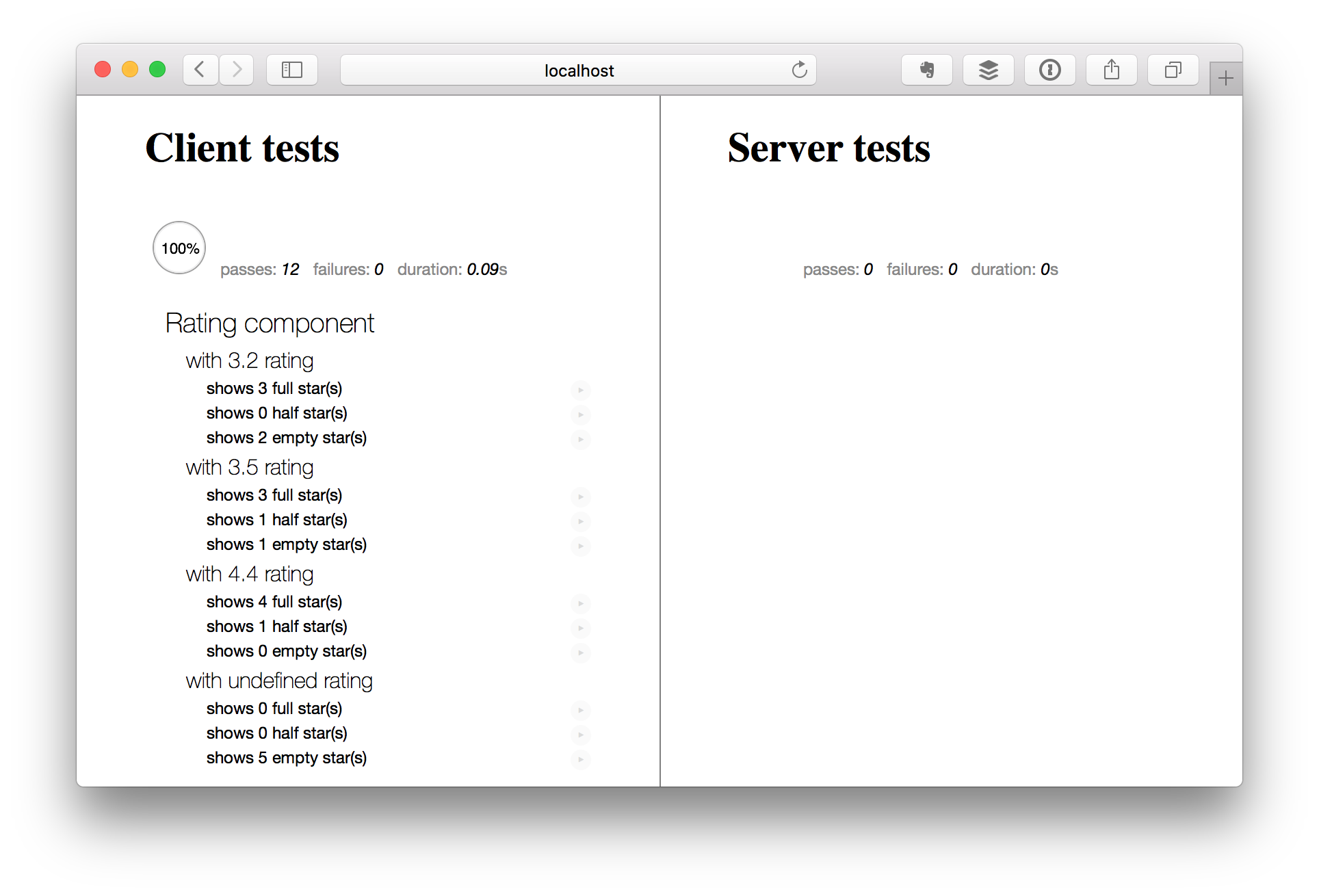
In the helpers, we're making use of a neat trick to get our template to work correctly. Since the {{#each}} construct expects an array, that's what we will return from the helpers. What's inside the array actually doesn't matter — we only make use of the length. Therefore, we simply generate an array with the required length and fill it with ones (as leaving them empty will not work). Boom! All tests are passing!
Note that in the above screenshot, I've filtered the tests to only show the Rating component. You can do this by simply clicking on the headline. All the other tests are still there, they are just hidden. We're just getting to the point where we have so many tests they won't fit on a single page — certainly a good problem to have!
Integrating the Rating Component
Time to make use of our fancy new component! First, let's add to our imports/ui/startup/client/index.js file to make it available to our app:
// components
// ... omitted for brevity ...
import '../../ui/components/Rating/Rating.js';
Next, we'll want to pass those ratings along to the Menu component, so we update our menuItems() helper in imports/ui/pages/home.js to include the rating:
Template.home.helpers({
  // ... omitted for brevity ...

  menuItems() {
    const places = Template.instance().places.get();
    return places.map((place) => ({
      title: place.name,
      rating: place.rating,
      link: '#'
    }));
  }
});
Finally, we'll need to update the Menu component's template to include the Rating component with every link:
      {{#each item in menuItems}}
        <li class="pure-menu-item {{isActive item}}">
          <a href="{{item.link}}" class="pure-menu-link menu-item">
            <span class="rating align-right">
              {{> Rating rating=item.rating}}
            </span>
            {{item.title}}
          </a>
        </li>
      {{/each}}
Finally, we'll make some quick tweaks to our stylesheet (client/main.css):
.app-menu .menu-item {
  white-space: normal;
}

.rating {
  font-size: 12px;
  line-height: 20px;
}
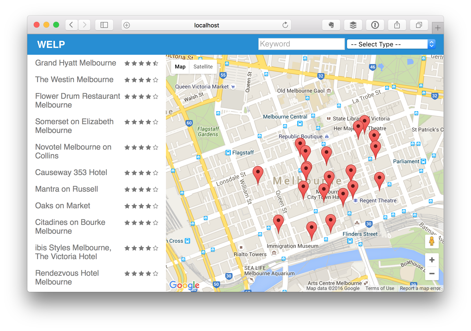
And voilà, we now have ratings!
Creating a PlaceDetail Component
Alright, we're almost there. The final piece of this app is a component to show details about a place when a user clicks on in in the menu.
Because this component is mostly visual, we're going to start it off very simple, then we'll integrate it into the app, and then we'll make it more visually interesting.
Let's start with template, imports/ui/components/PlaceDetail/PlaceDetail.html:
<template name="PlaceDetail">
  <h2>{{place.name}}</h2>
</template>
Since there are no helpers (for now), our script is equally as simple:
import { Template } from 'meteor/templating';
import './PlaceDetail.html';

Template.PlaceDetail.helpers({});
Finally, no component should be without tests, so here they are:
import { ensureElement } from '../../../test-helpers.js';
import '../PlaceDetail.js';

describe('PlaceDetail component', function() {
  const place = {
    name: "Moe's Tavern"
  };

  it('shows a header with the place name', function() {
    ensureElement('PlaceDetail', { place }, "h2:contains(Moe's Tavern)");
  });
});
It's as simple as that. Now, let's move forward and integrate it into our app. First, we need to import it (in imports/ui/startup/client/index.js):
// components
// ... removed for brevity ...
import '../../ui/components/PlaceDetail/PlaceDetail.js';
Next, we'll create a new route, so that we can make use of the fact that menu items are simply links:
FlowRouter.route('/place/:placeId', {
  name: 'place.show',
  action() {
    BlazeLayout.render("mainLayout", { content: "home", header: "Header" });
  }
});
Now, we'll replace the following line in imports/ui/pages/home.html:
{{> Map center=mapCenter zoom=defaultZoom query=query onPlacesChanged=placesChanged}}
with this:
{{#if placeSelected}}
  {{> PlaceDetail place=placeSelected}}
{{else}}
  {{> Map center=mapCenter zoom=defaultZoom query=query onPlacesChanged=placesChanged}}
{{/if}}
This makes use of a helper called placeSelected(), which looks like this:
We also update the link property in the menuItems() helper:
Template.home.helpers({
  // ... omitted for brevity ...
  menuItems() {
    const places = Template.instance().places.get();
    return places.map((place) => ({
      title: place.name,
      rating: place.rating,
      link: Template.instance().placePath(place)
    })).sort((a, b) => (b.rating||0) - (a.rating||0));
  },

  placeSelected() {
    const placeId = Template.instance().placeId();
    const places = Template.instance().places.get();

    return places.find((place) => place.id == placeId);
  }
});
These helpers make use of two new template instance methods, placeId(), and placePath():
Template.home.onCreated(function() {
  this.places = new ReactiveVar([]);
  this.placeId = () => FlowRouter.getParam('placeId');
  this.placePath = (place) => FlowRouter.path('place.show', { placeId: place.id });
})
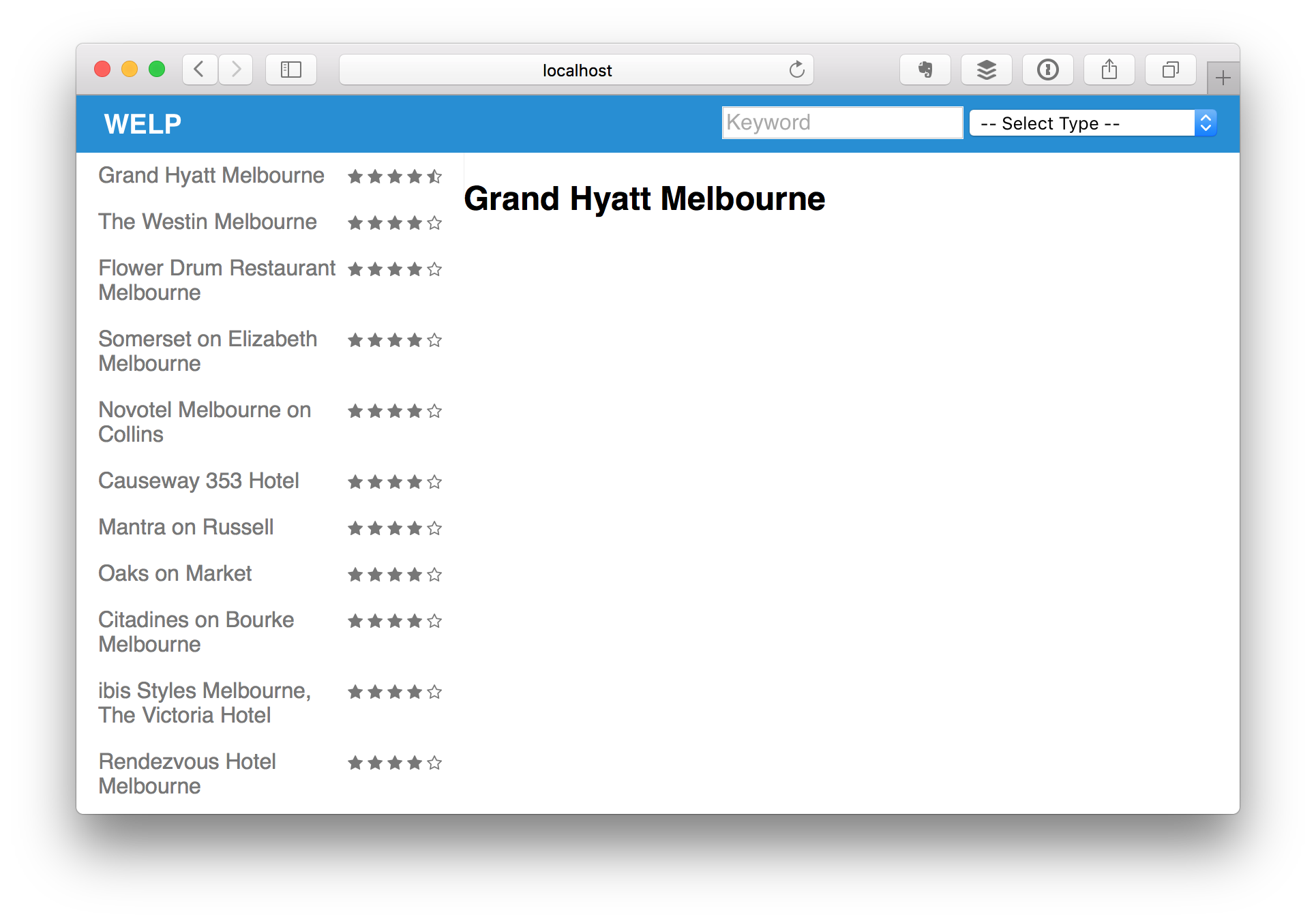
Let's try it out:
Well, it's not pretty, but it works. Next, we'll make it look nice.
Styling the PlaceDetail Component
Let's add some more information to the component now:
<template name="PlaceDetail">
  <div class="place-detail">
    <h2>
      {{place.name}}
      <span class="price-level">
        {{#each (priceLevel place)}}
          <i class="fa fa-dollar"></i>
        {{/each}}
      </span>
    </h2>

    <p class="address">{{place.vicinity}}</p>

    <h4>Photos</h4>
    <div class="pure-g">
      {{#each photo in place.photos}}
        <div class="pure-u-1-4">
          <img class="pure-img" src={{photoUrl photo}}>
        </div>
      {{/each}}
    </div>
  </div>
</template>
And here are the corresponding helpers:
Template.PlaceDetail.helpers({
  photoUrl(photo) {
    return 'getUrl' in photo ? photo.getUrl({
      maxWidth: 200, maxHeight: 200
    }) : null;
  },

  priceLevel(place) {
    const priceLevel = place.price_level;
    return new Array(priceLevel || 0).fill(1);
  }
});
Of course, let's not forget the tests:
describe('PlaceDetail component', function() {
  const place = {
    name: "Moe's Tavern",
    price_level: 2,
    photos: [{
      getUrl() { return 'moes-tavern.jpg' }
    }],
    vicinity: "Springfield U.S.A."
  };

  it('shows a header with the place name', function() {
    ensureElement('PlaceDetail', { place }, "h2:contains(Moe's Tavern)");
  });

  it('shows the address of the place', function() {
    ensureElement('PlaceDetail', { place }, ".address:contains(Springfield U.S.A.)");
  });

  it('shows the price level if available', function() {
    ensureElement('PlaceDetail', { place }, "span.price-level .fa-dollar", 2);
  });

  it('shows photos of the place', function() {
    ensureElement('PlaceDetail', { place }, "h4:contains(Photos)");
    ensureElement('PlaceDetail', { place }, "img[src='moes-tavern.jpg']");
  });
});
We'll also add a bit of CSS to our client/main.css to make it look nice:
.place-detail {
  padding: 0 15px;
}

.price-level {
  font-size: 14px;
  color: #1f8dd6;
}
Finally, we'd like the active link to be highlighted in the menu on the left. We'll need to install the zimme:active-route package for this, so let's install it:
meteor install zimme:active-route
Then, we'll update the isActive() helper in imports/ui/components/Menu/Menu.js as follows:
import { ActiveRoute } from 'meteor/zimme:active-route';

Template.Menu.helpers({
  isActive(item) {
    return ActiveRoute.path(item.link) ? 'menu-item-divided pure-menu-selected' : '';
  }
});
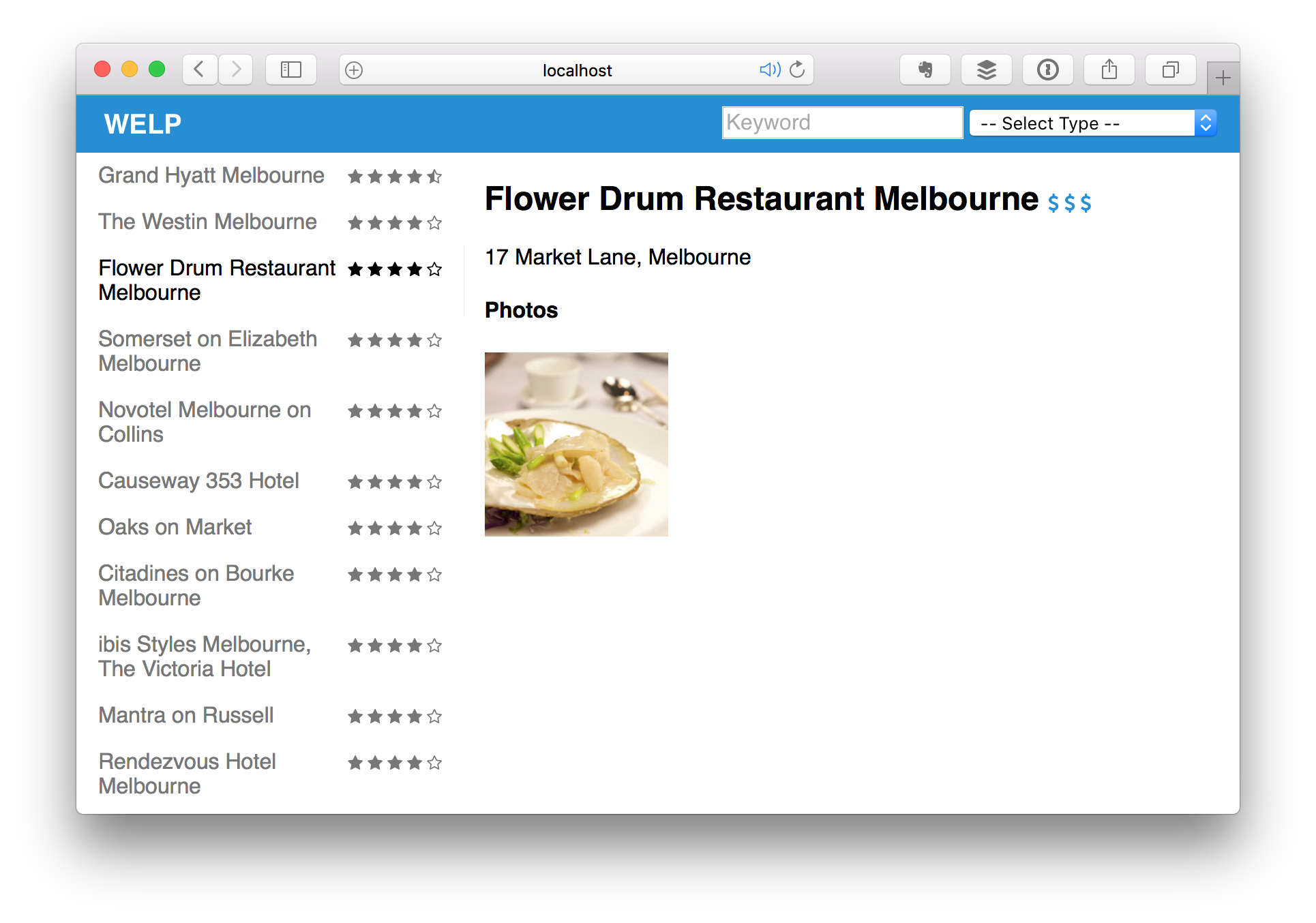
Finally, here's the end result in the browser:
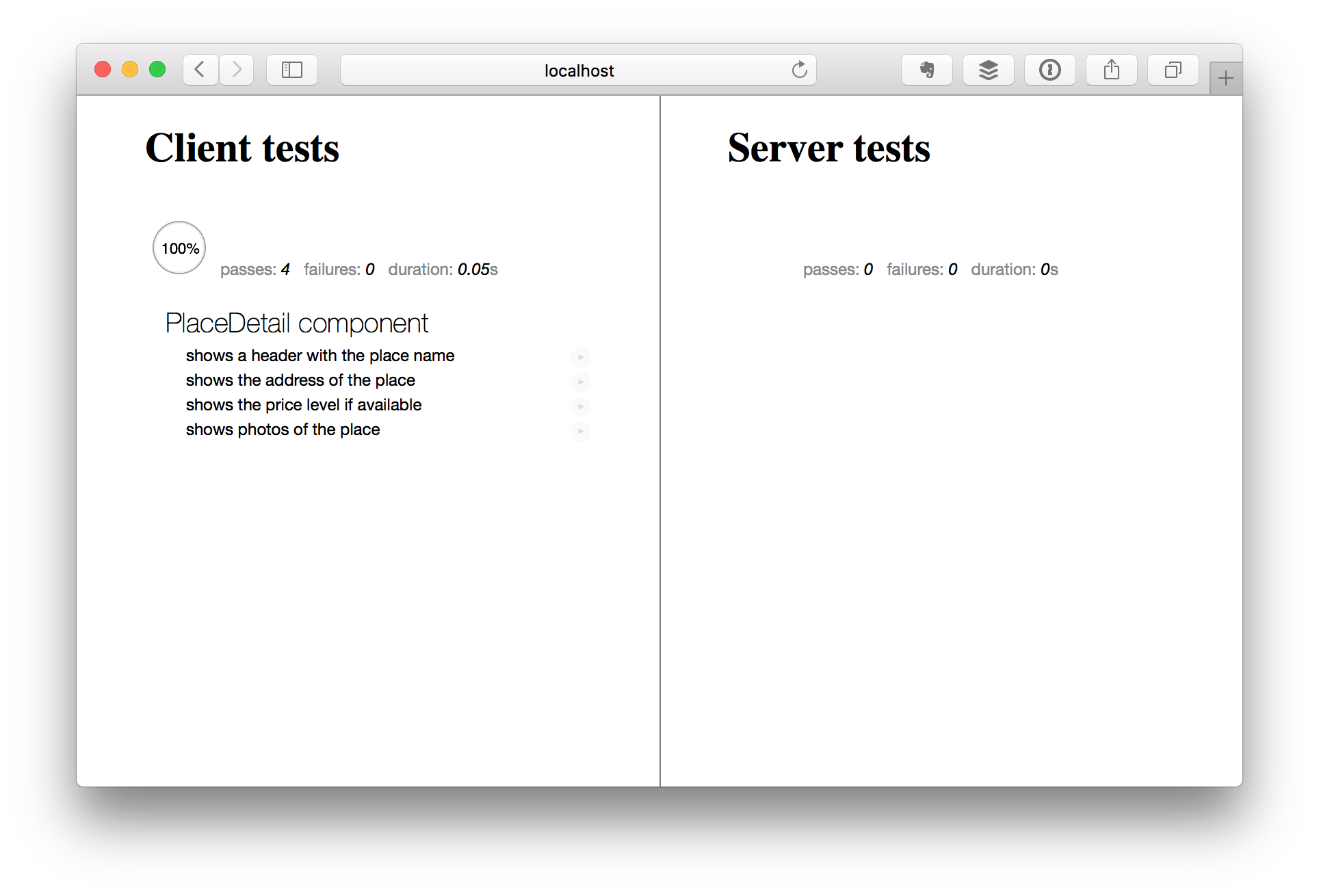
And of course, all our tests are passing:
Summary and Outlook
This concludes the tutorial with its initially planned scope. My goal was to get approximately feature parity with the React Tutorial on which this tutorial is based.
While writing the app, however, I did notice a variety of things that are missing or would be nice to have to make this app more useful and interesting. Depending on the feedback I get, I would like to implement one or more of the following:
- A "hamburger" menu button to show/hide the menu
- A location input to change the map location without having to drag it
- The option to locate the user via the browser's geolocation feature
- Automatically updating search when the map is dragged or zoomed
- When hovering over a menu item, the corresponding map marker should be animated
- Popup info boxes for map markers
- A "Back to Map" link on the PlaceDetail component
- Support for mobile devices
- Full app integration tests
- Anything else? Create a new issue.
If you found this useful, I'd love to hear your words of appreciation, feedback, (re)-tweets, emails, shoutouts, or whatever else you got.
I'm @Panda_Whisperer on Twitter.

