Shopify / Polaris Tokens
Programming Languages
Labels
Projects that are alternatives of or similar to Polaris Tokens
Polaris design tokens

Colors, spacing, animation, and typography for all platforms
JavaScript · JSON · CSS · SCSS · Android · Sketch · macOS · iOS · Adobe Swatch
Design tokens for Polaris, Shopify’s design system.
Design tokens originated at Salesforce, and the best way to describe them is to simply quote their documentation:
Design tokens are the visual design atoms of the design system — specifically, they are named entities that store visual design attributes. We use them in place of hard-coded values (such as hex values for color or pixel values for spacing) in order to maintain a scalable and consistent visual system for UI development – Salesforce UX
Installation
Polaris design tokens are available as both a npm package (@shopify/polaris-tokens) on npm, and as a Ruby gem (polaris_tokens) on RubyGems.
The recommended way to use and install design tokens may vary depending on your project; the most common are documented below.
Using npm:
npm install @shopify/polaris-tokens --save
Using yarn:
yarn add @shopify/polaris-tokens
Using Bundler:
bundle add polaris_tokens
Usage
Find all available tokens in the design tokens documentation.
JavaScript
In JavaScript, design token names are formatted in lower camelCase.
const tokens = require('@shopify/polaris-tokens');
console.log(tokens.colorBlueLighter); // rgb(235, 245, 250)
In JSON, design token names are formatted in kebab-case.
const tokens = require('@shopify/polaris-tokens/dist/index.json');
console.log(tokens['color-blue-lighter']); // rgb(235, 245, 250)
Note that, if your project supports ECMAScript Modules, you can also use the import syntax.
import * as tokens from '@shopify/polaris-tokens';
// or
import {colorBlueLighter} from '@shopify/polaris-tokens';
Sass
Sass variables and map keys are formatted in kebab-case.
// Using variables
@import '[email protected]/polaris-tokens/dist/index';

a {
  color: $color-blue-text;
}

// Using the map of all tokens
@import '[email protected]/polaris-tokens/dist/index.map';

a {
  color: map-get($polaris-index-map, 'color-blue-text');
}

// Using the map for a specific type of tokens (here: spacing)
@import '[email protected]/polaris-tokens/dist/spacing.spacing-map';

a {
  color: map-get($polaris-spacing-map, 'loose');
}
Sass, with CSS Custom Properties
Custom properties are formatted in kebab-case.
// Omit .css at the end of the file
@import '[email protected]/polaris-tokens/dist/colors.custom-properties';

a {
  color: var(--color-blue-text);
}
Rails
Token files are added to the assets pipeline. In JSON, design token names are formatted in kebab-case.
require 'json'
polaris_token_file = Rails.application.assets_manifest.find_sources('colors.json').first
polaris_colors = JSON.parse(polaris_token_file)
polaris_colors['color-blue-lighter'] # "rgb(235, 245, 250)"
CSS Filters
Color tokens include a CSS Filter (filter) value as part of their metadata. When this filter is applied to an element, it will change that element’s color to approximate the target token color.
<div>
  No background, no filter
</div>

<div style="background-color: #fff">
  White background, no filter
</div>

<div style="filter: brightness(0) saturate(100%) invert(28%) sepia(67%) saturate(3622%) hue-rotate(353deg) brightness(89%) contrast(95%)">
  No background, red filter
</div>

<div style="background-color: #fff; filter: brightness(0) saturate(100%) invert(28%) sepia(67%) saturate(3622%) hue-rotate(353deg) brightness(89%) contrast(95%)">
  White background, red filter
</div>
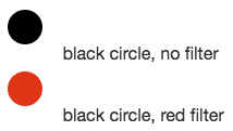
In general, these filters shouldn’t be used unless absolutely necessary. The main use case for the filters is to apply a color to an unsafe (as in: user-provided) SVG. Since SVGs can contain arbitrary code, we should be careful about how they are displayed. The safest option is to render SVGs as an img (for example <img src="circle.svg" alt="" />); when SVGs are rendered like this, browsers will block code execution. Unfortunately, it also means that the SVGs cannot be styled with external CSS (applying fill: red to the img won’t do anything.)
CSS filters allow us the safety of rendering SVGs inside img elements, but still give us control over their appearance.
<div>
  <img src="data:image/svg+xml;utf8,<svg xmlns='http://www.w3.org/2000/svg' width='50' height='50'><circle cx='20' cy='20' r='16' /></svg>" alt="" /> black circle, no filter
</div>
<div>
  <img src="data:image/svg+xml;utf8,<svg xmlns='http://www.w3.org/2000/svg' width='50' height='50'><circle cx='20' cy='20' r='16' /></svg>" style="filter: brightness(0) saturate(100%) invert(28%) sepia(67%) saturate(3622%) hue-rotate(353deg) brightness(89%) contrast(95%)" alt="" /> black circle, red filter
</div>
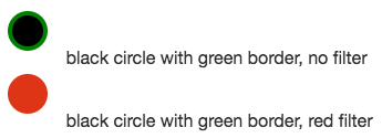
Note that all filled areas of an SVG will change color with this approach, including borders/strokes. For that reason it should only be used with monochromatic SVGs.
<div>
  <img src="data:image/svg+xml;utf8,<svg xmlns='http://www.w3.org/2000/svg' width='50' height='50'><circle cx='20' cy='20' r='16' stroke='green' stroke-width='4' /></svg>" alt="" /> black circle with green border, no filter
</div>
<div>
  <img src="data:image/svg+xml;utf8,<svg xmlns='http://www.w3.org/2000/svg' width='50' height='50'><circle cx='20' cy='20' r='16' stroke='green' stroke-width='4' /></svg>" style="filter: brightness(0) saturate(100%) invert(28%) sepia(67%) saturate(3622%) hue-rotate(353deg) brightness(89%) contrast(95%)" alt="" /> black circle with green border, red filter
</div>
If you need to generate new filter values, you can do so with this CodePen.
Contributing
The purpose of this repository is to see the core design elements of the Polaris design system evolve and improve over time with the needs of developers, designers and partners in mind.
We gratefully accept impromptu contributions to the documentation, typo and bug fixes, and expect design token requests and changes to be discussed before a pull request.
Code of conduct
We have a code of conduct, please follow it in all your interactions with the project.
Contributing guide
Read the contributing guide to learn how to propose changes and understand our development process.
License
The polaris-tokens project is available under the MIT license.
Parts of the code in this repository are directly inspired or borrowed from the Theo project, property of Salesforce.com, Inc., licensed under BSD 3-Clause.


