asabaylus / React Command Palette
Programming Languages
Projects that are alternatives of or similar to React Command Palette
React Command Palette
WAI-ARIA compliant React command palette like the one in Atom and Sublime


Live Playground
For examples of the command palette in action, go to the
OR
To run that demo on your own computer:
- Clone this repository
npm installnpm run storybook- Visit http://localhost:6006/
Usage
Install it in your project
$ npm i --save react-command-palette
Import into your react app and pass commands
import CommandPalette from 'react-command-palette';

const commands = [{
    name: "Foo",
    command() {}
  },{
    name: "Bar",
    command() {}
  }
  ...
 ];

 ReactDOM.render(
  <CommandPalette commands={commands} />,
  document.getElementById('app'))
Props
-
opena boolean, when set to true it forces the command palette to be displayed. Defaults to "false". -
alwaysRenderCommandsa boolean, Set it to true if you'd like to render suggestions even when the input is not focused. -
displayone of "modal" or "inline", when set to "modal" the command palette is rendered centered inside a modal. When set to "inline", it is render inline with other page content. Defaults to "modal". -
headera string or a React.ComponentType which provides a helpful description for the usage of the command palette. The component is displayed at the top of the command palette. The header is not displayed by default. see: src/examples/sampleInstruction.js for reference. -
closeOnSelecta boolean, when set to true the command palette will close immediately when the user makes a selection. Defaults to "false". -
resetInputOnClosea boolean which indicates whether to reset the user's query todefaultInputValuewhen the command palette closes. Defaults to "false". -
placeholdera string that contains a short text description which is displayed inside the the input field until the user provides input. Defaults to "Type a command". -
hotKeysa string or array of strings that contain a keyboard shortcut for opening/closing the palette. Defaults to "command+shift+p". Uses mousetrap key combos -
defaultInputValuea string that determines the value of the text in the input field. By default the defaultInputValue is an empty string. -
getSuggestionValuea function, when suggestion is clicked, react-autosuggest needs to populate the input element based on the clicked suggestion. Teach react-autosuggest how to calculate the input value for every given suggestion. By default the highlighed suggestion will be displayed -
highlightFirstSuggestiona boolean, will automatically highlight the first suggestion. Defaults to "true". */ -
optionsoptions controls how fuzzy search is configured. Note: use at your own risk, this is likely to change in the future. The search options are derived from these fuzzysort options. However the command palette options prop must have the following values included to function correctly:key: "name", // default is "name" keys: ["name"], // default is "name" // other options may be freely configured threshold: -Infinity, limit: 7, allowTypo: true, scoreFn: null
-
filterSearchQuerya function that filters searched input. If this prop is not used the default behavior will search using the input exactly as it was entered by the user. Otherwise whatever gets returned by your function is the text that will be searched. You might use this filter out extraneous characters such as ">" or "?" like VS Code does for action keys, ex:<CommandPalette commands={commands} placeholder="Try typing '?st', '>st' or 'st'" defaultInputValue=">" filterSearchQuery={ inputValue => { // strip action keys "? or >" from input before searching commands, ex: // "?something" or ">something" should search using "something" as the query return inputValue.replace(/^(>|\?)/g, ''); }} open />
-
onChangea function that's called when the input value changes. It returns two values: the current value of the input field followed by the users typed input. The query ignores keyboard navigation and clicks.<CommandPalette commands={commands} onChange={(inputValue, userQuery) => { alert(`The input was changed to:\n ${inputValue}\n \n The user typed:\n ${userQuery} `); }} />
-
onHighlighta function that's called when the highlighted suggestion changes.<CommandPalette commands={commands} onHighlight={suggestion => { console.log(`A suggested command was highlighted: \n ${JSON.stringify(suggestion)} `); }} />
-
onSelecta function that's called when the selected suggestion changes, given the user selects an item or the user clear the selection. It's called with the item that was selected or null.<CommandPalette commands={commands} onSelect={command => { alert(`A suggested command was selected: \n ${JSON.stringify(command)} `); }} />
-
onAfterOpena function that fires after the command palette modal is opened.<CommandPalette commands={commands} onAfterOpen={() => { alert("The palette was opened."); }} />
-
onRequestClosea function that will be run when the modal is requested to be closed (either by clicking on overlay or pressing ESC) Note: It is not called if open is changed by other means. Passes through to the react-modal prop.<CommandPalette commands={commands} onRequestClose={() => { alert("The palette was closed."); }} />
-
shouldReturnFocusAfterClosea boolean (default is true) indicate if the modal should restore focus to the element that had focus prior to its display. -
commandsappears in the command palette. For each command in the array the object must have a name and a command. The name is a user friendly string that will be display to the user. The command is a function that will be executed when the user clicks or presses the enter key. Commands may also include custom properties where "this" will be bound to the command, for example:{ id: 1, color: 'pink', name: "Foo", command() { document.location.href = `somepage.html?id=${this.id}&color=${this.color}`; } }, ...
-
reactModalParentSelectora selector compatible with querySelector. By default, the modal portal will be appended to the document's body. You can choose a different parent element by selector. If you do this, please ensure that your app element is set correctly. The app element should not be a parent of the modal, to prevent modal content from being hidden to screenreaders while it is open. -
renderCommanda React.func. By default, react-command-palette will render the suggestion.name_ for each command. However, if passed a custom react component renderCommand will display the command using any template you can imagine. The renderCommand code signature follows the same coding pattern defined by react-autosuggest's renderSuggestion property.function RenderCommand(suggestion) { // A suggestion object will be passed to your custom component for each command const { id, color, name } = suggestion; return ( <div> <span>{id}</span> <span>{color}</span> <span>{name}</span> </div> ); } const commands = [{ id: 1, color: 'pink', name: "Foo", command() { document.location.href = `somepage.html?id=${this.id}&color=${this.color}`; } } ...]; <CommandPalette commands={commands} renderCommand={RenderCommand} />
see: https://github.com/moroshko/react-autosuggest#rendersuggestion-required.
Note: the suggestion.highlight will contain the rendered markup from fuzzysort, see the
optionsprop. If theoptionsprop contains an array of "keys" then then suggestion.highlight will contain an array of matches, see: fuzzysort advanced usage or checkout the sampleChromeCommand.jsImportant: renderCommand must be a pure function (react-autosuggest, upon which this is based will optimize rendering performance based on this assumption).
-
maxDisplayeda number between 1 and 500 that determines the maximum number of commands that will be rendered on screen. Defaults to 7 -
spinnera string or a React.ComponentType that is displayed when the user selects an item. If a custom spinner is not set then the default spinner will be used. If a custom component or string is provided then it will automatically be wrapped inside a div with a role="status" attribute. If a component is provided then it will be be wrapped in a div that also contains a sibling node with a div contain "Loading..." visible only to screen readers. -
showSpinnerOnSelecta boolean which displays a loading indicator immediately after a command has been selected. When true the spinner is enabled when false the spinner is disabled. Useful when dynamically loading lists of a commands based upon user selections. Setting both showSpinnerOnSelect and closeOnSelect to false will keep the palette open and allow a new list of commands to be loaded, see the dynamic lists example. -
themeenables you to apply a sample or custom look-n-feel. Two themes are included with the command palette, Chrome and Atom. The CommandPalette comes with the Atom theme enabled default.Creating a new theme is also possible. There are four base components that should be styled, the trigger, spinner, react-modal and react-autosuggest components. All four can be styled at once via the
themeprop.There are two steps to styling. First create a theme object to map your custom class names to their associated components. Then add styles that use the rules mapped in the
themeprop.For example, to style the CommandPalette using CSS Modules, do:
/* theme.css */
.my-modal { ... }
.my-overlay { ... }
.my-container { ... }
.my-header { ... }
.my-input { ... }
...
/* my-component.js */
const theme = {
  modal:         "my-modal",
  overlay:       "my-overlay",
  container:     "my-container",
  header:        "my-header",
  content:       "my-content",
  input:         "my-input",
  ...
}

import theme from 'theme.css';

<CommandPalette theme={theme} ... />
When not specified,
themedefaults to the included Atom theme. Complete sample themes are provided, see: Chrome,Sublime and AtomThe following picture illustrates how
themekeys correspond to CommandPalette DOM structure: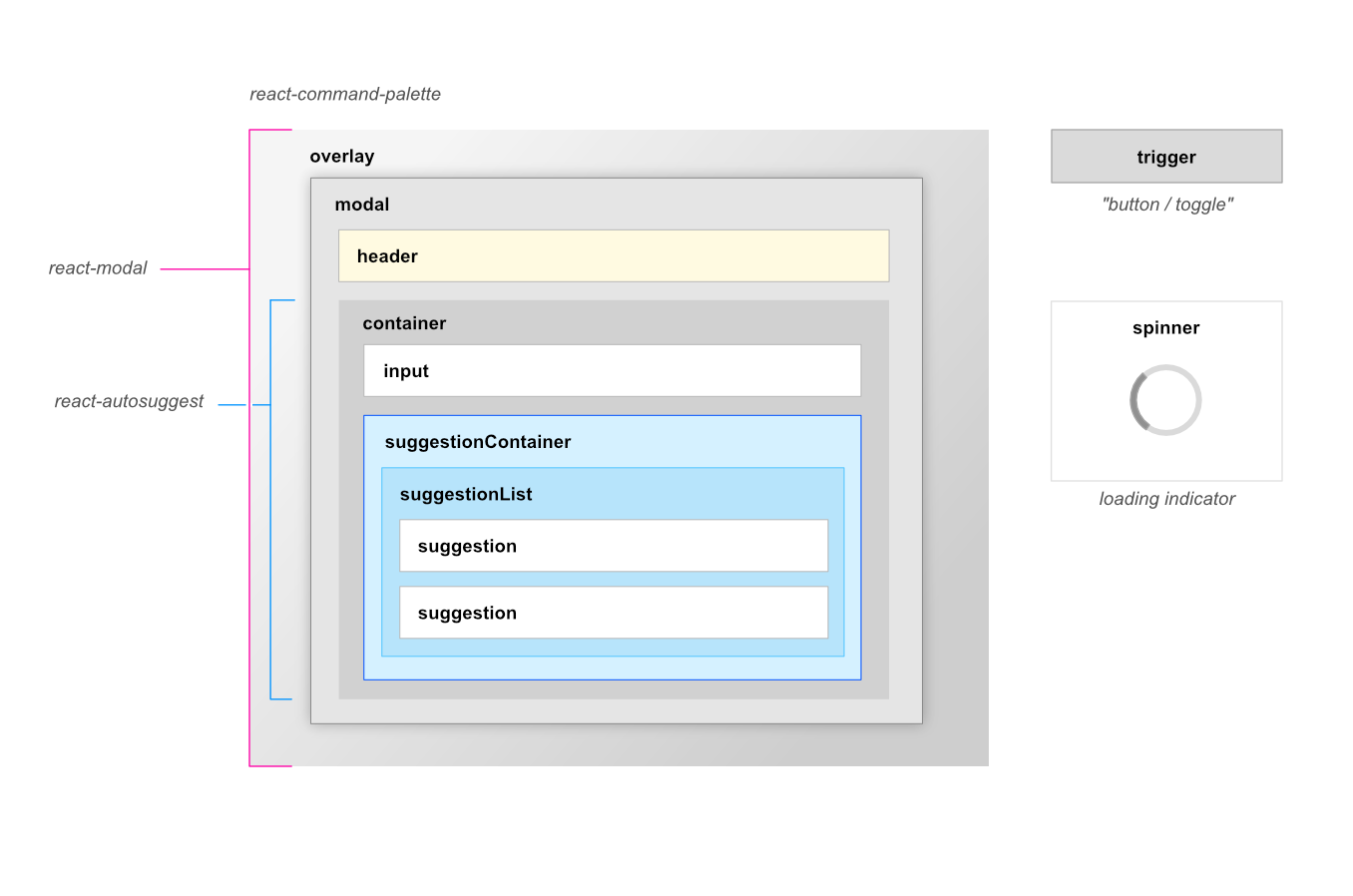

trigger a string or a React.ComponentType the opens the command palette when clicked. If a custom trigger is not set then by default a button will be used. If a custom component or string is provided then it will automatically be wrapped inside an accessible div that will allow it be keyboard accessible, clickable and focusable for assistive technologies.
Example with a component:
// jsx trigger prop
<CommandPalette commands={data} trigger={<b>Click Me!</b>}>

// html generated trigger
<div role="button" tabindex="0"><b>Click Me!</b></div>
Example with a string:
// jsx trigger prop
<CommandPalette commands={data} trigger="Click Me!">

// html generated trigger
<div role="button" tabindex="0">Click Me!</div>
When the trigger is clicked it will open the command palette, no custom handlers or events are required.
Developer Setup
# start the dev environment
$ yarn start

# install dependencies
$ yarn install

# visual regression tests
$ yarn chromatic

# run unit tests
$ yarn test

# update the docs
$ yarn storybook
Sponsors
Visual Regression Tests by ChromaticQA