wangdicoder / React Native Indicator
Licence: mit
🌀 A friendly loading indicator component for React Native
Stars: ✭ 280
Programming Languages
javascript
184084 projects - #8 most used programming language
Projects that are alternatives of or similar to React Native Indicator
loading-indicator
🚦 Simple and customizable command line loading indicator
Stars: ✭ 18 (-93.57%)
Mutual labels: loading, indicator
Vue Loading Overlay
Vue.js component for full screen loading indicator 🌀
Stars: ✭ 784 (+180%)
Mutual labels: loading, indicator
Flutter easyloading
✨A clean and lightweight loading/toast widget for Flutter, easy to use without context, support iOS、Android and Web
Stars: ✭ 455 (+62.5%)
Mutual labels: loading, indicator
Windless
Windless makes it easy to implement invisible layout loading view.
Stars: ✭ 919 (+228.21%)
Mutual labels: loading, indicator
flutter easyloading
✨A clean and lightweight loading/toast widget for Flutter, easy to use without context, support iOS、Android and Web
Stars: ✭ 1,021 (+264.64%)
Mutual labels: loading, indicator
react-native-image-blur-loading
React Native component for progressive image loading.
Stars: ✭ 12 (-95.71%)
Mutual labels: loading
Panorama360
Projekt przejściowy do projektu Magisterskiego. Android, LibGDX, OpenCV, Camera, SurfaceView, stitching, panorama, sphere, gyroscope
Stars: ✭ 52 (-81.43%)
Mutual labels: loading
StateLayout
一种无侵入,使用简单,无需修改现有布局,动态切换布局状态(Loading/Error/Empty/Content)的解决方案。
Stars: ✭ 151 (-46.07%)
Mutual labels: loading
ngx-smart-loader
Smart loader handler to manage loaders everywhere in Angular apps.
Stars: ✭ 28 (-90%)
Mutual labels: loading
React Loads
React Loads is a backend agnostic library to help with external data fetching & caching in your UI components.
Stars: ✭ 268 (-4.29%)
Mutual labels: loading
yuanful-ui
(微信小程序插件) yuanful-ui是一套可添加到微信小程序内直接使用的免费功能插件,无需重复开发,为用户提供更丰富的服务。
Stars: ✭ 30 (-89.29%)
Mutual labels: loading
Ngx Skeleton Loader
Make beautiful, animated loading skeletons that automatically adapt to your Angular apps
Stars: ✭ 278 (-0.71%)
Mutual labels: loading
React Wait
Complex Loader Management Hook for React Applications
Stars: ✭ 268 (-4.29%)
Mutual labels: loading
react-native-indicator


A useful indicator component for React Native
Installation
Make sure that you are in your React Native project directory and run:
$ npm install react-native-indicator --save
$ npm install @react-native-community/art --save
For react-native >= 0.60 ReactNativeART should be auto-linked and no additional action is required.
For react-native < 0.60 you need to link ReactNative ART:
$ react-native link @react-native-community/art
More info, following the Art module instruction to configure.
Usage
Import react-native-indicator as a JavaScript module:
import { CirclesLoader, PulseLoader, TextLoader, DotsLoader, ... } from 'react-native-indicator';
Here is currently available types:
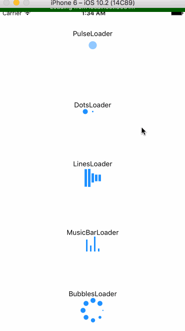
- PulseLoader
- DotsLoader
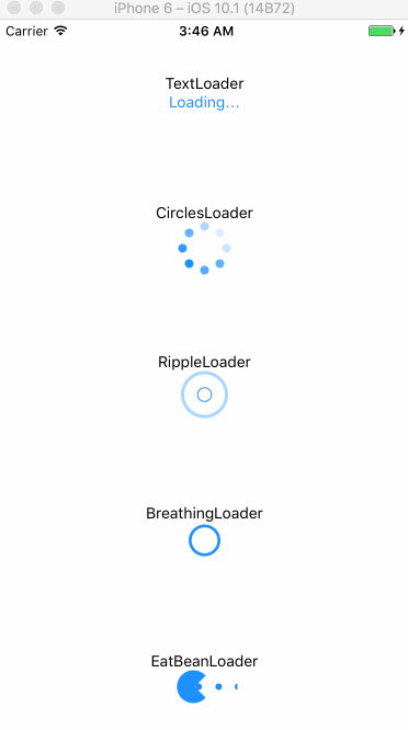
- TextLoader
- BubblesLoader
- CirclesLoader
- BreathingLoader
- RippleLoader
- LinesLoader
- MusicBarLoader
- EatBeanLoader
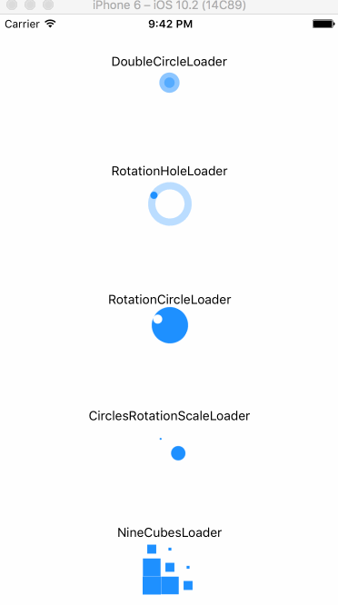
- DoubleCircleLoader
- RotationCircleLoader
- RotationHoleLoader
- CirclesRotationScaleLoader
- NineCubesLoader
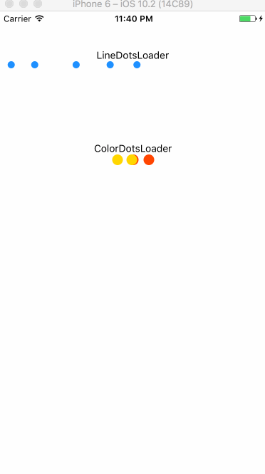
- LineDotsLoader
- ColorDotsLoader
- OpacityDotsLoader
render(){
  return(
    <View>
      <CirclesLoader />
      <TextLoader text="Loading" />
    </View>
  );
}
Props
PulseLoader
| prop | type | default | description |
|---|---|---|---|
| size | number | 30 | circle's size |
| color | string | '#1e90ff' | indicator's color |
| frequency | number | 1000 | scale's frequency |
DotsLoader
| prop | type | default | description |
|---|---|---|---|
| size | number | 10 | dot's size |
| color | string | '#1e90ff' | indicator's color |
| betweenSpace | number | 5 | distance between two dots |
TextLoader
| prop | type | default | description |
|---|---|---|---|
| text | string | 'Loading' | contents |
| textStyle | style | inherited | text's style |
BubblesLoader
| prop | type | default | description |
|---|---|---|---|
| size | number | 40 | circle's size |
| color | string | '#1e90ff' | indicator's color |
| dotRadius | number | 10 | each dot's size |
CirclesLoader
| prop | type | default | description |
|---|---|---|---|
| size | number | 40 | circle's size |
| color | string | '#1e90ff' | indicator's color |
| dotRadius | number | 8 | each dot's size |
BreathingLoader
| prop | type | default | description |
|---|---|---|---|
| size | number | 10 | circle's size |
| color | string | '#1e90ff' | indicator's color |
| strokeWidth | number | 3 | outline width |
| frequency | number | 800 | scale's frequency |
RippleLoader
| prop | type | default | description |
|---|---|---|---|
| size | number | 10 | circle's size |
| frequency | number | 1600 | scale's frequency |
| color | string | '#1e90ff' | indicator's color |
| strokeWidth | number | 3 | outline width |
LinesLoader
| prop | type | default | description |
|---|---|---|---|
| color | string | '#1e90ff' | indicator's color |
| barWidth | number | 5 | each bar's width |
| barHeight | number | 40 | each bar's height |
| barNumber | number | 5 | the number of bar |
| betweenSpace | number | 2 | distance between two bars |
MusicBarLoader
| prop | type | default | description |
|---|---|---|---|
| color | string | '#1e90ff' | indicator's color |
| barWidth | number | 3 | each bar's width |
| barHeight | number | 30 | each bar's height |
| betweenSpace | number | 5 | distance between two bars |
EatBeanLoader
| prop | type | default | description |
|---|---|---|---|
| color | string | '#1e90ff' | indicator's color |
| size | number | 30 | indicator's size |
DoubleCircleLoader
| prop | type | default | description |
|---|---|---|---|
| size | number | 30 | circle's size |
| color | string | '#1e90ff' | indicator's color |
RotationCircleLoader
| prop | type | default | description |
|---|---|---|---|
| size | number | 30 | indicator's size |
| color | string | '#1e90ff' | indicator's color |
| rotationSpeed | number | 800 | rotation speed |
RotationHoleLoader
| prop | type | default | description |
|---|---|---|---|
| size | number | 40 | indicator's size |
| color | string | '#1e90ff' | indicator's color |
| rotationSpeed | number | 800 | rotation speed |
| strokeWidth | number | 8 | circle outline's width |
CirclesRotationScaleLoader
| prop | type | default | description |
|---|---|---|---|
| size | number | 50 | indicator's size |
| color | string | '#1e90ff' | indicator's color |
NineCubesLoader
| prop | type | default | description |
|---|---|---|---|
| size | number | 20 | each cube's size |
| color | string | '#1e90ff' | indicator's color |
LineDotsLoader
warning: this indicator will occupy a whole horizontal space automatically, which means you don't need to set any center props. Just keeping the direction of its parent View is vertical.
| prop | type | default | description |
|---|---|---|---|
| size | number | 10 | dot's size |
| color | string | '#1e90ff' | indicator's color |
| dotsNumber | number | 5 | the number of dots |
| betweenSpace | number | 5 | distance between two dots |
ColorDotsLoader
| prop | type | default | description |
|---|---|---|---|
| size | number | 15 | each cube's size |
| betweenSpace | number | 7 | distance between two dots |
| color1 | string | '#ff4500'(red) | 1st color |
| color2 | string | '#ffd700'(yellow) | 2nd color |
| color3 | string | '#9acd32'(green) | 3rd color |
OpacityDotsLoader
| prop | type | default | description |
|---|---|---|---|
| size | number | 10 | dot's size |
| color | string | '#1e90ff' | indicator's color |
| betweenSpace | number | 5 | distance between two dots |
| speed | number | 200 | change speed |
License
MIT
Note that the project description data, including the texts, logos, images, and/or trademarks,
for each open source project belongs to its rightful owner.
If you wish to add or remove any projects, please contact us at [email protected].