gaoxiaosong / React Native Pure Navigation Bar
Programming Languages
Labels
Projects that are alternatives of or similar to React Native Pure Navigation Bar
react-native-pure-navigation-bar
Here is a fully customizable navigation bar in React-Native. You can set the global unified style of navigation bar and add it as a react component in each page.
It supports:
- Absolute position style.
- Safe Area Inset style.
- Portrait and Landscape mode.
- Translucent property for Android.
- Do go back action automatically.
- Title center or uncenter.
- Seperator under navigation bar.
- Button type of string, number or react element.
- Go back button with image or text.
- Customize style globally and in each view.
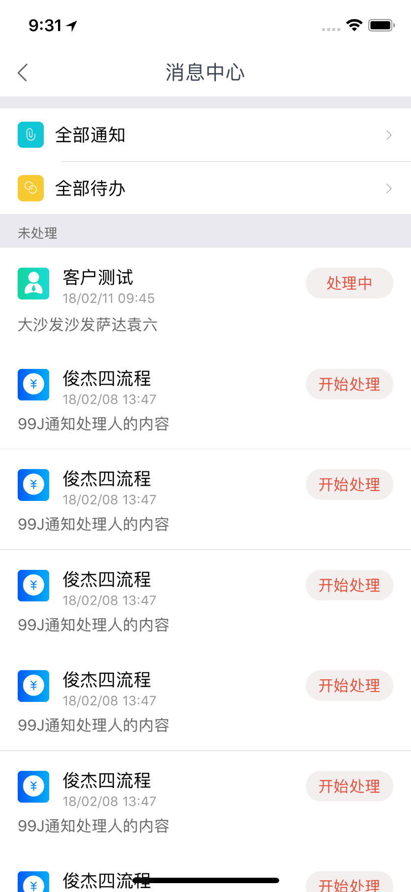
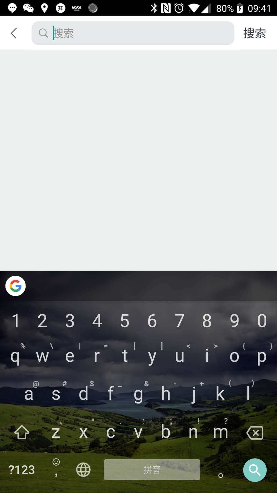
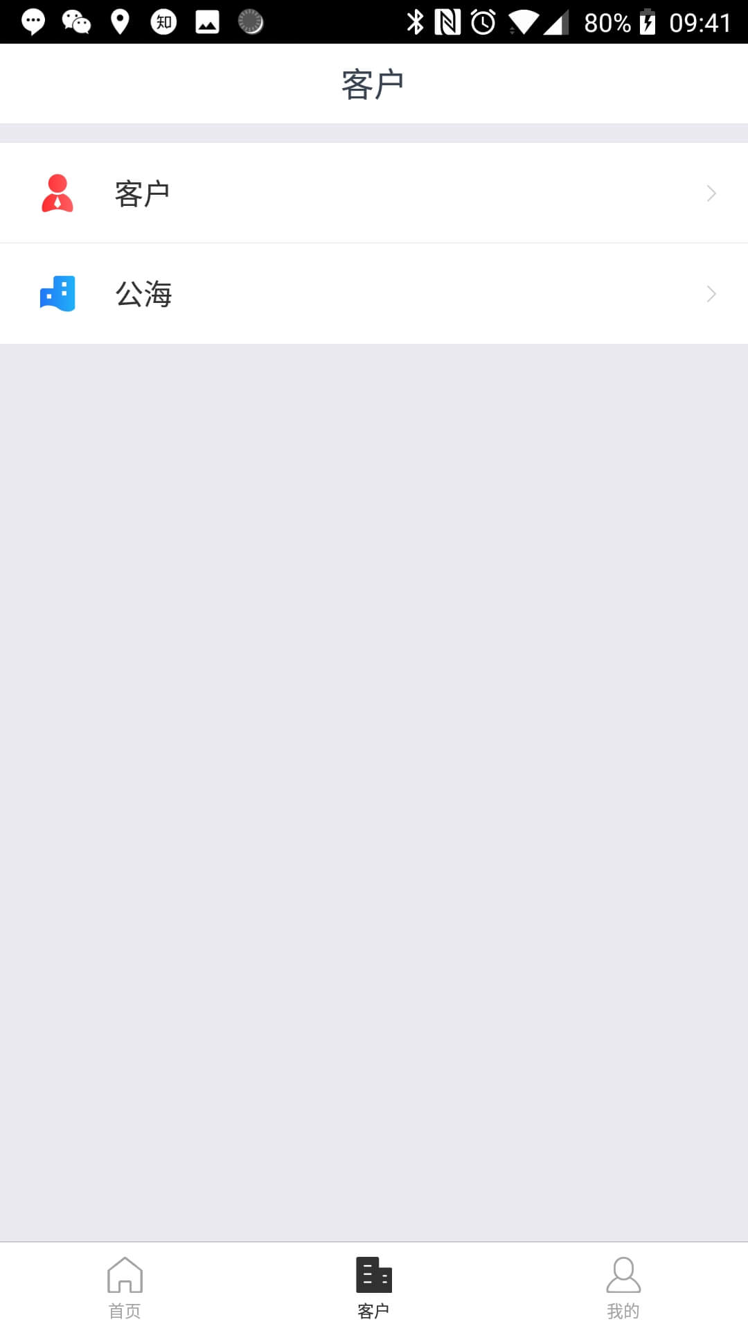
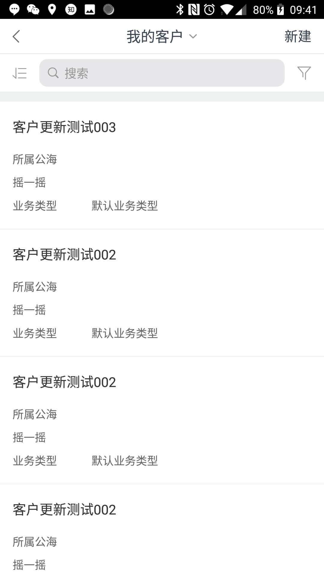
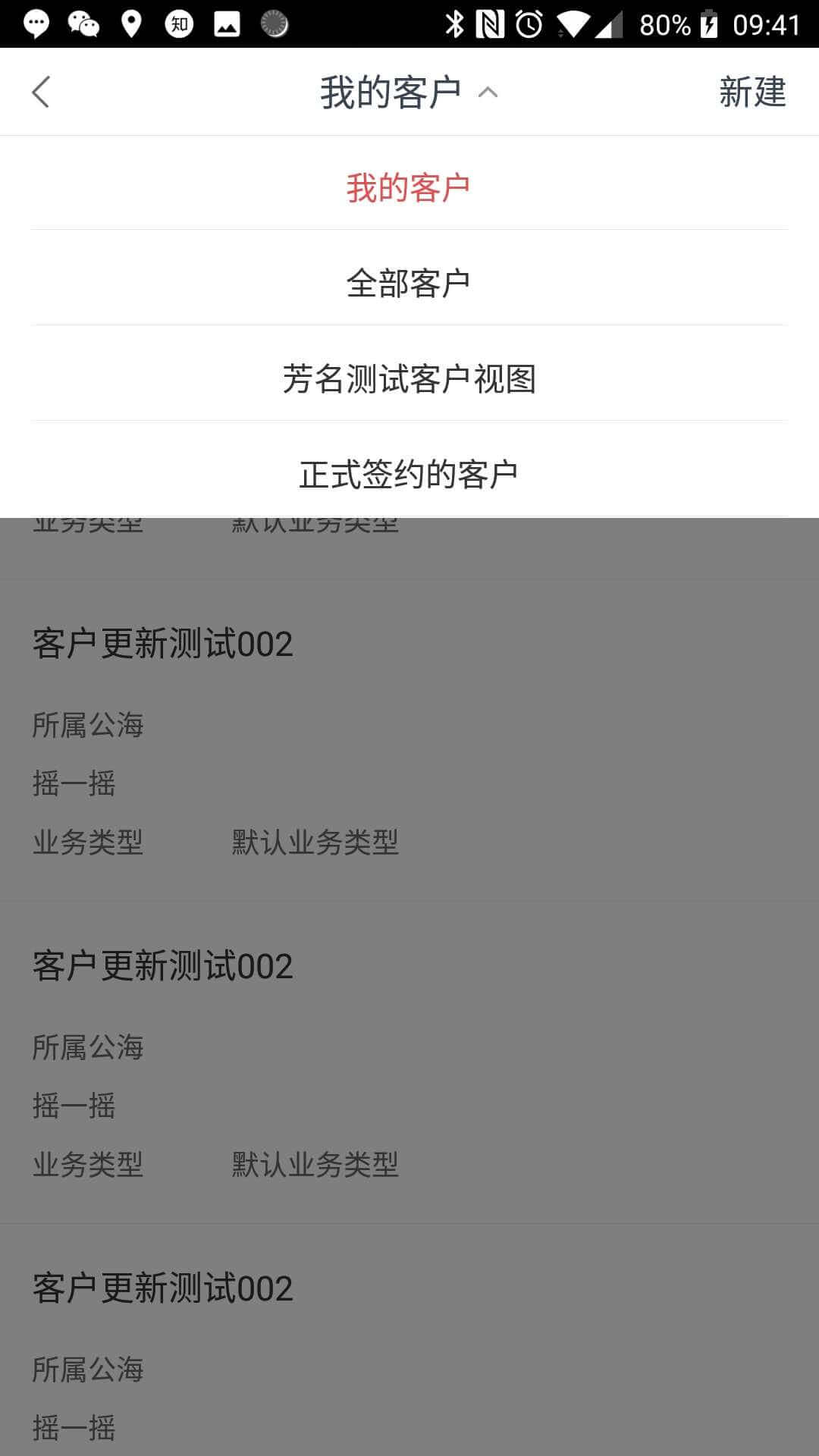
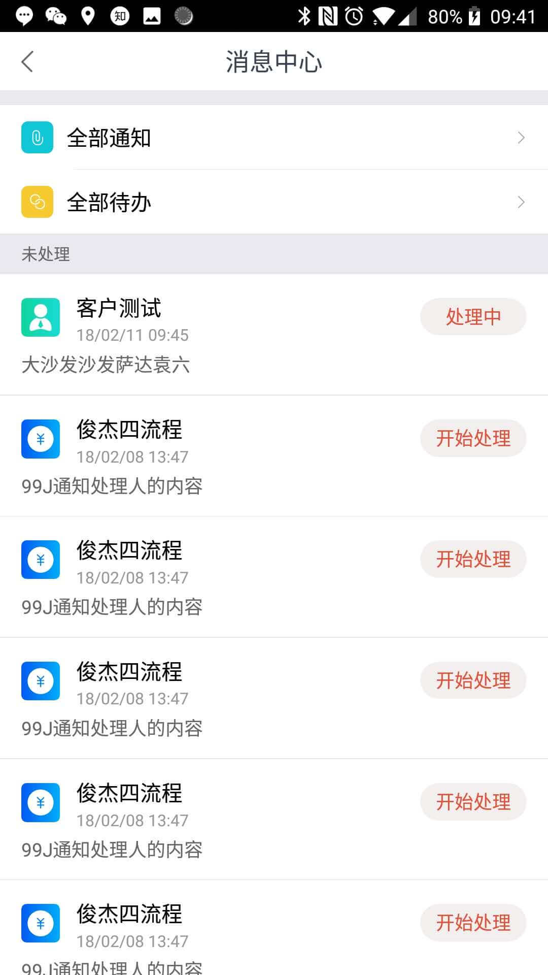
ScreenShots
iPhone X
Android
Install
Install by Yarn:
yarn add react-native-pure-navigation-bar
Install by NPM:
npm install --save react-native-pure-navigation-bar
Usage
First import in the file:
import NaviBar from 'react-native-pure-navigation-bar';
Then add component in render() function:
render() {
  return (
    <View style={{flex: 1}}>
      <NaviBar
        title='CustomTitle'
        {/* other properties if you want to specify it */}
      />
      {/* other components */}
    </View>
  );
}
Export
| Name | Description |
|---|---|
| DEFAULT_NAVBAR_HEIGHT | Default navigation bar height |
| GOBACK_BUTTON | An identifier when you set 'leftElement' or 'rightElement' to identify the button as GoBack button |
| GOBACK_IMAGE | An default image for GOBACK_BUTTON |
| forceInset | A function to generate forceInset options easilly |
| getSafeAreaInset | Get safe area inset with landscape and translucent params |
Global Settings
You can change the navigation bar settings at the startup, include navigation bar style, and other default props.
You can set options like this:
import {InnerNaviBar} from 'react-native-pure-navigation-bar';

InnerNaviBar.defaultProps.isTranslucent = true;
InnerNaviBar.defaultProps.style.titleContainer = {...};
Custom Setting
You can control the action or style of navigation bar by passing 'props'.
| PropName | Description |
|---|---|
| title | Title view of text style or user custom view |
| titleCenter | Title is must at center or not |
| hasSeperatorLine | Bottom of navigation bar has a seperator line or not |
| leftElement | Left buttons, a string or a number means a button of text style, an element means a button view, an array means an array of button which maybe text or custom view |
| rightElement | Right buttons, same format as 'leftElement' |
| onLeft | Left button click function, param is button index in 'leftElement', from 0 on. If return is false and button is goback button, then do not call the default goback action |
| onRight | Right button click function, same format as 'onLeft' |
| autoCloseKeyboard | Auto dismiss keyboard when click button or not |
| autoHardwareBack | Auto listen hardware back event on Android or not |
| disableLock | Enable or disable button clicking lock to avoid clicking multi times |
| gobackImage | Image of goback button |
| gobackText | Text of goback button |
| isAbsolute | Enable absolute style or not |
| isTranslucent | Translucent mode in Android |
| safeOptions | Safe area option of navigation bar. Use 'false' to disable |
| navbarHeight | Navigation bar height. Default is DEFAULT_NAVBAR_HEIGHT
|
| style | A custom style which has highest priority, object's key is in following 'Style' section |
You can see index.d.ts for their types and src/index.js for their default values.
Style
The component style is consist of three part:
- User custom style, passed by component props, is highest level.
- Global setting style, set with
defaultPropsinInnerNaviBar, is medium level, can be override by User custom style. - Inner style, written in
src/style.js, is lowest level, can be overrided by the two styles above.
All the key you can customize in Global or Custom settings list below:
| Key | Description |
|---|---|
| safeView | Safe area view |
| absoluteView | Absolute view |
| normalView | Not safe area or absolute view |
| container | The whole navigation bar |
| seperator | Seperator line at the bottom |
| titleContainer | Title container off center |
| title | Inner title text |
| leftView | Left view contains all left buttons |
| rightView | Right view contains all right buttons |
| buttonView | Text-type button touchable view |
| buttonText | Text-type button text |
| gobackView | Goback button touchable view |
| gobackImage | Goback button image |
| gobackText | Goback button text |
FAQ
You can see Wiki for questions. And if not found, you can commit a issue to me.
Example Project
You can open the example project by following steps:
- Enter
example. Useyarnornpm installto install the modules. Runnpm startin a seperate terminal. - Create a example project with entry file
indexand module nametest.


