echoulen / Storybook Addon Styled Component Theme
Licence: mit
storybook addon
Stars: ✭ 168
Programming Languages
typescript
32286 projects
Projects that are alternatives of or similar to Storybook Addon Styled Component Theme
storybook-styled-components
No description or website provided.
Stars: ✭ 76 (-54.76%)
Mutual labels: styled-components, addon, storybook
Storybook Addon
Develop themable components with Emotion/Styled Components/Material-UI with help of Storybook & React Theming
Stars: ✭ 122 (-27.38%)
Mutual labels: addon, styled-components, storybook
eleventy-react
Use React components in Eleventy.
Stars: ✭ 66 (-60.71%)
Mutual labels: styled-components, storybook
Storycap
A Storybook Addon, Save the screenshot image of your stories 📷 via puppeteer.
Stars: ✭ 451 (+168.45%)
Mutual labels: addon, storybook
Quantum
The default pack of components and layout principles that dictates Catho Frontend applications.
Stars: ✭ 39 (-76.79%)
Mutual labels: styled-components, storybook
chic-ui
Lightweight CSS-in-JS styled UI Component Library for React
Stars: ✭ 39 (-76.79%)
Mutual labels: styled-components, storybook
Storybook Addon A11y
REPO/PACKAGE MOVED - Storybook addon to help, improving accessibility within you're react components.
Stars: ✭ 37 (-77.98%)
Mutual labels: addon, storybook
medly-components
🧩 Medly components provides numerous themable react components, each with multiple varitaions of sizes, colors, position etc.
Stars: ✭ 66 (-60.71%)
Mutual labels: styled-components, storybook
Gatsby Starter Typescript Deluxe
A Gatsby starter with TypeScript, Storybook, Styled Components, Framer Motion, Jest, and more.
Stars: ✭ 50 (-70.24%)
Mutual labels: styled-components, storybook
Storybook Addon Preview
Storybook Addon Preview can show user selected knobs in various framework code in Storybook
Stars: ✭ 43 (-74.4%)
Mutual labels: addon, storybook
Meteor Apollo Starter Kit
Meteor, Apollo, React, PWA, Styled-Components boilerplate
Stars: ✭ 91 (-45.83%)
Mutual labels: styled-components, storybook
msw-storybook-addon
Mock API requests in Storybook with Mock Service Worker.
Stars: ✭ 168 (+0%)
Mutual labels: addon, storybook
react-component-library-lerna
Build your own React component library managed with lerna, presented with storybook and published in private npm registry.
Stars: ✭ 55 (-67.26%)
Mutual labels: styled-components, storybook
Storybook Addon Material Ui
Addon for storybook wich wrap material-ui components into MuiThemeProvider. 📃 This helps and simplifies development of material-ui based components.
Stars: ✭ 513 (+205.36%)
Mutual labels: addon, storybook
smores-react
🍭 Marshmallow React components
Stars: ✭ 34 (-79.76%)
Mutual labels: styled-components, storybook
react-awesome-notifications
A beautiful fully customizable React + Redux notification system built with styled-components
Stars: ✭ 29 (-82.74%)
Mutual labels: styled-components, storybook
Moveit
🚀 NLW #4 | React+ TypeScript + NextJS + StyledComponents + Firebase + MongoDb +Axios
Stars: ✭ 39 (-76.79%)
Mutual labels: styled-components, storybook
React95
A React components library with Win95 UI
Stars: ✭ 1,779 (+958.93%)
Mutual labels: styled-components, storybook

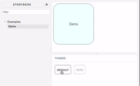
This addon allows storybook to showcase components with multiple different styled-component themes. Supports storybook v4, v5, v6 and newer
Installation
yarn add storybook-addon-styled-component-theme --dev
Configuration
storybook v6
Add a decorator to stories in .storybook/preview.js
import { addDecorator } from "@storybook/react";
import { withThemesProvider } from "storybook-addon-styled-component-theme";
import { ThemeProvider } from "styled-components";

const themes = [theme1, theme2];
addDecorator(withThemesProvider(themes), ThemeProvider);
Add to .storybook/main.js
module.exports = {
  ...
  addons: [
    ...
    "storybook-addon-styled-component-theme/dist/preset"
  ]
};
storybook v5 and v4
Add to .storybook/addons.js
// v1.3, storybook v5.2
import "storybook-addon-styled-component-theme/dist/register";

// v1.2, storybook v4, v5.0
import "storybook-addon-styled-component-theme/dist/src/register";
addDecorator to .storybook/preview.js
import { addDecorator } from "@storybook/react";
import { withThemesProvider } from "storybook-addon-styled-component-theme";

const themes = [theme1, theme2];
addDecorator(withThemesProvider(themes));
Remind
Make sure every theme object has a name property
Contributing
Build local library
yarn

yarn build
Start the local example
cd example

yarn

yarn storybook
Run all the spec
yarn test
Note that the project description data, including the texts, logos, images, and/or trademarks,
for each open source project belongs to its rightful owner.
If you wish to add or remove any projects, please contact us at [email protected].