Terminal in React


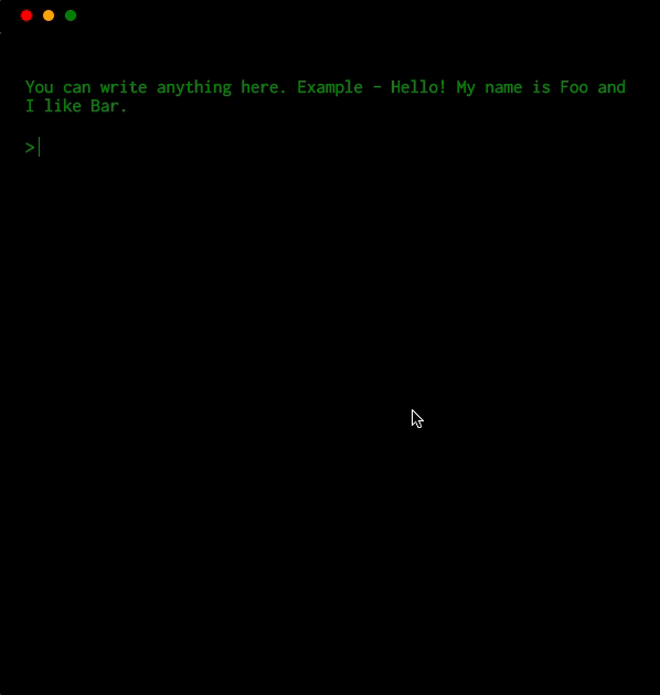
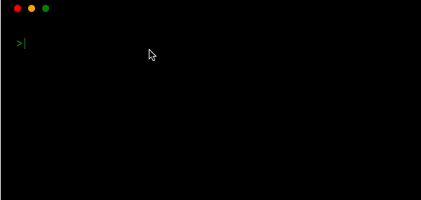
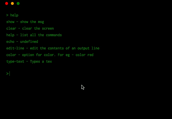
A component that renders a terminal
Table of contents
Install
npm install terminal-in-react --save
or if you use yarn
yarn add terminal-in-react
This package also depends on react so make sure you've already installed it.
Usage
import React, { Component } from 'react';
import Terminal from 'terminal-in-react';

class App extends Component {
  showMsg = () => 'Hello World'

  render() {
    return (
      <div
        style={{
          display: "flex",
          justifyContent: "center",
          alignItems: "center",
          height: "100vh"
        }}
      >
        <Terminal
          color='green'
          backgroundColor='black'
          barColor='black'
          style={{ fontWeight: "bold", fontSize: "1em" }}
          commands={{
            'open-google': () => window.open('https://www.google.com/', '_blank'),
            showmsg: this.showMsg,
            popup: () => alert('Terminal in React')
          }}
          descriptions={{
            'open-google': 'opens google.com',
            showmsg: 'shows a message',
            alert: 'alert', popup: 'alert'
          }}
          msg='You can write anything here. Example - Hello! My name is Foo and I like Bar.'
        />
      </div>
    );
  }
}
Be careful when copying this example because it uses
windowobject ('open-google': () => window.open("https://www.google.com/", "_blank"),) which is only available on the client-side and it will give you an error if you're doing server side rendering.
Working
Adding commands ✍️
To add your own command, use prop commands which accepts an object. This objects then maps command name -> command function.
Let's take an example. You want to open a website with a command open-google
<Terminal commands={{ 'open-google': () => window.open("https://www.google.com/", "_blank")}} />Adding description of your command 💁🏼♂️
Add a description of your command using prop description.
<Terminal descriptions={{ 'open-google': 'opens google' }} />Console logging
You can have the terminal watch console.log/info function and print out. It does so by default.
<Terminal watchConsoleLogging />

Command passthrough
You can have the terminal pass out the cmd that was input
<Terminal commandPassThrough={cmd => `-PassedThrough:${cmd}: command not found`} />Async handling of commands 😎
you can also handle the result with a callback
<Terminal
  commandPassThrough={(cmd, print) => {
    // do something async
    print(`-PassedThrough:${cmd}: command not found`);
  }}
/>
Minimise, maximise and close the window
<Terminal
  closedTitle='OOPS! You closed the window.'
  closedMessage='Click on the icon to reopen.'
/>
Hide the default options
<Terminal descriptions={{ color: false, show: false, clear: false }} />This will hide the option color, show and clear.
Advanced commands 👨💻
You can give your commands options and get them back parsed to the method.
Using this method will also give your command a build in help output.
With the option -h or --help.
<Terminal
  commands={{
    color: {
      method: (args, print, runCommand) => {
        print(`The color is ${args._[0] || args.color}`);
      },
      options: [
        {
          name: 'color',
          description: 'The color the output should be',
          defaultValue: 'white',
        },
      ],
    },
  }}
/>
The command API has three parameters arguments, print, and runCommand.
argumentswill be an array of the input split on spaces or and object with parameters meeting the options given as well as a_option with any strings given after the options.printis a method to write a new line to the terminals output. Any string returned as a result of a command will also be printed.runCommandis a method to call other commands it takes a string and will attempt to run the command given
Let's take an another example -
<Terminal
  commands={{
    'type-text': (args, print, runCommand) => {
      const text = args.slice(1).join(' ');
      print('');
      for (let i = 0; i < text.length; i += 1) {
        setTimeout(() => {
          runCommand(`edit-line ${text.slice(0, i + 1)}`);
        }, 100 * i);
      }
    }
  }}
/>
Using plugins 🔥
We have also developed a plugin system for the <Terminal /> component which helps you develop custom plugins. Here is one example of plugin which creates a fake file system called terminal-in-react-pseudo-file-system-plugin.
Instantiating the plugin
import pseudoFileSystem from 'terminal-in-react-pseudo-file-system-plugin';
const FileSystemPlugin = pseudoFileSystem();

<Terminal
  plugins={[
    FileSystemPlugin,
  ]}
/>
or if the plugin requires config
import NodeEvalPlugin from 'terminal-in-react-node-eval-plugin';
import pseudoFileSystemPlugin from 'terminal-in-react-pseudo-file-system-plugin';
const FileSystemPlugin = pseudoFileSystemPlugin();

...
<Terminal
  plugins={[
    FileSystemPlugin,
    {
      class: NodeEvalPlugin,
      config: {
        filesystem: FileSystemPlugin.displayName
      }
    }
  ]}
/>
...

Awesome! Right? Let us know if you make something interesting
Plugin List
- terminal-in-react-pseudo-file-system-plugin : A client-side only filesystem
- terminal-in-react-node-eval-plugin : used with a filesystem to evaluate js code
- terminal-in-react-vi-plugin : used with a filesystem to edit the contents of files more easily
More features
Tab autocomplete
Multiline input 🤹🏼♀️
via shift + enter

Check history of your commands 🖱️
using arrow down and up keys
Keyboard shortcuts ⌨
You can define keyboard shortcuts. They have to be grouped by os. The three available are
win, darwin, and linux. You can group multiple os by a , for example if the
shortcut was for all platforms win,darwin,linux would be fine as a key
<Terminal
  shortcuts={{
    'darwin,win,linux': {
      'ctrl + a': 'echo whoo',
    },
  }}
/>
But you might want to specific
<Terminal
  shortcuts={{
    'win': {
      'ctrl + a': 'echo hi windows',
    },
    'darwin': {
      'cmd + a': 'echo hi mac'
    },
    'linux': {
      'ctrl + a': 'echo hi linux'
    }
  }}
/>
You can mix and match
<Terminal
  shortcuts={{
    'win,linux': {
      'ctrl + b': 'echo we are special',
    },
    'win': {
      'ctrl + a': 'echo hi windows',
    },
    'darwin': {
      'cmd + a': 'echo hi mac'
    },
    'linux': {
      'ctrl + a': 'echo hi linux'
    }
  }}
/>
The value of the shortcut should be a command to run.
Override the top bar buttons actionHandlers
Use the prop actionHandlers.
The object allows for 3 methods handleClose, handleMaximise, handleMinimise;
Each one is a function and will pass in the default method as the first param. Any method not passed in will use the default.
<Terminal
  actionHandlers={{
    handleClose: (toggleClose) => {
      // do something on close
      toggleClose();
    },
    handleMaximise: (toggleMaximise) => {
      // do something on maximise
      toggleMaximise();
    }
  }}
/>
Customization
Use
- prop
colorto change the color of the text. - prop
outputColorto change the color of the output text defaults to color prop. - prop
backgroundColorto change the background. - prop
barColorto change the color of bar. - prop
promptto change the prompt (>) color. - prop
showActionsto change if the three circles are shown. - prop
hideTopBarto hide the top bar altogether. - prop
allowTabsto allow multiple tabs.
API
component props
| Props | Type | Default |
|---|---|---|
| color | string | 'green' |
| outputColor | string | props.color |
| backgroundColor | string | 'black' |
| prompt | string | 'green' |
| barColor | string | 'black' |
| description | object | {} |
| commands | object | { clear, help, show, } |
| msg | string | - |
| closedTitle | string | OOPS! You closed the window. |
| closedMessage | string | Click on the icon to reopen. |
| watchConsoleLogging | bool | false |
| commandPassThrough | function | null |
| promptSymbol | string | > |
| plugins | array | [ { name: '', load: new Plugin(), commands: {} descriptions: {} } ] |
| startState | string ['open', 'maximised', 'minimised', 'closed'] | 'open' |
| showActions | bool | true |
| hideTopBar | bool | false |
| allowTabs | bool | true |
| actionHandlers | object | - |
Built-in commands
clear- Clears the screenhelp- List all the commandsshow- Shows a msg if anyecho- Display the input messageedit-line- Edits the last line or a given line using the-largument
Where to use ?
- Embed it as a toy on your website
- For showcasing
- Explain any of your projects using this terminal component
- or just play with it
You want a X feature
Sure! Check our todolist or create an issue.
Contributing
Troubleshooting
Build errors when using with create-react-app
Eject from create-react-app and use a custom webpack configuration with babili-webpack-plugin. Read more about this here.
Style issues when maximizing
Set the style to height: 100vh on parent element.
