biigpongsatorn / Vue Element Loading
Licence: mit
⏳ Loading inside a container or full screen for Vue.js
Stars: ✭ 234
Projects that are alternatives of or similar to Vue Element Loading
Vue Loaders
Vue + loaders.css
Stars: ✭ 127 (-45.73%)
Mutual labels: component, loader, loading, spinner
Spinners React
Lightweight SVG/CSS spinners for React
Stars: ✭ 254 (+8.55%)
Mutual labels: loader, loading, spinner
Ng Block Ui
Block UI Loader/Spinner for Angular
Stars: ✭ 135 (-42.31%)
Mutual labels: loader, loading, spinner
busy-load
A flexible loading-mask jQuery-plugin
Stars: ✭ 76 (-67.52%)
Mutual labels: loader, spinner, loading
Vue Full Loading
Full overlay loading with spinner for Vue
Stars: ✭ 148 (-36.75%)
Mutual labels: loading, spinner, vuejs2
Vue Wait
Complex Loader and Progress Management for Vue/Vuex and Nuxt Applications
Stars: ✭ 1,869 (+698.72%)
Mutual labels: loader, loading, spinner
spinners-angular
Lightweight SVG/CSS spinners for Angular
Stars: ✭ 21 (-91.03%)
Mutual labels: loader, spinner, loading
Ngx Ui Loader
Multiple Loaders / spinners and Progress bar for Angular 5, 6, 7 and 8+
Stars: ✭ 368 (+57.26%)
Mutual labels: loader, loading, spinner
Whirl
CSS loading animations with minimal effort!
Stars: ✭ 774 (+230.77%)
Mutual labels: loader, loading, spinner
Vue Loading Overlay
Vue.js component for full screen loading indicator 🌀
Stars: ✭ 784 (+235.04%)
Mutual labels: loader, loading, spinner
Awloader
AWLoader is a UI Component that allows you to integrate loader that fits your needs within your app.
Stars: ✭ 11 (-95.3%)
Mutual labels: component, loader, loading
Css Spinner
small, elegant pure css spinner for ajax or loading animation
Stars: ✭ 1,013 (+332.91%)
Mutual labels: loader, loading, spinner
React Nprogress
⌛️ A React primitive for building slim progress bars.
Stars: ✭ 173 (-26.07%)
Mutual labels: component, loading, spinner
React Native Wormhole
⚛️ 🌌 Inter-dimensional Portals for React Native. 👽 🖖
Stars: ✭ 133 (-43.16%)
Mutual labels: component, loader
React Native Input Spinner
An extensible input number spinner component for react-native highly customizable. This component enhance a text input for entering numeric values, with increase and decrease buttons.
Stars: ✭ 155 (-33.76%)
Mutual labels: component, spinner
Vue Ui For Pc
基于Vue2.x的一套PC端UI组件,包括了Carousel 跑马灯、Cascader 级联、Checkbox 多选框、Collapse 折叠面板、DatePicker 日期选择、Dialog 对话框、Form 表单、Input 输入框、InputNumber 数字输入框、Layer 弹窗层、Loading 加载、Menu 菜单、Page 分页、Progress 进度条、Radio 单选框、SelectDropDown 仿select、Switch 开关、Table 表格、Tabs 标签页、Textarea 文本框、Tooltip 文字提示、BackTop 返回顶部、steps 步骤条、Transfer 穿梭框、Tree 树形、Upload 文件上传、Lazy 图片懒加载、Loading 加载、Pagination 分页等等
Stars: ✭ 156 (-33.33%)
Mutual labels: loading, vuejs2
Vue Content Loader
SVG component to create placeholder loading, like Facebook cards loading.
Stars: ✭ 2,790 (+1092.31%)
Mutual labels: component, loading
Vue Notifyjs
Minimalist 1kb Notification component
Stars: ✭ 160 (-31.62%)
Mutual labels: component, vuejs2
React Content Loader
⚪ SVG-Powered component to easily create skeleton loadings.
Stars: ✭ 11,830 (+4955.56%)
Mutual labels: loader, loading


vue-element-loading
⏳ Loading inside a container or full screen for Vue.js
👀 Document & Demo Page
💻 Install
npm install --save vue-element-loading
or
yarn add vue-element-loading
🖥 Install (Vue 3)
npm install --save [email protected]
or
yarn add [email protected]
🕹 Usage
import Vue from "vue";
import VueElementLoading from "vue-element-loading";

Vue.component("VueElementLoading", VueElementLoading);
or
import VueElementLoading from "vue-element-loading";

export default {
  components: {
    VueElementLoading
  }
};
🔎 Example
Inside container
<div class="parent">
  <vue-element-loading :active="show" spinner="bar-fade-scale" />
  <span>
    This is my content.
  </span>
</div>
Full screen
<body>
  <vue-element-loading :active="show" is-full-screen />
</body>
Adjust Spinner Color
Use the color parameter to set the color of the displayed spinner (does not affect custom spinner images).
<div class="parent">
  <vue-element-loading
    :active="show"
    spinner="bar-fade-scale"
    color="#FF6700"
  />
  <span>
    This is my content.
  </span>
</div>
Set text
Use the text parameter to set the text which will appear below loader.
<div class="parent">
  <vue-element-loading
    :active="show"
    spinner="bar-fade-scale"
    color="#FF6700"
    text="Please wait..."
  />
  <span>
    This is my content.
  </span>
</div>
Set text style
Use the textStyle parameter to set the style of text( you need to pass css-in-js way using camelCase exp. fontSize, backgroundColor etc).
<div class="parent">
  <vue-element-loading
    :active="show"
    spinner="bar-fade-scale"
    color="#FF6700"
    text="Please textStyle={fontSize: '25px'}  wait..."
  />
  <span>
    This is my content.
  </span>
</div>
Adjust Spinner Size
Use the size parameter to set the size of the displayed spinner (does not affect custom spinner images).
<div class="parent">
  <vue-element-loading :active="show" spinner="bar-fade-scale" size="128" />
  <span>
    This is my content.
  </span>
</div>
Adjust Spinner Animation Speed
Use the duration parameter to set the animation loop duration in seconds (does not affect custom spinner images).
<div class="parent">
  <vue-element-loading :active="show" spinner="bar-fade-scale" duration="1.0" />
  <span>
    This is my content.
  </span>
</div>
Customize loader
<div class="parent">
  <vue-element-loading :active="show">
    <img src="/static/pikachu.gif" width="55px" height="55px" />
  </vue-element-loading>
</div>
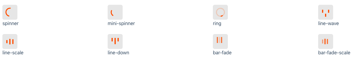
🌀 Spinner
⚙️ Props
| Props | Type | Default | Description |
|---|---|---|---|
| active | Boolean | - | Status for show/hide loading |
| spinner | String | spinner | Spinner icon name: spinner, mini-spinner, ring, line-wave, line-scale, line-down, bar-fade, bar-fade-scale
|
| color | String | #000 | Color of spinner icon |
| background-color | String | rgba(255, 255, 255, .9) | Background color of spinner icon (for overlay) |
| size | String | "40" | The size to display the spinner in pixels (NOTE: this will not affect custom spinner images) |
| duration | String | "0.6" | The duration of one 'loop' of the spinner animation, in seconds (NOTE: this will not affect custom spinner images) |
| delay | Number | String | 0 | The minimum appearing duration of loading in seconds |
| is-full-screen | Boolean | false | Loader will overlay the full page |
| text | String | - | Text will appear below loader |
| text-style | Object | {} | Change style of the text below loader |
🤝 Contributing
- Fork this repository.
- Create new branch with feature name.
- Run
npm installandnpm run dev. - Create your feature.
- Commit and set commit message with feature name.
- Push your code to your fork repository.
- Create pull request. 🙂
⭐️ Support
If you like this project, You can support me with starring ⭐ this repository.
📄 License
Developed with ❤️ and ☕️
Note that the project description data, including the texts, logos, images, and/or trademarks,
for each open source project belongs to its rightful owner.
If you wish to add or remove any projects, please contact us at [email protected].