All Projects → constkhi → Vue Simple Alert

constkhi / Vue Simple Alert

Licence: mit
Simple alert(), confirm(), prompt() for Vue.js

Projects that are alternatives of or similar to Vue Simple Alert

Razor.SweetAlert2
A Razor class library for interacting with SweetAlert2
Stars: ✭ 98 (+5.38%)
Mutual labels:  alert, prompt, confirm
Smalltalk
Promise-based Alert, Confirm and Prompt replacement
Stars: ✭ 76 (-18.28%)
Mutual labels:  prompt, alert, confirm
jquery.dialog.js
A lightweight replacement for the browser's default dialog boxes.
Stars: ✭ 17 (-81.72%)
Mutual labels:  alert, prompt, confirm
react-st-modal
Simple and flexible modal dialog component for React JS
Stars: ✭ 41 (-55.91%)
Mutual labels:  alert, prompt, confirm
Alertifyjs
A javascript framework for developing pretty browser dialogs and notifications.
Stars: ✭ 1,922 (+1966.67%)
Mutual labels:  prompt, alert, confirm
ax5ui-dialog
Javascript UI Component - Dialog - JavaScript Dialog / Bootstrap Dialog
Stars: ✭ 29 (-68.82%)
Mutual labels:  alert, prompt, confirm
mobile-message
基于移动端的弹窗组件,默认提供info、success、warning、error、alert、confirm、multiple、vertical、bottomSheet、prompt,可自定义弹窗。它可以包含任何Html内容可以自定义弹窗的样式,也可以加入自定以的弹窗动画。
Stars: ✭ 13 (-86.02%)
Mutual labels:  alert, prompt, confirm
Notie
🔔 a clean and simple notification, input, and selection suite for javascript, with no dependencies
Stars: ✭ 6,170 (+6534.41%)
Mutual labels:  prompt, alert, confirm
Sweetalert2
A beautiful, responsive, highly customizable and accessible (WAI-ARIA) replacement for JavaScript's popup boxes. Zero dependencies.
Stars: ✭ 13,929 (+14877.42%)
Mutual labels:  prompt, alert, confirm
Vuejs Dialog
A lightweight, promise based alert, prompt and confirm dialog
Stars: ✭ 327 (+251.61%)
Mutual labels:  prompt, alert, confirm
Layer
丰富多样的 Web 弹出层组件,可轻松实现 Alert/Confirm/Prompt/ 普通提示/页面区块/iframe/tips等等几乎所有的弹出交互。目前已成为最多人使用的弹层解决方案
Stars: ✭ 8,202 (+8719.35%)
Mutual labels:  alert, confirm
Alertjs
Dialog Builder allows you to create fully customisable dialogs and popups in Dynamics 365.
Stars: ✭ 80 (-13.98%)
Mutual labels:  prompt, alert
PopOverAlert
PopOverAlert is a PopOver style alert view.
Stars: ✭ 56 (-39.78%)
Mutual labels:  alert, confirm
Ng Popups
🎉 Alert, confirm and prompt dialogs for Angular. Simple as that.
Stars: ✭ 80 (-13.98%)
Mutual labels:  prompt, alert
enquirer
Stylish, intuitive and user-friendly prompts, for Node.js. Used by eslint, webpack, yarn, pm2, pnpm, RedwoodJS, FactorJS, salesforce, Cypress, Google Lighthouse, Generate, tencent cloudbase, lint-staged, gluegun, hygen, hardhat, AWS Amplify, GitHub Actions Toolkit, @airbnb/nimbus, and many others! Please follow Enquirer's author: https://github.…
Stars: ✭ 6,523 (+6913.98%)
Mutual labels:  prompt, confirm
Messg
Messages via CSS3 animations
Stars: ✭ 56 (-39.78%)
Mutual labels:  alert, confirm
vue2-dialog
A mobile Vue plugin for VueDialog
Stars: ✭ 21 (-77.42%)
Mutual labels:  alert, confirm
Overhang.js
🔔 A jQuery plugin for notifications, prompts and confirmations.
Stars: ✭ 437 (+369.89%)
Mutual labels:  prompt, alert
React Notie
Simple notifications for react
Stars: ✭ 27 (-70.97%)
Mutual labels:  prompt, alert
React Native Alert Pro
The Pro Version of React Native Alert (Android & iOS)
Stars: ✭ 69 (-25.81%)
Mutual labels:  alert, confirm

Vue Simple Alert

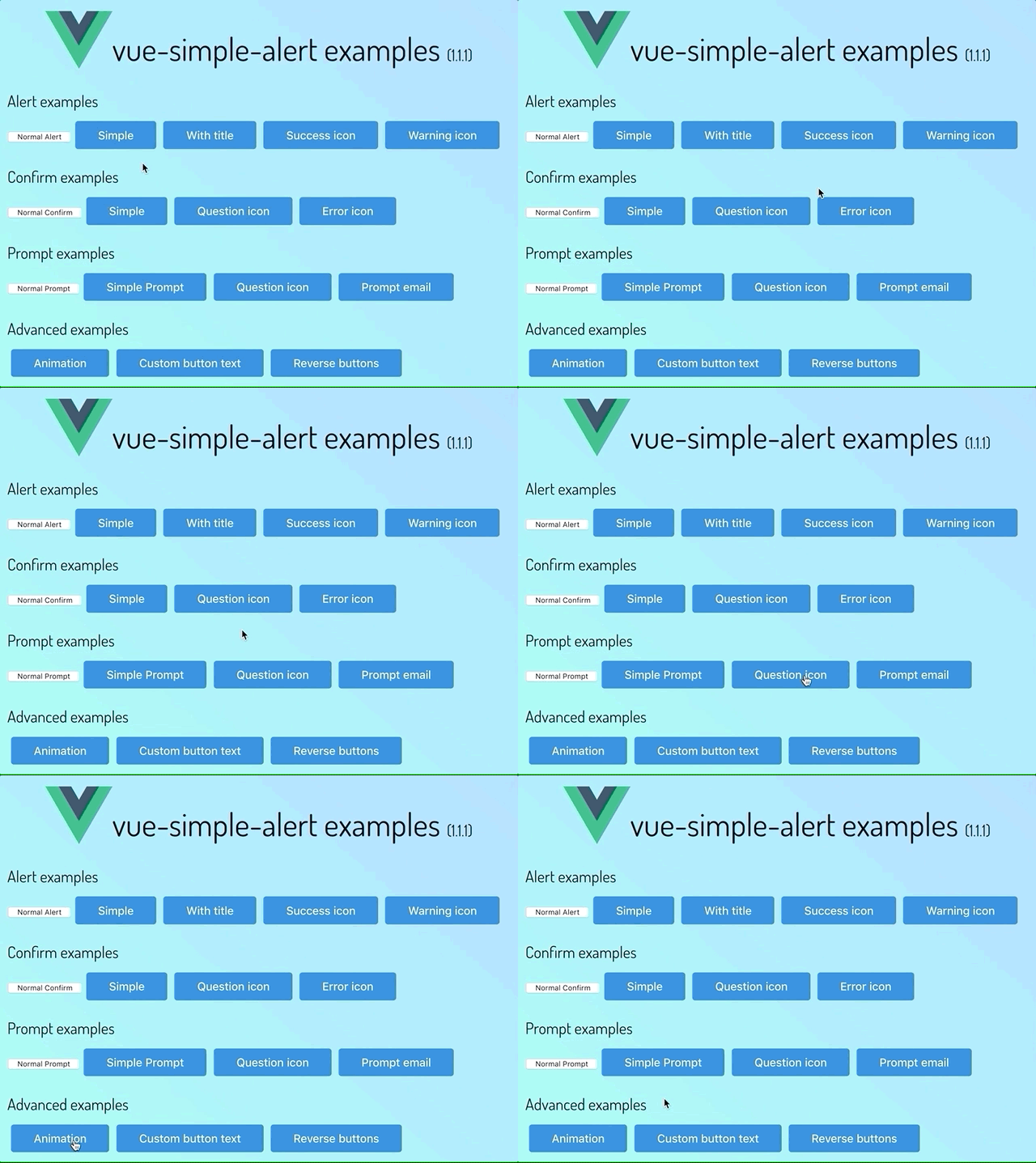
screenshot

version Vue.js version total downloads downloads Codacy Badge license

Simple alert(), confirm(), prompt() for Vue.js, using sweetalert2.

Demo

Check out live demo

Features

  • Provides simple alert(), confirm(), prompt() like DOM Window methods.
  • Based on sweetalert2.
  • Installed as a Vue.js plugin.
  • Promise based API.
  • Support typescript.

Install

npm i vue-simple-alert

Basic Usage

install plugin

// main.js
import Vue from "vue";
import VueSimpleAlert from "vue-simple-alert";

Vue.use(VueSimpleAlert);

Alert

// in any component

this.$alert("Hello Vue Simple Alert.");

Confirm

// in any component

this.$confirm("Are you sure?").then(() => {
  //do something...
});

Prompt

// in any component

this.$prompt("Input your name").then(text => {
  // do somthing with text
});

Advanced Usage

Global options

Global options can be set when initialize plugin. Refer to sweetalert2 documentation

// main.js
import Vue from "vue";
import VueSimpleAlert from "vue-simple-alert";

Vue.use(VueSimpleAlert, { reverseButtons: true });

More advanced usage

You can use sweetalert2's fire() method through $fire(). For detailed usage, refer to sweetalert2 documentation.

// in any component

this.$fire({
  title: "Title",
  text: "text",
  type: "success",
  timer: 3000
}).then(r => {
  console.log(r.value);
});

API

alert(message?, title?, type?, options?)

The alert() method displays an alert box with a specified message and an OK button.

  • message: string

Optional. Specifies the text to display in the alert box

  • title: string

Optional. Specifies title of the alert box

  • type: 'success' | 'error' | 'warning' | 'info' | 'question'

Optional. Specifies icon type.

  • options: SweetAlertOptions

Optional. Advanced options. Refer to sweetalert2 documentation.

  • returns: Promise<boolean>

Will be resolved with true when alert box closed.

confirm(message?, title?, type?, options?)

The confirm() method displays a dialog box with a specified message, along with an OK and a Cancel button.

  • message: string

Optional. Specifies the text to display in the confirm box

  • title: string

Optional. Specifies title of the confirm box

  • type: 'success' | 'error' | 'warning' | 'info' | 'question'

Optional. Specifies icon type.

  • options: SweetAlertOptions

Optional. Advanced options. Refer to sweetalert2 documentation.

  • returns: Promise<boolean>

Will be resolved when OK button clicked. If confirm box closed by any other reason, this promise will be rejected.

prompt(message, defaultText?, title?, type?, options?)

The prompt() method displays a dialog box that prompts the user for input.

  • message: string

Required. Specifies the text to display in the dialog box

  • defaultText: string

Optional. The default input text

  • title: string

Optional. Specifies title of the confirm box

  • type: 'success' | 'error' | 'warning' | 'info' | 'question'

Optional. Specifies icon type.

  • options: SweetAlertOptions

Optional. Advanced options. Refer to sweetalert2 documentation.

  • returns: Promise<string>

Will be resolved with input text when OK button clicked. If the user clicks OK without entering any text, promise will be resolved with an empty string. If dialog box closed by any other reason, this promise will be rejected.

Versioning

We use SemVer for versioning. For the versions available, see the tags on this repository.

License

This project is licensed under the MIT License - see the LICENSE file for details

Note that the project description data, including the texts, logos, images, and/or trademarks, for each open source project belongs to its rightful owner. If you wish to add or remove any projects, please contact us at [email protected].