All Projects → Yoshino-UI → Yoshino

Yoshino-UI / Yoshino

Licence: mit
A themable React component library!Flexible Lightweight PC UI Components built on React! Anyone can generate easily all kinds of themes by it!

Programming Languages

typescript
32286 projects

Projects that are alternatives of or similar to Yoshino

React Multi Select
A Multi Select component built with and for React
Stars: ✭ 111 (-48.61%)
Mutual labels:  component, components, react-component
Flawwwless Ui
Flawwwless ui library for React.js.
Stars: ✭ 265 (+22.69%)
Mutual labels:  components, react-components, react-component
React Workshop
⚒ 🚧 This is a workshop for learning how to build React Applications
Stars: ✭ 114 (-47.22%)
Mutual labels:  webpack, components, react-components
React Components
React components
Stars: ✭ 47 (-78.24%)
Mutual labels:  component, components, react-components
React Splitters
React splitter component, written in TypeScript.
Stars: ✭ 127 (-41.2%)
Mutual labels:  component, react-components, react-component
Ej2 React Ui Components
Syncfusion React UI components library offer more than 50+ cross-browser, responsive, and lightweight react UI controls for building modern web applications.
Stars: ✭ 166 (-23.15%)
Mutual labels:  material-design, react-components
Terra Core
Terra offers a set of configurable React components designed to help build scalable and modular application UIs. This UI library was created to solve real-world issues in projects we work on day to day.
Stars: ✭ 167 (-22.69%)
Mutual labels:  components, react-components
Semantic Ui React
The official Semantic-UI-React integration
Stars: ✭ 12,561 (+5715.28%)
Mutual labels:  components, react-components
Video React
A web video player built for the HTML5 world using React library.
Stars: ✭ 2,227 (+931.02%)
Mutual labels:  react-components, react-component
Gwt Polymer Elements
Polymer Web Components for GWT. A collection of Material Design widgets for desktop and mobile.
Stars: ✭ 153 (-29.17%)
Mutual labels:  material-design, components
React Tradingview Widget
React component for rendering the TradingView Advanced Real-Time Chart Widget.
Stars: ✭ 170 (-21.3%)
Mutual labels:  webpack, react-component
React Awesome Slider
React content transition slider. Awesome Slider is a 60fps, light weight, performant component that renders an animated set of production ready UI general purpose sliders with fullpage transition support for NextJS and GatsbyJS. 🖥️ 📱
Stars: ✭ 2,343 (+984.72%)
Mutual labels:  react-components, react-component
Material Ui Datatables
An another React Data tables component.
Stars: ✭ 163 (-24.54%)
Mutual labels:  material-design, react-component
Shine Design
为开发者、设计师和产品经理准备的 UI 设计语言
Stars: ✭ 157 (-27.31%)
Mutual labels:  components, react-components
Reactopt
A CLI React performance optimization tool that identifies potential unnecessary re-rendering
Stars: ✭ 1,975 (+814.35%)
Mutual labels:  component, react-component
Garland View Android
≡ GarlandView seamlessly transitions between multiple lists of content. Made by @Ramotion
Stars: ✭ 1,855 (+758.8%)
Mutual labels:  material-design, component
React Component Echarts
React component echarts. 组件式百度图表。
Stars: ✭ 175 (-18.98%)
Mutual labels:  component, react-component
React Md Spinner
Material Design spinner components for React.js.
Stars: ✭ 195 (-9.72%)
Mutual labels:  material-design, react-component
Vue Plugin Template
🚀 Solid foundation to start a Vue plugin with the best developer experience and a focus on performance
Stars: ✭ 189 (-12.5%)
Mutual labels:  webpack, component
React Md
React material design - An accessible React component library built from the Material Design guidelines in Sass
Stars: ✭ 2,284 (+957.41%)
Mutual labels:  material-design, components

Yoshino

travis ci badge version license downloads downloads-month

Flexible Lightweight PC UI Components built on React!

Anyone can generate easily all kinds of themes by it!

English | 🇨🇳简体中文

📄Docs

Docs

📔Usage

import * as React from 'react';
import { Button } from 'yoshino';

export default function () {
  return (
    <div>
      <Button type="primary">Primary</Button>
      <Button>Default</Button>
      <Button type="dashed">Dashed</Button>
      <Button type="danger">Danger</Button>
    </div>
  )
}

Using css via import:

import 'yoshino/lib/index.css'

🤓Install

Using npm:

npm install yoshino --save

👗Themes

Yoshino offer theme-site, developers can share yoshino-theme with others! How to share you themes?Follow the steps below:

  • use yoshino-cli to genearate theme template and do what you want
  • upload yours themes to github
  • fork this rep and edit docs/pages/themes/index.tsxto add your theme msg
  • then pull request
  • merge and you can search your theme on theme-site

Developes want to use these themes?click yoshino-cli

🤔How to Design?

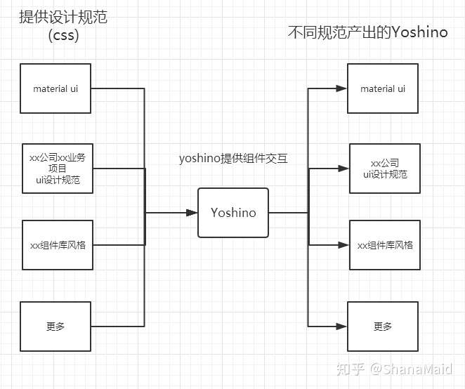
Yoshino is similar to Hexo.The different style components of yoshino are equal to Hexo various theme,Hexo official only provides a set of tools and a basic theme. Yoshino is also such.

Developers can output the components of the style they need, just like configuring the Hexo theme. You can even use cli to output multiple different styles of components in the same project.

Different themes of Yoshino need to be completed by the open source community, and the official will provide a similar yoshino-theme-site to show different themes, similar to hexojs/site

Currently the yoshino-cli tool only supports component creation outputs, such as creating custom Alert components.

yoshino new Alert

Later, yoshino-cli can output corresponding specification components through instructions similar to the following, such as outputting the Alert component of the material-ui specification.

yoshino new Alert --theme material-ui

Even a component library that directly outputs the entire theme.

yoshino new all --theme material-ui

✨Features

  • Develop with TypeScript, provide d.ts files to help developers increase development speed
  • Advocate the concept of OFA(one for all) and AFO(all for one), before project development by yoshino-cli. According to project ui, standardize the output of components.
  • In addition to the simple and generic ui component, yoshino draws out some of the more usable effects (features) components, such as
    • Helpers
    • Ripple
    • Transitions
  • Icon component based on archer-svgs, load on demand, only load .svg that you use

👍Contributos

💪Development process

npm run dev // 启动开发环境
npm run new ComponentName // 新建组件

🛠Ecosystem Links

💎Yoshino is Inspired or Powered By:

Note that the project description data, including the texts, logos, images, and/or trademarks, for each open source project belongs to its rightful owner. If you wish to add or remove any projects, please contact us at [email protected].