sabergeek / Android Material Design In Practice
Programming Languages
Projects that are alternatives of or similar to Android Material Design In Practice
Material Design in Practice.
Purpose
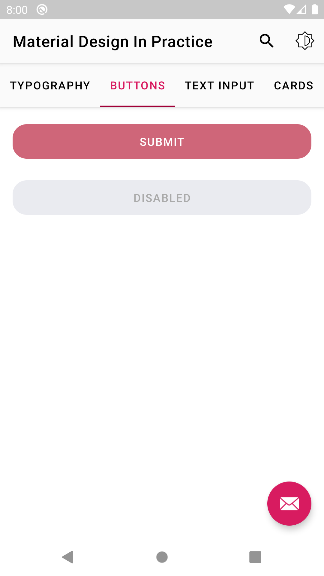
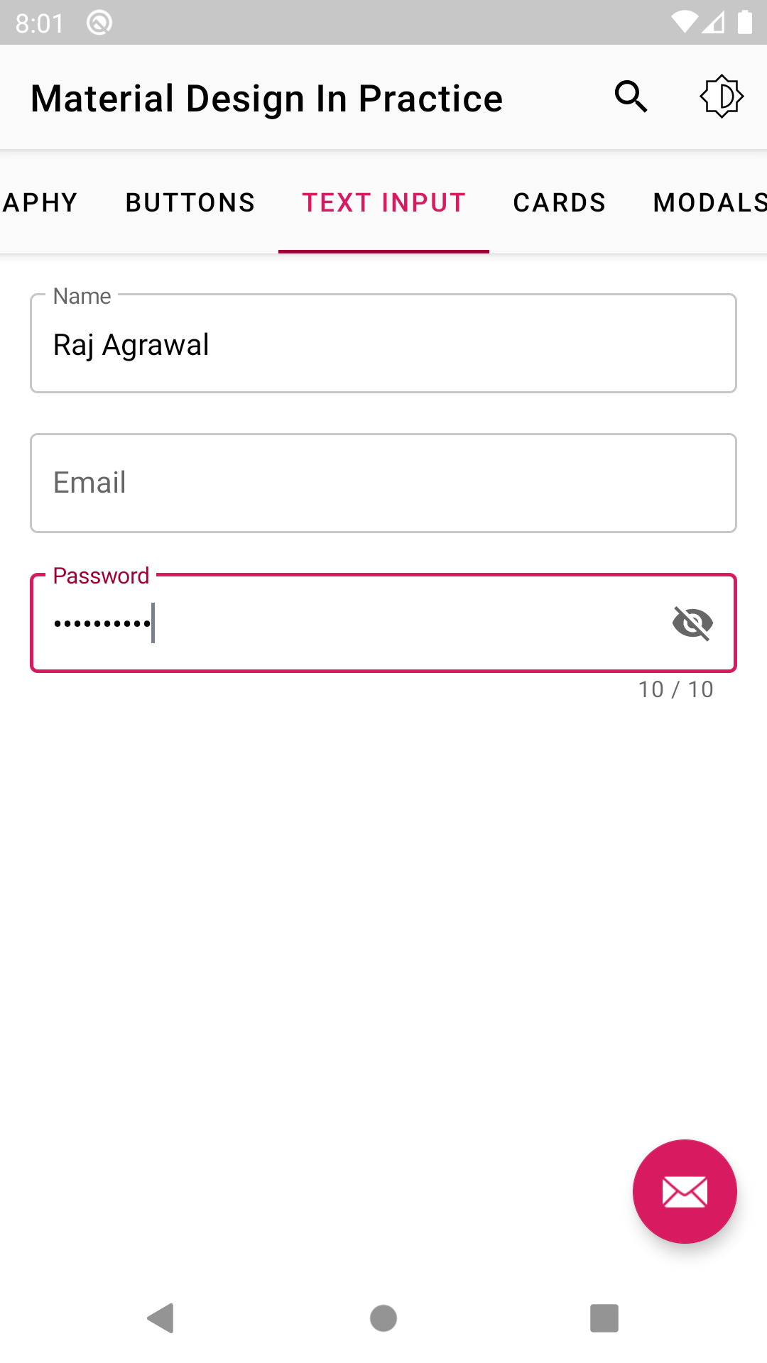
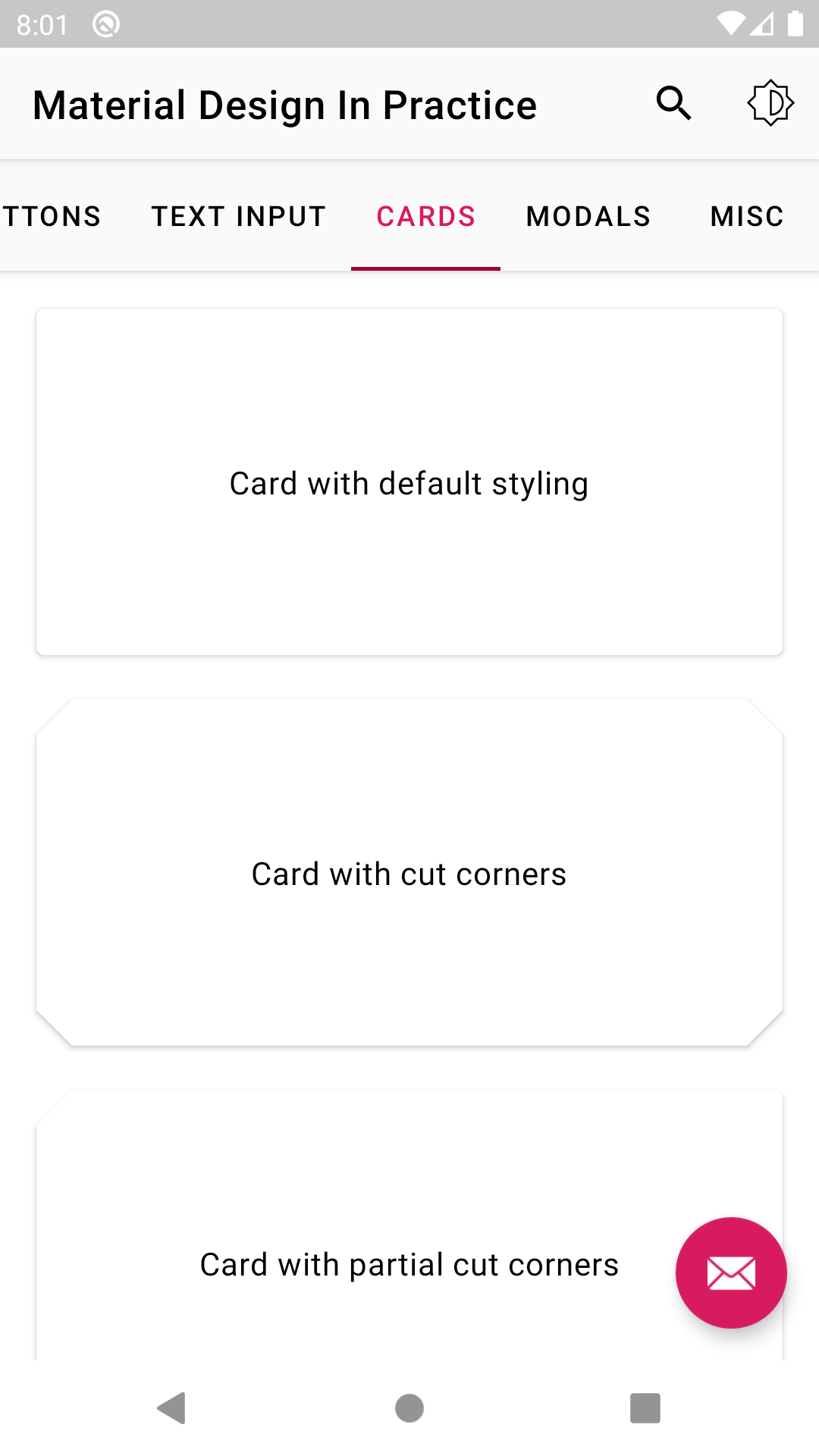
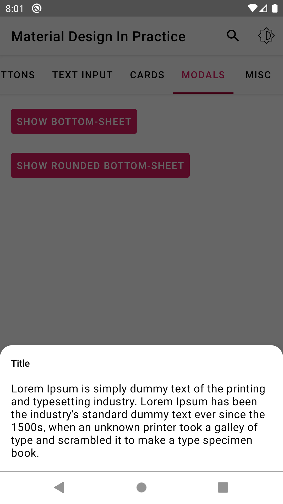
- Intended to be simple and practical - A project to demonstrate the usage of color palette, typography and shapes as per the material design guidelines. Also shares a method to properly scale text sizes.
Configuration
- Uses both app wide and view level theming.
- Min SDK support is API 16.
Usage
-
themes.xml - The app automatically looks into this file during runtime to skin itself - this is an important step to setup day/ night mode.
-
styles.xml - All view specific styles are neatly declared in this file.
-
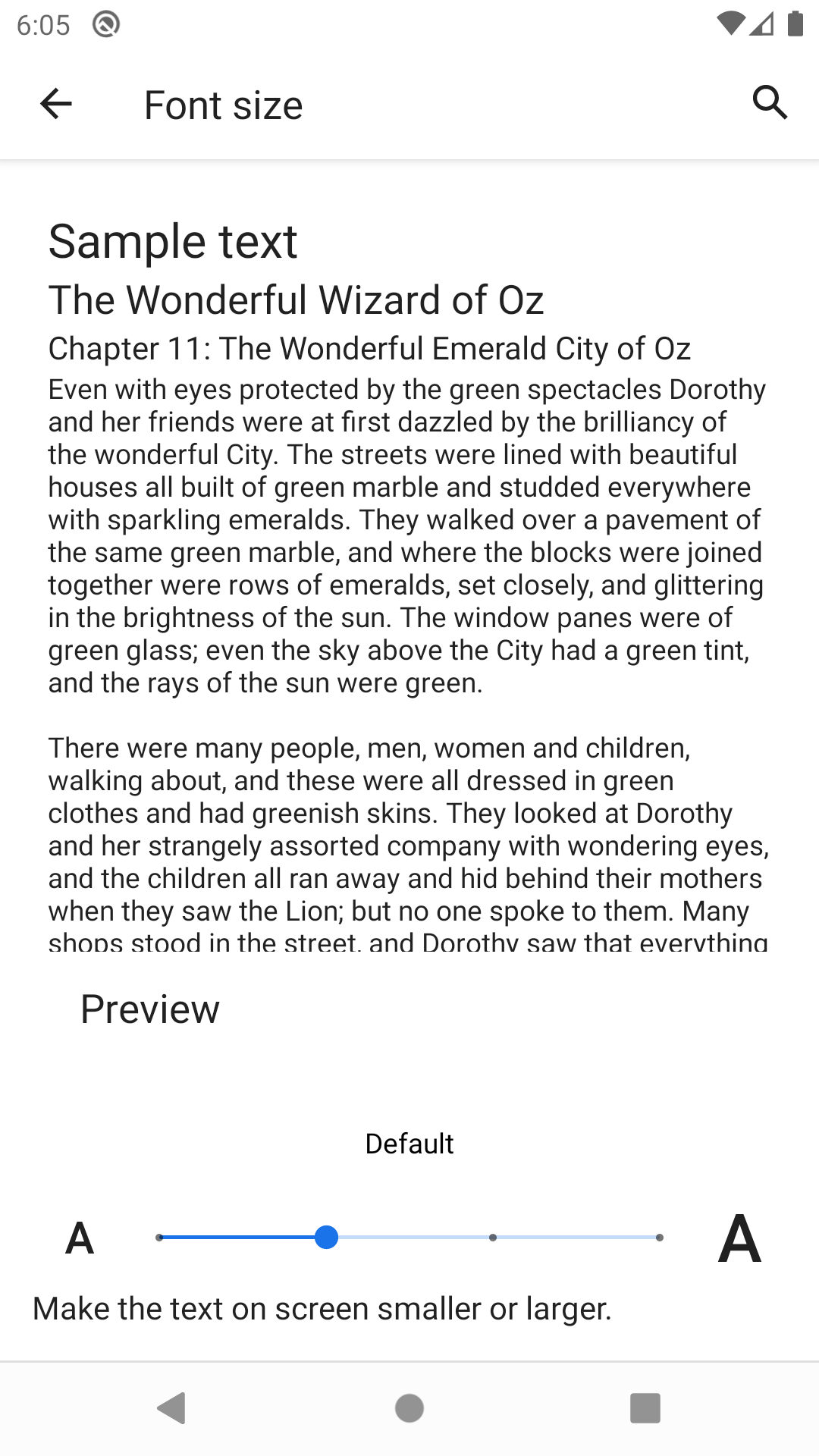
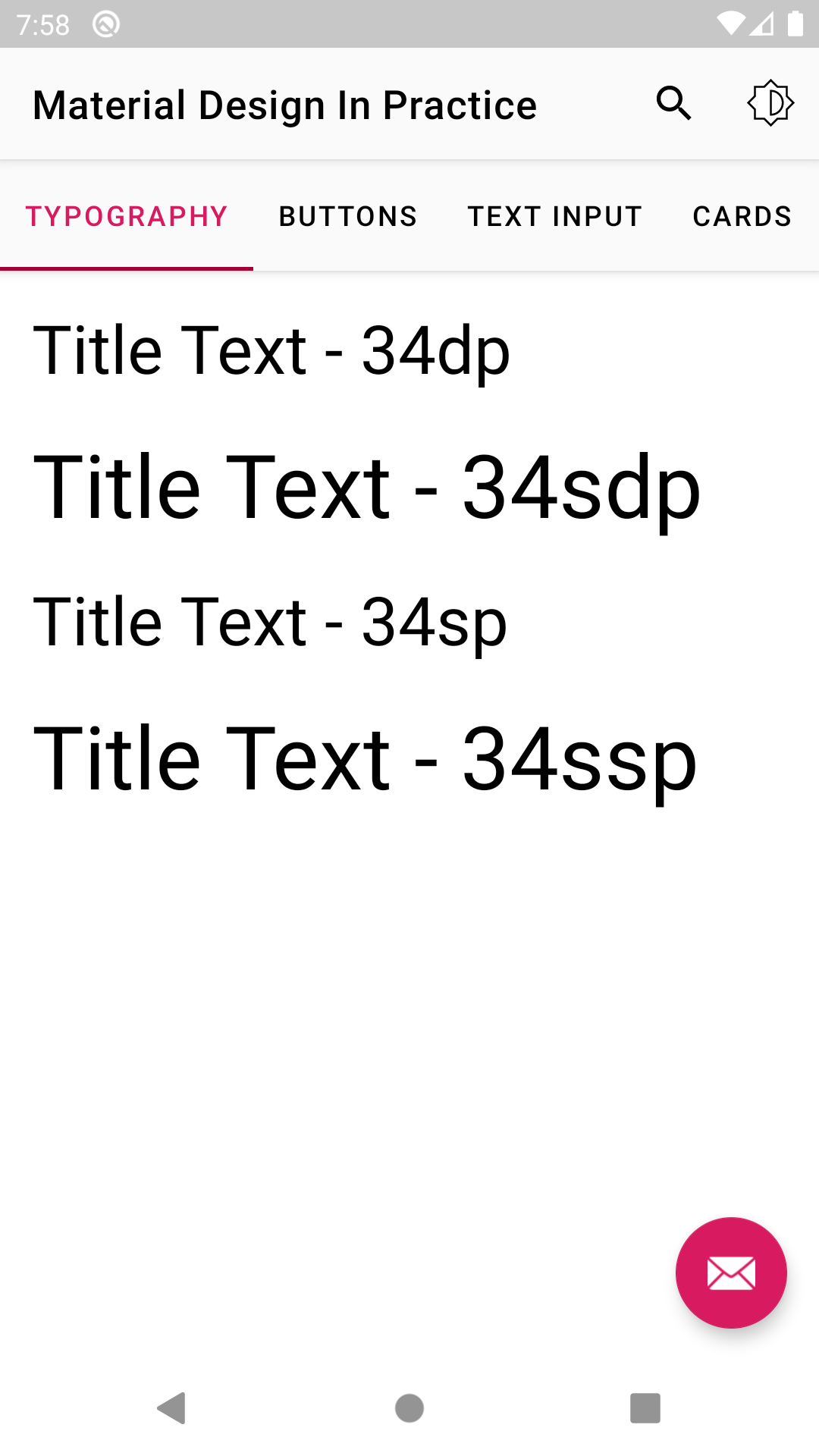
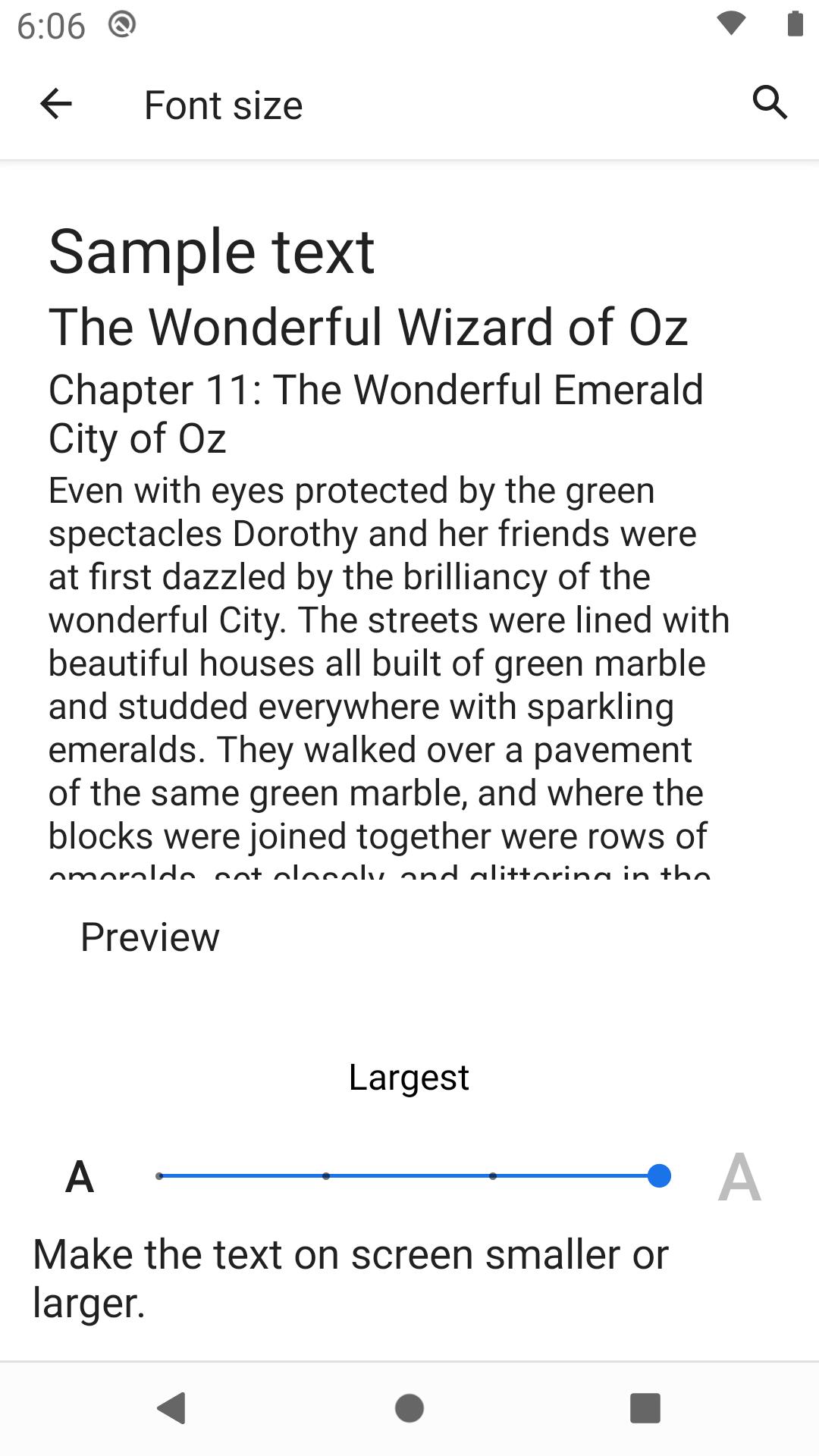
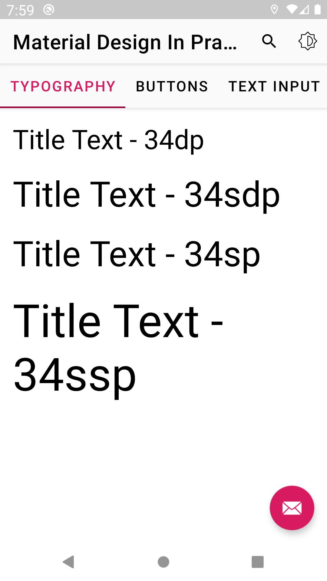
Scaling typography - This section contains 4 sizing variants for the text - sp, ssp, dp, sdp.
- "ssp and sdp" are good alternatives over "sp and dp" if you do not wish to manage varying dimens.xml. The intuit library has a bundle of pre-defined dimens.xml that handles it for you. Note that while developing for tablets, this may not be the best idea.
- The main difference you can see is that "sp and ssp" respond when user changes the font size from system settings. However, "dp and sdp" do not. Run the MDIP app, switch to typography tab and test it out yourself.
-
Easy color management - Use color palette generator tool for preparing a new color scheme, export to the Android format (color.xml) and use the color variables to replace the existing set in the project.
-
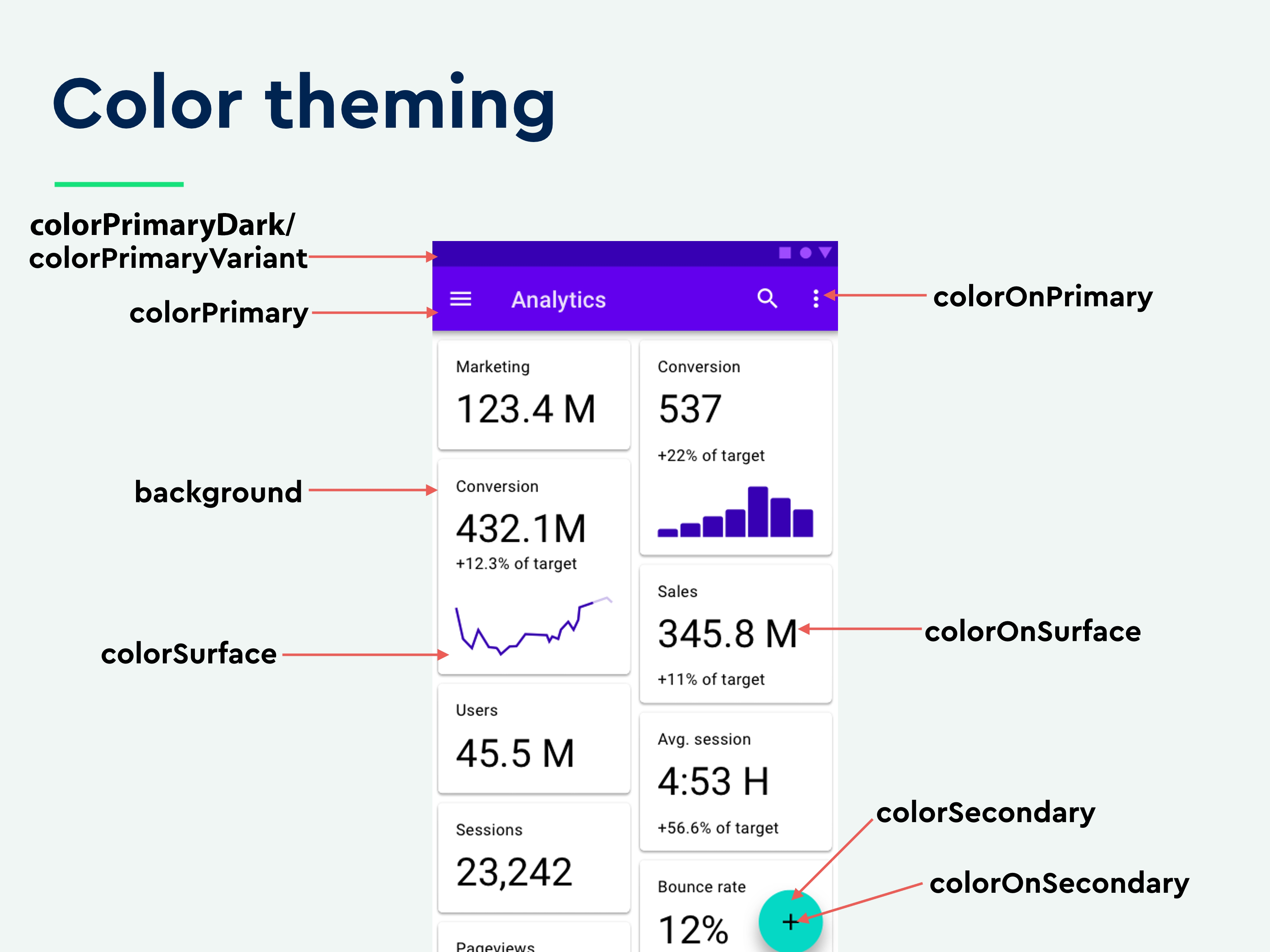
For applying app-wide default colors, you will be largely dealing with:
* colorPrimary * colorPrimaryDark/ colorPrimaryVariant * colorSecondary * colorSecondaryVariant * android:textColorPrimary * android:textColorSecondary * android:colorBackground -
If you wish to try different new schemes - simply replace the colors under "Base Color Scheme" and above "Other colors" in color.xml. You can leave 'Other colors' as it is, since they can be suitable for most cases.
-
Day/ Night mode - The app auto-switches to appropriate mode depending on system settings. You can override this by clicking the top right icon on toolbar. The widgets depend on ?colorName to look proper on day/ night mode. For instance, widget styles have colors defined with ?colorPrimary instead of a hard-coded @color/primaryColor. This means you're instructing the app to pick the defined color for ?colorPrimary in themes.xml (of day or night version) at runtime. And each of these files will contain different colors to suit day/ night mode.
-
App-wide widget theming - Take advantage of a new feature in the latest material design library that allows app-wide application of common styling for views from a single place - Refer to the base theme for an example.
Concept
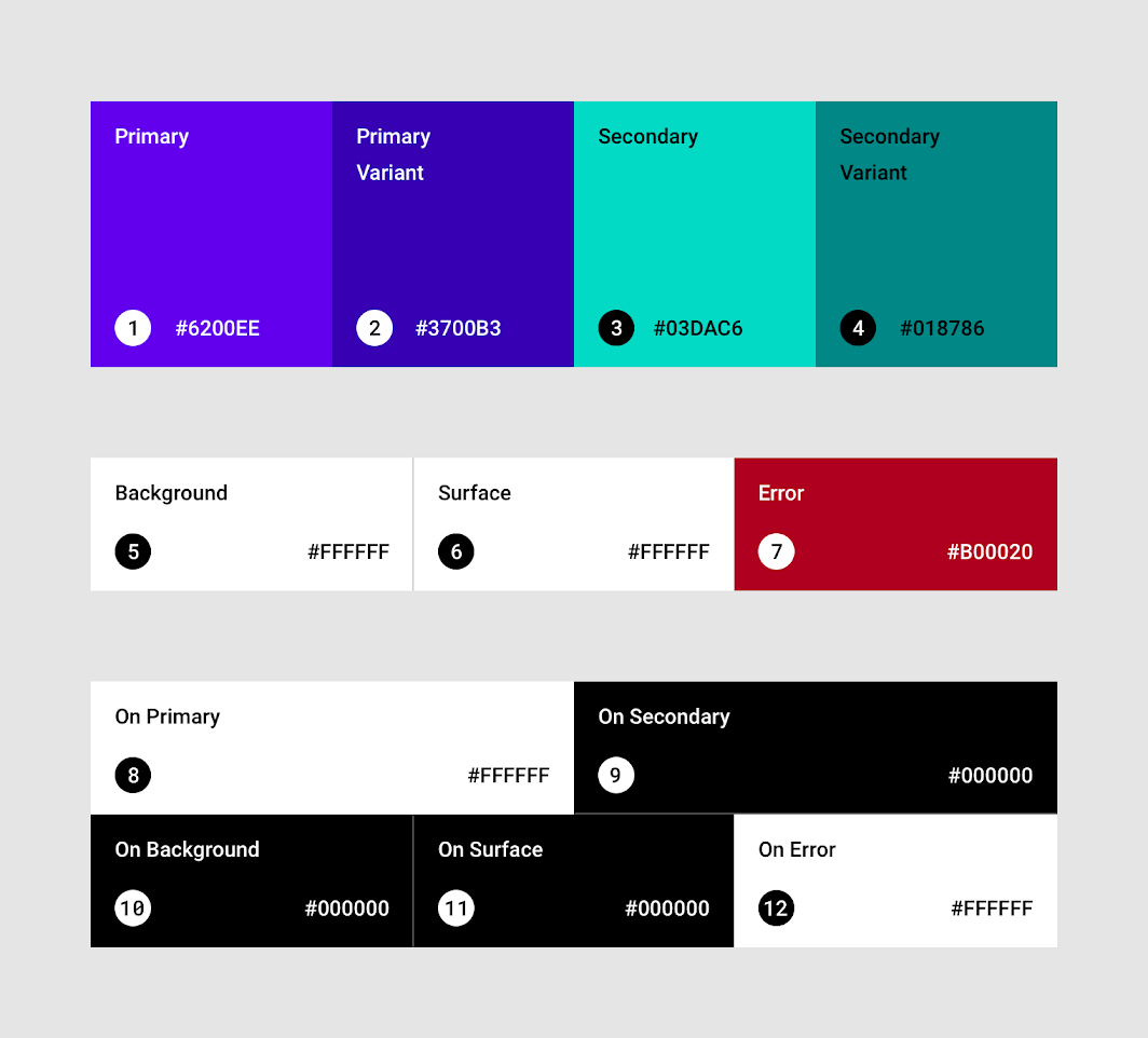
Concept applied:
(Slightly modified and sourced from: https://speakerdeck.com/anitas3791/styles-themes-material-theming-oh-my/em)
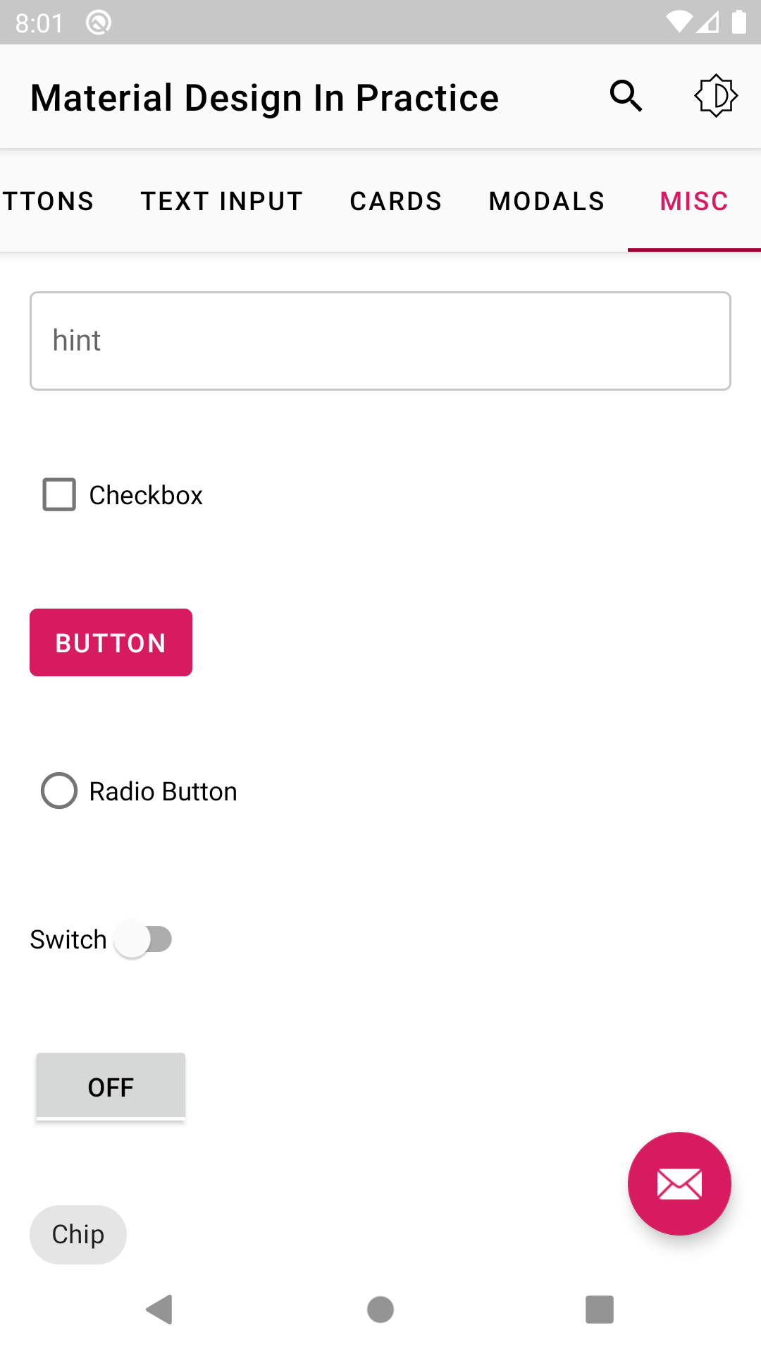
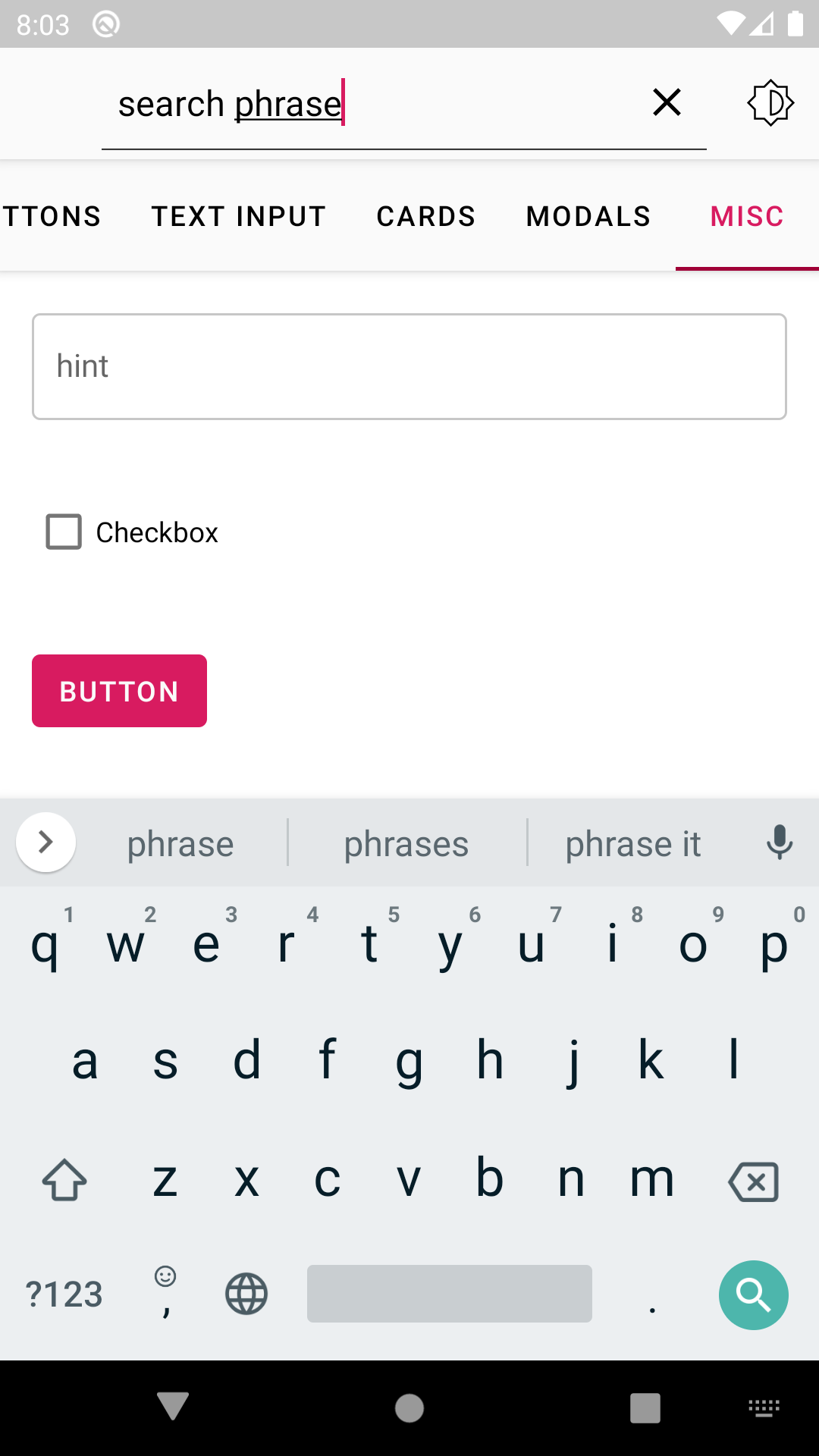
App screenshots - On Pixel 2, Android 10 (API 29), Day mode.
Caveats
- For unclear reasons, colorPrimaryVariant does NOT reflect on the status bar color despite the official material design guidelines - https://material.io/design/color/the-color-system.html#color-theme-creation. However, colorPrimaryDark DOES work (Issue tracker). So it's useful to maintain both variables even though they point to the exact same colors.
What's coming soon
- Material motion.
Try the demo app
Visit the releases section to download the latest iterations of the app.
References
- SSP library - https://github.com/intuit/ssp
- SDP library - https://github.com/intuit/sdp
- Color guide: https://material.io/design/color/the-color-system.html
- Color palette generator tool: https://material.io/resources/color
- Key lines and grids reference - https://www.youtube.com/watch?v=ESJuU2gp-P8
- Issue tracker : https://github.com/material-components/material-components-android/issues/468

