Kunzisoft / Android Switchdatetimepicker
Programming Languages
Projects that are alternatives of or similar to Android Switchdatetimepicker
Android SwitchDateTime Picker
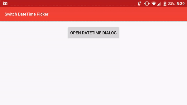
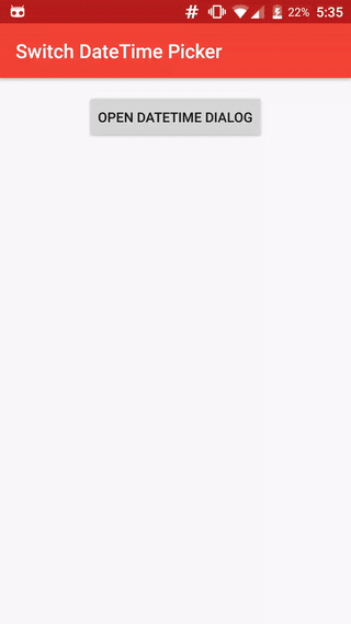
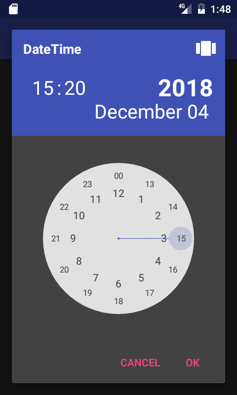
 SwitchDateTime Picker is a library for select a Date object in dialog with a DatePicker (Calendar) and a TimePicker (Clock) in the same UI.
Contributions
You can contribute in different ways to help us on our work.
- Add features by a pull request.
- Help to translate into your language
- Donate 人◕ ‿‿ ◕人Y for a better service and a quick development of your features.
Installation
Add the JitPack repository in your build.gradle at the end of repositories:
	allprojects {
		repositories {
			...
			maven { url "https://jitpack.io" }
		}
	}
And add the dependency
 replacing ${version} with the version number in jitpack
	dependencies {
	        compile 'com.github.Kunzisoft:Android-SwitchDateTimePicker:${version}'
	}
Usage
SimpleDateFormat for Day and Month
You can specify a particular SimpleDateFormat for value of Day and Month with setSimpleDateMonthAndDayFormat(SimpleDateFormat format) Warning, the format must satisfy the regular expression : (M|w|W|D|d|F|E|u|\s)* , for example dd MMMM
24 Hours mode
By default, time is in 12 hours mode, If you want a 24-hour display, use:
dateTimeFragment.set24HoursMode(true);
before the "show"
Hightligh selected AM / PM
In 24 hours mode, If you want to highlight the selected AM or PM, use :
dateTimeFragment.setHighlightAMPMSelection(true);
Start with a specific view
For launch Dialog with a specific view, call :
dateTimeFragment.startAtTimeView();, dateTimeFragment.startAtCalendarView(); or dateTimeFragment.startAtYearView();
before the "show"
Define minimum and maximum
For just allow selection after or/and before dates, use :
dateTimeFragment.setMinimumDateTime(Date minimum);
and
dateTimeFragment.setMaximumDateTime(Date maximum);
TimeZone
Optionally define a timezone :
dateTimeFragment.setTimeZone(TimeZone.getDefault());
Style
You can customize the style to change color, bold, etc... of each element.
You need to use a Theme.AppCompat theme (or descendant) with SwitchDateTime's activity. (compile 'com.android.support:appcompat-v7:25.1.0' in gradle)
In your styles.xml, you can redefine each style separately, but you must keep each item, for example : change size of "year label"
<resources>
    <!-- Base application theme. -->
    <style name="MyAppCustomTheme" parent="Theme.AppCompat.Light">
        <!-- Customize your theme here. -->
        <item name="colorPrimary">@color/colorPrimary</item>
        <item name="colorPrimaryDark">@color/colorPrimaryDark</item>
        <item name="colorAccent">@color/colorAccent</item>
    </style>

    <!-- SwitchDateTime style is independent, each element is optional-->
    <!-- Year Precise -->
    <style name="Theme.SwitchDateTime.DateLabelYear">
        <item name="android:textSize">58sp</item>
        <item name="android:textColor">#fff</item>
        <item name="android:textStyle">bold</item>
    </style>
</resources>
Styles elements : https://github.com/Kunzisoft/Android-SwitchDateTimePicker/blob/master/switchdatetime/src/main/res/values/styles.xml
AlertStyle
To customize the AlertDialog that is shown, use :
void setAlertStyle(@StyleRes int styleId)
Sample
You can see https://github.com/J-Jamet/Android-SwitchDateTimePicker/blob/master/sample/src/main/java/com/kunzisoft/switchdatetimesample/Sample.java for complete sample.
// Initialize
SwitchDateTimeDialogFragment dateTimeDialogFragment = SwitchDateTimeDialogFragment.newInstance(
        "Title example",
        "OK",
        "Cancel"
);

// Assign values
dateTimeDialogFragment.startAtCalendarView();
dateTimeDialogFragment.set24HoursMode(true);
dateTimeDialogFragment.setMinimumDateTime(new GregorianCalendar(2015, Calendar.JANUARY, 1).getTime());
dateTimeDialogFragment.setMaximumDateTime(new GregorianCalendar(2025, Calendar.DECEMBER, 31).getTime());
dateTimeDialogFragment.setDefaultDateTime(new GregorianCalendar(2017, Calendar.MARCH, 4, 15, 20).getTime());

// Define new day and month format
try {
    dateTimeDialogFragment.setSimpleDateMonthAndDayFormat(new SimpleDateFormat("dd MMMM", Locale.getDefault()));
} catch (SwitchDateTimeDialogFragment.SimpleDateMonthAndDayFormatException e) {
    Log.e(TAG, e.getMessage());
}

// Set listener
dateTimeDialogFragment.setOnButtonClickListener(new SwitchDateTimeDialogFragment.OnButtonClickListener() {
    @Override
    public void onPositiveButtonClick(Date date) {
        // Date is get on positive button click
        // Do something
    }

    @Override
    public void onNegativeButtonClick(Date date) {
        // Date is get on negative button click
    }
});

// Show
dateTimeDialogFragment.show(getSupportFragmentManager(), "dialog_time");
Neutral button

To use with a neutral button, initialize with another parameter and implement the OnButtonWithNeutralClickListener :
SwitchDateTimeDialogFragment dateTimeDialogFragment = SwitchDateTimeDialogFragment.newInstance(
        "Title example",
        "OK",
        "Cancel",
        "Clean"
);

dateTimeFragment.setOnButtonClickListener(new SwitchDateTimeDialogFragment.OnButtonWithNeutralClickListener() {
    @Override
    public void onPositiveButtonClick(Date date) {
    }

    @Override
    public void onNegativeButtonClick(Date date) {
    }

    @Override
    public void onNeutralButtonClick(Date date) {
    }
});
Bonus
You can follow the project live on https://www.livecoding.tv/kunzisoft/
License
Copyright (c) 2016 JAMET Jeremy
Licensed under the Apache License, Version 2.0 (the "License"); you may not use this file except in compliance with the License. You may obtain a copy of the License at
http://www.apache.org/licenses/LICENSE-2.0
Unless required by applicable law or agreed to in writing, software distributed under the License is distributed on an "AS IS" BASIS, WITHOUT WARRANTIES OR CONDITIONS OF ANY KIND, either express or implied. See the License for the specific language governing permissions and limitations under the License.