teambit / Base Ui
Programming Languages
Base component design system of Bit.dev
The reusable set of infra-level React components used to build Bit.dev.
Components
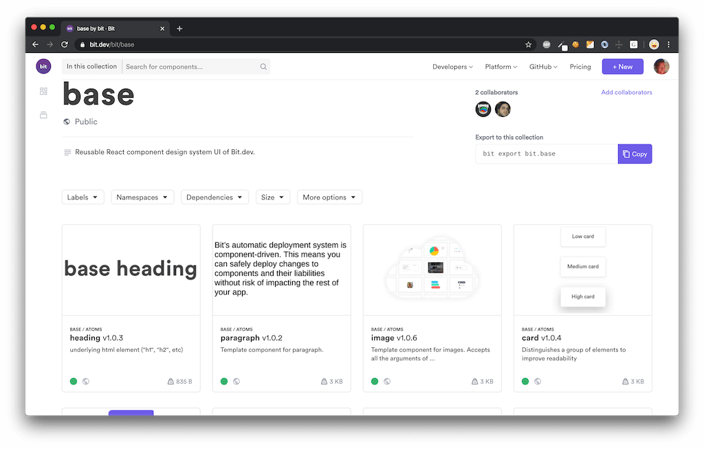
All components in this frontend codebase were contained and exposed using Bit as a set of independently-usable components. See the base collection on bit.dev to explore and integrate any component into your project.
- Install independent components with npm/yarn.
- Use
bbit importto source and edit components locally for quick editing and integration. - Try any component hands-on in a live playground.
This is a component-based micro-frontend
Wait.. what?
- Install independent components with
bbit install - Use
bbit importto explore components in your local workspace and modify them to your own needs. - Try any component hands-on in the docs' live playground and in the 'compositions' page.
Show me an example!
Take a look at the bit.dev homepage.
You will notice that it's built from components that live in different front-end codebases:
- "Evangelist" marketing components.
- base-ui components.
- Container application (private).
- etc
We use Bit to contain and expose components from any codebase as a set of APIs in bit.dev that can be integrated into different pages and applications. For example:
- Exposed ["Evangelist" marketing components] on bit.dev.
- Exposed base-ui components on bit.dev.
Structure:
Theme
All shared styles, colors, sizes, fonts, and css variables, belong here.
Theme-provider applies all of these styles at the root of your app, and different apps may implement their own unique theme.
Constants
Hard coded singleton values, like storage-url and enums. In case of change, this central location could update all other components.
Layout
Components controlling the position of elements in the document. (Grid, breakpoints, etc)
Atoms
Generic building blocks for any front end application.
These components are 'vanilla', meaning they should not contain content (like texts or icons) and no specific styles. This is because different designs could look entirely different, so any styles in the base component could lead to a 'CSS Specificity War'. So, add the bare minimum of css here and keep these components purely logical!
Utils
Pure logic components and helpers. (no visual components)
Setup
- Install Bit:
npm install @teambit/bit --global - Clone this Bit Workspace:
git clone https://github.com/teambit/evangelist.git evangelist - Go to the workspace directory:
cd evangelist - Install all packages and import all components:
bbit install - Run the Workspace UI to explore the Evangalist components:
bbit startand go to https://localhost:3000 - Enjoy!


