nightsense / Carbonized
This repository has been superseded by vimspectr.
.
.
.
carbonized
A vim theme inspired by the Carbon keycap set by T0mb3ry.
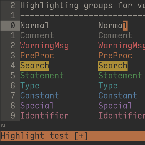
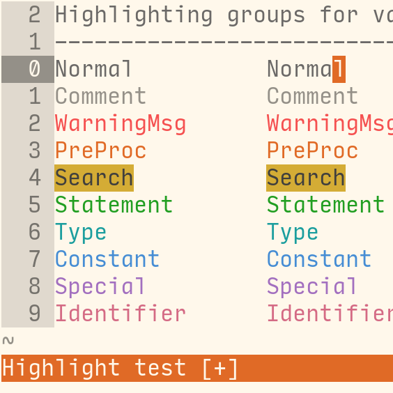
screenshots
| carbonized-dark | carbonized-light |
 |
 |
pictured font: Input Mono Narrow (1.2x line spacing)
setup
installation
While vim themes can be installed manually (place theme file in ~/.vim/colors/), a plugin helper is recommended.
If you don’t have a preferred helper, consider trying vim-plug, which can be installed with:
curl -fLo ~/.vim/autoload/plug.vim --create-dirs \
  https://raw.githubusercontent.com/junegunn/vim-plug/master/plug.vim
To install carbonized using vim-plug, add the following to the top of your vimrc:
call plug#begin('~/.vim/plugged')
Plug 'nightsense/carbonized'
call plug#end()
Then restart vim and run PlugUpdate (from the vim command line).
activation
To activate the carbonized theme, add one of the following lines to your vimrc:
colorscheme carbonized-lightcolorscheme carbonized-dark
To activate the lightline theme, add one of the following lines to your lightline config:
\ 'colorscheme': 'carbonized_light',\ 'colorscheme': 'carbonized_dark',
To assign themes to specific intervals of the day, try the night-and-day plugin.
options
You can tweak the following options by adding lines to your `vimrc’.
Disable highlighted current line number:
let g:carbonized_dark_CursorLineNr = 'off'
let g:carbonized_light_CursorLineNr = 'off'
Disable the highlighted line number background:
let g:carbonized_dark_LineNr = 'off'
let g:carbonized_light_LineNr = 'off'
terminal vim
See the nightshell repository, which allows carbonized to be used in a variety of terminal applications.
palette
carbonized consists of 8 theme-distinct base colours, which are used for most interface elements, and 8 standard accent colours (common to the “nightsense theme family”) used for syntax highlighting.
- hues were selected at the scale of 1/48 (7.5°) colour wheel intervals
- saturations and values were selected at the scale of 1/24 (4.17%)
- the ISO 3:1 contrast standard is met by nearly all text/background combinations, exceptions being made for some transient-highlighted backgrounds (e.g. cursorcolumn, cursorline)
| base | light accents | dark accents |
|---|---|---|
2b2b2b |
f55050 |
bf5858
|
3b3b37 |
e06a26 |
b56f45
|
75756e |
d4ac35 |
ab8e38
|
8a8a81 |
219e21 |
508a50
|
9e9e95 |
1b9e9e |
458a8a
|
b5b5aa |
468dd4 |
557b9e
|
f0f0e1 |
a26fbf |
8b6a9e
|
fffff0 |
d46a84 |
ab6a7a
|
![]() Red, the colour of alarm, is used for warning elements, including error messages, misspellings, and diff deletions.
Red, the colour of alarm, is used for warning elements, including error messages, misspellings, and diff deletions.
![]() Orange, the colour of fire, can be associated with the preliminary “warmup” phase of some activity; literally, this could be the heating-up of a hearth for forging, or a stove for cooking. Orange is therefore used for preliminary elements, such as preprocessor commands (which prepare data to be handled by another program), incremental searching (that is, a search term in the process of being typed), titles, and miscapitalized words.
Orange, the colour of fire, can be associated with the preliminary “warmup” phase of some activity; literally, this could be the heating-up of a hearth for forging, or a stove for cooking. Orange is therefore used for preliminary elements, such as preprocessor commands (which prepare data to be handled by another program), incremental searching (that is, a search term in the process of being typed), titles, and miscapitalized words.
![]() Yellow, the classic highlighting colour, is applied to elements that are not warnings, yet should draw attention with high visibility. These highlighted elements include search results, task tags (
Yellow, the classic highlighting colour, is applied to elements that are not warnings, yet should draw attention with high visibility. These highlighted elements include search results, task tags (TODO, FIXME…), and diff changes.
![]() Green, the colour that says “go ahead, proceed with the task at hand”, is used for action elements, such as statements (if/then, while/do, case…), mode indicators (insert, visual…), vim user prompts, and diff additions.
Green, the colour that says “go ahead, proceed with the task at hand”, is used for action elements, such as statements (if/then, while/do, case…), mode indicators (insert, visual…), vim user prompts, and diff additions.
![]() Teal is named after the “common teal”, a kind of duck, thus connecting this colour with the concept of “species”, which is a means of classifying life into very specific types. Teal is therefore used for specifying object types, such as data type (boolean, integer, string…) or storage class (static, volatile…), as well as marking mislocalized words (that is, words that are not misspelled but of the wrong type, namely a foreign locale type).
Teal is named after the “common teal”, a kind of duck, thus connecting this colour with the concept of “species”, which is a means of classifying life into very specific types. Teal is therefore used for specifying object types, such as data type (boolean, integer, string…) or storage class (static, volatile…), as well as marking mislocalized words (that is, words that are not misspelled but of the wrong type, namely a foreign locale type).
![]() Blue, a colour of calm stability, is used for constants, which come in the form of boolean values, integers, floating-point numbers, characters, and strings.
Blue, a colour of calm stability, is used for constants, which come in the form of boolean values, integers, floating-point numbers, characters, and strings.
![]() Purple, often associated with (historically) rare purple dyes produced for special works of art, is used for special text, including special characters (standalone or within syntax units), vim tags, and debugging statements. Rarely-used words are also marked, allowing the writer to consider whether such a specially uncommon word is appropriate.
Purple, often associated with (historically) rare purple dyes produced for special works of art, is used for special text, including special characters (standalone or within syntax units), vim tags, and debugging statements. Rarely-used words are also marked, allowing the writer to consider whether such a specially uncommon word is appropriate.
![]() Pink, the colour of spring blossoms, is used for object names, including the names of variables and functions. To code is to bring countless objects blossoming into life as one types their names.
Pink, the colour of spring blossoms, is used for object names, including the names of variables and functions. To code is to bring countless objects blossoming into life as one types their names.
