AndreiMisiukevich / Cardview
Projects that are alternatives of or similar to Cardview
GIF
| CardsView | CarouselView | CoverFlowView | CubeView |
|---|---|---|---|
 |
 |
 |
 |
| ScaleFactor & OpacityFactor | ScaleFactory & OpacityFactor [2] | TabsControl |
|---|---|---|
 |
 |
 |
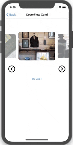
- CoverFlowView sample: https://github.com/AndreiMisiukevich/CardView/blob/master/PanCardViewSample/PanCardViewSample/Views/CoverFlowSampleXamlView.xaml
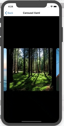
- CarouselView sample: https://github.com/AndreiMisiukevich/CardView/blob/master/PanCardViewSample/PanCardViewSample/Views/CarouselSampleXamlView.xaml
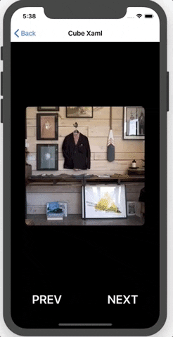
- CubeView sample: https://github.com/AndreiMisiukevich/CardView/blob/master/PanCardViewSample/PanCardViewSample/Views/CubeSampleXamlView.xaml
- CardsView sample: https://github.com/AndreiMisiukevich/CardView/blob/master/PanCardViewSample/PanCardViewSample/Views/CardsSampleView.cs
Setup
- Available on NuGet: CardsView

- Add nuget package to your Xamarin.Forms .NETSTANDARD/PCL project and to your platform-specific projects
- Add (AFTER
Forms.Init(...)):- CardsViewRenderer.Preserve() AppDelegate in FinishedLaunching for iOS
- CardsViewRenderer.Preserve() MainActivity in OnCreate for Android
| Platform | Version |
|---|---|
| Xamarin.iOS | iOS 7+ |
| Xamarin.Mac | All |
| Xamarin.Android | API 15+ |
| Windows 10 UWP | 10+ |
| Tizen | 4.0+ |
| Gtk | All |
| WPF | .NET 4.5 |
| .NET Standard | 2.0+ |
C#:
-> Create CardsView and setup it
var cardsView = new CardsView
{
    ItemTemplate = new DataTemplate(() => new ContentView()) //your template
};
cardsView.SetBinding(CardsView.ItemsSourceProperty, nameof(PanCardSampleViewModel.Items));
cardsView.SetBinding(CardsView.SelectedIndexProperty, nameof(PanCardSampleViewModel.CurrentIndex));
-> Optionaly you can create ViewModel... or not... as you wish
-> Indicators bar (For CarouselView, perhaps). It's easy to add indicators -> Just add IndicatorsControl into your carouselView as a child view.
carouselView.Children.Add(new IndicatorsControl());
XAML:
<cards:CarouselView
    ItemsSource="{Binding Items}"
    SelectedIndex="{Binding CurrentIndex}">
    <cards:CarouselView.ItemTemplate>
        <DataTemplate>
            <ContentView>
                <Frame
                    VerticalOptions="Center"
                    HorizontalOptions="Center"
                    HeightRequest="300"
                    WidthRequest="300"
                    Padding="0"
                    HasShadow="false"
                    IsClippedToBounds="true"
                    CornerRadius="10"
                    BackgroundColor="{Binding Color}">

                    <Image Source="{Binding Source}"/>

                </Frame>
            </ContentView>
        </DataTemplate>
    </cards:CarouselView.ItemTemplate>

    <controls:LeftArrowControl/>
    <controls:RightArrowControl/>
    <controls:IndicatorsControl/>
</cards:CarouselView>
Also you are able to manage IndicatorsControl appearing/disappearing. For example if user doesn't select new page during N miliseconds, the indicators will disappear. Just set ToFadeDuration = 2000 (2 seconds delay before disappearing) Yoy manage LeftArrowControl and RightArrowControl as well as IndicatorsControl (ToFadeDuration is presented too).
Indicators styling:
 <ContentPage.Resources>
    <ResourceDictionary>
        <Style x:Key="ActiveIndicator" TargetType="Frame">
            <Setter Property="BackgroundColor" Value="Red" />
        </Style>
        <Style x:Key="InactiveIndicator" TargetType="Frame">
            <Setter Property="BackgroundColor" Value="Transparent" />
            <Setter Property="OutlineColor" Value="Red" />
        </Style>
    </ResourceDictionary>
</ContentPage.Resources>

...

<controls:IndicatorsControl ToFadeDuration="1500"
          SelectedIndicatorStyle="{StaticResource ActiveIndicator}"
          UnselectedIndicatorStyle="{StaticResource InactiveIndicator}"/>
if you want to add items directly through xaml
...
    <cards:CarouselView.ItemsSource>
            <x:Array Type="{x:Type View}">
                <ContentView>
                    <Image Source="yourImage.png"/>
                </ContentView>
                <RelativeLayout>
                    <Button Text="Click" />
                </RelativeLayout>
                <StackLayout>
                    <Label Text="any text"/>
                </StackLayout>
            </x:Array>
    </cards:CarouselView.ItemsSource>
...
if you want to achieve scale or opacity changing effects for side views (ScaleFactor & OpacityFactor), you should mange corresponding properties in processor and pass them to view constructor via x:Arguments:
<ContentPage
    ...
    xmlns:cards="clr-namespace:PanCardView;assembly=PanCardView"
    xmlns:proc="clr-namespace:PanCardView.Processors;assembly=PanCardView">

...

<cards:CoverFlowView
      PositionShiftValue="145"
      ItemsSource="{Binding Items}">

      <x:Arguments>
          <proc:CoverFlowProcessor ScaleFactor="0.75" OpacityFactor="0.25" />
      </x:Arguments>

  <cards:CoverFlowView.ItemTemplate>
      <DataTemplate>
         <Frame
             Margin="80">

              ....

          </Frame>
      </DataTemplate>
  </cards:CoverFlowView.ItemTemplate>

</cards:CoverFlowView>

...
-> If you want to customize indicators, you need set SelectedIndicatorStyle and/or UnselectedIndicatorStyle, or you are able to extend this class and override several methods. Also you can customize position of indicators (You need to set Rotation / AbsoluteLayout Flags and Bounds etc.)
This class is describing default indicators styles (each default indicator item is Frame) https://github.com/AndreiMisiukevich/CardView/blob/master/PanCardView/Styles/DefaultIndicatorItemStyles.cs
MORE SAMPLES you can find here https://github.com/AndreiMisiukevich/CardView/tree/master/PanCardViewSample
Custom Animations
You are able to create custom animations, just implement IProcessor or extend existing processors (change animation speed or type etc.) https://github.com/AndreiMisiukevich/CardView/tree/master/PanCardView/Processors
Workarounds
-> If you want to put your cardsView/carouselView INTO a TabbedPage on Android:
- Add an event handler for the
UserInteractionevent - On
UserInteractionStatus.Started: Disable TabbedPage Swipe Scrolling - On
UserInteractionStatus.Ending/Ended: Enabled TabbedPage Swipe Scrolling
Example:
- TabbedPage:
public partial class TabbedHomePage : Xamarin.Forms.TabbedPage
{
    public static TabbedHomePage Current { get; private set; }

    public TabbedHomePage()
    {
        Current = this;
    }

    public static void DisableSwipe()
    {
        Current.On<Android>().DisableSwipePaging();
    }

    public static void EnableSwipe()
    {
        Current.On<Android>().EnableSwipePaging();
    }
}
- Page with CardsView/CarouselView:
public PageWithCarouselView()
{
    InitializeComponent();

    carouselView.UserInteracted += CarouselView_UserInteracted;
}

private void CarouselView_UserInteracted(PanCardView.CardsView view, PanCardView.EventArgs.UserInteractedEventArgs args)
{
    if (args.Status == PanCardView.Enums.UserInteractionStatus.Started)
    {
        TabbedHomePage.DisableSwipe();
    }
    if (args.Status == PanCardView.Enums.UserInteractionStatus.Ended)
    {
        TabbedHomePage.EnableSwipe();
    }
}
-> If you don't want to handle vertical swipes or they interrupt your scrolling, you can set IsVerticalSwipeEnabled = "false"
-> If all these tricks didn't help you, you may use IsPanInteractionEnabled = false This trick disables pan interaction, but preserve ability to swipe cards.
-> If you get crashes during ItemsSource update, try to add/set items in Main Thread (Device.BeginInvokeOnMainThread)
-> GTK use click / double click for forward/back navigation.
Check source code for more info, or just ask me =)
Full documentation
https://github.com/AndreiMisiukevich/CardView/tree/master/docs
License
The MIT License (MIT) see License file
Contribution
Feel free to create issues and PRs 😃