msasikanth / Colorsheet
Licence: apache-2.0
A color picker bottom sheet 🌈
Stars: ✭ 179
Programming Languages
kotlin
9241 projects
Projects that are alternatives of or similar to Colorsheet
Color Studio
It is too hard to build coherent and accessible themes with the right colors. This should help.
Stars: ✭ 289 (+61.45%)
Mutual labels: material-design, color-picker
Simpledialogfragments
A collection of easy to use and extendable DialogFragment's for Android
Stars: ✭ 94 (-47.49%)
Mutual labels: material-design, color-picker
Pickr
🎨 Flat, simple, multi-themed, responsive and hackable Color-Picker library. No dependencies, no jQuery. Compatible with all CSS Frameworks e.g. Bootstrap, Materialize. Supports alpha channel, rgba, hsla, hsva and more!
Stars: ✭ 3,759 (+2000%)
Mutual labels: material-design, color-picker
Md2
Angular2 based Material Design components, directives and services are Accordion, Autocomplete, Collapse, Colorpicker, Datepicker, Dialog(Modal), Menu, Multiselect, Select, Tabs, Tags(Chips), Toast and Tooltip.
Stars: ✭ 389 (+117.32%)
Mutual labels: material-design, color-picker
Colordrop
Interactive Drag & Drop Coloring with Material Design Color palette
Stars: ✭ 120 (-32.96%)
Mutual labels: material-design, color-picker
Material Components Android
Modular and customizable Material Design UI components for Android
Stars: ✭ 13,128 (+7234.08%)
Mutual labels: material-design
Ha client
It was the first Home Assistant fully native Android client from the times when there was no any official alternatives
Stars: ✭ 166 (-7.26%)
Mutual labels: material-design
React Native Color
Color components for React Native 🌈
Stars: ✭ 178 (-0.56%)
Mutual labels: color-picker
Flutter kart
Sample flutter project based on udmey tutorial
Stars: ✭ 174 (-2.79%)
Mutual labels: material-design
Material Design Guideline
A library for Android developers who want to create layout which follows Google material design principle.
Stars: ✭ 170 (-5.03%)
Mutual labels: material-design
Xamarin.forms.backgroundkit
🔨 A powerful Kit for customizing the background of Xamarin.Forms views
Stars: ✭ 167 (-6.7%)
Mutual labels: material-design
Morpheus
A Flutter package for easily implementing Material Design navigation transitions.
Stars: ✭ 177 (-1.12%)
Mutual labels: material-design
React Selectrix
A beautiful, materialized and flexible React Select control
Stars: ✭ 166 (-7.26%)
Mutual labels: material-design
Materialdesign2
A beautiful app designed with Material Design 2 using Android X.
Stars: ✭ 170 (-5.03%)
Mutual labels: material-design
React Native Paper Dates
Smooth and fast cross platform Material Design date and time picker for React Native Paper
Stars: ✭ 173 (-3.35%)
Mutual labels: material-design
ColorSheet
A color picker bottom sheet
implementation "dev.sasikanth:colorsheet:1.0.1"
Usage
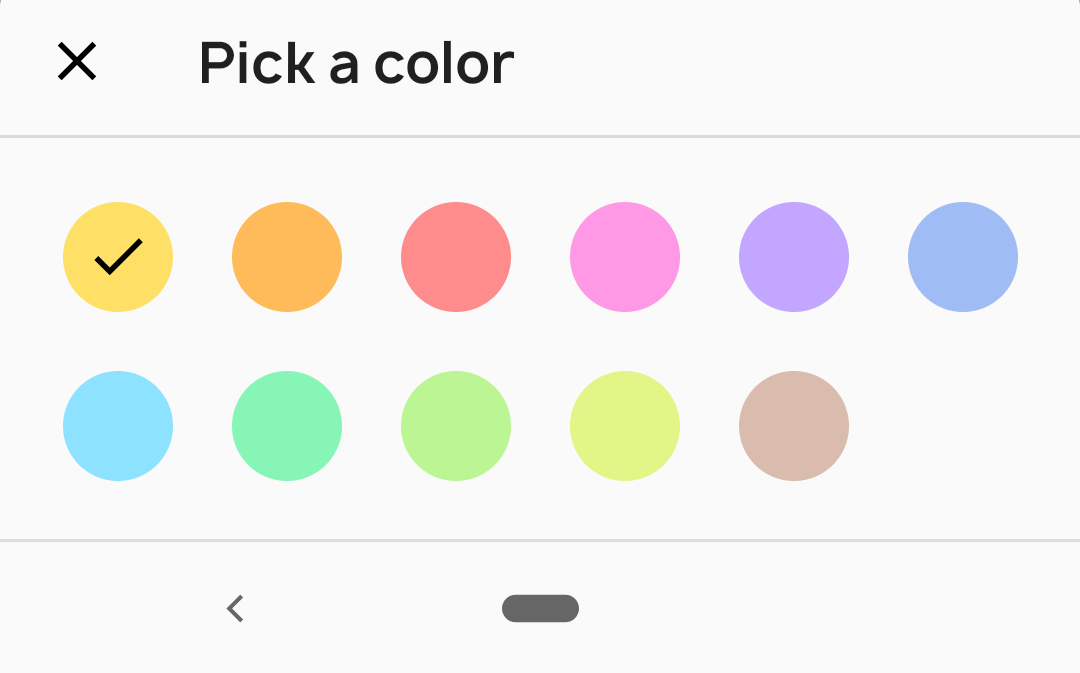
Default color sheet, it will show grid of colors

ColorSheet().colorPicker(
    colors = colors,
    listener = { color ->
        // Handle color
    })
    .show(supportFragmentManager)
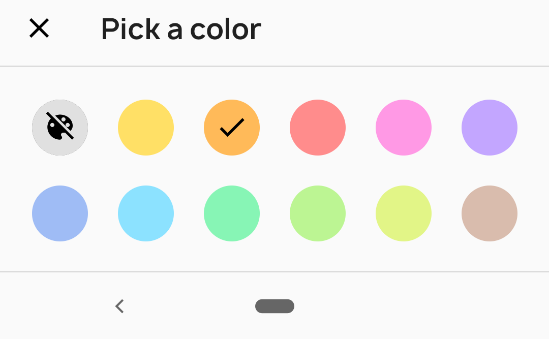
Color sheet with "no color" option

ColorSheet().colorPicker(
    colors = colors,
    noColorOption = true,
    listener = { color ->
        // Handle color
    })
    .show(supportFragmentManager)
With this you will get a no color option at start, when user selects this it will return ColorSheet.NO_COLOR.
To mark the color as selected in color sheet, specify selectedColor in colorPicker
ColorSheet().colorPicker(
    colors = colors,
    selectedColor = color,
    listener = { color ->
        // Handle color
    })
    .show(supportFragmentManager)
Misc
Corner radius Default corner radius is 4dp. You can set your own corner radius like this
ColorSheet().cornerRadius(radius)
Color to Hex string
ColorSheetUtils.colorToHex(color)
Sheet title textAppearance
    <style name="AppTheme" parent="Theme.MaterialComponents">
        <item name="colorSheetTitleFont">@font/font</item>
        <item name="colorSheetTitleLineHeightHint">@dimen/line_height_hint</item> // in sp
        <item name="colorSheetTitleLetterSpacing">0</item>
    </style>
License
Copyright 2019 Sasikanth Miriyampalli

Licensed under the Apache License, Version 2.0 (the "License");
you may not use this file except in compliance with the License.
You may obtain a copy of the License at

   http://www.apache.org/licenses/LICENSE-2.0

Unless required by applicable law or agreed to in writing, software
distributed under the License is distributed on an "AS IS" BASIS,
WITHOUT WARRANTIES OR CONDITIONS OF ANY KIND, either express or implied.
See the License for the specific language governing permissions and
limitations under the License.
Note that the project description data, including the texts, logos, images, and/or trademarks,
for each open source project belongs to its rightful owner.
If you wish to add or remove any projects, please contact us at [email protected].

