HeyAlex / Cornersheet
Programming Languages
Projects that are alternatives of or similar to Cornersheet
Corner Sheet
Behavior to make a view expands from corner
Usage
The usage is similar to BottomSheetBehavior Corner Sheet - behavior that allow you expand a view from corner.
 A simple view with behavior in xml will be look like:
<androidx.coordinatorlayout.widget.CoordinatorLayout
    android:id="@+id/coordinator"
    android:layout_width="match_parent"
    android:layout_height="match_parent">

        <FrameLayout
            android:id="@+id/corner_behavior_container"
            android:layout_width="match_parent"
            android:layout_height="match_parent"
            app:backgroundTint="@color/colorPrimary"
            app:behavior_expanded_width="175dp"
            app:behavior_horizontal_peekHeight="94dp"
            app:behavior_peekHeight="60dp"
            app:layout_behavior="com.github.heyalex.cornersheet.behavior.CornerSheetBehavior"
            app:shapeAppearanceOverlay="@style/ShapeAppearanceOverlay.CornerShape"
            tools:ignore="MissingPrefix">

            <androidx.appcompat.widget.Toolbar
                android:layout_width="match_parent"
                android:layout_height="wrap_content"
                android:background="@android:color/transparent"
                app:title="Corner Sample"
                app:titleTextColor="@android:color/white" />

        </FrameLayout>

</androidx.coordinatorlayout.widget.CoordinatorLayout>
You can use the following attributes on view with CornerSheetBehavior.
| Properties | Type | Default |
|---|---|---|
behavior_horizontalExpandingRatio |
float | 0.2f |
behavior_expanded_width |
dimension | 0dp |
behavior_horizontal_peekHeight |
dimension | 0dp |
Customize corner shape with shapeAppearanceOverlay attribute:
 <style name="ShapeAppearanceOverlay.CornerShape" parent="">
        <item name="cornerSizeTopLeft">30dp</item>
        <item name="cornerFamily">rounded</item>
 </style>
There are 3 state of CornerSheetBehavior:
| State | Description |
|---|---|
CornerSheetBehavior.STATE_EXPANDED |
expanded horizontally on behavior_expanded_width value |
CornerSheetBehavior.STATE_COLLAPSED |
expanded horizontally on behavior_horizontal_peekHeight value |
CornerSheetBehavior.STATE_HIDDEN |
hide horizontally |

There are following api that can be used on CornerSheetBehavior:
behavior.expandingRatio = 0.5f
behavior.horizontalState = CornerSheetBehavior.STATE_EXPANDED
behavior.expandedWidth = 170.dp()
behavior.setHorizontalPeekHeight(60.dp(), animate = true) //will be animated if horizontal state is CornerSheetBehavior.STATE_COLLAPSED
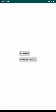
Just check app module with "Behavior Sample":

There is also an option to use a view that can contain a header and content:
<androidx.coordinatorlayout.widget.CoordinatorLayout
    android:id="@+id/coordinator"
    android:layout_width="match_parent"
    android:layout_height="match_parent">

    <com.github.heyalex.CornerDrawer
        android:id="@+id/corner_drawer"
        android:layout_width="match_parent"
        android:layout_height="match_parent"
        android:clickable="true"
        app:behavior_horizontal_peekHeight="58dp"
        app:content_color="@color/corner_drawer_content_color"
        app:content_view="@layout/content_layout"
        app:header_color="@color/corner_drawer_header_color"
        app:header_view="@layout/header_layout"
        app:layout_behavior="com.github.heyalex.cornersheet.behavior.CornerSheetHeaderBehavior"
        app:shapeAppearanceOverlay="@style/ShapeAppearanceOverlay.CornerShape" />
</androidx.coordinatorlayout.widget.CoordinatorLayout>
With CornerDrawer you don't need to set behavior_peekHeight and behavior_expanded_width, they will be assigned automatically when header_view will be inflated.
You can use an attributes on behavior that described below and a following attributes on CornerDrawer
| Properties | Type | Default |
|---|---|---|
header_view |
reference | -1 |
header_color |
reference | #FFF |
content_view |
reference | -1 |
content_color |
reference | #FFF |
The main preview is done with CornerDrawer, just check app module with "Support Sample"
Integration
This library is available on jcenter, so you need to add this repository to your root build.gradle:
allprojects {
    repositories {
        ...
        jcenter()
    }
}
Add one of the following dependency:
dependencies {

    //only CornerSheetBehavior
    implementation 'com.github.heyalex.cornersheet:core:v1.0.1'

    //CornerSheetBehavior and CornerDrawer
    implementation 'com.github.heyalex.cornersheet:drawer:v1.0.1'
}
Samples
You can find sample in app module, to understand functionality of library or just get an APK here