All Projects → rafaelrinaldi → Data Components

rafaelrinaldi / Data Components

Licence: mit
♻️ Tiny component structure for web applications

Programming Languages

javascript
184084 projects - #8 most used programming language

Projects that are alternatives of or similar to Data Components

Calcite Components
Web Components for the Calcite Design System. Built with Stencil JS. Currently in Beta!
Stars: ✭ 96 (-4%)
Mutual labels:  components, custom-elements
anywhere-webcomponents
A UI work in progress based on custom elements (web components) for use in anywhere.
Stars: ✭ 17 (-83%)
Mutual labels:  components, custom-elements
Standalone
Create framework agnostic components that are truly reusable and interoperable with all the benefits of the React ecosystem – using the HTML5 custom elements API to extend HTML's vocabulary.
Stars: ✭ 205 (+105%)
Mutual labels:  components, custom-elements
Switzerland
🇨🇭Switzerland takes a functional approach to Web Components by applying middleware to your components. Supports Redux, attribute mutations, CSS variables, React-esque setState/state, etc… out-of-the-box, along with Shadow DOM for style encapsulation and Custom Elements for interoperability.
Stars: ✭ 261 (+161%)
Mutual labels:  components, custom-elements
cwco
Powerful and Fast Web Component Library with a Simple API
Stars: ✭ 27 (-73%)
Mutual labels:  components, custom-elements
Weightless
High-quality web components with a small footprint
Stars: ✭ 284 (+184%)
Mutual labels:  components, custom-elements
Stencil
A toolchain for building scalable, enterprise-ready component systems on top of TypeScript and Web Component standards. Stencil components can be distributed natively to React, Angular, Vue, and traditional web developers from a single, framework-agnostic codebase.
Stars: ✭ 9,880 (+9780%)
Mutual labels:  custom-elements
Aybolit
Lightweight web components library built with LitElement.
Stars: ✭ 90 (-10%)
Mutual labels:  custom-elements
Maskjs
Markup | Template | HMVC
Stars: ✭ 89 (-11%)
Mutual labels:  components
Auto Check Element
An input element that validates its value with a server endpoint.
Stars: ✭ 85 (-15%)
Mutual labels:  custom-elements
Devextreme React
React UI and data visualization components
Stars: ✭ 100 (+0%)
Mutual labels:  components
Magix Gallery
magix gallery
Stars: ✭ 98 (-2%)
Mutual labels:  components
Wp Storybook
📔 Storybook for WordPress Reusable React Components
Stars: ✭ 95 (-5%)
Mutual labels:  components
Ui React
📖 U&I with React — UI components for you & I
Stars: ✭ 91 (-9%)
Mutual labels:  components
Capivarajs
✌️ Um novo jeito de criar componentes híbridos.
Stars: ✭ 97 (-3%)
Mutual labels:  components
Taiga Ui
Angular UI Kit and components library for awesome people
Stars: ✭ 1,353 (+1253%)
Mutual labels:  components
Ui
React Styled Components with bootstrap grid system
Stars: ✭ 89 (-11%)
Mutual labels:  components
Dataformsjs
🌟 DataFormsJS 🌟 A minimal JavaScript Framework and standalone React and Web Components for rapid development of high quality websites and single page applications.
Stars: ✭ 95 (-5%)
Mutual labels:  custom-elements
Leaf Ui
🍃 Leaf-UI: A react component library built using styled-components
Stars: ✭ 98 (-2%)
Mutual labels:  components
React Instantsearch
⚡️ Lightning-fast search for React and React Native applications, by Algolia.
Stars: ✭ 1,320 (+1220%)
Mutual labels:  components

data-components

Tiny component structure for web applications

Sponsors

Thank you to all the sponsors for this project:


Lucas Motta

→ Sponsor my open source work

Install

$ npm install data-components --save

Or you can simply copy and paste the minified standalone version that lives under dist/

Features

Motivation

There are plenty of options to architect a web application out there but most of them often assume that you're working on a SPA. That alone will add a lot of stuff that you might not want at all. Data binding, custom messaging system and virtual DOM to name a few.

Sometimes you just need something simple to kick things off without having to worry about naming conventions and programming paradigms. That's how this library was born.

Usage

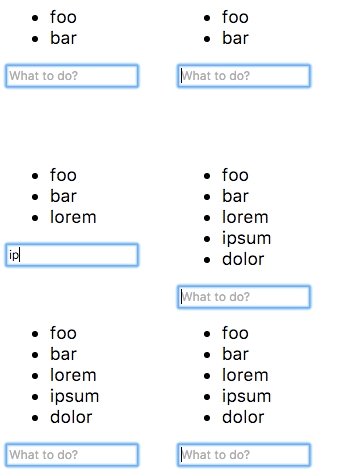
Let's implement the simplest todo list app.

<!-- Create our todo list element passing some initial values -->
<ul data-component="todo" data-values="foo,bar"></ul>

<!-- Let's use a input field to read the user input -->
<input data-component="input" placeholder="What to do?">

Ok, now that we have our markup in place, let's implement the application.

// Todo component
class Todo {
  constructor(el, options) {
    this.el = el;
    // Read from initial values
    this.todos = options.values.split(',');
    this.render();
  }

  // Add items to the list
  add(todo) {
    this.todos.push(todo);
    this.render();
  }

  // Render the list to the DOM
  render() {
    this.el.innerHTML = this.todos.map(todo => `<li>${todo}</li>`).join('');
  }
}

// User input component
class Input {
  constructor(el, options, sandbox) {
    const todo = sandbox.get('todo');

    // Submit value to "todo" component when hitting the enter key
    el.addEventListener('keydown', e => {
      if (e.keyCode === 13) {
        todo.add(el.value);
        el.value = '';
        el.focus();
      }
    });
  }
}

// Bootstrap components (UMD build exposes `components()`)
components({
  todo: Todo,
  input: Input
});

demo

It works with just a few lines of code 🎉

Check out the demo page for a slightly more complex example.

More

For more detailed instructions on how the project works and how to use it, please check the user guide.

License

MIT © Rafael Rinaldi


Buy me a ☕

Note that the project description data, including the texts, logos, images, and/or trademarks, for each open source project belongs to its rightful owner. If you wish to add or remove any projects, please contact us at [email protected].