twitterdev / Gnip Trend Detection
Programming Languages
Introduction
This repository contains the "Trend Detection in Social Data" whitepaper, along with software that implements a variety of models for trend detection.
We focus on trend detection in social data times series. A time series is defined by the presence of a word, a phrase, a hashtags, a mention, or any other characteristic of a social media event that can be counted in a series of time intervals. To do trend detection, we quantify the degree to which each count in the time series is atypical. We refer to this figure of merit with the Greek letter eta, and we say that a time series and its associated topic are "trending" if the figure of merit exceeds a pre-defined threshold denoted by the Greek letter theta.
Whitepaper
The trends whitepaper source can be found in the paper directory, which
also includes a subdirectory for figures, figs. A PDF version of the
paper is included but it is not gaurenteed to be up-to-date. A new version can
be generated from the source by running:
pdflatex paper/trends.tex
Installation of pdflatex and/or additional .sty files may be required.
Gnip-Trend-Detection Software
Input Data
The input data consists of CSV records, and is expected to contain data for one quantity ("counter") and one time interval on each line, in the following format:
| interval start time | interval duration in sec. | count | counter name |
|---|---|---|---|
| 2015-01-01 00:03:25.0 | 195 | 201 | TweetCounter |
| 2015-01-01 00:03:25.0 | 195 | 13 | ReTweetCounter |
| 2015-01-01 00:06:40.0 | 195 | 191 | TweetCounter |
| 2015-01-01 00:06:40.0 | 195 | 10 | ReTweetCounter |
The format of the interval start time can be any of the large number of standard formats recognized by Python's dateutil package.
The recommended way to produce time series data in the correct format is to use
the Gnip-Analysis-Pipeline package.
With this package, you can enrich and aggregate Tweet data from the Gnip APIs.
You can find a set of dummy data in example/example.csv.
Installation
The package can be pip-installed. The 'plotting' extra includes matplotlib, and can be ignored if plotting is not important. Note that the examples below require plotting.
$ pip install gnip_trend_detection[plotting]
The scripts and library in the repository can also be pip-installed locally.
[REPOSITORY] $ pip install -e .[plotting]
Depending on your operating system, you may need to set a
Matplotlib backend,
often done in ~/.matplotlib/matplotlibrc.
Key functionalities
The software in this package provides three scripts that perform the three main tasks:
-
trend_rebin.py- resize the time intervals of the input data -
trend_analyze.py- calculate a figure-of-merit (trend score) at each point -
trend_plot.py- plot the counts and the figure-of-merit
These scripts act on and deliver CSV data.
A fourth script, trend_analyze_many.py, performs these steps sequentially,
with re-binning and analysis done in parallel. To manage the (potentially)
large number of time series, this script uses JSON-formatted intermediate
and final data strutures.
Two final scripts provide extra analysis information:
-
trend_detection.py- return information about time series data sets with trend figures-of-merit that exceed a threshold.
This script is intended
to be used on the analyzed output of the
trend_analyze_many.pyscript.
- return information about time series data sets with trend figures-of-merit that exceed a threshold.
This script is intended
to be used on the analyzed output of the
-
time_series_correlations.py- calculate a correlation coefficient between all pairs of time series in a CSV data set (BUGS BE HERE).
Configuration
All the scripts mentioned in the previous sections assume the presence of a configuration
file. By default, its name is config.cfg. You can find a template at config.cfg.example.
A few parameters can be set with command-line argument. Use the scripts' -h option
for more details.
Example
A full example has been provided in the example directory. In it, you will find
formatted time series data for mentions of the "#scotus" hashtag in August-September 2014.
This file is example/example.csv. In the same directory, there is a configuration file,
which specifies what the software will do, including the size of the final time buckets
and the trend detection technique and parameter values. This example assumes that you
have installed the package, but are working from the repo directory. The example will run
from any location, but the paths to input and configuration files would have to change.
The first step to to use the rebin script to get appropriately and evenly sized time buckets. Let's use 2-hour buckets and put the output back in the the example directory.
cat example/example.csv | trend_rebin.py -c example/config.cfg > example/scotus_rebinned.csv
Next, we will run the analysis script on the re-binned data. Remember, all the modeling specification is in the config file.
cat example/scotus_rebinned.csv | trend_analyze.py -c example/config.cfg > example/scotus_analyzed.csv
To view results, let's run the plotting after the analysis, both of which are packaged in the plotting script:
cat example/scotus_analyzed.csv | trend_plot.py -c example/config.cfg
The configuration specifies that the output PNG should be in the example directory. It will look like:
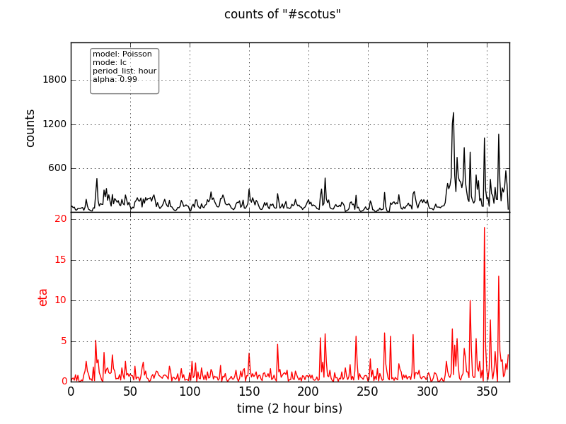
This analysis is based on a point-by-point Poisson model, with the previous point defining the expectation for the current point. You must still choose the cutoff value of eta (called theta) that defines the presence of a trend. It is clear that, if you wish to flag the large spike as a trend, almost any choice for theta will lead to lots of false positives.
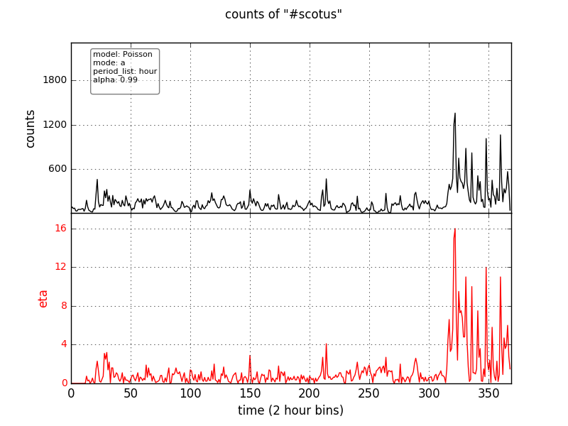
A more robust background model can be used by changing the mode parameter in the Poisson_model
section of the example/config.cfg from lc (last count) to a (average). The period_list
parameter determines the time interval over which the average is taken.
The output PNG should for this model should look like:
There is less noise in this result, but we can do better. Choose the data-derived template method
in example/config.cfg by uncommenting model_name=WeightedDataTemplates. In this model, eta quantifies the
extent to which the test series looks more like a set of known trending time series, or like a set of
time series known not to be trending.
The output PNG should for this model should look like:
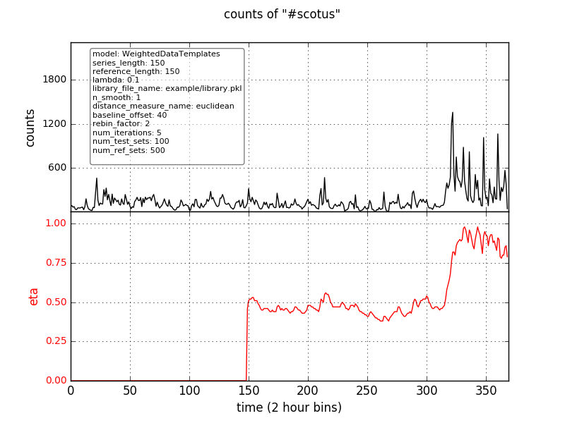
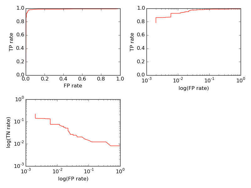
In this result, there is virtually no noise, but the eta curve lags the data because of the data smoothing procedure. Nevertheless, this model provides the most robust performance, at the cost of additional complexity and CPU time. The ROC curve for this model looks like:
The previous methods focus on identifying sudden increases, or spikes, in the time series.
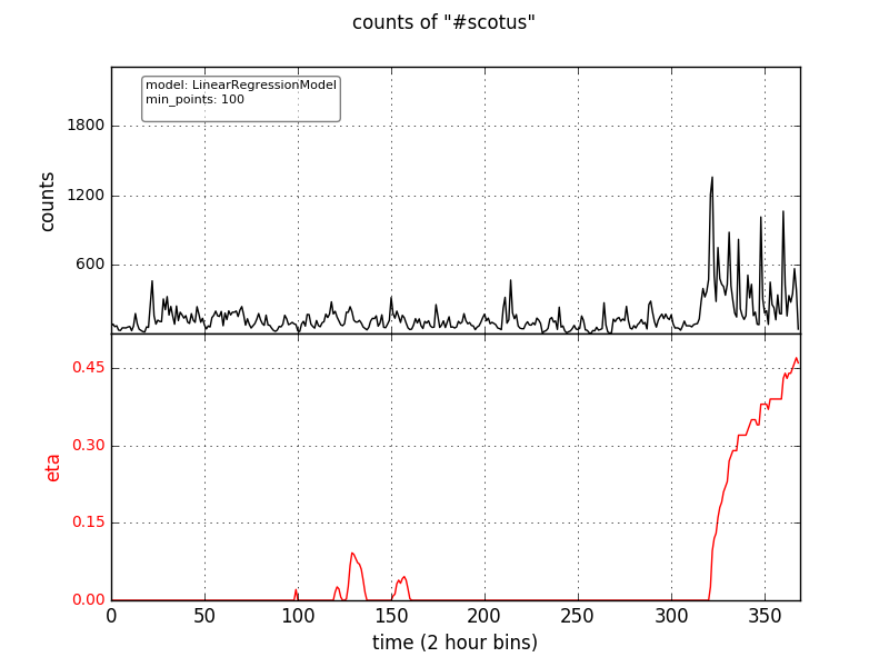
To identify trends characterized by constant growth over time, you can use
a linear regression. Choose the LinearRegressionModel in the config file,
and the output PNG should look like:
Analysis Model Details
The various trend detection techniques are implemented as classes in gnip_trend_detection/models.py.
The idea is for each model to get updated point-by-point with the time series data,
and to store internally whichever data is need to calculate the figure of merit for
the latest point.
Each class must define:
- a constructor that accepts one argument, which is a dictionary containing configuration name/value pairs.
- an
updatemethod that accepts at least a keyword argument "counts", representing the latest data point to be analyzed. No return value. - a
get_resultsmethod, which takes no arguments and returns the figure of merit for the most recent update.