heatmapcluster
heatmapcluster is a python library for generating a clustered heatmap
with dendrograms plotted along with the heatmap, such as the following:
This is prototype-quality software. The documentation is sparse, and the API will likely change.
Plots are generated with matplotlib (http://matplotlib.org/). To use the package, numpy, scipy and matplotlib must be installed.
setuptools is required to install the package using setup.py.
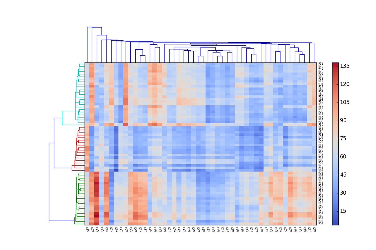
Example 1
Most of the code in this example is the function make_data, which generates
an array of data for the demonstration. The main part of the demo is the last
three statements of the script. This script generates the plot shown above:
import numpy as np
import matplotlib.pyplot as plt
from heatmapcluster import heatmapcluster


def make_data(size, seed=None):
    if seed is not None:
        np.random.seed(seed)

    s = np.random.gamma([7, 6, 5], [6, 8, 6], size=(size[1], 3)).T
    i = np.random.choice(range(len(s)), size=size[0])
    x = s[i]

    t = np.random.gamma([8, 5, 6], [3, 3, 2.1], size=(size[0], 3)).T
    j = np.random.choice(range(len(t)), size=size[1])

    x += 1.1*t[j].T

    x += 2*np.random.randn(*size)

    row_labels = [('R%02d' % k) for k in range(x.shape[0])]
    col_labels = [('C%02d' % k) for k in range(x.shape[1])]

    return x, row_labels, col_labels


x, row_labels, col_labels = make_data(size=(64, 48), seed=123)

h = heatmapcluster(x, row_labels, col_labels,
                   num_row_clusters=3, num_col_clusters=0,
                   label_fontsize=6,
                   xlabel_rotation=-75,
                   cmap=plt.cm.coolwarm,
                   show_colorbar=True,
                   top_dendrogram=True)
plt.show()
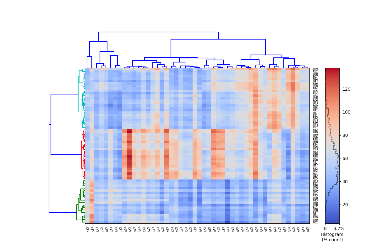
Example 2
This example uses the same data as in Example 1, but the linkage that is used
to cluster the rows and columns is changed. In this example, the clustering
is the 'average' method of scipy.cluster.hierarchy.linkage, combined with
the 'correlation' metric. This example also shows that when the option
histogram=True is given, a histogram of the values in x is drawn in the
colorbar:
from scipy.cluster.hierarchy import linkage

h = heatmapcluster(x, row_labels, col_labels,
                   num_row_clusters=3, num_col_clusters=0,
                   label_fontsize=6,
                   xlabel_rotation=-75,
                   cmap=plt.cm.coolwarm,
                   show_colorbar=True,
                   top_dendrogram=True,
                   row_linkage=lambda x: linkage(x, method='average',
                                                 metric='correlation'),
                   col_linkage=lambda x: linkage(x.T, method='average',
                                                 metric='correlation'),
                   histogram=True)