dgwozdz / Hn_so_analysis
Programming Languages
Projects that are alternatives of or similar to Hn so analysis
Is there a relationship between popularity of a given technology on Stack Overflow (SO) and Hacker News (HN)? And a few words about causality
dgwozdz
3rd JUNE 2018
Last update: 08th JULY 2018
Table of Contents
- Introduction
- How to cope with problem
- Exploratory Data Analysis
- Granger causality
- Summary
- Further research
- Acknowledgments
1. Introduction
Stack Overflow and Hacker News are portals mainly (but not only) read and used by programmers and other people who occupy their (professional or free) time with writing code.
Stack Overflow (hereafter referenced as SO)
Stack Overflow lets their users easily Stack Overflow (SO), an established in 2008 portal on which programmers help each other by asking and answering coding questions, lets their users easily find questions related to a certain programming language/framework/library etc. by tags. The questions and replies/comments are evaluated in a form of points so it is usually instantly obvious which answer was rated the highest (and therefore is considered as the best one by the community) or whether a described problem is reproducible, i.e. you can replicate it with a piece of code prepared by a person asking a question.
Hacker News (hereafter referenced as HN)
Hacker News (HN) is an established in 2007 portal on which users submit interesting links/stories. Those stories gather points just like questions on SO (however, users cannot downvote stories until they reach a certain karma treshold). Each post can be commmented on.
Causality and relationship
Does one site influence the other? They could but the factors behind it – the causes would rather be external. Let’s see a definition of causality:
Causality (also referred to as causation, or cause and effect) is what connects one process (the cause) with another process or state (the effect), where the first is partly responsible for the second, and the second is partly dependent on the first. In general, a process has many causes, which are said to be causal factors for it, and all lie in its past.1
Causality is a phenomenon which people intuitively understand but which is tough to measure with statistical methods. Let’s say you would like to build a model which explains the behaviour of defaults on mortgages. You may use the following data explaining a lack of repayments: clients’ incomes, GDP, clients’ heights, their genders etc. You employ a regression/decision tree/neural network and it seems that the best predictors are sex and height. Does that mean that those variables influence defaults? It may just be a spurious correlation. Those variables may include other information, not directly implied by themselves (e.g. that there is a gap in salaries between genders). You may have not considered other important variables (e.g. number of kids, length of employment, the history of previous loans if it’s available), so the data you put in your model are statistically significant. Or, because such a situation is also possible, the significant variables do indeed influence defaults but you just don’t understand the dependence of those phenomena. The causality seems to be a tough thing to identify.
In the context of HO and SN, the factors influencing both sites could be, for example, the following:
- Both sites (to some extend) share user base: programmers or people writing code (for whatever reason). Some of these users check Hacker News to be informed about new technologies but they visit SO if they have specific problem.
- The initial popularity of a given topic/programming language on both sites can be driven by a company which produced it, like in case of Swift (which was developed by Apple).
- Some users may be interested specifically in their language(s) of choice and read posts about them on HN.
- Popularity of a given technology on both sites can be driven by
other factors:
- meetups/conferences,
- the availability of errorless documentation
- size of current userbase,
- materials to learn: books, courses, tutorials, blog posts.
2. How tackle the problem
Popularity
This article examines data from SO and HN trying to answer the question whether an intuitive relationship between the two is reflected in available data. It is a combination of Exploratory Data Analysis (EDA) with some descriptive statistics. It does not try to further investigate or quantify the above mentioned factors influencing both Stack Overflow and Hacker News.
When dealing with the problem of relationship, an operationalization of variables to investigate is needed. Here, the phenomenon which was examined was described as “popularity of a given technology”. What is it and how to measure it in the context of SO and HN? Popularity could be defined as liking or attraction to a certain person, an idea or, in our case, a technology. In the context of this analysis (SO and HN), you can name at least a few metrics by which you could measure whether something is popular or not. Additionally, they should be measured in a certain time unit, e.g. daily. If data that we would like to analyse can be identified by an ordered time index (the unit is irrelevant) that means that we deal with a time series.
I suggest starting the analysis with available empirical variables such as a number of questions (SO) / posts (HN) for a given programming language and points gathered by those questions (SO) / topics (HN). Those two are probably the most universal ones. Of course, you could come up with much more variables, for example:
- number of times questions from a certain time span (e.g. from a given day) were tagged as a favourite,
- number of comments for questions from a certain life span,
- number of views of questions from a certain life span,
- number of replies for questions from a certain life span.
However, there is a small problem with the available variable c): the number of views seems to be irreproducible. SO shows only the number of views a given question gathered by today’s date, so obtaining this variable from different time points (e.g. from 1st June 2018 and 2nd June 2018) results in different values. DUe to this fact, the variable, althought interesting, migth lead to irreproducible results.
When it comes to obtaining data from Satck Oveflow, it was easy to identyify which question is assigned to which technology. Every question has its tags. The process of data preprocessing was a bit tougher in case of Hacker News. The definition of a topic related to a certain technology is a topic, in which the name of this technology appears either in a title or in the text (comments were not taken into consideration).
The selected variables: number of questions/topics/point were usually analysed in four pairs:
- number of questions on SO vs. number of topics on HN,
- number of questions on SO vs. number of points on HN,
- number of points on SO vs. number of topics on HN,
- number of points on SO vs. number of points on HN.
I have previously written that all variables should be measured in a certain time unit, which leads to the next issue: how to aggregate data from a certain period? I decided to use a sum as an aggregation function, e.g. sum of questions which appeared in a certain day. You could come up with, for example, an average. However, the problem with such a metric could be small samples on the basis of which it would be computed (for example, a mean number of points gathered by questions on SO from a given day when during that 24 hours only one or two posts popped up), which would be unrepresentative.
How to cope with the problem of validating a relatiship between two phenomena? The first approach could be an EDA - Exploratory Data Analysis, which basically means producing some plots and trying to indicate something from them. The plus of this solution is the visual aspect: you can clearly see the trend of (or a lack of thereof) of a popularity for a given programming language and for most people it is easier to read plots than just bare tables. The somewhat hindering side of the method to unravel causality is its qualitative character - there is no statistic/test indicating whether your conclusions on the basis of plots are correct or not.
The second approach a qualitative one: a Granger causality. Wait a minute, you may ask, there’s a specific type of causality? Basically saying, yup. Granger causality, proposed in 1969, determines whether one time series is helpful in forecasting another time series. Therefore, this type of causality is called a predictive causality.
Note that the question: Does one phenomenon is a cause of another one? is different from what Granger causality measures: here you only use past values of a given variable and try to use them to forecast the future values of another phenomenon, just like building a forecasting model. That means that Granger causality is not and does not indicate causality between two phenomena. Nonetheless, it may indicate a relationship either resulting from the third factor influencing the two observed ones or that one variable is really an effect of the other. It is nonetheless impossible to identify it on the basis of the Granger causality test itself.
Data
Data from this analysis, comes from two sources: (quite obviously) Stack Overflow and Kaggle (surprise!). Kaggle is a website which organizes competitons for data scientists/analysts which goal is to build the best predictive model for a given phenomenom based on shared data set(s). It also provides some data sets which are not strictly for competitions but can be used in EDA (Exploratory Data Analysis). The data utilised in this analysis with regard to Hacker News comes from the latter. Variables regarding Stack Overflow comes from queries utilized in Stack Exchange Data Explorer which allows anyone interested to write SQL queries for Stack Overflow as well as other Stack databases. The data were gathered from the period 15th September 2008 - 31st December 2017.
The programming languages or technologies which were examined include: C, C++, C#, Cobol, CSS, D3.js, R, Delphi, Fortran, Hadoop, HTML, Java, Javascript, JQuery, Pascal, Perl, Python, PHP, Ruby, Rust, Scala, Shell, Spark, SQL, Swift, Tensorflow, VBA. The choice of technologies was arbitrary.
The data from portals were assigned specific colors: grey for Stack Overflow, orange for Hacker News. Those colours are consistent with the ones used later on so that it would be easier to identify the source of data (Stack Overflow or Hacker News).
3. Exploratory Data Analysis
One of the ideas with regard to examining causality included checking cumulative plots. Cumulative plots show aggregated value of a given measure to a given date. For example, if we have data in such a form:
| Date | Value |
|---|---|
| 2018-01-01 | 1 |
| 2018-01-02 | 2 |
| 2018-01-03 | 3 |
Then the cumulative value would be sum of all the values up to a given date:
| Date | Value | Cumulative value |
|---|---|---|
| 2018-01-01 | 1 | 1 |
| 2018-01-02 | 2 | 3 |
| 2018-01-03 | 3 | 6 |
3.0 C#
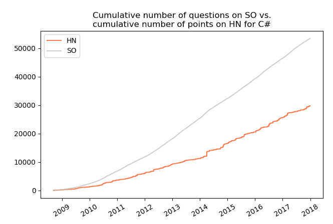
Exemplifying, the plot below shows:
- cumulative number of questions asked for C# on Stack Overflow to the date on x axis (grey line),
- cumulative number of points gathered by all topic with regard to C# on Hacker News to the date on x axis (orange line).
It can be noticed that by the end of 2017 the cumulative number of questions on SO exceeded 50 thousand while in the same time the number of points for topics with C# on HN reached about 30 thousand.
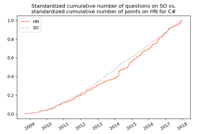
Above described plot for C# does not seem particularly interesting. It shows (rather obviously) an upward trends for both variables, however, the dynamic for them is different. What is more, it would be nice to see a standardized variables, for example in such a way that they both start at 0 and end at 1. Thanks to such a data transformation technique it is possible to find time series which may be similar in terms of behaviour in time but different when it comes to differences by which they increase (or decrease). The plot for the same phenomena and technology as above but with standardized variables is presented below:
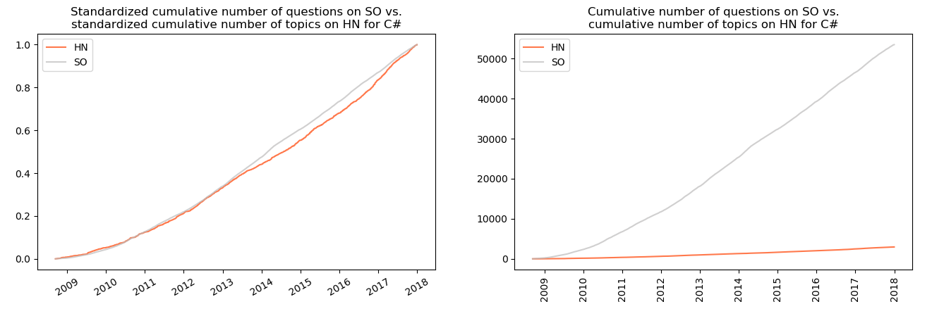
Now it can be noticed that the cumulative number of questions on SO and the cumulative number of points for topics on HN show strong resemblance. Similar resemblance can be seen when comparing standardized plots of cumulative number of questions vs. cumulative number of topics:
Let’s see some interesting similarities between statistics on SO and HN for different technologies on standardized plots. We will only see the technologies for which I identified somme sort of similarity between data from SO and HN or for which I discovered something interesting. Additionally, plots on the left will be the ones for standardised variables while those on the right for variables without transformation (standardisation).
3.1 C
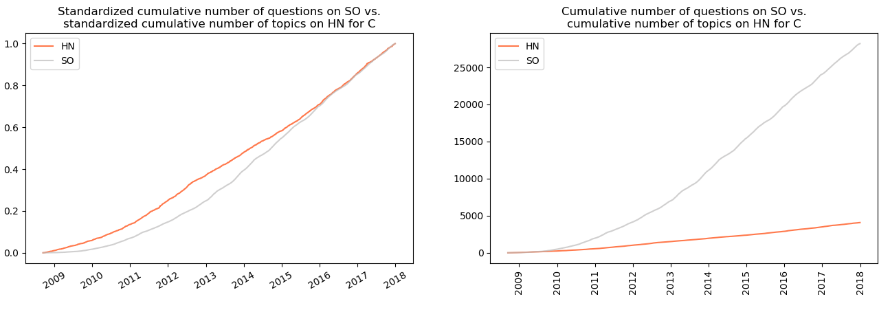
Similarly to C#, there is visible resemblance between cumulative number of questions on SO and cumulative number of points for topics on HN:
as well as in case of cumulative number of questions on SO and cumulative number of topics on HN:
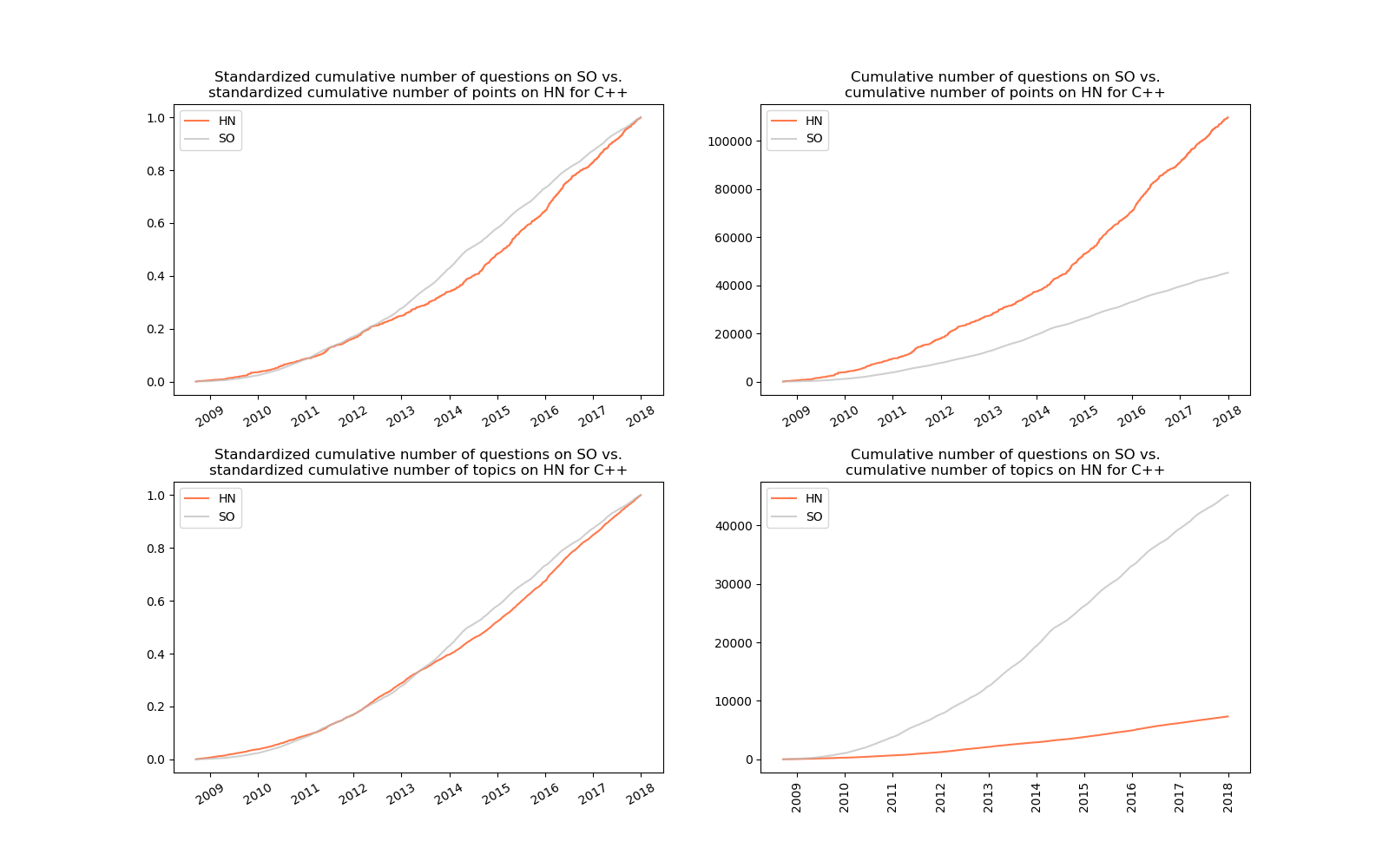
3.2 C++
Not surprisingly, in case of C++ the similarities existing for C and C# are repeated.
3.3 Cobol
Yes, Cobol. I wanted to say (write) good, old Cobol, however, I find such statement to be a little exaggeration for this, I would say antique programming language. If you don’t know what Cobol is, its name is an acronym from common business-oriented language, which resembles high similarity to English language. The aim of such a design was to be readable for both programmers and non-technical staff like managers. It was introduced in 1959(!) and was/is used in variety of environments, including banking and insurance.
The plot below shows a high resemblance of cumulative number of questions on SO and cumulative number of topics with regard to this programming language on HN.
It is worth noticing that in a span of about 9 years less than 300 questions appeared on SO, which shows low or even lack of popularity of this technology nowadays.
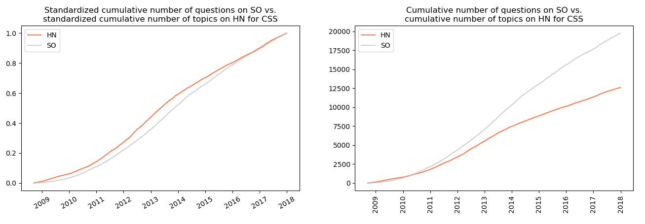
3.4 CSS
Similar resemblance is observed between the cumulative number of questions on SO and the cumulative number of points gathered by the topics on HN.
.and between the cumulative number of questions on SO and cumulative number of topics on HN:
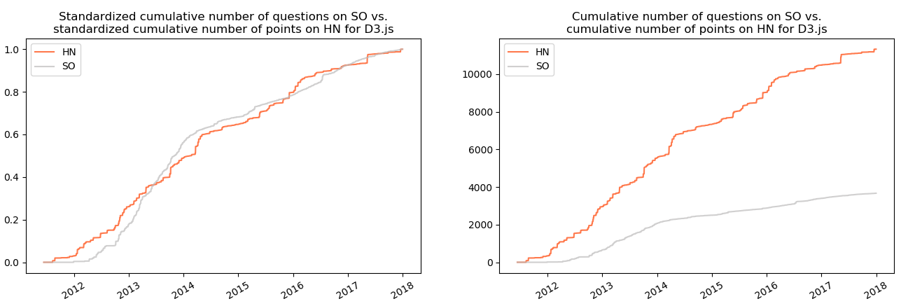
3.5 D3.js
In case of Javascript visualization library D3.js a resemblance is observed between the cumulative number of points obtained by questions on SO and the cumulative number of points gathered by topics on HN:
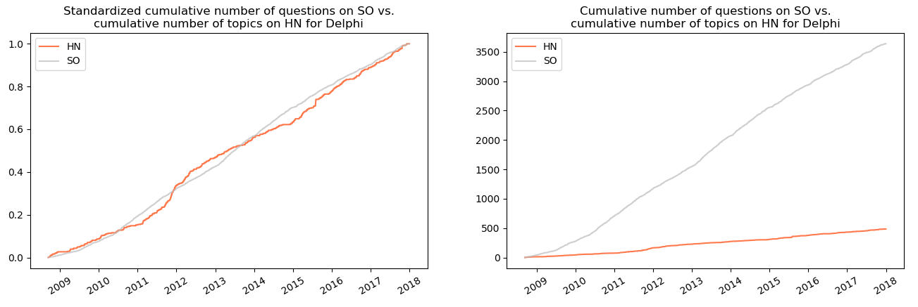
3.6 Delphi
For Delphi the cumulative number of questions on SO seems to follow the same trend as the cumulative number of topics on Hacker News:
3.7 Fortran
When it comes to Fortran, the similarity is observed between the cumulative number of questions on SO and the cumulative number of topics on HN.
Similarly to Cobol, this programming gathered only 700 question in over 9 years which indicates its unpopularity.
3.8 Hadoop
In case of Hadoop, the cumulative number of questions on SO seems to be similar to the cumulative number of points on HN. What’s interesting here is the change of dynamic in 2013: since the middle of this year the number of question on SO grows faster than the number of points on HN.
3.9 HTML
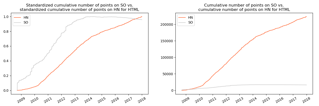
In case of HTML there was no resemblance between variables. Nevertheless, the interesting fact is that since 2014 the number of point for questions on SO stabilizes and later slightly decreases by about 5%, which is shown on the plot below:
Such a situation occurred due to greater number of downvotes than upvotes. This may be result of high number of duplicates since 2014 or the questions which were not formulated in a clear way or were not reproducible (and therefore were downvoted).
3.10 Java
In case of Java the resemblance is visible between the cumulative number of questions on SO and the cumulative number of topics on HN:
Like in the case of HTML, here the cumulative number of pointsalso levels off in 2014 to fall slightly by the end of 2015. The significant drop is observed by the end of 2017.
3.11 Javascript
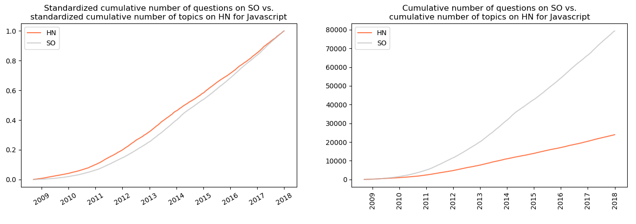
In case of Javascript the similarity is observed between the cumulative number of questions and cumulative number of topics on HN…
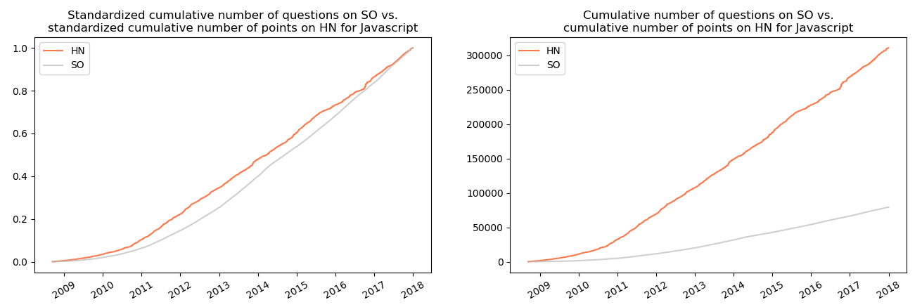
…as well as between the cumulative number of questions on SO and the cumulative number of points between questions on HN:
3.12 Pascal
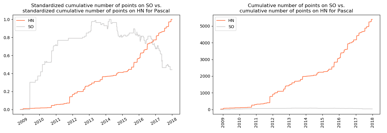
In case of Pascal the cumulative number of questions on SO tends to resemble the cumulative number of points for topics on HN:
However, in case of this programming language an analogous to HTML and Java situation is visible: the cumulative number of points achieves its peak between 2013 and 2014. In the later years it plummets to be reduced by half by the end of 2017.
3.13 Perl
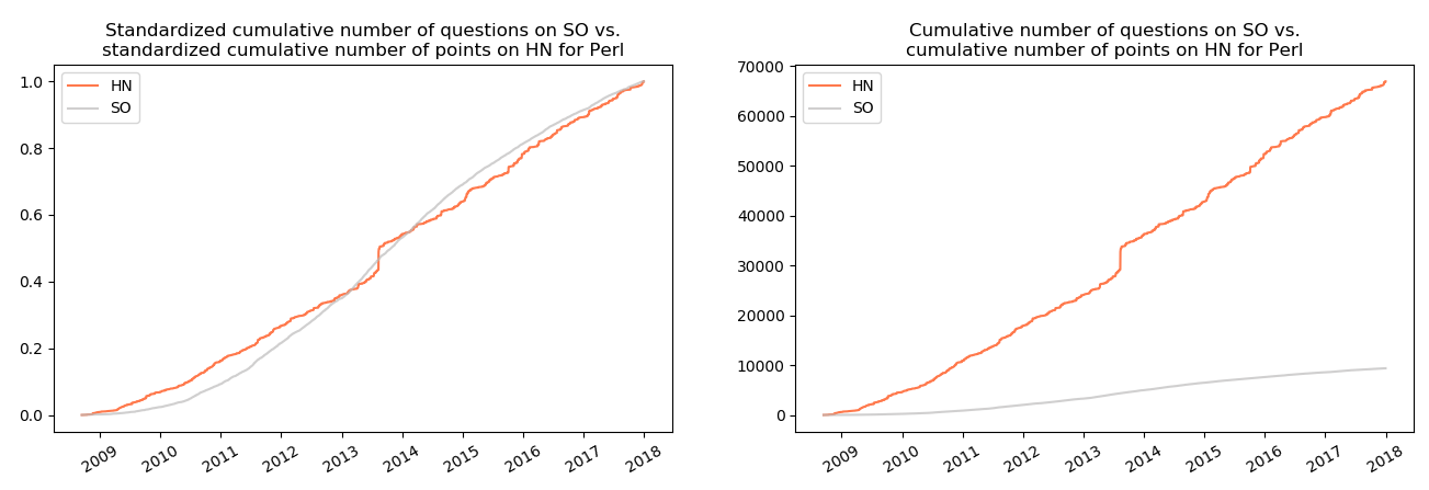
The cumulative number of questions on SO seems to resemble the cumulative number of points on HN…
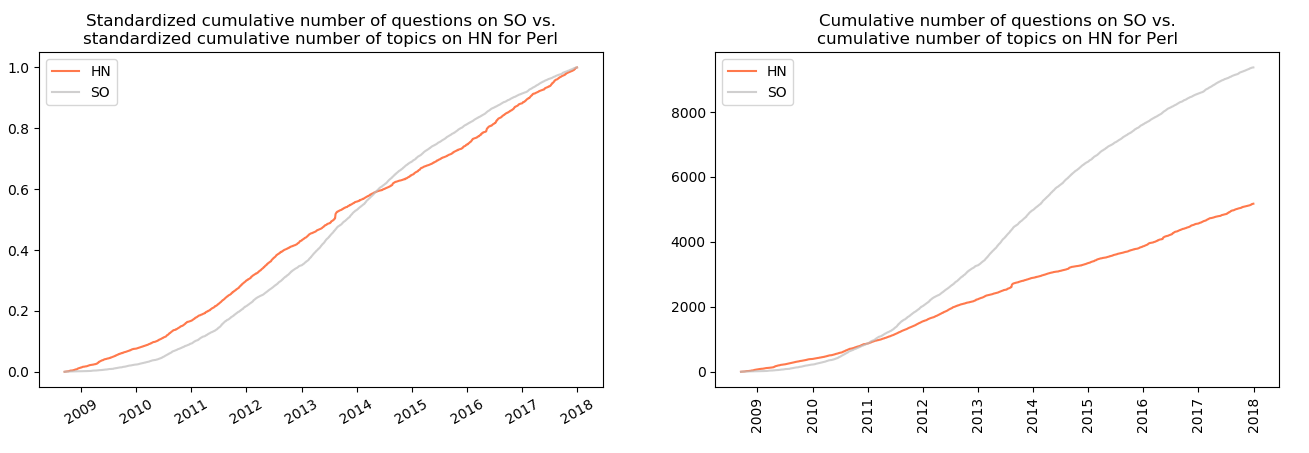
…and the cumulative number of topics on Hacker News related to Perl.
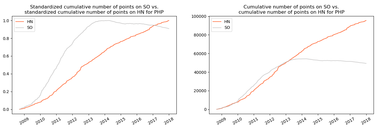
3.14 PHP
In case of PHP only the drop of the cumulative number of points of questions on SO is visible:
3.15 Python
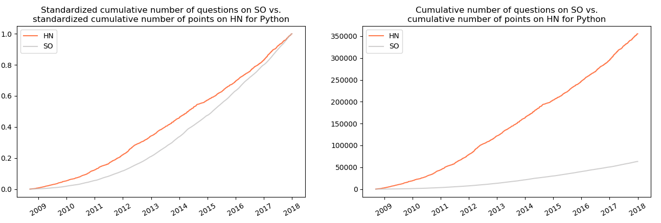
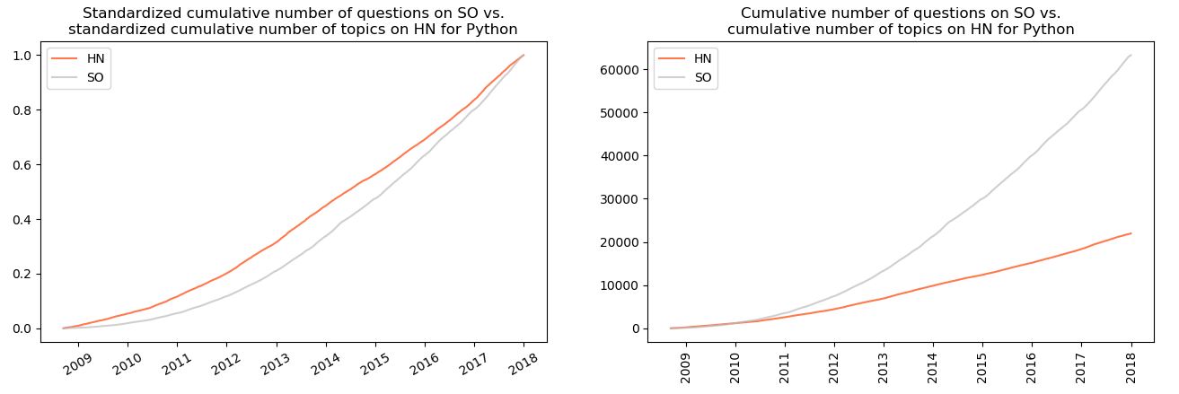
In case of Python the visible similarity appears between the cumulative number of questions on SO and the cumulative number of points for topics on HN…
…as well as for the cumulative number of questions on SO and the cumulative number of topics on HN:
3.16 Shell
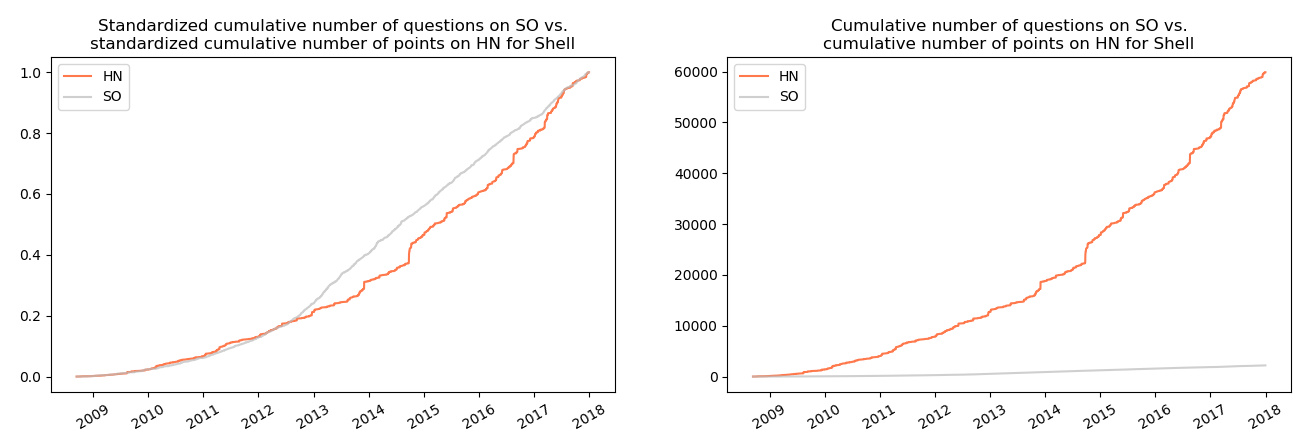
The visible similarity appears between the cumulative number of questions on SO and the cumulative number of points for topics on HN.
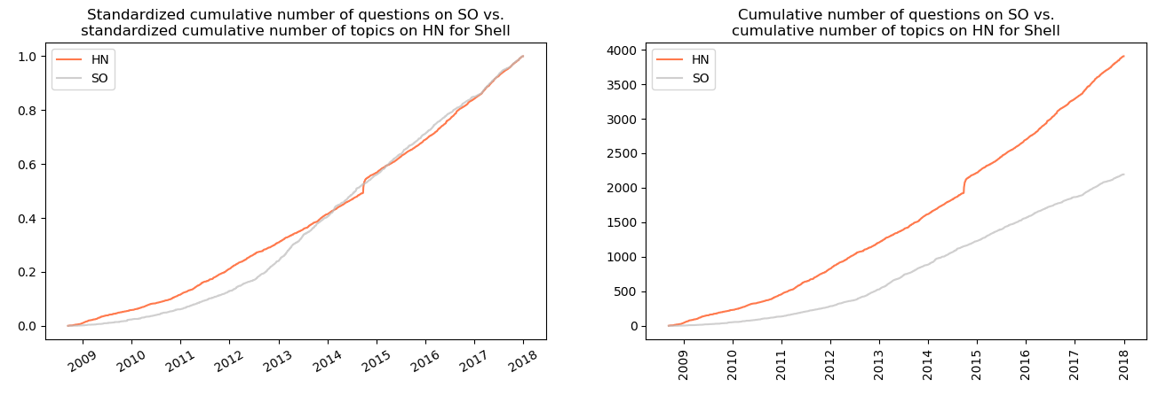
.as well as between the cumulative number of questions on SO and the cumulative number of topics on HN:
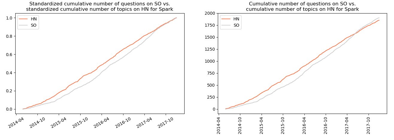
3.17 Spark
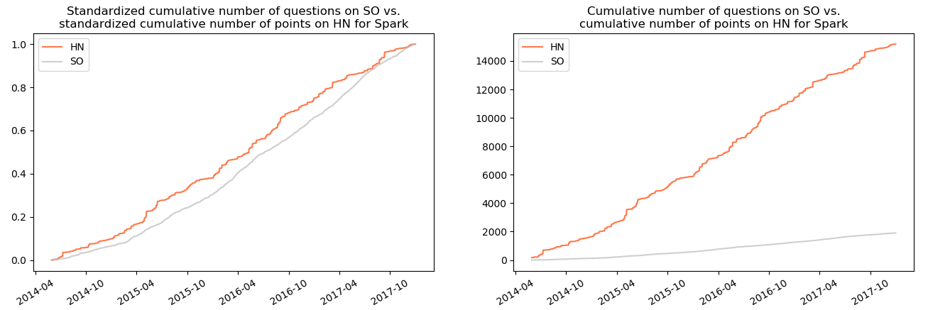
The same situation: the similarity can be identified between the cumulative number of questions on SO and:
- the cumulative number of points for topics on HN:
- the cumulative number of topics on HN:
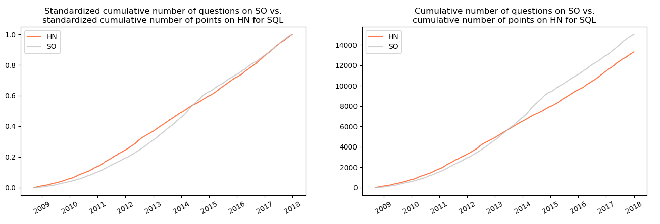
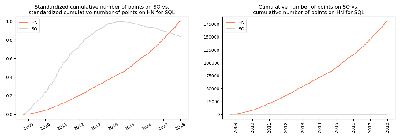
3.18 SQL
In case of this technology, the variables characterized by similar trends are the cumulative number of questions on SO and the cumulative number of topics on HN:
In addition to that, this technology is also characterized by the decrease of cumulative number of points since 2014 by about 20 percent.
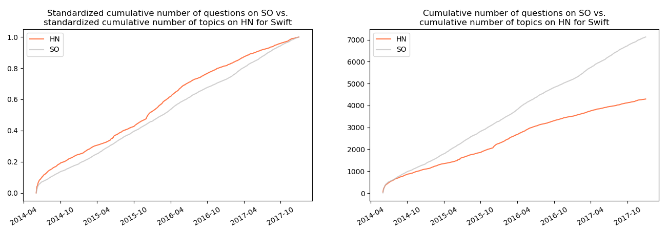
3.19 Swift
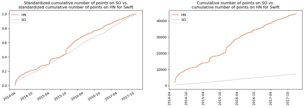
In case of swift there also seems to be a similarity between the cumulative number of questions on SO and:
- the cumulative number of points on HN:
- the cumulative number of topics on HN:
3.20 Tensorflow
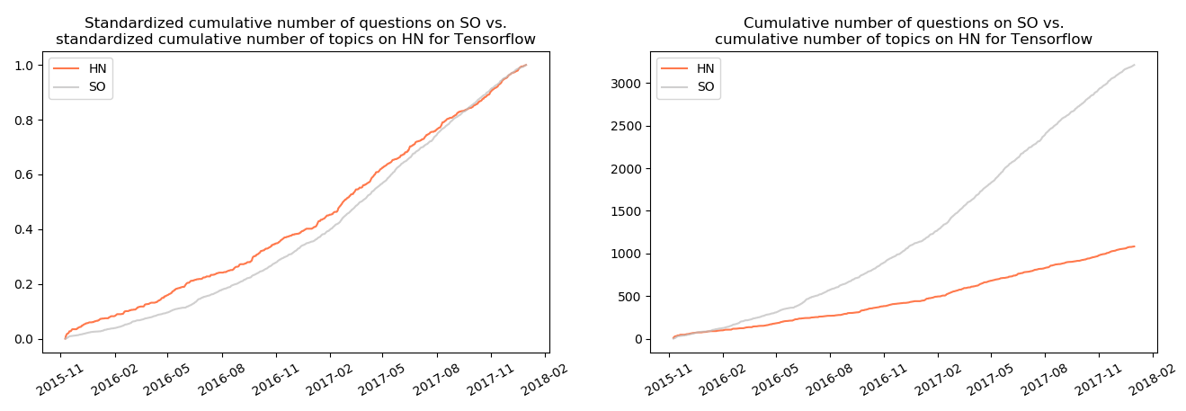
In case of Tensorflow, the highest visible resemblance was identified between the cumulative number of questions on SO and the cumulative number of topics on HN:
There are a couple of problems with above given visual identifications:
- First of all, they are subjective. The terms similarity and resemblance were not quantified. It is only possible to compare those plots visually.
- Secondly, those time series are obviously nonstationary (they do not have the same moments through the period of observation) and therefore cannot be used in statistical methods.
- Last but not least, EDA does not answer the question of causality. Even if you agree with my subjective opinions of similarity of those time series, it is not possible to determine whether one is or isn’t the cause of another. In order to cope with those issues, I used Granger causality.
4. Granger causality
Granger causality informs whether one variable is useful in forecasting another variable. The test takes a form of performing two linear regressions2:
- The first one, in which the potential resulting time series is explained by its past values (autoregressors):
where:
-
 - potential result in period
(t),
 -
 - intercept,
 -
 - number of autoregressors (past
values),
 -
 - coefficient for i-th
autoregressor (i-th past value) of potential result,
 -
 - error term.
- In the second one the same regressand (potential resulting time series) and its past values (autoregressors) are used, however, the past values (autoregressors) of potential cause are added as well:
where:  - potential cause in
period (t-i),
  - coefficient
for i-th autoregressor (i-th past value) of potential cause,
 - error term.
The null hypothesis is that all the added past values of the potential cause are equal to 0:
The computed statistic takes such a form:
where:
 - number of observations
(elements in time series)
Let’s try to interpret it.
- The difference
 in the numerator is the difference between error terms of the
regression without the potential cause and with the potential cause.
It can be interpreted as the error reduction resulting from the
autoregressors of a potential cause.
 - This difference is divided by the number of additional parameters in
the regression with the potential cause:
 . Notice that the number
of estimated parameters in the regression
 is almost the same:
 . Additional parameter
over
  is just the intercept.
 - If we divide the difference by the number of additional parameters, we obtain the average error reduction per each new parameter in the regression with the potential cause.
- The second element - denominator
 - is the error
term of the regression with the potential cause divided by the
number of degrees of freedom (number of observations minus the
number of estimated parameters). It can be interpreted as an average
error per one degree of freedom.
 - Let’s wrap it up: the nominator is the average error reduction in the regression with the potential cause. The denominator represents the average error per degree of freedom of the regression with the potential cause. The entire statistic can therefore be interpreted as an average error reduction per degree of freedom of the regression with added autoregressors of the potential cause.
Now we know what we want to use, however, we don’t know if we can use it. Let me just remind that we’re dealing with time series. One of time series properties is that they can be nonstationary i.e. the realizations of the examined process may not come from the same distribution over time. Using nonstationary time series in linear regression may lead to so called spurious regression in which the modelled dependencies between a regressand and regressors are really nonexistent. In order to avoid such a situation, the times series should be transformed to stationary ones a priori. It is obtained by differencing.
How to check whether a given time series is (non)stationary? One of possible solutions for this task is employing an Augmented Dickey-Fuller test. Its null hypothesis is that the series is nonstationary. There are two versions of the test utilized in this article:
-
 : nonstationary time series,
 : stationary time series,
 -
 : non-stationary time series,
 : trend-stationary time series.
Detection whether a time series includes a trend is performed by
regressing it against the time (time series from 1 to n, where n is the
number of observations in the examined time series) and checking whether
the estimated coefficient by the trend is statistically significant for
the determined significance level
 (in this case
 = 0.05). If the coefficient is
statistically significant, the ADF test with constant and trend is used,
otherwise only with a constant.
After each time series is transformed (if necessary) to a stationary one, a Granger causality test is performed. Here an important question should be asked: how many autoregressors should be considered? It was pointed out that this number should be dependent on minimum value of information criteria: in case of this article, Akaike and Bayes. It was remarked that the former tends to choose the overfitted while the latter the underfitted model, so neither of them is perfect. Nevertheless, the analysis indicates that they often suggest the same lag. Maximum considered lag was 36 periods (3 years).
The ADF test, differencing and the Granger causality test were performed
on data aggregated to monthly frequency in order to reduce the daily
noise in number of questions/points for examined variables. In order to
check if Hacker News does not influence popularity of technology on
Stack Overflow, the opposite hypotheses were also examined.
Statistically significant results when
 is rejected (for significance level
 = 0.05) are presented in the
table
below:
| No | Technology | Regressand (Y) | Regressor (X; potential cause) | AIC | BIC | max lag | min AIC | min BIC | p.value | Differentiations of Y | Differentiations of X |
|---|---|---|---|---|---|---|---|---|---|---|---|
| 1 | swift | Number of posts on HN | Number of points on SO | 188,29 | 226,13 | 13 | True | True | 0,01 | 0 | 0 |
| 2 | css | Number of posts on HN | Number of points on SO | 123,18 | 292,36 | 36 | True | True | 0 | 1 | 0 |
| 3 | html | Number of points on HN | Number of questions on SO | 822,3 | 991,48 | 36 | True | True | 0,02 | 1 | 1 |
| 4 | java | Number of posts on HN | Number of points on SO | 43,06 | 211,26 | 36 | True | True | 0,03 | 1 | 2 |
| 5 | jQuery | Number of points on SO | Number of points on HN | 269,49 | 438,67 | 36 | True | True | 0 | 1 | 1 |
| 6 | jQuery | Number of posts on HN | Number of points on SO | 95,03 | 264,2 | 36 | True | True | 0,01 | 1 | 1 |
| 7 | tensorflow | Number of questions on SO | Number of points on HN | 143,91 | 155,48 | 6 | True | True | 0,04 | 2 | 1 |
Explanations of consecutive columns:
- No - ordinal number,
- Technology - technology, for which the variables were checked,
- Regressand (Y) - variable, which is potentially influenced by a regressor,
- Regressor (X; potential cause) - variable, which is a potential cause for the regressand,
- AIC - value of AIC,
- BIC - value of BIC,
- max lag - lag, for which AIC or BIC has the minimum value,
- min AIC - boolean value indicating whether minimum AIC was obtained for the considered maximum lag,
- min BIC - boolean value indicating whether minimum BIC was obtained for the considered maximum lag,
- p.value - p-value of the performed test,
- Differentiations of Y - number of times the regressand was differentiated before being transformed to a stationary variable,
- Differentiations of X - number of times the regressor was differentiated before being transformed to a stationary variable.
The table with results of Granger causality test suggests a few things:
- First of all, in case of Swift the number of points for questions appearing in a given month is Granger-causes the number of topics on Swift appearing in a given month on Hacker News. The same situations happens in case of CSS, Java and JQuery
- Secondly, in case of HTML the number of questions in a given month Granger-causes number of points for topics with regard to HTML on Hacker News.
- Thirdly, in case of Tensorflow the dependency seems to be reversed: number of points for topics appearing in a given month on Hacker News Granger-causes number of questions popping up in a given month on Stack Overflow.
- Last but not least, in case of JQuery there seems to be a two-way dependence between Stack Overflow and Hacker News:
- the number of points for topics appearing in given month on HN Granger-causes number of points for questions on SO, and
- the number of points for questions appearing in a given month on SO Granger-causes number of topics with regard to JQuery on HN.
- Additionally, in case of examples above both criteria (AIC and BIC) suggested the same maximum lags.
- None of the results in the table is corroborated by the previous exploratory visual analysis. In case of data aggregated to weekly or daily frequency the number of statistically significant results would be greater, however, it such situations could take place randomly.
5. Summary
It’s high time to ask the most important question: do the data confirm the relationship between the popularity of technology on Stack Overflow causes the popularity of technology on Hacker News?
The question seems to be clear. However, answering it seems to be not an easy job. Nevertheless, let’s try.
- Hacker News is a portal used by lots of programmers. Programmers use Stack Overflow all the time. It seems intuitive that the more popular technology on Stack Overflow, the more people interested in it and therefore the more topics/points for topics with regard to it on Hacker News.
- For a start, there seems to be a some sort of resemblance between data on Hacker News and Stack Overflow, which is indicated by the exploratory data analysis. Significant results of Granger causality tests corroborate this statement.
- The visual analysis may only point out some sort of relationship. It means neither causality nor does it indicate which variable is the cause and which an effect.
- The Granger causality tests were statistically significant only for a couple of pairs. In case of such a number of performed tests (216; 27 technologies x 4 pairs x 2 because both directions: HN ~ SO and SO ~ HN were examined) it could happen that by coincidence a couple of pairs were statistically significant.
- As mentioned earlier, the Granger causality can be identified as a predictive causality: it means that a possible variable-cause can be used as a predictor in forecasting the possible variable-effect. Such a statement does not imply that the regressor useful in forecasting is a real cause of a given process.
- Popularity of technologies on Hacker News/Stack Overflow can be determined by lots of factors. Some (and probably not all) of them were mentioned above. When using a framework identifying Granger-causes with more than one regressor the SO-variables may lose its statistical significance in favour of other variables (which, in turn may or may not be the causes of popularity of a given technology on Hacker News).
- I wrote earlier that change of aggregation frequency (to monthly/daily basis) causes more pairs to be statistically significant. Those options were neither presented nor further described due to the high number of statistically significant results as well as a fear that those results may be significant by accident. On the other hand, they would corroborate a hypothesis of a relationship between those two portals.
- The number of maximum lags considered lags in Granger causality test was set to 36 any real indication that this number is right. It could be higher (in case of technologies which have longer history) or lower. If latter, more pairs could be statistically significant, however, there is a serious anxiety that obtaining more significant pairs by shortening the checked window would not mean that there really is a cause-effect relationship; it might rather be showing significant results for the sole purpose of showing something significant, i.e. a variant of p-hacking.
As a side-effect of this side-project (sic!) I find it interesting that there are technologies (HTML, Java, SQL, Pascal, PHP) in case of which the number of negatively rated questions high (or the number of negative points for some questions) was so high that the cumulative number of points for those technologies dropped (even by a half from its maximum).
To sum up: can popularity of technology on Stack Overflow (SO) be related to popularity of post about this technology on Hacker News (HN)? Data seem to reflect some kind of relationship between those two portals, although it is worth mentioning that the conducted here Exploratory Data Analysis is (to some extent) subjective therefore such a conclusion cannot be treated as set in stone. This article definitively does not exhaust the topic.
6. Further research
Further research in this topic may include:
- Investingating other technologies (e.g. if tensorflow was checked, e.g. keras and pytorch could be included).
- Using other, named or unnamed above variables (e.g. number of times questions were flagged as favourites in a certain life spans).
- Using other statistical methods.
- Computing correlations. However, Pearson correlation detects only a linear dependence (and should be computed on stationary series).
7. Acknowledgements
I would like to thank Piotr Migdal for the suggestion of this topic, his mentoring, research ideas and the overall supervision of this analysis. Also, many thanks to Jan Bendarz for suggesting a method of trend detection, Andrzej Drzystek for thoughts on an initial draft and Maciej Pomykała for his valuable remarks. Thanks as well to all people who improved the text by catching typos or a lacking plot. Last but not least, a big Thank you! for all commenters in the topic with regard to this analysis on Hacker News and really anyone who showed interest in this article.
1: source: https://en.wikipedia.org/wiki/Causality, access: 02JUN2018 ←
2: source: https://support.sas.com/rnd/app/ets/examples/granger/index.htm, access: 02JUN2018 ←


