
L.E.P.R.E


Lepre is a lightweight (<1Kb) emoji picker library for React. It's fully customizable and was inspired by Github's reactions.
Install
npm:
npm install --save lepreYarn:
yarn add lepreCDN:
<sript src="https://unpkg.com/lepre@latest/dist/index.js"></script>Index
Examples
Default Reaction Block
import React from 'react';

import Reactions from 'lepre';

export default function Example() {
  const MY_EMOJIS = [
    { emoji: '🐼', label: 'panda' },
    { emoji: '📞', label: 'cell' },
  ];

  return <Reactions emojis={MY_EMOJIS} selected={SELECTED_EMOJIS}
 />;
}
Custom Component
import React from 'react';
import { EmojiCounter, EmojiPicker, useEmojis } from 'lepre';

const MY_EMOJIS = [
  { emoji: '🐼', label: 'panda' },
  { emoji: '📞', label: 'cell' },
];
export default function CustomReactions() {
  const [emojis, increment] = useEmojis();

  const selected = emojis
    .sort((a, b) => (a.emoji < b.emoji ? 1 : -1)) // No sorting is applied by default
    .map((emoji) => (
      <EmojiCounter
        key={emoji.label}
        emoji={emoji}
        initialValue={emoji.counter}
        onClick={increment}
      />
));


  return (
    <div className='comment'>
      <div className='custom-picker'>
        <EmojiPicker
            availableEmojis={MY_EMOJIS}
            onClick={increment}
            selectedEmojis={emojis}
          />
      </div>
      <p>You can customize the reaction block however you want!</p>
      <div className='custom-selection'>{selected}</div>
    </div>
  );
}
Usage
lepre can be used in two ways, either by importing a single block which handles everything for you, or by importing each component and then do the connections yourself.
While the first method is plug and play and easy to get started, the latter will give you more flexibility on the layout.
Default Reaction Block
API Documentation.
To use the Reaction Block, import the default Component from lepre.
import React from 'react';
import Reactions from 'lepre';
This Component only requires an emojis prop to work. emojis is an array of emoji objects which will be available to be selected.
Optionally, it also accepts a selected prop, which is an array of emojis already selected, and onUpdate, a callback fired whenever the state is updated.
  const MY_EMOJIS = [
    { emoji: '🐼', label: 'panda' },
    { emoji: '📞', label: 'cell' },
  ];

  const onStateUpdate = newState => console.log(newState)

  return <Reactions emojis={MY_EMOJIS}
                    selected={SELECTED_EMOJIS}
                    onUpdate={onStateUpdate}
          />;
Custom Block
To create a Custom Block you have to individually import the three building blocks of this library:
import React from 'react';
import { EmojiCounter, EmojiPicker, useEmojis } from 'lepre';
Then use the useEmojis hook to create a state for the emojis.
const emojisFromDatabase = fetch(...);

const [emojis, increment, decrement] = useEmojis(emojisFromDatabase);
Map the emojis with the EmojiCounter Component.
const mappedEmojis = emojis
  .sort((a, b) => (a.emoji < b.emoji ? 1 : -1)) // This is optional, but recommended
  .map((emoji) => (
    <EmojiCounter
      key={emoji.label}
      emoji={emoji}
      initialValue={emoji.counter}
      onClick={increment}
    />
  ));
Or create your own Component with the Emoji Component.
import React from 'react';
import EmojiComponent from './EmojiComponent.js';

export default function MyCustomEmojiComponent({ emoji, initialValue = 0, increment, decrement }){
  return (
    <span>
      <span onClick={() => increment(emoji)}>Incr</span>
      <span onClick={() => decrement(emoji)}>Decr</span>
      <EmojiComponent emoji={emoji} />
      <div>
        <span>{initialValue}</span>
      </div>
    </span>
  );
}
Finally, render the components however you want.
return (
<div>
  <div>
    <EmojiPicker
      availableEmojis={AVAILABLE_EMOJIS}
      onClick={increment}
      selectedEmojis={emojis}
    />
  </div>
  <p>{YOUR_CONTENT}</p>
  <div>{mappedEmojis}</div>
</div>
);
API
Emoji (Object)
const Emoji = {
  emoji: "🐰",
  label: "rabbit",
  counter: 0
}
Object containing infos about an emoji.
emoji: stringThe emoji itself.label?: stringLabel of the emoji, used for accessibility reasons (Optional).counter?: numberNumber of times the emoji was selected (Optional).
Emoji (Event)
addEventListener("emoji", e => console.log(e.emoji));Event dispatched whenever an emoji gets clicked.
emoji: Emojiemoji from which the event was dispatched.
useEmojis
const [emojis, increment, decrement] = useEmojis(initialValue);emojis: Array<Emoji>State.increment(Emoji): functionIncrement the counter of the given Emoji.decrement(Emoji): functionDecrement the counter of the given Emoji.initialValue: Array<Emoji>An initial value for the state.
Reactions
import Reactions from 'lepre';

const reactionBlock = <Reactions emojis={EMOJI_OPTIONS} selected={SELECTED_EMOJIS} />
Default block, already configured and ready to be used anywhere.
emojis: Array<Emoji>All available emojis.selected?: Array<Emoji>Emojis already selected (taken from a database, from example).onUpdate?: function(state)Fired whenever the state gets update, has the state as parameter.
Emoji
import {Emoji} from 'lepre';

const myEmoji= (
  <Emoji emoji={{emoji: "🐰", label: "rabbit"}} onClick={myCallback} />
);
Component used to render Emojis.
emoji: EmojiThe Emoji to render.onClick?: functionOptional callback.
EmojiCounter
import {EmojiCounter} from 'lepre';

const counter = (
  <EmojiCounter emoji={{emoji: "🐰", label: "rabbit"}} onClick={myCallback} initialValue={5}/>
);
Component used to render Emojis with a counter near them.
emoji: EmojiEmoji to renderinitialValue: numberInitial value of the counteronClick?: functionOptional callback
EmojiPicker
import {EmojiPicker} from 'lepre';

const emojisToBeUsed = [
  {emoji: "🐰", label: "rabbit"},
  {emoji: "🐻", label: "bear"}
]

const emojisAlreadySelectedIGotFromTheDatabase = [
  {emoji: "🐰", label: "rabbit", counter: 10},
]

const picker = (
  <EmojiPicker  selectedEmojis={emojisAlreadySelectedIGotFromTheDatabase}
                availableEmojis={emojisToBeUsed}
                pickerIcon="<--"
                onClick={myCallback} />
);
Component used to render the Emoji Picker itself.
selectedEmojis: Array<Emoji>Array of Emojis already selectedavailableEmojis: Array<Emoji>Array of all emojis availableonClick?: functionOptional callbackpickerIcon = "👍": string || svgOptional custom icon for the picker. Accepts a string (including emojis) or an svg object.
Demo
A basic demo with some example of Custom Blocks is available here.
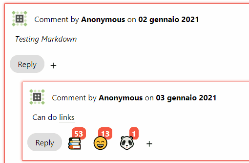
I also use lepre on a personal project, check it out here: Real-Time React Commenting System.
Limitations
lepre aims to be fast and thin and because of that it has some limitations:
- Emojis have to be configured first, there are no defaults
- CSS is not included (but there's a starter CSS in this README!)
Contribute
Contributions are welcome! Please submit a pull request for new features or an issue if you find any bug or problem.
Please bear in mind that this library is meant to be lightweight first.
Contributors
- @lodmfjord - Typescript, Size Improvements
To-Do
- Typescript support (Thanks to @lodmfjord)
- Get 100% Test Coverage (Thanks to @lodmfjord)
CSS
lepre comes with no CSS by default because rarely the stock design will remain unchanged. I thought that no CSS was better than unused CSS.
Every component comes with classes already defined that you can use for styling.
emojiSpan container of EmojiComponentemoji-adderSpan container of the EmojiComponent which renders the "+" signemoji-containerSpan container of EmojiCounteremoji-counterSpan container of the counter in EmojiCounteremoji-menu-openClass applied to the emoji selection menu when it's openedemoji-menu-closedClass applied to the emoji selection menu when it's closedreaction-blockDiv container of the whole library (Default Reactions Block only)
Starter CSS
To help with the design, here's the CSS used in the Demo project for the Default Component.
In the example/src folder of this repo you can find the styles for the other blocks.
.emoji {
  font-size: 25px;
  display: flex;
  align-items: center;
  cursor: pointer;
  vertical-align: middle;
  transform: translateZ(0);
  box-shadow: 0 0 1px rgba(0, 0, 0, 0);
  backface-visibility: hidden;
  -moz-osx-font-smoothing: grayscale;
  transition-duration: 0.1s;
  transition-property: transform;
}

.reaction-div {
  display: inline-flex;
  flex-flow: wrap;
  margin: 10px 0px 10px 10px;
}

.emoji-container {
  position: relative;
  user-select: none;
  display: flex;
}

.emoji-counter {
  font-weight: bold;
  padding: 2px 5px;
  border-radius: 30%;
  background-color: #f55742;
  color: #fefefe;
}
.emoji:hover,
.emoji:focus,
.emoji:active {
  transform: scale(1.1);
}

.reaction-block {
  display: inline-flex;
  flex-flow: wrap;
}

.emoji-adder {
  user-select: none;
  position: relative;
  display: inline-block;
}

.emoji-menu-open {
  position: absolute;
  display: flex;
  top: 0px;
  left: 35px;
  border-radius: 10px;
  box-shadow: rgba(0, 0, 0, 0.24) 0px 3px 8px;
  background-color: #fefefe;
  z-index: 10;
  width: auto;
}

.emoji-menu-open .emoji {
  margin: 5px;
}

.emoji-menu-closed {
  display: none;
}
Changelog
See CHANGELOG.md.
License
MIT © PandaSekh