StephenVinouze / Materialnumberpicker
Programming Languages
Labels
Projects that are alternatives of or similar to Materialnumberpicker
MaterialNumberPicker
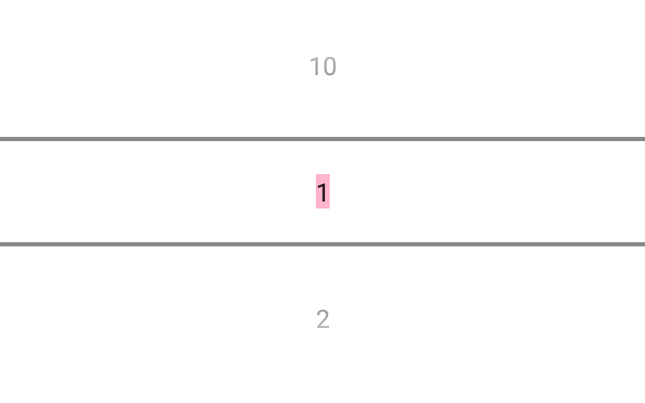
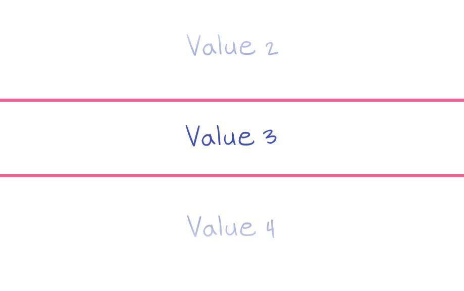
This library takes over the repository that I originally created and passed on but seems no longer maintained. It was ported in Kotlin to provide clearer and more optimized code, and includes various features that are still pending in the previous library. It also provides optionals and nullables with a custom constructor so that you can customize your picker the way you want without using a verbose builder pattern.
| Native NumberPicker | MaterialNumberPicker (default) | MaterialNumberPicker (custom) |
|---|---|---|
 |
 |
 |
Gradle Dependency
Add this in your root build.gradle file:
allprojects {
    repositories {
	maven { url "https://jitpack.io" }
    }
}
Then add the dependencies that you need in your project.
dependencies {
    compile "com.github.StephenVinouze:MaterialNumberPicker:{latest_version}"
}
Usage
Both XML and programmatic instanciations are supported :
<com.github.stephenvinouze.materialnumberpickercore.MaterialNumberPicker
    android:layout_width="match_parent"
    android:layout_height="match_parent"
    app:mnpMaxValue="50"
    app:mnpMinValue="1"
    app:mnpEditable="false"
    app:mnpFontname="Hand.ttf"
    app:mnpSeparatorColor="@color/colorAccent"
    app:mnpTextColor="@color/colorPrimary"
    app:mnpTextSize="16sp"
    app:mnpTextStyle="bold"
    app:mnpValue="10"
    app:mnpWrapped="false" />
val numberPicker = MaterialNumberPicker(
    context = this,
    minValue = 1,
    maxValue = 50,
    value = 10,
    separatorColor = ContextCompat.getColor(this, R.color.colorAccent),
    textColor = ContextCompat.getColor(this, R.color.colorPrimary),
    textSize = resources.getDimensionPixelSize(R.dimen.numberpicker_textsize),
    textStyle = Typeface.BOLD_ITALIC,
    editable = false,
    wrapped = false,
    fontName = "Hand.ttf",
    formatter = NumberPicker.Formatter {
        return@Formatter "Value $it"
    }
)
For Java users, I have overloaded the constructor so that it generates all possible constructors.
MaterialNumberPicker numberPicker = new MaterialNumberPicker(
    this,
    1,
    50,
    10,
    ContextCompat.getColor(this, R.color.colorAccent),
    ContextCompat.getColor(this, R.color.colorPrimary),
    getResources().getDimensionPixelSize(R.dimen.numberpicker_textsize),
    Typeface.BOLD_ITALIC,
    false,
    false,
    "Hand.ttf",
    new NumberPicker.Formatter() {
        @Override
        public String format(int i) {
            return "Value " + i;
        }
    }
);
I have arranged the parameters in priority order but it is not as ideal as with Koltin because you can't name the attributes nor change their orders. However, all attributes are exposed with getter/setters so you can easily set the desired attributes after instanciating the picker with the default constructor.
MaterialNumberPicker numberPicker = new MaterialNumberPicker(this);
numberPicker.setTextColor(ContextCompat.getColor(this, R.color.colorPrimary));
Once you have your number picker, you can present it by itself, or within an alert dialog :
AlertDialog.Builder(this)
    .setTitle(title)
    .setView(numberPicker)
    .setNegativeButton(getString(android.R.string.cancel), null)
    .setPositiveButton(getString(android.R.string.ok), { _, _ ->
        Toast.makeText(this, getString(R.string.picker_value, numberPicker.value), Toast.LENGTH_LONG).show()
    })
    .show()
The only attribute that cannot be defined through XML is the formatter that is natively included in the NumberPicker. It can be directly assigned from the custom constructor when instanciating programmaticaly. Note that all attributes have their own getter/setters and can be upcated anytime durnig your view's lifecycle.
We also provide a way to define either your text style within the picker or a custom font. Be aware though that once you define a custom font, the text style will be overriden by the custom font and won't be interpreted.
Pull requests
I welcome and encourage all pull requests. I might not be able to respond as fast as I would want to but I endeavor to be as responsive as possible.
All PR must:
- Be written in Kotlin
- Maintain code style
- Indicate whether it is a enhancement, bug fix or anything else
- Provide a clear description of what your PR brings
- Enjoy coding in Kotlin :)


