AdityaAnand1 / Morphing Material Dialogs
Programming Languages
Projects that are alternatives of or similar to Morphing Material Dialogs

Morphing Material Dialogs
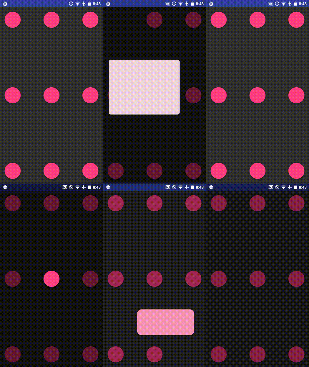
A library for fab-to-dialog morphing (as in Nick Butcher's Plaid) with Aidan Follestad's Material Dialogs.
Table of Contents
Setup Instructions
Add the following to your root (project) level build.gradle:
	allprojects {
		repositories {
			...
			maven { url 'https://jitpack.io' }
		}
	}
Add the library to your app's build.gradle
	dependencies {
		implementation 'com.github.AdityaAnand1:Morphing-Material-Dialogs:0.0.3'
		//you should also have the design support library, since we're using the native floating action button
   		implementation "com.android.support:design:27.0.2"
	}
In your styles.xml, override the MorphDialog.Base themes (at least one, both if you wish to support light and dark themes for your app)
    <style name="MorphDialog.Custom.Light" parent="MorphDialog.Base.Light">
        <item name="colorPrimary">@color/primary</item>
        <item name="colorPrimaryDark">@color/primary_dark</item>
        <item name="colorAccent">@color/accent</item>
    </style>

    <style name="MorphDialog.Custom.Dark" parent="MorphDialog.Base.Dark">
        <item name="colorPrimary">@color/primary</item>
        <item name="colorPrimaryDark">@color/primary_dark</item>
        <item name="colorAccent">@color/accent</item>
    </style>
In your app's manifest file, add the following (at least one, both if you wish to support light and dark themes for your app)
   <activity
       android:name="com.adityaanand.morphdialog.MorphDialogActivity"
       android:theme="@style/MorphDialog.Custom.Light">
   </activity>
   <activity
       android:name="com.adityaanand.morphdialog.MorphDialogActivityDark"
       android:theme="@style/MorphDialog.Custom.Dark">
   </activity>
Usage instructions
This library mirror's a subset of afollestad/material-dialogs API.
new MorphDialog.Builder(this, fabView)
               .title("Title")
               .content("This is a sentence. Here is another one.")
               .positiveText(R.string.ok)
               .onPositive((MorphDialog dialog1, MorphDialogAction which) -> {
                   Toast.makeText(this, "onPositive", Toast.LENGTH_SHORT).show();
               })
               .useDarkTheme(true) //optional, default is false
               .show();
For example, if you have a floating action button in your activity
       <android.support.design.widget.FloatingActionButton
           android:layout_width="wrap_content"
           android:layout_height="wrap_content"
           android:onClick="morph"/>
Then your morph() might look like:
    public void morph(View view) {
        new MorphDialog.Builder(this, (FloatingActionButton) view)
                .title("Title")
                .content("This is a sentence. Here is another one.")
                .show();
    }
Customization
Listen for action button callbacks
MorphDialog is not a dialog. It's another activity and the only way to get back the result of any interactions with it is through onActivityResult().
In order to use the .onPositive(), .onNegative(), .onNeutral or .onAny() callbacks, you must pass on the activity result to the morphDialog object. You must do this for each dialog that you are using individually.
    MorphDialog dialog1;
    MorphDialog dialog2;

    void buildDialog(){
     dialog1 = new MorphDialog.Builder(this, (FloatingActionButton) view)
                .title("Title")
                .content("This is a sentence. Here is another one.")
                .positiveText(R.string.ok)
                .negativeText("Cancel")
                .neutralText("More")
                .onPositive((MorphDialog dialog1, MorphDialogAction which) -> {
                    Toast.makeText(this, "onPositive", Toast.LENGTH_SHORT).show();
                })
                .onNegative((MorphDialog dialog1, MorphDialogAction which) -> {
                    Toast.makeText(this, "onNegative", Toast.LENGTH_SHORT).show();
                })
                .onNeutral((MorphDialog dialog1, MorphDialogAction which) -> {
                    Toast.makeText(this, "onNeutral", Toast.LENGTH_SHORT).show();
                })
                .build();
	}


    @Override
    protected void onActivityResult(int requestCode, int resultCode, Intent data) {
        super.onActivityResult(requestCode, resultCode, data);
        dialog1.onActivityResult(requestCode, resultCode, data);
        dialog2.onActivityResult(requestCode, resultCode, data);
    }
If you have a large number of dialogs you may prefer to use the helper function instead, which uses a varargs parameter to register the callback to multiple dialog objects:
    @Override
    protected void onActivityResult(int requestCode, int resultCode, Intent data) {
        super.onActivityResult(requestCode, resultCode, data);
	MorphDialog.registerOnActivityResult(requestCode, resultCode, data, dialog1, dialog2, dialog3);
    }
Also, note that you will receive the callbacks only after the animation has ended.
Set Canceleable
If you do not want the dialog to close when tapping outside the dialog you can use builder.cancelable(false)
Customize Colors
The following methods can be used to customize the different colors in your dialog
new MorphDialog.Builder(context, (FloatingActionButton) view)
                .contentColor(Color.BLUE)
                .backgroundColor(Color.GREEN)
                .neutralColorRes(R.color.primary)
                .positiveColor(Color.BLACK)
                .titleColor(Color.YELLOW);
Theme overrides
Override the android:windowBackground attribute to provide a custom color for the area outside of the dialog.
    <style name="MorphDialog.Custom.Light" parent="MorphDialog.Base.Light">
        <item name="android:windowBackground">@color/windowBackground</item>
    </style>
Misc
What happens below API 21 (<Lollipop)?
Nothing. Since this library uses activity transitions which are properly supported only for Lollipop and up, the dialog pops up normally without any morphing animation below Lollipop.
Why does the library not support all of Material Dialogs features?
The problem is passing the instructions to build a MaterialDialog (i.e,a MaterialDialog.Builder object) to another activity. The Builder class is not Parcelable and contains a lot of context aware fields like custom views. In the current architecture, there's no clear path to doing this without explicitly adding memory leaks. (Suggestions welcome)
I want to morph from something other than a fab/ I want to morph to something other than MorphDialog
Currently, this library does not support morphing something-other-than-a-fab to something-other-than-a-material-dialog transition. If you'd like for it to work in another setting, say a custom view, head over to the standalone module and check out the minimal implementation (without all the library plumbing) that should point you in the direction of a custom solution.
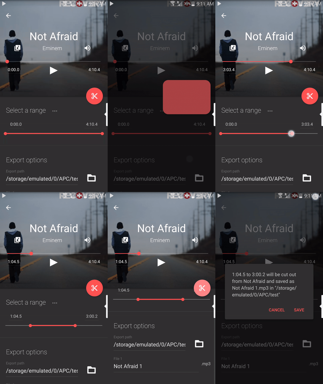
Fun fact: This library was originally built for Timbre.


