siriwatknp / Mui Layout
Jump start Material-UI project with out tears
Stars: ✭ 99
Programming Languages
javascript
184084 projects - #8 most used programming language
This project is moved to mui-treasury

Material-UI Layout 
A set of components that allows you to build dynamic and responsive layout based on Material-UI
Prerequisites
This project based on React Material-UI, so you have to install @material-ui/core @material-ui/styles
Installation
// yarn
yarn add mui-layout @material-ui/core @material-ui/styles @material-ui/icons

// npm
npm install mui-layout @material-ui/core @material-ui/styles @material-ui/icons
Demo
see demo here Storybook Demo
Usage
// this example use icon from material-ui/icons, you can use your own!
import React from 'react';
import { ThemeProvider } from '@material-ui/styles';
import { createMuiTheme } from '@material-ui/core/styles';
import ChevronLeft from '@material-ui/icons/ChevronLeft';
import ChevronRight from '@material-ui/icons/ChevronRight';
import MenuRounded from '@material-ui/icons/MenuRounded';

import {
 Root,
 Header,
 Nav,
 Content,
 Footer,
 presets,
} from 'mui-layout';

const baseTheme = createMuiTheme(); // or use your own theme;
const config = presets.createStandardLayout();

const App = () => (
  <ThemeProvider theme={baseTheme}>
   <Root config={config}>
     <Header
       renderMenuIcon={open => (open ? <ChevronLeft /> : <MenuRounded />)}
     >
       header
     </Header>
     <Nav
       renderIcon={collapsed =>
         collapsed ? <ChevronRight /> : <ChevronLeft />
       }
     >
       nav
     </Nav>
     <Content>
       content
     </Content>
     <Footer>
       footer
     </Footer>
   </Root>
  </ThemeProvider>
)

export default App;
Built-in Features
-
Collapsible Nav
-
Header Magnet
-
Auto Collapsed
-
Responsive Config
const extendedConfigs2 = {
  ...defaultConfig,

  // navVariant is 'temporary' in mobile and tablet, 'permanent' in desktop and greater
  navVariant: {
    xs: 'temporary',
    md: 'permanent',
  },
Custom Styles
Mostly, you will custom Header & Nav. This is an example for Header
import { makeStyles } from '@material-ui/styles';

const useHeaderStyles = makeStyles(({ palette, spacing }) => ({
  header: {
    backgroundColor: palette.secondary.main,
  },
  menuBtn: {
    padding: spacing(2.5),
    borderRadius: 0,
  },
  icon: {
    color: palette.common.white,
  },
  toolbar: {
    padding: spacing(0, 1),
  },
}));

function App() {
  const {
    icon: iconCss,
    toolbar: toolbarCss,
    header: headerCss,
    menuBtn: menuBtnCss,
  } = useHeaderStyles();
  return (
    <Header
      classes={{ root: headerCss }}
      renderMenuIcon={open =>
        open ? (
          <ChevronLeft className={iconCss} />
        ) : (
          <MenuRounded classes={{ root: iconCss }} />
        )
      }
      menuButtonProps={{ className: menuBtnCss }}
      toolbarProps={{ className: toolbarCss }}
    />
  );
}
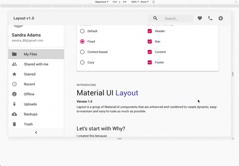
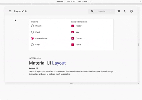
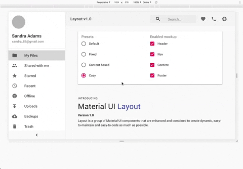
Presets
-
Standard
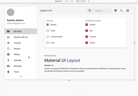
-
Fixed
-
Content Based
-
Cozy
How it works
-
They are basically material-ui components that are combined to make things easier.
AppBar,Toolbar,Drawer -
use
@material-ui/stylesto style components -
use react-hooks
Contributing
Pull requests are welcome. For major changes, please open an issue first to discuss what you would like to change.
Please make sure to update tests as appropriate.
License
Note that the project description data, including the texts, logos, images, and/or trademarks,
for each open source project belongs to its rightful owner.
If you wish to add or remove any projects, please contact us at [email protected].