nextjs-components
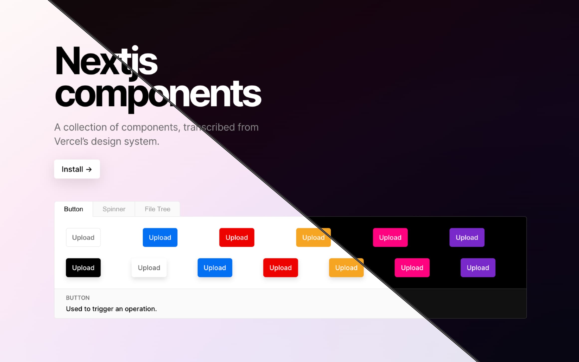
A collection of React components, transcribed from https://vercel.com/design. 1


Motivation
Blog post from 01/09/2022
Todo's
- Unit test coverage
- Unit tests in CI (Github workflows)
- Add every component to the docs site
- Deploy the docs site
- Report Bundle size
- Figure out monorepo situation
- Lerna? Turborepo?
- 1 Large components-package or multiple per-component packages?
- Move Todo's to project board
Installation
# with npm
npm i nextjs-components
# with yarn
yarn add nextjs-componentsThis project uses TypeScript and CSS modules. It relies on next-transpile-modules to work in a Next.js app.
yarn add next-transpile-modulesUsage
With Next.js
Hide/Show Example Code
Transpile
// next.config.js
const withTM = require("next-transpile-modules")(["nextjs-components"]);

/**
 * @type {import('next').NextConfig}
 */
const nextConfig = {
  reactStrictMode: true,
};

module.exports = withTM(nextConfig);
Import Global CSS
// pages/_app.tsx
import "nextjs-components/dist/styles/globals.css";

import {
  ThemeContextProvider,
  ToastsProvider,
  ToastArea,
} from "nextjs-components";

function App({ Component, pageProps }) {
  return (
    <ThemeContextProvider>
      <ToastsProvider>
        <Component {...pageProps} />
        <ToastArea />
      </ToastsProvider>
    </ThemeContextProvider>
  );
}

export default App;
Import Components
// pages/index.tsx
import {
  Button,
  Checkbox,
  Container,
  fs,
  LoadingDots,
  Spacer,
  Spinner,
  Text,
  useTheme,
  useToasts,
  IconSizeContext,
  Toggle,
} from "nextjs-components";

import { Sun, Moon } from "nextjs-components/dist/icons";

export default function IndexPage() {
  const { selectTheme, isDarkMode } = useTheme();
  const toast = useToasts();

  return (
    <Container center>
      <Container row vcenter>
        <IconSizeContext.Provider value={{ size: 18 }}>
          <Sun />
          <Spacer x={0.4} />
          <Toggle
            checked={isDarkMode}
            onChange={(checked) => {
              selectTheme(checked ? "dark" : "light");
              toast.current.message(
                `Theme has been set to ${checked ? "dark" : "light"}`
              );
            }}
          />
          <Spacer x={0.4} />
          <Moon />
        </IconSizeContext.Provider>
      </Container>
      <Text h1 noMargin>
        Hello World
      </Text>
      <Text h2 noMargin>
        Hello World
      </Text>
      <Text h3 noMargin>
        Hello World
      </Text>

      <Spacer />

      <fs.Fieldset>
        <fs.Content>
          <fs.Title>The Holland Lop Jumped over the Fence</fs.Title>
          <fs.Subtitle>The Holland Lop Jumped over the Fence</fs.Subtitle>
        </fs.Content>
        <fs.Footer>
          <fs.Footer.Status>
            The Holland lop Jumped over the Fence
            <Spacer />
          </fs.Footer.Status>
          <fs.Footer.Actions>
            <Button size="small">Action</Button>
          </fs.Footer.Actions>
        </fs.Footer>
      </fs.Fieldset>

      <Spacer />
      <Button>A button!</Button>
      <Spacer />
      <Checkbox>A checkbox</Checkbox>
      <Spacer />
      <LoadingDots size={8} />
      <Spacer />
      <Spinner />
    </Container>
  );
}
With create-react-app
Hide/Show Example Code
// index.js
import { StrictMode } from "react";
import ReactDOM from "react-dom";

import "nextjs-components/dist/styles/globals.css";

import {
  ThemeContextProvider,
  ToastsProvider,
  ToastArea,
} from "nextjs-components";

import App from "./App";

const rootElement = document.getElementById("root");
ReactDOM.render(
  <StrictMode>
    <ThemeContextProvider>
      <ToastsProvider>
        <App />
        <ToastArea />
      </ToastsProvider>
    </ThemeContextProvider>
  </StrictMode>,
  rootElement
);
// App.js
import {
Button,
Checkbox,
Container,
fs,
LoadingDots,
Spacer,
Spinner,
Text,
useTheme,
useToasts,
IconSizeContext,
Toggle,
} from "nextjs-components";
import { Sun, Moon } from "nextjs-components/dist/icons";
export default function App() {
const { selectTheme, isDarkMode } = useTheme();
const toast = useToasts();
return (
<Container center>
<Container row vcenter>
<IconSizeContext.Provider value={{ size: 18 }}>
<Sun />
<Spacer x={0.4} />
<Toggle
checked={isDarkMode}
onChange={(checked) => {
selectTheme(checked ? "dark" : "light");
toast.current.message(
`Theme has been set to ${checked ? "dark" : "light"}`
);
}}
/>
<Spacer x={0.4} />
<Moon />
</IconSizeContext.Provider>
</Container>
<Text h1 noMargin>
Hello World
</Text>
<Text h2 noMargin>
Hello World
</Text>
<Text h3 noMargin>
Hello World
</Text>
<Spacer />
<fs.Fieldset>
<fs.Content>
<fs.Title>The Holland Lop Jumped over the Fence</fs.Title>
<fs.Subtitle>The Holland Lop Jumped over the Fence</fs.Subtitle>
</fs.Content>
<fs.Footer>
<fs.Footer.Status>
The Holland lop Jumped over the Fence
<Spacer />
</fs.Footer.Status>
<fs.Footer.Actions>
<Button size="small">Action</Button>
</fs.Footer.Actions>
</fs.Footer>
</fs.Fieldset>
<Spacer />
<Button>A button!</Button>
<Spacer />
<Checkbox>A checkbox</Checkbox>
<Spacer />
<LoadingDots size={8} />
<Spacer />
<Spinner />
</Container>
);
}