Obsidian Style Settings Plugin
This plugin allows snippet, theme, and plugin CSS files to define a set of configuration options. It then allows users to see all the tweakable settings in one settings pane. Style Settings allows both toggling classes on and off the body element, as well as setting numeric, string, and color CSS variables.
This CSS Snippet can be used to adjust every CSS variable of the default Obsidian theme.
Configurable settings are defined by comments within CSS files beginning with /* @settings. These comments must contain YAML with name, id, and settings properties. Style Settings will scan all CSS loaded by Obsidian for these comments.
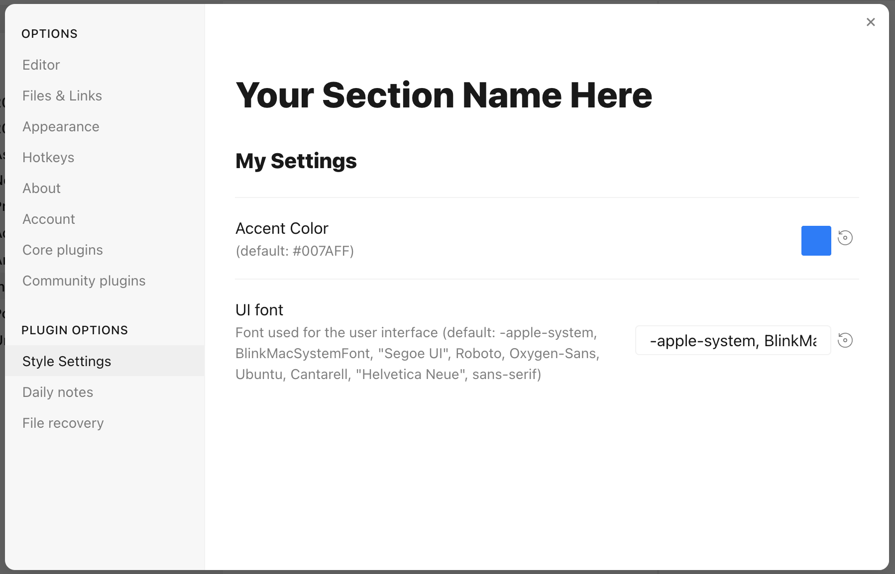
For example, adding this to a CSS snippet in your vault:
/* @settings

name: Your Section Name Here
id: a-unique-id
settings:
    -
        id: my-title
        title: My Settings
        type: heading
        level: 3
    -
        id: accent
        title: Accent Color
        type: variable-color
        format: hsl-split
        default: '#007AFF'
    -
        id: text
        title: UI font
        description: Font used for the user interface
        type: variable-text
        default: -apple-system, BlinkMacSystemFont, "Segoe UI", Roboto, Oxygen-Sans, Ubuntu, Cantarell, "Helvetica Neue", sans-serif

*/
will result in:
Each setting definition must be separated by a dash (-). There are 7 setting types.
All settings definitions must have these parameters:
id: A unique id for the setting parametertitle: The name of the settingdescription(optional): a description of the settingtype: The type of setting. Can be one of:heading: a heading element for organizing settingsclass-toggle: a switch to toggle classes on thebodyelementclass-select: a dropdown menu of predefined options to add classes on thebodyelementvariable-text: a text-based CSS variablevariable-number: a numeric CSS variablevariable-number-slider: a numeric CSS variable represented by a slidervariable-select: a text-based CSS variable displayed as a dropdown menu of predefined optionsvariable-color: a color CSS variable with corresponding color picker
heading
headings can be used to organize and group settings into collapsable nested sections. Along with the required attributes, headings must contain a level attribute between 1 and 6, and can optionally contain a collapsed attribute:
/* @settings

name: Your Section Name Here
id: a-unique-id
settings:
    -
        id: this-is-a-heading
        title: My Heading
        type: heading
        level: 2
        collapsed: true

*/
class-toggle
class-toggles will toggle a css class on and off of the body element, allowing CSS themes and snippets to toggle features on and off. The id of the setting will be used as the class name. The default parameter can optionally be set to true.
/* @settings

name: Your Section Name Here
id: a-unique-id
settings:
    -
        id: my-css-class
        title: My Toggle
        description: Adds my-css-class to the body element
        type: class-toggle

*/
class-select
class-select creates a dropdown of predefined options for a CSS variable. The id of the setting will be used as the variable name.
- When
allowEmptyisfalse, adefaultoption must be specified. - When
allowEmptyistrue, thedefaultattribute is optional, and may be set tonone.
/* @settings

name: Your Section Name Here
id: a-unique-id
settings:
    -
        id: theme-variant
        title: Theme variant
        description: Variations on a theme
        type: class-select
        allowEmpty: false
        default: my-class
        options:
            - my-class
            - my-other-class
            - and-yet-another

*/
Options may also be given a label:
/* @settings

name: Your Section Name Here
id: a-unique-id
settings:
    -
        id: theme-variant
        title: Theme variant
        description: Variations on a theme
        type: class-select
        allowEmpty: false
        default: my-class
        options:
            -
                label: My Class
                value: my-class
            -
                label: My Other Class
                value: my-other-class
*/
variable-text
variable-text represents any text based CSS value. The id of the setting will be used as the variable name. variable-text settings require a default attribute.
/* @settings

name: Your Section Name Here
id: a-unique-id
settings:
    -
        id: text
        title: UI font
        description: Font used for the user interface
        type: variable-text
        default: -apple-system, BlinkMacSystemFont, "Segoe UI", Roboto, Oxygen-Sans, Ubuntu, Cantarell, "Helvetica Neue", sans-serif

*/
This will output the variable:
--text: -apple-system, BlinkMacSystemFont, "Segoe UI", Roboto, Oxygen-Sans, Ubuntu, Cantarell, "Helvetica Neue", sans-serif;
variable-number
variable-number represents any numeric CSS value. The id of the setting will be used as the variable name. variable-number settings require a default attribute. Optionally, a format attribute can be set. This value will be appended to the number. Eg format: px will result in 42px
/* @settings

name: Your Section Name Here
id: a-unique-id
settings:
    -
        id: line-width
        title: Line width
        description: The maximum line width in rem units
        type: variable-number
        default: 42
        format: rem

*/
This will output the variable:
--line-width: 42rem;
variable-number-slider
variable-number-slider represents any numeric CSS value. The id of the setting will be used as the variable name. variable-number-slider settings require a default attribute, as well as these three attributes:
min: The minimum possible value of the slidermax: The maximum possible value of the sliderstep: The size of each "tick" of the slider. For example, a step of 100 will only allow the slider to move in increments of 100.
Optionally, a format attribute can be set. This value will be appended to the number. Eg format: px will result in 42px
/* @settings

name: Your Section Name Here
id: a-unique-id
settings:
    -
        id: line-width
        title: Line width
        description: The maximum line width in rem units
        type: variable-number-slider
        default: 42
        min: 10
        max: 100
        step: 1

*/
This will output the variable:
--line-width: 42;
variable-select
variable-select creates a dropdown of predefined options for a CSS variable. The id of the setting will be used as the variable name. variable-select settings require a default attribute as well as a list of options.
/* @settings

name: Your Section Name Here
id: a-unique-id
settings:
    -
        id: text
        title: UI font
        description: Font used for the user interface
        type: variable-select
        default: Roboto
        options:
            - Roboto
            - Helvetica Neue
            - sans-serif
            - Segoe UI

*/
Options can optionally be given a label:
/* @settings

name: Your Section Name Here
id: a-unique-id
settings:
    -
        id: text
        title: UI font
        description: Font used for the user interface
        type: variable-select
        default: Roboto
        options:
            -
                label: The best font
                value: Roboto
            -
                label: The next best font
                value: Helvetica Neue
*/
This will output the variable:
--text: Roboto;
variable-color
variable-color creates a color picker with a variety of output format options. A default attribute is required in hex or rgb format. Note: hex color values must be wrapped in quotes. A format attribute is also required.
Optional parameters:
- Setting
opacitytotruewill enable opacity support in all output formats. - A list of alternate output formats can be supplied via the
alt-formatsetting
/* @settings

name: Your Section Name Here
id: a-unique-id
settings:
    -
        id: accent
        title: Accent Color
        type: variable-color
        opacity: false
        format: hex
        alt-format:
            -
                id: accent-rgb
                format: rgb
        default: '#007AFF'

*/
This will output the variable:
--accent: #007AFF;
--accent-rgb: rgb(0, 123, 255);
variable-themed-color
variable-themed-color is identical to variable-color except that it generates two color pickers for a light and dark variant.
/* @settings

name: Your Section Name Here
id: a-unique-id
settings:
    -
        id: accent
        title: Accent Color
        type: variable-themed-color
        format: hex
        opacity: false
        default-light: '#007AFF'
        default-dark: '#2DB253'

*/
This will output the variables:
body.theme-light.css-settings-manager { --accent: #007AFF; }
body.theme-dark.css-settings-manager { --accent: #2DB253; }
variable-color formatting options
There are 7 formatting options:
hex
--accent: #007AFF;
When opacity is set to true:
--accent: #007AFFFF;
rgb
--accent: rgb(0, 122, 255);
When opacity is set to true:
--accent: rgba(0, 122, 255, 1);
rgb-values
--accent: 0, 122, 255;
When opacity is set to true:
--accent: 0, 122, 255, 1;
rgb-split
--accent-r: 0;
--accent-g: 122;
--accent-b: 255;
When opacity is set to true:
--accent-r: 0;
--accent-g: 122;
--accent-b: 255;
--accent-a: 1;
hsl
--accent: hsl(211, 100%, 50%);
When opacity is set to true:
--accent: hsla(211, 100%, 50%, 1);
hsl-values
--accent: 211, 100%, 50%;
When opacity is set to true:
--accent: 211, 100%, 50%, 1;
hsl-split
--accent-h: 211;
--accent-s: 100%;
--accent-l: 50%;
When opacity is set to true:
--accent-h: 211;
--accent-s: 100%;
--accent-l: 50%;
--accent-a: 1;
Localization Support
Translations for titles and descriptions can be supplied for each language Obsidian supports by using one of the following postfixes:
en: English
zh: 简体中文
zh-TW: 繁體中文
ru: Pусский
ko: 한국어
it: Italiano
id: Bahasa Indonesia
ro: Română
pt-BR: Portugues do Brasil
cz: čeština
de: Deutsch
es: Español
fr: Français
no: Norsk
pl: język polski
pt: Português
ja: 日本語
da: Dansk
uk: Український
sq: Shqip
tr: Türkçe (kısmi)
hi: हिन्दी (आंशिक)
nl: Nederlands (gedeeltelijk)
ar: العربية (جزئي)
For example:
```css
/* @settings

name: Your Section Name Here
id: a-unique-id
settings:
    -
        id: my-css-class
        title: My Toggle
        title.de: Mein Toggle
        title.ko: 내 토글
        description: Adds my-css-class to the body element
        description.de: Fügt my-css-class zum body-Element hinzu
        description.ko: my-css-class를 body 요소에 추가합니다.
        type: class-toggle

*/