Haixiang6123 / Overwatch Ui
Licence: mit
A UI library of Overwatch, built with Vue.js
Stars: ✭ 365
Labels
Projects that are alternatives of or similar to Overwatch Ui
CheckMarkView
UI view which draws programmatically a checkmark with different styles
Stars: ✭ 35 (-90.41%)
Mutual labels: uikit, ui-components
unity-ui-manager
🎫 A Simple UI Manager for rapid prototyping and ease of collaboration
Stars: ✭ 44 (-87.95%)
Mutual labels: uikit, ui-components
qi-design-vue
This is a design standard with an implement for web UI components library based on Vue.
Stars: ✭ 26 (-92.88%)
Mutual labels: uikit, ui-components
Underexpress
A free, responsive, ready to use website ui kit, built with bootstrap 4.
Stars: ✭ 205 (-43.84%)
Mutual labels: uikit, ui-components
Chakra Ui
⚡️ Simple, Modular & Accessible UI Components for your React Applications
Stars: ✭ 22,745 (+6131.51%)
Mutual labels: uikit, ui-components
Numl
A UI Design Language, WC UI Library, and Runtime CSS Framework for rapidly building interfaces that follow your Design System 🌈
Stars: ✭ 229 (-37.26%)
Mutual labels: uikit, ui-components
taiga-ui
Angular UI Kit and components library for awesome people
Stars: ✭ 2,251 (+516.71%)
Mutual labels: uikit, ui-components
Collectionviewslantedlayout
A CollectionView Layout displaying a slanted cells
Stars: ✭ 2,029 (+455.89%)
Mutual labels: uikit, ui-components
laravel-starter-kit
A minimal starter kit for Laravel 8 using Bootstrap 5 and Webpixels CSS.
Stars: ✭ 23 (-93.7%)
Mutual labels: uikit, ui-components
sodium-ui
Sodium is a simple, modular and customizable web component library to build elegant and accessible UI pieces for your React Application.
Stars: ✭ 23 (-93.7%)
Mutual labels: uikit, ui-components
Komponents Deprecated
📦 React-inspired UIKit Components - ⚠️ Deprecated
Stars: ✭ 202 (-44.66%)
Mutual labels: uikit, ui-components
Uix Kit
A free UI toolkit based on some common libraries for building beautiful responsive website, compatible with Bootstrap v4.
Stars: ✭ 318 (-12.88%)
Mutual labels: uikit, ui-components
Boomerang Free Bootstrap Ui Kit
Boomerang is a high quality UI Kit built on top of the well known Bootstrap 4 Framework. This theme was designed as its own extended version of Bootstrap with multiple functionalities and controls added, extended color palette and beautiful typography.
Stars: ✭ 196 (-46.3%)
Mutual labels: uikit, ui-components
open design system
Open Source Design System using Sketch. It's early days of my project.
Stars: ✭ 22 (-93.97%)
Mutual labels: uikit, ui-components
Light dark toggle
An awesome flutter app which artistically animates light and dark mode 😍
Stars: ✭ 175 (-52.05%)
Mutual labels: uikit, ui-components
ng-sq-ui
Flexible and easily customizable UI-kit for Angular 11+
Stars: ✭ 99 (-72.88%)
Mutual labels: uikit, ui-components
Styled Bootstrap
💅🏻 A styled-component implementation of Bootstrap
Stars: ✭ 154 (-57.81%)
Mutual labels: uikit, ui-components
monalisa-ui
MonalisaUI ✨ React Native UI Library
Stars: ✭ 37 (-89.86%)
Mutual labels: uikit, ui-components
Material Bread
Cross Platform React Native Material Design Components
Stars: ✭ 287 (-21.37%)
Mutual labels: uikit, ui-components
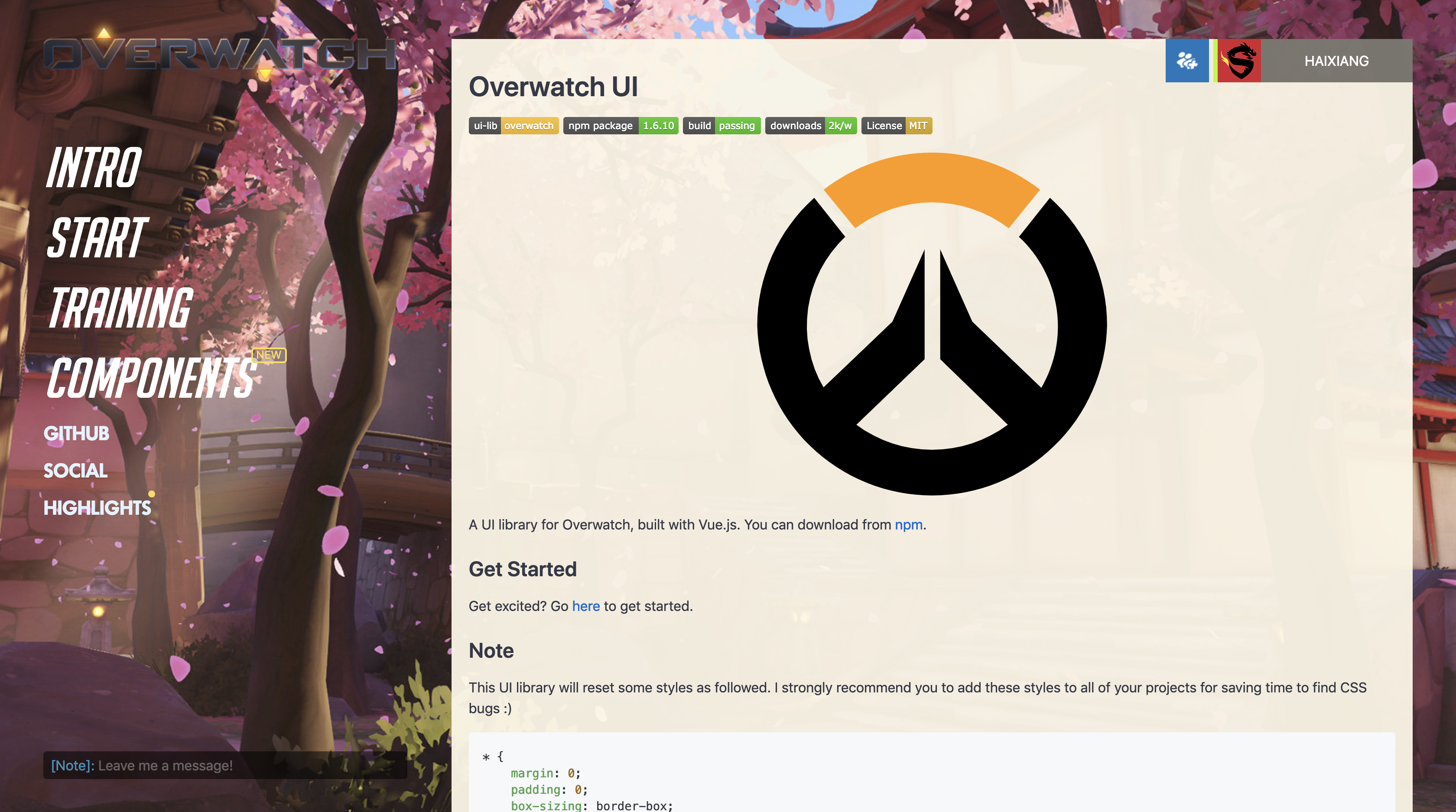
overwatch-ui
Overwatch UI library for Web APP, built with Vue.js.
Documentation
Install
$ yarn add overwatch-ui

or

$ npm install overwatch-ui --save
Import
Then you need to import its components and plugins in main.js.
// main.js
// Import the library
import OwUI from 'overwatch-ui'
import 'overwatch-ui/dist/overwatch-ui.css'

// Use some plugins
Vue.use(OwUI.plugins.$owAlert)

// Register components that you need in the root component
new Vue({
    components: {
        ...OwUI.Components
    },
    router,
    render: h => h(App)
}).$mount('#app')
Usage
Now, let's place some components in your Web APP!
<ow-button type="info">Info</ow-button>
<ow-button type="primary">Primary</ow-button>
<ow-button type="success">Success</ow-button>
<ow-button type="warning">Warning</ow-button>
<ow-button type="danger">Danger</ow-button>

<ow-popover position="top">
    <template slot="content">
        <div>Hello, Overwatch UI!</div>
    </template>
    <ow-button>Pop It!</ow-button>
</ow-popover>
If you wanna explore more usages, here's a playground on CodeSandBox.io.
Note
This UI library will reset some styles as followed. I strongly recommend you to add these styles to all of your projects for saving time to find CSS bugs :)
* {
    margin: 0;
    padding: 0;
    box-sizing: border-box;
}
Copyright Statement
I love playing Overwatch, so I built this just for fun but not for commercial purpose. Please note: some images, logos are from Overwatch made by Blizzard Entertainment. If you want to use this lib for commercial purpose, you have to obey those licences and place a proper licence for your project.
Note that the project description data, including the texts, logos, images, and/or trademarks,
for each open source project belongs to its rightful owner.
If you wish to add or remove any projects, please contact us at [email protected].


