wieslawsoltes / Panandzoom
Licence: mit
Pan and zoom control for Avalonia.
Stars: ✭ 159
Projects that are alternatives of or similar to Panandzoom
Core2d
A multi-platform data driven 2D diagram editor.
Stars: ✭ 475 (+198.74%)
Mutual labels: multi-platform, gui, xaml
Avalonia
A cross platform XAML framework for .NET
Stars: ✭ 12,588 (+7816.98%)
Mutual labels: multi-platform, gui, xaml
Toastnotifications
Toast notifications for WPF allows you to create and display rich notifications in WPF applications. It's highly configurable with set of built-in options like positions, behaviours, themes and many others. It's extendable, it gives you possibility to create custom and interactive notifications in simply manner.
Stars: ✭ 507 (+218.87%)
Mutual labels: gui, xaml, control
DialogHost.Avalonia
AvaloniaUI control that provides a simple way to display a dialog with information or prompt the user when information is needed
Stars: ✭ 92 (-42.14%)
Mutual labels: xaml, multi-platform, control
React Prismazoom
A pan and zoom component for React, using CSS transformations.
Stars: ✭ 29 (-81.76%)
Mutual labels: zoom, pan
Reactivehistory
Reactive undo/redo framework for .NET.
Stars: ✭ 82 (-48.43%)
Mutual labels: multi-platform, xaml
Mahapps.metro.simplechildwindow
A simple child window for MahApps.Metro
Stars: ✭ 339 (+113.21%)
Mutual labels: gui, xaml
React Pan Zoom
Generic html wrapper for pan and zoom feature for react canvas like components
Stars: ✭ 31 (-80.5%)
Mutual labels: zoom, pan
Avaloniabehaviors
Port of Windows UWP Xaml Behaviors for Avalonia Xaml.
Stars: ✭ 96 (-39.62%)
Mutual labels: multi-platform, xaml
Aura.ui
A Library with a lot of Controls for AvaloniaUI
Stars: ✭ 114 (-28.3%)
Mutual labels: xaml, control
React Svg Pan Zoom
👀 A React component that adds pan and zoom features to SVG
Stars: ✭ 569 (+257.86%)
Mutual labels: zoom, pan
Handycontrols
Contains some simple and commonly used WPF controls based on HandyControl
Stars: ✭ 347 (+118.24%)
Mutual labels: xaml, control
Panzoom
Universal pan and zoom library (DOM, SVG, Custom)
Stars: ✭ 1,003 (+530.82%)
Mutual labels: zoom, pan
Panzoom
A library for panning and zooming elements using CSS transforms 🔍
Stars: ✭ 1,593 (+901.89%)
Mutual labels: zoom, pan
ColorPicker
Customizable Color Picker control for WPF
Stars: ✭ 57 (-64.15%)
Mutual labels: xaml, control
Flutter advanced networkimage
flutter advanced network image provider
Stars: ✭ 282 (+77.36%)
Mutual labels: zoom, pan
PanAndZoom


PanAndZoom control for Avalonia
NuGet
PanAndZoom is delivered as a NuGet package.
You can find the NuGet packages here for Avalonia or by using nightly build feed:
- Add
https://www.myget.org/F/panandzoom-nightly/api/v2to your package sources - Alternative nightly build feed
https://pkgs.dev.azure.com/wieslawsoltes/GitHub/_packaging/Nightly/nuget/v3/index.json - Update your package using
PanAndZoomfeed
You can install the package for Avalonia based projects like this:
Install-Package Avalonia.Controls.PanAndZoom -Pre
Package Sources
Resources
Using PanAndZoom
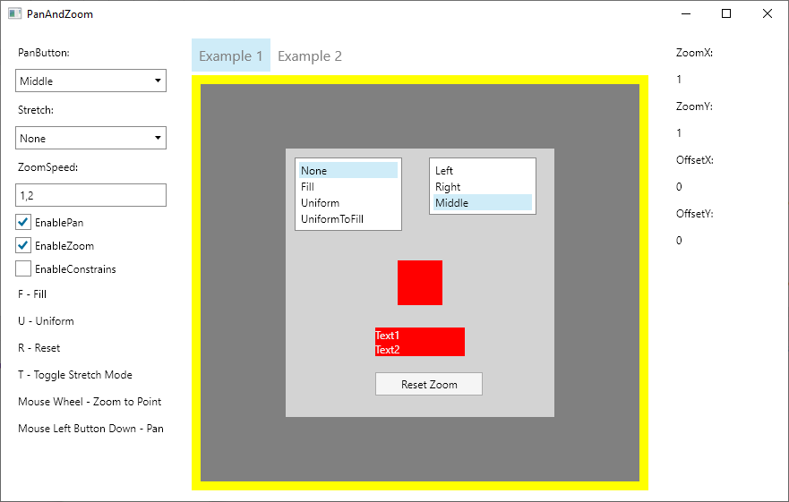
MainWindow.xaml
<Window x:Class="AvaloniaDemo.MainWindow"
        xmlns="https://github.com/avaloniaui"
        xmlns:x="http://schemas.microsoft.com/winfx/2006/xaml"
        xmlns:paz="using:Avalonia.Controls.PanAndZoom"
        WindowStartupLocation="CenterScreen" UseLayoutRounding="True"
        Title="PanAndZoom" Height="640" Width="640">
    <Grid RowDefinitions="Auto,12,Auto,12,*,12" ColumnDefinitions="50,*,50">
        <StackPanel Orientation="Vertical"
                    HorizontalAlignment="Center" Grid.Row="0" Grid.Column="1">
            <TextBlock Text="F - Fill"/>
            <TextBlock Text="U - Uniform"/>
            <TextBlock Text="R - Reset"/>
            <TextBlock Text="T - Toggle Stretch Mode"/>
            <TextBlock Text="Mouse Wheel - Zoom to Point"/>
            <TextBlock Text="Mouse Left Button Down - Pan"/>
        </StackPanel>
        <StackPanel Orientation="Horizontal"
                    HorizontalAlignment="Center" Grid.Row="2" Grid.Column="1">
            <TextBlock Text="PanButton:" VerticalAlignment="Center"/>
            <ComboBox Items="{x:Static paz:ZoomBorder.ButtonNames}"
                      SelectedItem="{Binding #ZoomBorder.PanButton, Mode=TwoWay}"
                      Margin="2">
            </ComboBox>
            <TextBlock Text="Stretch:" VerticalAlignment="Center"/>
            <ComboBox Items="{x:Static paz:ZoomBorder.StretchModes}"
                      SelectedItem="{Binding #ZoomBorder.Stretch, Mode=TwoWay}"
                      Margin="2">
            </ComboBox>
            <TextBlock Text="ZoomSpeed:" VerticalAlignment="Center"/>
            <TextBox Text="{Binding #ZoomBorder.ZoomSpeed, Mode=TwoWay}"
                     TextAlignment="Center" Width="50" Margin="2"/>
            <CheckBox IsChecked="{Binding #ZoomBorder.EnablePan}"
                      Content="EnablePan" VerticalAlignment="Center"/>
            <CheckBox IsChecked="{Binding #ZoomBorder.EnableZoom}"
                      Content="EnableZoom" VerticalAlignment="Center"/>
        </StackPanel>
        <ScrollViewer Grid.Row="4" Grid.Column="1"
                      VerticalScrollBarVisibility="Auto"
                      HorizontalScrollBarVisibility="Auto">
            <paz:ZoomBorder Name="ZoomBorder" Stretch="None" ZoomSpeed="1.2"
                            Background="SlateBlue" ClipToBounds="True" Focusable="True"
                            VerticalAlignment="Stretch" HorizontalAlignment="Stretch">
                <Canvas Background="LightGray" Width="300" Height="300">
                    <Rectangle Canvas.Left="100" Canvas.Top="100" Width="50" Height="50" Fill="Red"/>
                    <StackPanel Canvas.Left="100" Canvas.Top="200">
                        <TextBlock Text="Text1" Width="100" Background="Red" Foreground="WhiteSmoke"/>
                        <TextBlock Text="Text2" Width="100" Background="Red" Foreground="WhiteSmoke"/>
                    </StackPanel>
                </Canvas>
            </paz:ZoomBorder>
        </ScrollViewer>
    </Grid>
</Window>
MainWindow.xaml.cs
using System.Diagnostics;
using Avalonia;
using Avalonia.Controls;
using Avalonia.Controls.PanAndZoom;
using Avalonia.Input;
using Avalonia.Markup.Xaml;

namespace AvaloniaDemo
{
    public class MainWindow : Window
    {
        private readonly ZoomBorder? _zoomBorder;

        public MainWindow()
        {
            this.InitializeComponent();
            this.AttachDevTools();

            _zoomBorder = this.Find<ZoomBorder>("ZoomBorder");
            if (_zoomBorder != null)
            {
                _zoomBorder.KeyDown += ZoomBorder_KeyDown;

                _zoomBorder.ZoomChanged += ZoomBorder_ZoomChanged;
            }
        }

        private void InitializeComponent()
        {
            AvaloniaXamlLoader.Load(this);
        }

        private void ZoomBorder_KeyDown(object? sender, KeyEventArgs e)
        {
            switch (e.Key)
            {
                case Key.F:
                    _zoomBorder?.Fill();
                    break;
                case Key.U:
                    _zoomBorder?.Uniform();
                    break;
                case Key.R:
                    _zoomBorder?.ResetMatrix();
                    break;
                case Key.T:
                    _zoomBorder?.ToggleStretchMode();
                    _zoomBorder?.AutoFit();
                    break;
            }
        }

        private void ZoomBorder_ZoomChanged(object sender, ZoomChangedEventArgs e)
        {
            Debug.WriteLine($"[ZoomChanged] {e.ZoomX} {e.ZoomY} {e.OffsetX} {e.OffsetY}");
        }
    }
}
Getting zoom ratio
To get current zoom ratio use ZoomX and ZoomY properties.
Getting pan offset
To get current pan offset use OffsetX and OffsetY properties.
Constrain zoom ratio
To constrain zoom ratio use MinZoomX, MaxZoomX, MinZoomY and MaxZoomY properties.
Constrain pan offset
To constrain pan offset use MinOffsetX, MaxOffsetX, MinOffsetY and MaxOffsetY properties.
Enable or disable constrains
To enable or disable constrains use EnableConstrains flag.
License
PanAndZoom is licensed under the MIT license.
Note that the project description data, including the texts, logos, images, and/or trademarks,
for each open source project belongs to its rightful owner.
If you wish to add or remove any projects, please contact us at [email protected].