🌀 Portal.JS
Create a gateway to your data
- What is Portal.JS ?
- Installation and setup
- Getting Started
- Tutorial
- Architecture / Reference
- Appendix
What is Portal.JS
portal.js is a framework for rapidly building rich data portal frontends using a modern frontend approach. portal.js can be used to present a single dataset or build a full-scale data catalog/portal.
portal.js is built in Javascript and React on top of the popular Next.js framework. portal assumes a "decoupled" approach where the frontend is a separate service from the backend and interacts with backend(s) via an API. It can be used with any backend and has out of the box support for CKAN.
Features
🗺️ Unified sites: present data and content in one seamless site, pulling datasets from a DMS (e.g. CKAN) and content from a CMS (e.g. wordpress) with a common internal API.👩💻 Developer friendly: built with familiar frontend tech Javascript, React etc🔋 Batteries included: Full set of portal components out of the box e.g. catalog search, dataset showcase, blog etc.🎨 Easy to theme and customize: installable themes, use standard CSS and React+CSS tooling. Add new routes quickly.🧱 Extensible: quickly extend and develop/import your own React components📝 Well documented: full set of documentation plus the documentation of NextJS and Apollo.
For developers
🏗 Build with modern, familiar frontend tech such as Javascript and React.🚀 NextJS framework: so everything in NextJS for free React, SSR, static site generation, huge number of examples and integrations etc.- SSR => unlimited number of pages, SEO etc whilst still using React.
- Static Site Generation (SSG) (good for small sites) => ultra-simple deployment, great performance and lighthouse scores etc
Installation and setup
Before installation, ensure your system satisfies the following requirements:
- Node.js 10.13 or later
- Nextjs 10.0.3
- MacOS, Windows (including WSL), and Linux are supported
Note: We also recommend instead of npm using
yarninstead ofnpm.
Portal.js is built with React on top of Nextjs framework, so for a quick setup, you can bootstrap a Nextjs app and install portal.js as demonstrated in the code below:
## Create a react app
npx create-next-app
# or
yarn create next-app
After the installation is complete, follow the instructions to start the development server. Try editing pages/index.js and see the result on your browser.
For more information on how to use create-next-app, you can review the create-next-app documentation.
Once you have Nextjs created, you can install portal.js:
yarn add https://github.com/datopian/portal.js.git
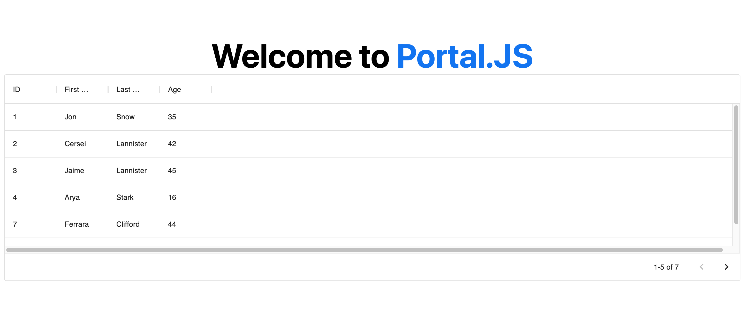
You're now ready to use portal.js in your next app. To test portal.js, open your index.js file in the pages folder. By default you should have some autogenerated code in the index.js file:
Which outputs a page with the following content:

Now, we are going to do some clean up and add a table component. In the index.js file, import a Table component from portal as shown below:
import Head from 'next/head'
import { Table } from 'portal' //import Table component
import styles from '../styles/Home.module.css'

export default function Home() {

  const columns = [
    { field: 'id', headerName: 'ID' },
    { field: 'firstName', headerName: 'First name' },
    { field: 'lastName', headerName: 'Last name' },
    { field: 'age', headerName: 'Age' }
  ];

  const rows = [
    { id: 1, lastName: 'Snow', firstName: 'Jon', age: 35 },
    { id: 2, lastName: 'Lannister', firstName: 'Cersei', age: 42 },
    { id: 3, lastName: 'Lannister', firstName: 'Jaime', age: 45 },
    { id: 4, lastName: 'Stark', firstName: 'Arya', age: 16 },
    { id: 7, lastName: 'Clifford', firstName: 'Ferrara', age: 44 },
    { id: 8, lastName: 'Frances', firstName: 'Rossini', age: 36 },
    { id: 9, lastName: 'Roxie', firstName: 'Harvey', age: 65 },
  ];

  return (
    <div className={styles.container}>
      <Head>
        <title>Create Portal App</title>
        <link rel="icon" href="/favicon.ico" />
      </Head>

      <h1 className={styles.title}>
        Welcome to <a href="https://nextjs.org">Portal.JS</a>
      </h1>

      {/* Use table component */}
      <Table data={rows} columns={columns} />

    </div>
  )
}
Now, your page should look like the following:
Note: You can learn more about individual portal components, as well as their prop types in the components reference.
Getting Started
If you're new to Portal.js we recommend that you start with the step-by-step guide below. You can also check out the following examples of projects built with portal.js.
The
examplesdirectory is regularly updated with different portal examples.
If you have questions about anything related to Portal.js, you're always welcome to ask our community on GitHub Discussions.
Tutorial
Build a single Frictionless dataset portal
This tutorial will guide you through building a portal for a single Frictionless dataset.
In this tutorial, you’ll learn Portal.js basics by creating a very simple portal app. Here’s an example of the final result.
Let’s get started!
This tutorial assumes basic knowledge of JavaScript, React and Nextjs. If you are not familiar with React or Nextjs, it is advisable to learn them first. We provide some links below to get you started:
Setup
TODO
Build a CKAN powered dataset portal
TODO
Architecture / Reference
Component List
Portal.js supports many components that can help you build amazing data portals similar to this and this.
In this section, we'll cover all supported components in depth, and help you understand their use as well as the expected properties.
Components are grouped under the following sections:
- UI: Components like Nav bar, Footer, e.t.c
- Dataset: Components used for displaying a Frictionless dataset and resources
- Search: Components used for building a search interface for datasets
- Blog: Components for building a simple blog for datasets
- Views: Components like charts, tables, maps for generating data views
- Misc: Miscellaneous components like errors, custom links, etc used for extra design.
UI Components
In the UI we group all components that can be used for building generic page sections. These are components for building sections like the Navigation bar, Footer, Side pane, Recent datasets, e.t.c.
Nav Component
To build a navigation bar, you can use the Nav component as demonstrated below:
import { Nav } from 'portal'

export default function Home(){

 const navMenu = [{ title: 'Blog', path: '/blog' },
                 { title: 'Search', path: '/search' }]

 return (
   <>
    <Nav logo="/images/logo.png" navMenu={navMenu}/>
    ...
   </>

 )
}
Nav Component Prop Types
Nav component accepts two properties:
- logo: A string to an image path. Can be relative or absolute.
- navMenu: An array of objects with title and path. E.g : [{ title: 'Blog', path: '/blog' },{ title: 'Search', path: '/search' }]
Recent Component
The Recent component is used to display a list of recent datasets in the home page. This useful if you want to display the most recent dataset users have interacted with in your home page.
To build a recent dataset section, you can use the Recent component as demonstrated below:
import { Recent } from 'portal'

export default function Home() {

  const datasets = [
    {
      organization: {
        name: "Org1",
        title: "This is the first org",
        description: "A description of the organization 1"
      },
      title: "Data package title",
      name: "dataset1",
      description: "description of data package",
      resources: [],
    },
    {
      organization: {
        name: "Org2",
        title: "This is the second org",
        description: "A description of the organization 2"
      },
      title: "Data package title",
      name: "dataset2",
      description: "description of data package",
      resources: [],
    },
  ]

  return (
    <div>
      {/* Use Recent component */}
      <Recent datasets={datasets} />
    </div>
  )
}
Note: The Recent component is hyperlinked with the dataset name of the organization and the dataset name in the following format:
/@<org name>/<dataset name>
For instance, using the example dataset above, the first component will be link to page:
/@org1/dataset1
and the second will be linked to:
/@org2/dataset2
This is useful to know when generating dynamic pages for each dataset.
Recent Component Prop Types
The Recent component accepts the following properties:
- datasets: An array of datasets
Dataset Components
The dataset component groups together components that can be used for building a dataset UI. These includes components for displaying info about a dataset, resources in a dataset as well as dataset ReadMe.
KeyInfo Component
The KeyInfo components displays key properties like the number of resources, size, format, licences of in a dataset in tabular form. See example in the Key Info section here. To use it, you can import the KeyInfo component as demonstrated below:
import { KeyInfo } from 'portal'

export default function Home() {

  const datapackage = {
    "name": "finance-vix",
    "title": "VIX - CBOE Volatility Index",
    "homepage": "http://www.cboe.com/micro/VIX/",
    "version": "0.1.0",
    "license": "PDDL-1.0",
    "sources": [
      {
        "title": "CBOE VIX Page",
        "name": "CBOE VIX Page",
        "web": "http://www.cboe.com/micro/vix/historical.aspx"
      }
    ],
    "resources": [
      {
        "name": "vix-daily",
        "path": "vix-daily.csv",
        "format": "csv",
        "size": 20982,
        "mediatype": "text/csv",
      }
    ]
  }

  return (
    <div>
      {/* Use KeyInfo component */}
      <KeyInfo descriptor={datapackage} resources={datapackage.resources} />
    </div>
  )
}
KeyInfo Component Prop Types
KeyInfo component accepts two properties:
- descriptor: A Frictionless data package descriptor
- resources: An Frictionless data package resource
ResourceInfo Component
The ResourceInfo components displays key properties like the name, size, format, modification dates, as well as a download link in a resource object. See an example of a ResourceInfo component in the Data Files section here.
You can import and use the ResourceInfo component as demonstrated below:
import { ResourceInfo } from 'portal'

export default function Home() {

  const resources = [
    {
      "name": "vix-daily",
      "path": "vix-daily.csv",
      "format": "csv",
      "size": 20982,
      "mediatype": "text/csv",
    },
    {
      "name": "vix-daily 2",
      "path": "vix-daily2.csv",
      "format": "csv",
      "size": 2082,
      "mediatype": "text/csv",
    }
  ]

  return (
    <div>
      {/* Use Recent component */}
      <ResourceInfo resources={resources} />
    </div>
  )
}
ResourceInfo Component Prop Types
ResourceInfo component accepts a single property:
- resources: An Frictionless data package resource
ReadMe Component
The ReadMe component is used for displaying a compiled dataset Readme in a readable format. See example in the README section here.
Note: By compiled ReadMe, we mean ReadMe that has been converted to plain string using a package like remark.
You can import and use the ReadMe component as demonstrated below:
import { ReadMe } from 'portal'
import remark from 'remark'
import html from 'remark-html'
import { useEffect, useState } from 'react'


const readMeMarkdown = `
    CBOE Volatility Index (VIX) time-series dataset including daily open, close,
    high and low. The CBOE Volatility Index (VIX) is a key measure of market
    expectations of near-term volatility conveyed by S&P 500 stock index option
    prices introduced in 1993.

    ## Data

    From the [VIX FAQ][faq]:

    > In 1993, the Chicago Board Options Exchange® (CBOE®) introduced the CBOE
    > Volatility Index®, VIX®, and it quickly became the benchmark for stock market
    > volatility. It is widely followed and has been cited in hundreds of news
    > articles in the Wall Street Journal, Barron's and other leading financial
    > publications. Since volatility often signifies financial turmoil, VIX is
    > often referred to as the "investor fear gauge".

    [faq]: http://www.cboe.com/micro/vix/faq.aspx

    ## License

    No obvious statement on [historical data page][historical]. Given size and
    factual nature of the data and its source from a US company would imagine this
    was public domain and as such have licensed the Data Package under the Public
    Domain Dedication and License (PDDL).

    [historical]: http://www.cboe.com/micro/vix/historical.aspx
`

export default function Home() {
  const [readMe, setreadMe] = useState("")

  useEffect(() => {
    async function processReadMe() {
      const processed = await remark()
        .use(html)
        .process(readMeMarkdown)
      setreadMe(processed.toString())
    }
    processReadMe()
  }, [])

  return (
    <div>
      <ReadMe readme={readMe} />
    </div>
  )
}
ReadMe Component Prop Types
The ReadMe component accepts a single property:
- readme: A string of a compiled ReadMe in html format.
View Components
View components is a set of components that can be used for displaying dataset views like charts, tables, maps, e.t.c.
Chart Component
The Chart components exposes different chart components like Plotly Chart, Vega charts, which can be used for showing graphs. See example in the Graph section here.
To use a chart component, you need to compile and pass a view spec as props to the chart component.
Each Chart type have their specific spec, as explained in this doc.
In the example below, we assume there's a compiled Plotly spec:
import { PlotlyChart } from 'portal'

export default function Home({plotlySpec}) {

  return (
    < div >
      <PlotlyChart spec={plotlySpec} />
    </div>
  )
}
Note: You can compile views using the datapackage-render library, as demonstrated in this example.
Chart Component Prop Types
KeyInfo component accepts two properties:
- spec: A compiled view spec depending on the chart type.
Table Component
The Table component is used for displaying dataset resources as a tabular grid. See example in the Data Preview section here.
To use a Table component, you have to pass an array of data and columns as demonstrated below:
import { Table } from 'portal' //import Table component

export default function Home() {

  const columns = [
    { field: 'id', headerName: 'ID' },
    { field: 'firstName', headerName: 'First name' },
    { field: 'lastName', headerName: 'Last name' },
    { field: 'age', headerName: 'Age' }
  ];

  const data = [
    { id: 1, lastName: 'Snow', firstName: 'Jon', age: 35 },
    { id: 2, lastName: 'Lannister', firstName: 'Cersei', age: 42 },
    { id: 3, lastName: 'Lannister', firstName: 'Jaime', age: 45 },
    { id: 4, lastName: 'Stark', firstName: 'Arya', age: 16 },
    { id: 7, lastName: 'Clifford', firstName: 'Ferrara', age: 44 },
    { id: 8, lastName: 'Frances', firstName: 'Rossini', age: 36 },
    { id: 9, lastName: 'Roxie', firstName: 'Harvey', age: 65 },
  ];

  return (
    <Table data={data} columns={columns} />
  )
}
Note: Under the hood, Table component uses the DataGrid Material UI table, and as such all supported params in data and columns are supported.
Table Component Prop Types
Table component accepts two properties:
- data: An array of column names with properties: e.g [{field: "col1", headerName: "col1"}, {field: "col2", headerName: "col2"}]
- columns: An array of data objects e.g. [ {col1: 1, col2: 2}, {col1: 5, col2: 7} ]
Search Components
Search components groups together components that can be used for creating a search interface. This includes search forms, search item as well as search result list.
Form Component
The searchForm component is a simple search input and submit button. See example of a search form here.
The search form requires a submit handler (handleSubmit). This handler function receives the search term, and handles actual search.
In the example below, we demonstrate how to use the Form component.
import { Form } from 'portal'

export default function Home() {

  const handleSearchSubmit = (searchQuery) => {
    // Write your custom code to perform search in db
    console.log(searchQuery);
  }

  return (
    <Form
      handleSubmit={handleSearchSubmit} />
  )
}
Form Component Prop Types
The Form component accepts a single property:
- handleSubmit: A function that receives the search text, and can be customize to perform the actual search.
Item Component
The searchItem component can be used to display a single search result.
In the example below, we demonstrate how to use the Item component.
import { Item } from 'portal'

export default function Home() {
  const datapackage = {
    "name": "finance-vix",
    "title": "VIX - CBOE Volatility Index",
    "homepage": "http://www.cboe.com/micro/VIX/",
    "version": "0.1.0",
    "description": "This is a test organization description",
    "resources": [
      {
        "name": "vix-daily",
        "path": "vix-daily.csv",
        "format": "csv",
        "size": 20982,
        "mediatype": "text/csv",
      }
    ]
  }

  return (
    <Item dataset={datapackage} />
  )
}
Item Component Prop Types
The Item component accepts a single property:
- dataset: A Frictionless data package descriptor
ItemTotal Component
The searchItemTotal is a simple component for displaying the total search result
In the example below, we demonstrate how to use the ItemTotal component.
import { ItemTotal } from 'portal'

export default function Home() {
  //do some custom search to get results
  const search = (text) => {
    return [{ name: "data1" }, { name: "data2" }]
  }
  //get the total result count
  const searchTotal = search("some text").length

  return (
    <ItemTotal count={searchTotal} />
  )
}
ItemTotal Component Prop Types
The ItemTotal component accepts a single property:
- count: An integer of the total number of results.
Blog Components
These are group of components for building a portal blog. See example of portal blog here
PostList Components
The PostList component is used to display a list of blog posts with the title and a short excerpts from the content.
In the example below, we demonstrate how to use the PostList component.
import { PostList } from 'portal'

export default function Home() {

  const posts = [
    { title: "Blog post 1", excerpt: "This is the first blog excerpts in this list." },
    { title: "Blog post 2", excerpt: "This is the second blog excerpts in this list." },
    { title: "Blog post 3", excerpt: "This is the third blog excerpts in this list." },
  ]
  return (
    <PostList posts={posts} />
  )
}
PostList Component Prop Types
The PostList component accepts a single property:
- posts: An array of post list objects with the following properties:
[
    {
      title: "The title of the blog post",
      excerpt: "A short excerpt from the post content",
    },
]
Post Components
The Post component is used to display a blog post. See an example of a blog post here
In the example below, we demonstrate how to use the Post component.
import { Post } from 'portal'
import * as dayjs from 'dayjs' //For converting UTC time to relative format
import relativeTime from 'dayjs/plugin/relativeTime'

dayjs.extend(relativeTime)

export default function Home() {

  const post = {
    title: "This is a sample blog post",
    content: `<h1>A simple header</h1>
    The PostList component is used to display a list of blog posts
              with the title and a short excerpts from the content.
              In the example below, we demonstrate how to use the PostList component.`,
    createdAt: dayjs().to(dayjs(1620649596902)),
    featuredImage: "https://pixabay.com/get/ge9a766d1f7b5fe0eccbf0f439501a2cf2b191997290e7ab15e6a402574acc2fdba48a82d278dca3547030e0202b7906d_640.jpg"
  }

  return (
    <Post post={post} />
  )
}
Post Component Prop Types
The Post component accepts a single property:
- post: An object with the following properties:
  {
    title: <The title of the blog post>
    content: <The body of the blog post. Can be plain text or html>
    createdAt: <The utc date when the post was last modified>
    featuredImage: < Url/relative url to post cover image>
  }
Misc Components
These are group of miscellaneous/extra components for extending your portal. They include components like Errors, custom links, etc.
Error Component
The Error component is used to display a custom error message.
In the example below, we demonstrate how to use the Error component.
import { Error } from 'portal'

export default function Home() {

  return (
    <Error message="An error occured when loading the file!" />
  )
}
Error Component Prop Types
The Error component accepts a single property:
- message: A string with the error message to display.
Custom Component
The CustomLink component is used to create a link with a consistent style to other portal components.
In the example below, we demonstrate how to use the CustomLink component.
import { CustomLink } from 'portal'

export default function Home() {

  return (
    <CustomLink url="/blog" title="Goto Blog" />
  )
}
CustomLink Component Prop Types
The CustomLink component accepts the following properties:
- url: A string. The relative or absolute url of the link.
- title: A string. The title of the link
Concepts and Terms
In this section, we explain some of the terms and concepts used throughtout the portal.js documentation.
Some of these concepts are part of official specs, and when appropriate, we'll link to the sources where you can get more details.
Dataset
A dataset extends the Frictionless data package to add an extra organization property. The organization property describes the organization the dataset belongs to, and it should have the following properties:
organization = {
 name: "some org name",
 title: "Some optional org title",
 description: "A description of the organization"
}
An example of dataset with organization properties is given below:
datasets = [{
    organization: {
     name: "some org name",
     title: "Some optional org title",
     description: "A description of the organization"
    },
    title: "Data package title",
    name:  "Data package name",
    description: "description of data package",
    resources: [...],
    licences: [...],
    sources: [...]
    }
]
Resource
TODO
view spec
Deploying portal build to github pages
Showcases
Single Dataset with Default Theme

Appendix
What happened to Recline?
Portal.JS used to be Recline(JS). If you are looking for the old Recline codebase it still exists: see the recline branch. If you want context for the rename see this issue.