halilozercan / Progressbutton
Licence: other
A Flutter Material Button that animates between Progress and Error states
Stars: ✭ 125
Programming Languages
dart
5743 projects
progress_button
A Material Flutter Button that supports progress and error visuals
Getting Started
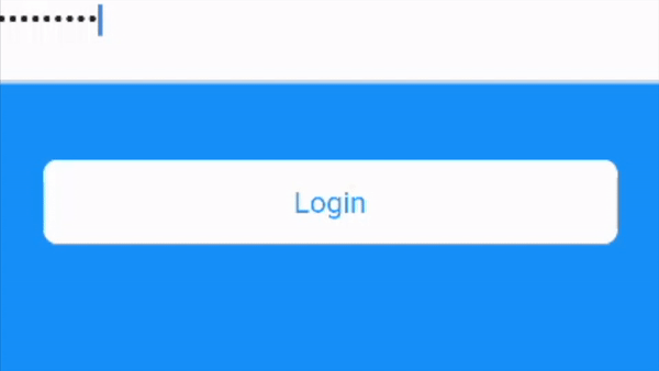
ProgressButton is designed to be easy to use and customizable. Without going into much detail, you can see a demo and example code below. What more do you need from a single class package??
- First, add dependency to your pubspec.yaml
dependencies:
  progress_button: ^0.0.2
- Second, add progress button to your widget tree
val progressButton = ProgressButton(
    child: Text("Login"),
    onPressed: VoidCallback,
    buttonState: ButtonState.normal,
    backgroundColor: Theme.of(context).primaryColor,
    progressColor: Theme.of(context).primaryColor,
);
Of course you can change the buttonState anytime you want by using StreamBuilders and such. ProgressButton reacts accordingly to changes.

Note that the project description data, including the texts, logos, images, and/or trademarks,
for each open source project belongs to its rightful owner.
If you wish to add or remove any projects, please contact us at [email protected].