rhodgkins / Rdhcollectionviewgridlayout
Projects that are alternatives of or similar to Rdhcollectionviewgridlayout
RDHCollectionViewGridLayout
Works and tested on iOS 6.0 to 10.0 (under Xcode 8.0), but if you find any issues please report them!
Carthage
As of 1.2.2 Carthage support has been added.
github "rhodgkins/RDHCollectionViewGridLayout" ~> 1.2
CocoaPods
Grid layout for UICollectionView.
pod 'RDHCollectionViewGridLayout', '~> 1.2'
Summary
This layout provides simple options for customisation of a collection view as a grid layout.
Supporting vertical and horizontal scrolling directions, the layout also takes care of left over pixels at the end of rows.
For example, a UICollectionView for a size of 320x300 scrolling vertically with 6 columns would normally mean each cell would be 53.3333 points wide.
This would mean the cells would be blurry due to it's frame sitting over non-integer pixel values.
RDHCollectionViewGridLayout takes care of this, and distributes these dirty extra pixels over the columns. This means the first 2 columns would have a cell width of 54 points, while the rest have a size of 53 points.
PSTCollectionView
From version 1.1.0 PSTCollectionView support is removed.
If PSTCollectionView is being used, use the RDHCollectionViewGridLayout/PST pod and a version less than 1.1.0:
pod 'RDHCollectionViewGridLayout/PST', '< 1.1'
Documentation
Properties
/**
 * A vertical direction will constrain the layout by rows (lineItemCount per row), a horizontal direction by columns
 (lineItemCount per column).
 *
 * The default value of this property is UICollectionViewScrollDirectionVertical.
 */
@property (nonatomic, assign) UICollectionViewScrollDirection scrollDirection;

/**
 * Defines the size of the unconstrained dimension of the items. Simply, for vertical layouts this is the height of the items, and for horizontal layouts this is the width of the items.
 * Setting this value to 0 will make layout set the dimension to the average of the other dimenion on the same line. This is due to the layout taking account of dirty pixels, adding these extra pixels in the first X items on the line.
 * For example, if using a vertical scrollDirection and a lineItemCount of 5 when the collectionView has a width of 104, the first 4 items on every line will have a width of 21, and the last 20 (21 + 21 + 21 + 21 + 20 = 104), so the height of the lines would be 21 (20.8 rounded).
 *
 * A value of 0 is the same as setting the `lineExtension` property to 0 `lineMultiplier` property to 1. Setting this value will ignore the `lineExtension` and `lineMultiplier` properties and set them to their default values. When used and set in Interface Builder, leave the other properties to Default and only set this property.
 *
 * The default value of this property is 0.
 *
 * @see lineMultiplier
 * @see lineExtension
 *
 * @warning A negative value will throw an exception.
 */
@property (nonatomic, assign) IBInspectable CGFloat lineSize;

/**
 * Defines a multipler of the unconstrained dimension of the items in relation to the strained dimension. Simply, for vertical layouts this value is multiplied by the width and used as the height of the items, and for horizontal layouts this value is multiplied by the height and used as the width of the items. The final dimension is rounded to a whole integer.
 *
 * A value of 1 is the same as setting the `lineSize` or `lineExtension` properties to 0.Setting this value will ignore the `lineSize` and `lineExtension` properties and set them to their default values. When used and set in Interface Builder, leave the other properties to Default and only set this property.
 *
 * The default value of this property is 1.
 *
 * @see lineSize
 * @see lineExtension
 *
 * @warning A negative value will throw an exception.
 */
@property (nonatomic, assign) IBInspectable CGFloat lineMultiplier;

/**
 * Defines a multipler of the unconstrained dimension of the items in relation to the strained dimension. Simply, for vertical layouts this value is added to the width and used as the height of the items, and for horizontal layouts this value is added to the height and used as the width of the items.
 *
 * A value of 0 is the same as setting the `lineSize` property to 0 `lineMultiplier` property to 1. Setting this value will ignore the `lineSize` and `lineMultiplier` properties and set them to their default values. When used and set in Interface Builder, leave the other properties to Default and only set this property.
 *
 * The default value of this property is 0.
 *
 * @see lineSize
 * @see lineMultiplier
 *
 * @warning A negative value will throw an exception.
 */
@property (nonatomic, assign) IBInspectable CGFloat lineExtension;

/**
 * Defines the maximum number of items allowed per line. Simply, for vertical layouts this is the number of columns,
 and for horizontal layouts this is the number of rows. The layout accounts for adding the extra pixels to the first
 X items on the line. Best case is that the useable width is exactly divisible by lineItemCount, worse case is that
 (useable width) mod lineItemCount = (lineItemCount - 1) and that the first (lineItemCount - 1) items are 1 pixel
 bigger.
 *
 * The default value of this property is 4.
 */
@property (nonatomic, assign) NSUInteger lineItemCount;

/**
 * Defines the spacing of items on the same line of the layout. Simply, for vertical layouts this is the column
 spacing, and for horizontal layouts this is the row spacing.
 *
 * The default value of this property is 0.
 */
@property (nonatomic, assign) CGFloat itemSpacing;

/**
 * Defines the line spacing of the layout. Simply, for vertical layouts this is the row spacing, and for horizontal
 layouts this is the column spacing.
 *
 * The default value of this property is 0.
 */
@property (nonatomic, assign) CGFloat lineSpacing;

/**
 * To force sections to start on a new line set this property to YES. Otherwise the section will follow on on from
 the previous one.
 *
 * The default value of this property is NO.
 */
@property (nonatomic, assign) BOOL sectionsStartOnNewLine;
Examples
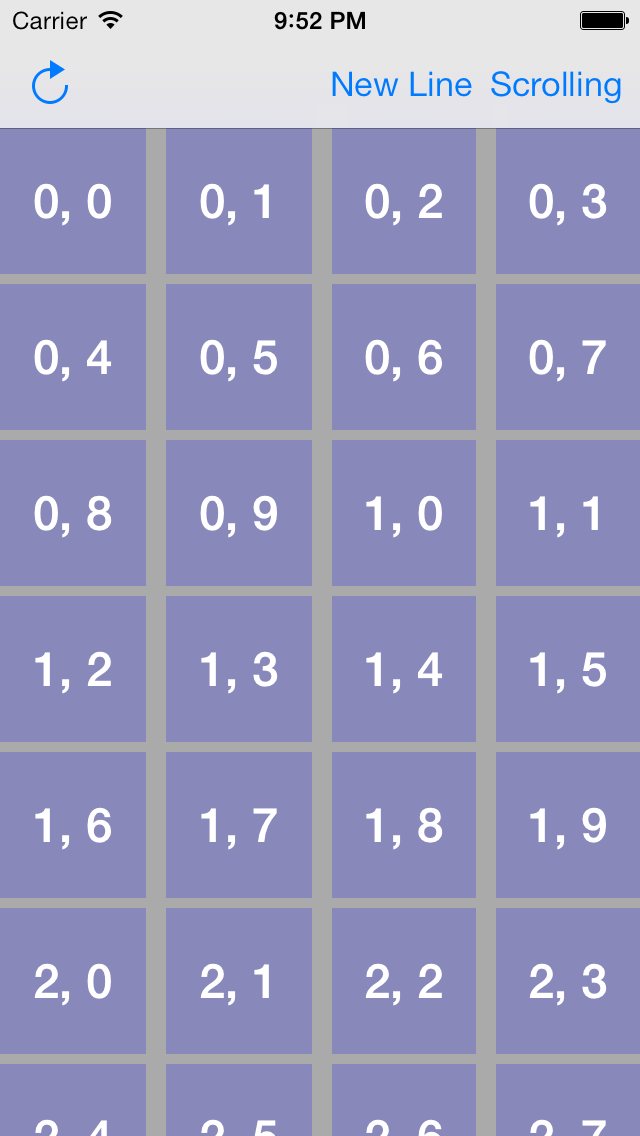
The following example is with a lineSpacing of 5 and itemSpacing of 10. Each section starts on a new line (sectionsStartOnNewLine is YES).

This is the same as the above but the sectionsStartOnNewLine is NO.
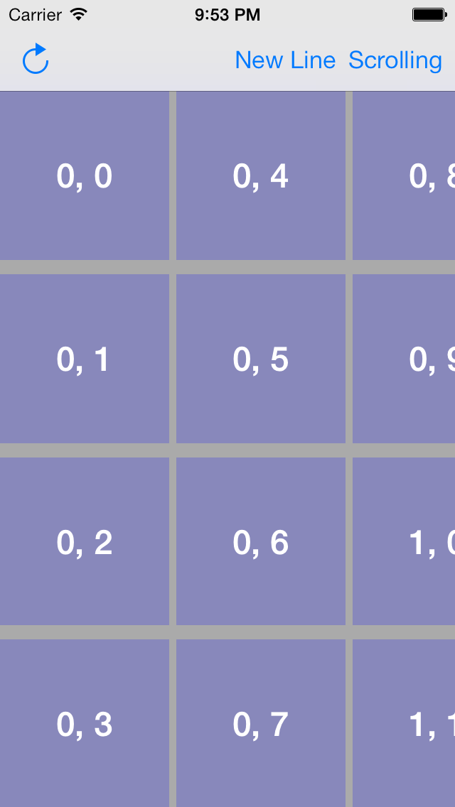
Horizontal scrolling


