React Native Animated Screen


This module includes all the necessary components to generate outstanding scroll-based animated screens and screens header.
The package is both Android and iOS compatible.
Try it out
You can play with our ready-to-use examples from our GitHub repository
| Example 1 | Example 2 | Example 3 | Example 4 |
|---|---|---|---|
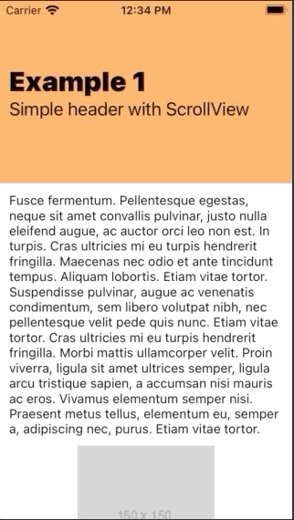 |
 |
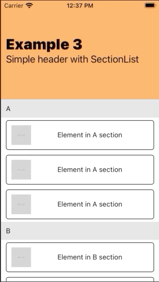 |
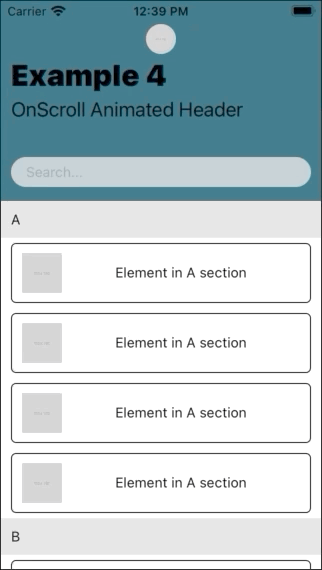 |
$ git clone https://github.com/giovannidavi/react-native-animated-screen.git
You can check the examples code here examples
Installation
With npm
$ npm install react-native-animated-screen
With yarn
$ yarn add react-native-animated-screen
The solution is implemented in JavaScript so no native module linking is required.
Usage
By default the component exposes 7 sub-components to help you creating the stage.
- AnimatedScreen.Wrapper
- AnimatedScreen.Header
- AnimatedScreen.ScrollView
- AnimatedScreen.FlatList
- AnimatedScreen.SectionList
- AnimatedScreen.Element
- AniamtedScreen.CollapsibleElement
For the animation to work properly you need to wrap your entire view in an AnimatedScreen.Wrapper component which will include the AnimatedScreen.Header and at least one of the scrollable elements:
- AnimatedScreen.ScrollView
- AnimatedScreen.FlatList
- AnimatedScreen.SectionList
import  React  from  'react';
import { Image, Text, View } from  'react-native';
import AnimatedScreen from  'react-native-animated-screen';

const  Component = () => {
   return (
     <AnimatedScreen.Wrapper>
       <AnimatedScreen.Header>
         <View>
           <Text>Title</Text>
           <AnimatedScreen.CollapsibleElement>
             <Text>Subtitle</Text>
           </AnimatedScreen.CollapsibleElement>
         </View>
       </AnimatedScreen.Header>
       <AnimatedScreen.ScrollView>
         <View  style={{ height: '300%' }}>
           <View>
             <Text>Body</Text>
           </View>
         </View>
       </AnimatedScreen.ScrollView>
     </AnimatedScreen.Wrapper>
   );
};
AnimatedScreen.Wrapper
Is the main component and the wrapper of the entire animated screen, required
Basic parameters
<AnimatedScreen.Wrapper
  // Set header max and min height (before and after scroll)

  // headerMaxHeight?: number; (default: 200)
  hederMaxHeight={200}
  // headerMinHeight?: number; (default: 70)
  headerMinHeight={70}

  // Select if the screen should take care of avoiding safe area
  // avoidSafeArea?: boolean; (default: false)
  avoidSafeArea={true}

  // Select if want your body and header to scroll with a parallax effect or not
  // disableParallaxEffect?: boolean; (default: false)
  disableParallaxEffect={false}

  // Function triggered on scroll event taking the `event` object as a parameter
  // onScroll?: (e: NativeSyntheticEvent<NativeScrollEvent>) =>  void;
  onScroll={() => null}

>
  // at least an AnimatedScreen.Header and an AnimatedScreen scrollable element required as children
  { children }
</AnimatedScreen.Wrapper>
AnimatedScreen.Header
Is one of the children of the Wrapper, is required, and it contains all the header elements. Its dimensions are inherited from the wrapper and define the scroll animation behaviours. It expect at least one child component.
Basic parameters
<AnimatedScreen.Header
  // if the header content has to wrapped in boxed content
  // boxed?: boolean; (default: false)
  boxed={true}

  // Expects a callback returning a style object that can interpolate the Animated.Value
  // animatedStyle?: (scrollY: Animated.Value) =>  ViewStyle;
  animatedStyle={ scrollY => ({
   opacity: scrollY.interpolate({
     inputRange: [0, 200], // from 0 scrolled to headerMaxHeight scrolled
     outputRange: [1, 0]
    })
   })
  }

  // Expects a callback returning the component to be used as background
  // renderBackground?: (scrollY: Animated.Value) =>  JSX.Element;
  renderBackground={ scrollY => (
    <Animated.View style={[style.background, getBackgroundOpacity(scrollY)]}/>
  )

  // Set if your header should generate a shadow on scroll
  // withShadow?: boolean; (default: false)
  withShadow={ true }

  // Set if your header should have a translucent blured effect on scroll
  // (ONLY Android - not recommended in iOS)
  // blur?: boolean; (default: false)
  blur={ false }

  // Expects a string or undefined containing the background color to be passed to the style
  // backgroundColor?: string; (default: undefined)
  backgroundColor="#303030"

  // Select if the header should take care of SafeArea
  // withSafeArea?: boolean; (default: true)
  withSafeArea={ true }

  // Expect a style object that can extend the header style
  // (preferred to animatedStyle if static)
  // style?: ViewStyle; (default: undefined)
  style={{ paddingBottom: 10 }}
>
  // at least one child is required, can be any component (AnimatedScreen.CollapsibleElement and AnimatedScreen.Element are provided to create animated effects)
  { children }
</AnimatedScreen.Header>
AnimatedScreen.ScrollView
Extends the react-native ScrollView and can be used as scrollable element for the screen. For the entire list of possible props refer to react-native ScrollView documentation. Never to be used in combination with AnimatedScreen.FlatList or AnimatedScreen.SectionList.
Basic parameters
<AnimatedScreen.ScrollView
  // Expects a callback returning a style object that can interpolate the Animated.Value
  // animatedStyle?: (scrollY: Animated.Value) =>  ViewStyle;
  animatedStyle={ scrollY => ({
   opacity: scrollY.interpolate({
     inputRange: [0, 200], // from 0 scrolled to headerMaxHeight scrolled
     outputRange: [1, 0]
    })
   })
  }

  // Expect a style object that can extend the header style
  // (preferred to animatedStyle if static)
  // style?: ViewStyle; (default: undefined)
  style={{ paddingBottom: 10 }}

  // Expect a React.RefObject to be attached to the ScrollView
  // scrollViewRef?: React.RefObject<ScrollView>;
  scrollViewRef={ scrollViewRef }
>
  { children }
</AnimatedScreen.ScrollView>
AnimatedScreen.FlatList
Extends the react-native FlatList and can be used as scrollable element for the screen. For the entire list of possible props refer to react-native FlatList documentation. Never to be used in combination with AnimatedScreen.ScrollView or AnimatedScreen.SectionList.
Basic parameters
<AnimatedScreen.FlatList
  // Expects a callback returning a style object that can interpolate the Animated.Value
  // animatedStyle?: (scrollY: Animated.Value) =>  ViewStyle;
  animatedStyle={ scrollY => ({
   opacity: scrollY.interpolate({
     inputRange: [0, 200], // from 0 scrolled to headerMaxHeight scrolled
     outputRange: [1, 0]
    })
   })
  }

  // Expect a style object that can extend the header style
  // (preferred to animatedStyle if static)
  // style?: ViewStyle; (default: undefined)
  style={{ paddingBottom: 10 }}

  // Expect a React.RefObject to be attached to the ScrollView
  // flatlistRef?: React.RefObject<FlatList<T>>;
  flatlistRef={ flatlistRef }

  { ...restOfFlatListProps }
/>
AnimatedScreen.SectionList
Extends the react-native SectionList and can be used as scrollable element for the screen. For the entire list of possible props refer to react-native SectionList documentation. Never to be used in combination with AnimatedScreen.ScrollView or AnimatedScreen.FlatList.
Basic parameters
<AnimatedScreen.SectionList
  // Expects a callback returning a style object that can interpolate the Animated.Value
  // animatedStyle?: (scrollY: Animated.Value) =>  ViewStyle;
  animatedStyle={ scrollY => ({
   opacity: scrollY.interpolate({
     inputRange: [0, 200], // from 0 scrolled to headerMaxHeight scrolled
     outputRange: [1, 0]
    })
   })
  }

  // Expect a style object that can extend the header style
  // (preferred to animatedStyle if static)
  // style?: ViewStyle; (default: undefined)
  style={{ paddingBottom: 10 }}

  // Expect a React.RefObject to be attached to the ScrollView
  // sectionlistRef?: React.RefObject<SectionList<T>>;
  sectionlistRef={ sectionlistRef }

  { ...restOfSectionListProps }
/>
AnimatedScreen.CollapsibleElement
Can only be used as a child of AnimatedScreen.Header, it can wrap any type of component that you want to disappear while scrolling
Basic parameters
<AnimatedScreen.CollapsibleElement
  // Expects a callback returning a style object that can interpolate the Animated.Value
  // animatedStyle?: (scrollY: Animated.Value) =>  ViewStyle;
  animatedStyle={ scrollY => ({
   opacity: scrollY.interpolate({
     inputRange: [0, 200], // from 0 scrolled to headerMaxHeight scrolled
     outputRange: [1, 0]
    })
   })
  }

  // Expect a style object that can extend the header style
  // (preferred to animatedStyle if static)
  // style?: ViewStyle; (default: undefined)
  style={{ paddingBottom: 10 }}

  // Set if you want the content of the element to overflow the boxed header (and take full-width)
  // only to be used if AnimatedScreen.Header is set to `boxed`
  // unboxed?: boolean; (default: false)
  unboxed={ true }

  // Expects an object containing all the style elements to interpolate on scroll, can be considered as a shortcut for animatedStyle
  // interpolate?: { [key: string]: string[] | number[] };
  interpolate={ height: [200, 0] } // will interpolated from an height of 200 to an height of 0 while scrolling
>
  { children }
</AnimatedScreen.CollapsibleElement>
AnimatedScreen.Element
As the CollapsibleElement can only be used as a child of AnimatedScreen.Header but it should wrap element that you don't want to disappear while scrolling
Basic parameters
<AnimatedScreen.Element
  // Expects a callback returning a style object that can interpolate the Animated.Value
  // animatedStyle?: (scrollY: Animated.Value) =>  ViewStyle;
  animatedStyle={ scrollY => ({
   opacity: scrollY.interpolate({
     inputRange: [0, 200], // from 0 scrolled to headerMaxHeight scrolled
     outputRange: [1, 0]
    })
   })
  }

  // Expect a style object that can extend the header style
  // (preferred to animatedStyle if static)
  // style?: ViewStyle; (default: undefined)
  style={{ paddingBottom: 10 }}

  // Set if you want the content of the element to overflow the boxed header (and take full-width)
  // only to be used if AnimatedScreen.Header is set to `boxed`
  // unboxed?: boolean; (default: false)
  unboxed={ true }

  // Expects an object containing all the style elements to interpolate on scroll, can be considered as a shortcut for animatedStyle
  // interpolate?: { [key: string]: string[] | number[] };
  interpolate={ height: [200, 0] } // will interpolated from an height of 200 to an height of 0 while scrolling
>
  { children }
</AnimatedScreen.Element>
Author
Contributing
Pull requests are most welcome!
Don't forget to add a title and a description that explain the issue you're trying to solve and your suggested solution. Screenshots and gifs are very helpful.