lhandel / React Native Card Flip
Licence: mit
Card flip animation for React Native
Stars: ✭ 183
Programming Languages
javascript
184084 projects - #8 most used programming language
Projects that are alternatives of or similar to React Native Card Flip
React Useragent
Integrate user-agent detection in an idiomatic React way
Stars: ✭ 154 (-15.85%)
Mutual labels: react-component
React Tradingview Widget
React component for rendering the TradingView Advanced Real-Time Chart Widget.
Stars: ✭ 170 (-7.1%)
Mutual labels: react-component
React Translated
A dead simple way to add complex translations (i18n) in a React (DOM/Native) project 🌎🌍🌏
Stars: ✭ 176 (-3.83%)
Mutual labels: react-component
Material Ui Datatables
An another React Data tables component.
Stars: ✭ 163 (-10.93%)
Mutual labels: react-component
Reactopt
A CLI React performance optimization tool that identifies potential unnecessary re-rendering
Stars: ✭ 1,975 (+979.23%)
Mutual labels: react-component
Animate Css Styled Components
simple port of animate css for styled-components
Stars: ✭ 173 (-5.46%)
Mutual labels: react-component
Ion Phaser
A web component to use Phaser Framework with Angular, React, Vue, etc 🎮
Stars: ✭ 152 (-16.94%)
Mutual labels: react-component
React Rater
⭐️ Interative & customizable star rater
Stars: ✭ 180 (-1.64%)
Mutual labels: react-component
React Terminal Component
Terminal emulator component for React. Emulate a terminal/console with autocomplete, commands, a file-system and themes.
Stars: ✭ 169 (-7.65%)
Mutual labels: react-component
React Awesome Slider
React content transition slider. Awesome Slider is a 60fps, light weight, performant component that renders an animated set of production ready UI general purpose sliders with fullpage transition support for NextJS and GatsbyJS. 🖥️ 📱
Stars: ✭ 2,343 (+1180.33%)
Mutual labels: react-component
React Paginate
A ReactJS component that creates a pagination
Stars: ✭ 2,169 (+1085.25%)
Mutual labels: react-component
React Component Echarts
React component echarts. 组件式百度图表。
Stars: ✭ 175 (-4.37%)
Mutual labels: react-component
React Touch Carousel
Ultra-customizable carousel framework for React.JS
Stars: ✭ 158 (-13.66%)
Mutual labels: react-component
React Credit Cards
Beautiful credit cards for your payment forms
Stars: ✭ 2,239 (+1123.5%)
Mutual labels: react-component
React Ds
🔥 React Drag To Select component (tiny, touch friendly, and no dependencies!)
Stars: ✭ 153 (-16.39%)
Mutual labels: react-component
Cassette
📼 A flexible media player component library for React that requires no up-front config
Stars: ✭ 171 (-6.56%)
Mutual labels: react-component
React Mobile Picker
An iOS like select box component for React
Stars: ✭ 180 (-1.64%)
Mutual labels: react-component
Video React
A web video player built for the HTML5 world using React library.
Stars: ✭ 2,227 (+1116.94%)
Mutual labels: react-component
react-native-card-flip
Card flip animation for React Native
Installation
npm install --save react-native-card-flip
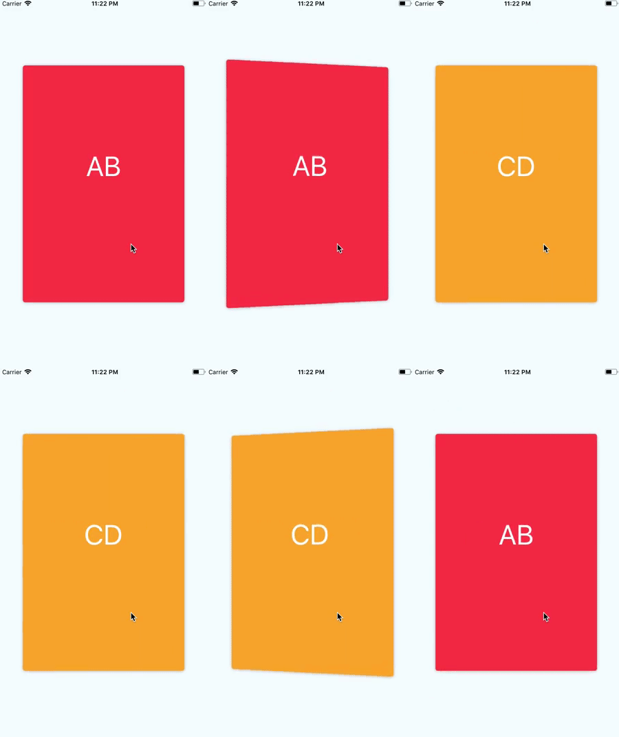
Preview
import CardFlip from 'react-native-card-flip';
  <CardFlip style={styles.cardContainer} ref={(card) => this.card = card} >
    <TouchableOpacity style={styles.card} onPress={() => this.card.flip()} ><Text>AB</Text></TouchableOpacity>
    <TouchableOpacity style={styles.card} onPress={() => this.card.flip()} ><Text>CD</Text></TouchableOpacity>
  </CardFlip>
CardFlip
CardFlip props
| Props | type | description | required | default |
|---|---|---|---|---|
| style | object | container style | {} | |
| duration | number | flip duration | 1000 | |
| flipZoom | number | zoom level on flip | 0.09 | |
| flipDirection | string | the rotation axis. 'x' or 'y' | 'y' | |
| perspective | number | 800 |
CardFlip events
| Props | type | description |
|---|---|---|
| onFlip | func | function to be called when a card is fliped. it receives the card-sides index |
| onFlipStart | func | function to be called when the flip-animation starts. it receives the card-sides index |
| onFlipEnd | func | function to be called when the flip-animation ends. it receives the card-sides index |
CardStack actions
| Props | type | description | args | default |
|---|---|---|---|---|
| flip | func | Flips the card | ||
| tip | func | Flips the card | { direction, progress, duration } | { direction: 'left', progress: 0.05, duration: 150 } |
| jiggle | func | Jiggles the card | { count, duration, progress } | { count: 2, duration: 200, progress: 0.05 } |
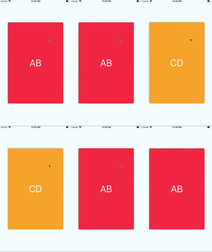
jiggle
<CardFlip style={styles.cardContainer} ref={(card) => this.card = card} >
  <TouchableOpacity style={styles.card} onPress={() => this.card.jiggle({ count: 2, duration: 100, progress: 0.05 })} ><Text>AB</Text></TouchableOpacity>
  <TouchableOpacity style={styles.card} onPress={() => this.card.flip()} ><Text>CD</Text></TouchableOpacity>
</CardFlip>
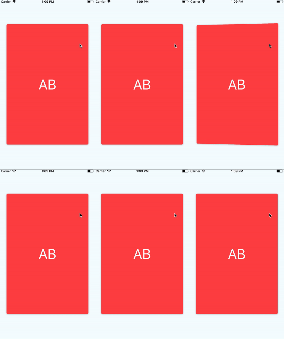
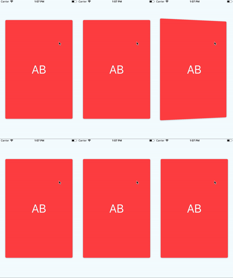
tip
<CardFlip style={styles.cardContainer} ref={(card) => this.card = card} >
  <TouchableOpacity style={styles.card} onPress={() => this.card.tip({ direction: 'right', duration: 150 })} ><Text>AB</Text></TouchableOpacity>
  <TouchableOpacity style={styles.card} onPress={() => this.card.flip()} ><Text>CD</Text></TouchableOpacity>
</CardFlip>
CardFlip in map
{cards.map((item, index) => {
  return (
    <CardFlip style={ styles.cardContainer } ref={ (card) => this['card' + index] = card } >
      <TouchableOpacity style={ styles.card } onPress={() => this['card' + index].flip()} ><Text>{item}</Text></TouchableOpacity>
      <TouchableOpacity style={ styles.card } onPress={() => this['card' + index].flip()} ><Text>{item}</Text></TouchableOpacity>
    </CardFlip>
  )
})}
Note that the project description data, including the texts, logos, images, and/or trademarks,
for each open source project belongs to its rightful owner.
If you wish to add or remove any projects, please contact us at [email protected].


