gs-akhan / React Native Chooser
Licence: mit
Simple Cross Platform HTML Select Tag for react-native
Stars: ✭ 153
Programming Languages
javascript
184084 projects - #8 most used programming language
Labels
React Native Chooser
Simple DropDown menu for React Native App! Your Select Tag for React Native. Fully Customizable too.
Introduction
React Native Chooser is simple, customizable and easy to use dropdown in React Native. It has been tested on both Android and IOS and works like a charm.
Installation
npm i react-native-chooser --save
Usage
import React, { Component } from 'react';
import {Select, Option} from "react-native-chooser";

import {
  AppRegistry,
  StyleSheet,
  Text,
  View
} from 'react-native';

export default class AwesomeProject extends Component {

  constructor(props) {
    super(props);
    this.state = {value : "Select Me Please"}
  }
  onSelect(value, label) {
    this.setState({value : value});
  }

  render() {
    return (
      <View style={styles.container}>
        <Select
            onSelect = {this.onSelect.bind(this)}
            defaultText  = {this.state.value}
            style = {{borderWidth : 1, borderColor : "green"}}
            textStyle = {{}}
            backdropStyle  = {{backgroundColor : "#d3d5d6"}}
            optionListStyle = {{backgroundColor : "#F5FCFF"}}
          >
          <Option value = {{name : "azhar"}}>Azhar</Option>
          <Option value = "johnceena">Johnceena</Option>
          <Option value = "undertaker">Undertaker</Option>
          <Option value = "Daniel">Daniel</Option>
          <Option value = "Roman">Roman</Option>
          <Option value = "Stonecold">Stonecold</Option>
          <Option value = "Rock">Rock</Option>
          <Option value = "Sheild">Sheild</Option>
          <Option value = "Orton">Orton</Option>

        </Select>
      </View>
    );
  }
}
Props
Props for Select
| Prop Name | Data Type | Default Values | Description |
|---|---|---|---|
| onSelect | function | null | function that executes on selection of an option |
| defaultText | string | Click To Select | Text to show as default text |
| style | object | null | To style the select box. |
| backdropStyle | object | null | To style the overlay |
| textStyle | object | null | To style the text shown in the box |
| optionListStyle | object | null | To style the selection box |
| transparent | boolean | false | To set the transparent prop on Modal |
| animationType | string | "none" | To set the animationType prop on Modal |
| indicator | string | "none", "up" or "down" | "none" |
| indicatorColor | string | "black" | The color of the indicator arrow |
| indicatorSize | number | 10 | The size of the indicator arrow |
| indicatorStyle | object | null | To style the indicator arrow |
| indicatorIcon | react element | null | Show the indicator icon |
| selected | string | null | Give it same value as you give to Option |
| selectedStyle | object | null | Apply styles to the selected Option |
Functions for Select
| Function Name | Description |
|---|---|
| setSelectedText(text) | Set default text in the select option, often used to reset text. |
Props for Option
| Prop Name | Data Type | Default Values | Description |
|---|---|---|---|
| style | object | null | To style each option |
| styleText | object | null | To style the text shown in the option |
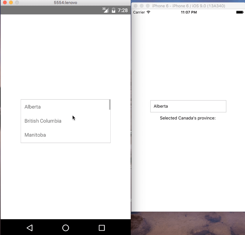
Demo
IOS and Android:
Contributions
Your contributions and suggestions are heartily♡ welcome. (✿◠‿◠)
Note that the project description data, including the texts, logos, images, and/or trademarks,
for each open source project belongs to its rightful owner.
If you wish to add or remove any projects, please contact us at [email protected].