react-native-hybrid-storybook
Document your react-native project's UI components, with browser preview.
This repository is a react-native optimized, predefined set of rules for Storybook allowing you to easliy create per-project UI documentation for your react-native components.
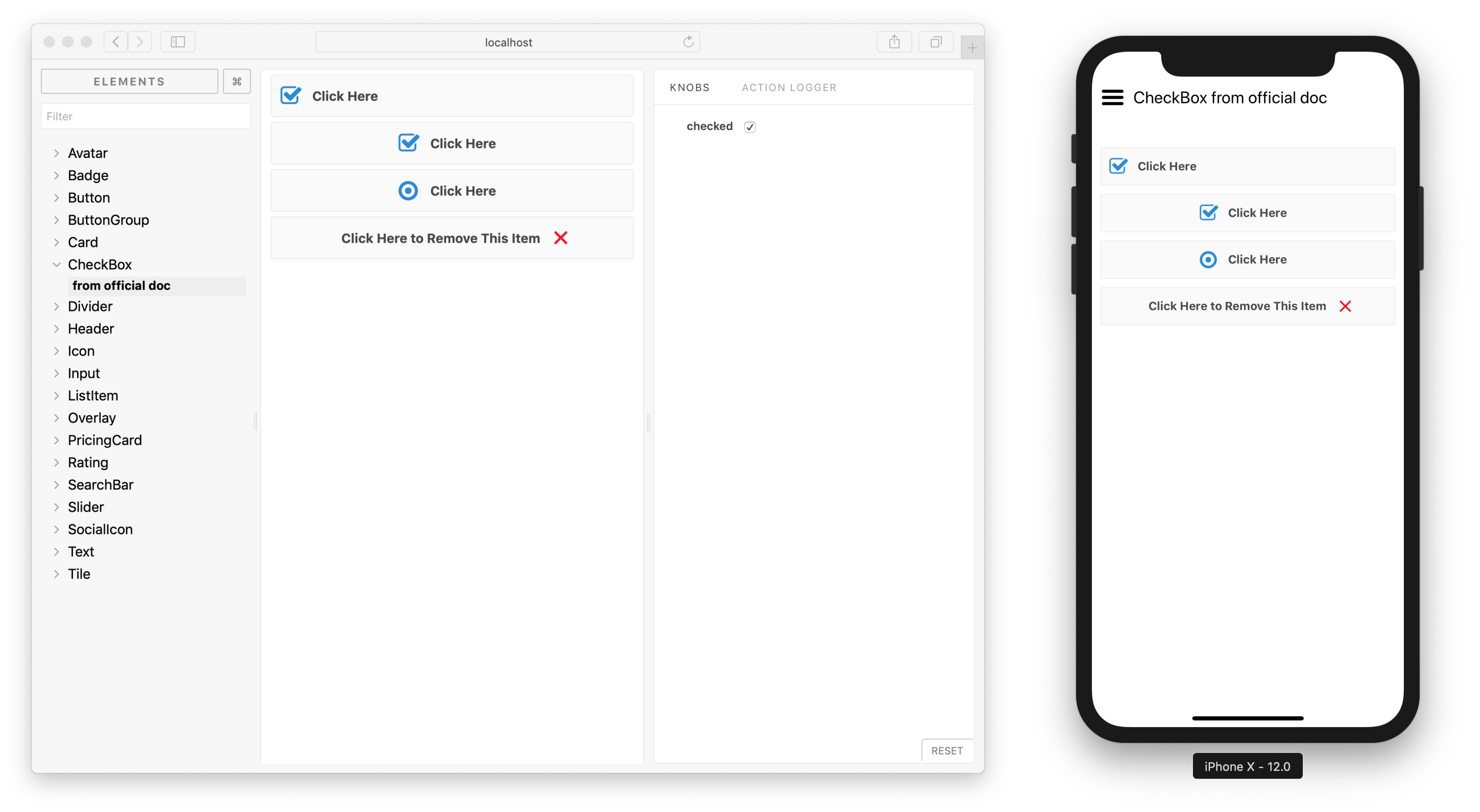 Example
 react-native-elements web & native rendering of same CheckBox component stories.
Philosophy
- A set of tools for creating per-project-basis component libraries.
- Example-based auto-generated documentation.
- Extensible
- Building on top of Storybook should allow to easily adjust the default rules to your project, avoiding lock-in.
- Minimal setup time.
- No need to set up webpack, loaders, or go into any of that fuss. Just install
react-native-hybrid-storybookand run one command to start creating your documentation. - Popular Storybook plugins pre-installed.
- No need to set up webpack, loaders, or go into any of that fuss. Just install
- Web-only documentation preview (as static page) out of the box.
Modes
You can run this in 2 basic modes:
-
native- just as you would do with
@storybook/react-native- more on Storybook's react-native integration documentation page - used mainly for development of your custom UI components
- blocks your application
- integrated into your app
- just as you would do with
-
web- a "production" build, where you can develop your application with support of well crafted documentation
- special webpack bundler replaces
react-nativeimports withreact-native-webones - used mainly for production - you can develop your application with support of (hopefully) well crafted documentation
- does not block your application
- separated build system, should not break anything (except some native-code dependent components, see react-native-web compatibility table)
Usage
Quick start
Minimal recipe to start documenting your react-native UI & components in the web.
Installation
- Install package:
yarn add react-native-hybrid-storybook- Add this entry to
package.json:
{
    "scripts": {
        "storybook-web": "node ./node_modules/@storybook/react/dist/server/index.js -c ./node_modules/react-native-hybrid-storybook/src/web/storybook",
    }
}- Create a documentation for your component as
ExampleComponent.story.jssomewhere in your project:
import React from 'react';
import {
    storiesOf,
} from 'react-native-hybrid-storybook';
import ExampleComponent from './ExampleComponent';

storiesOf('ExampleComponent', module)
    .add('First example', () => (
        <ExampleComponent title="Test component" />
    ));
Usage
Run documentation (in web mode):
yarn run storybook-web -p 9001 # Now open http://localhost:9001 in the browserRecipes
Integration examples:
| Stack | Web rendering only ("minimal") | Web & native rendering ("full") |
|---|---|---|
| Expo / CRNA | Integration, Example | Integration, Example |
"Pure" react-native |
Integration, Example | Integration, Example |
Custom fonts / icons
In order to use your custom font or icon in the web mode, you need to bundle the file manually. For example, if using Font Awesome icons from react-native-vector-icons in your storybook.js file you need to add:
import { loadFont } from 'react-native-hybrid-storybook';
import fontAwesome from 'react-native-vector-icons/Fonts/FontAwesome.ttf';

loadFont(fontAwesome, 'FontAwesome');
The loadFont function takes font file as first argument, and font name as a second.
Configuration options
In your package.json there is a possibility to specify few options:
| Option | Allowed values | Default | Meaning |
|---|---|---|---|
magic.autoResolveStories |
true, false |
true |
In web mode it can automatically resolve *.story.js files for you, without maintaing list in storybook.js |
magic.overwritePlatform |
false, "ios", "android", "web" |
false |
Set custom Platform.OS value. Default is "web", that might be unrecognized by 3rd party libs. |
excludedPaths |
array |
(below) | Excluded paths from bundling with custom babel loader (for web mode). |
includedFontPaths |
array |
(below) | Paths with assets to be included in the bundle, in order to load them (for web mode). For custom fonts and react-naive-vector-icons compatibility. |
addonOptions |
object |
(below) | See addon-options documentation for reference. |
getStorybookUI |
object |
(below) | See storybook/react-native plugin documentation for reference. No effect in web mode. |
Defaults:
{
    "magic": {
        "overwritePlatform": false,
        "autoResolveStories": true,
    },
    "excludedPaths": [
        "node_modules/art",
    ],
    "includedFontPaths": [
        "node_modules/react-native-vector-icons",
    ],
    "addonOptions": {
        "addonPanelInRight": true,
    },
    "getStorybookUI": {
        "port": 7007,
        "onDeviceUI": true,
    }
}
Options under magic are likely to be changed in future releases.
Plugins
This comes with predefined set of plugins, that're working in both web & native modes:
- Addon knobs - for playing with your component's properties in real time
- Addon actions - for logging actions
- Addon options - with some preconfigured options
Some plugins & integrations are web only (will not render / be ignored on the device):
- react-storybook-addon-chapters - adds structural template to document your components, see CRNA example for usage
- storybook-host - better web preview rendering
Examples
Many examples can be found in the examples repo.
Commands
This lib mainly uses Storybook's commands with some custom config assigned. Cheat sheet of those can be found here.
Web
Run your components stories in the browser at localhost:9001:
node ./node_modules/@storybook/react/dist/server/index.js -p 9001 -c ./node_modules/react-native-hybrid-storybook/src/web/storybookBuild static version of the web documentation to output folder:
build-storybook -c ./node_modules/react-native-hybrid-storybook/src/web/storybook -o outputNative
Run bundler for use on the device:
node ./node_modules/@storybook/react-native/dist/bin/storybook-start.js -p 7007 -c ./node_modules/react-native-hybrid-storybook/src/native/storybookVersions
The current version is using latest react-native-web (of version ^0.9.0). It's compatible (with exsiting working examples) with Expo SDK 30 (using react-native of version 0.55.4) and "pure" react-native apps of latest 0.57.3.
Known issues
React version does not match React native prefered version for Expo installations
Expo (as of Expo 30.0.1) still uses React Native 0.55.4 version, that uses React 16.3.1 - which has very rough support from react-native-web. So I decided to go with latest React version (16.5.2), and just wait for Expo to upgrade theirs.