InterfaceKit / React Native Js Bottom Sheet
Licence: mit
A React Native implementation of Android's bottom sheet
Stars: ✭ 29
Programming Languages
javascript
184084 projects - #8 most used programming language
Projects that are alternatives of or similar to React Native Js Bottom Sheet
Bottomdialogs
An Android library that shows a customizable Material-based bottom sheet. API 11+ required.
Stars: ✭ 624 (+2051.72%)
Mutual labels: material-design, bottom-sheet
Awesome Flutter
An awesome list that curates the best Flutter libraries, tools, tutorials, articles and more.
Stars: ✭ 38,582 (+132941.38%)
Mutual labels: material-design
Verticalstepperform
Vertical Stepper Form Library for Android. It follows Google Material Design guidelines.
Stars: ✭ 868 (+2893.1%)
Mutual labels: material-design
Laravel Spa Vuetify Starter
A simple lightweight admin template based on laravel and vuetifyjs. Simple and clean!
Stars: ✭ 20 (-31.03%)
Mutual labels: material-design
Ember Paper
The Ember approach to Material Design.
Stars: ✭ 871 (+2903.45%)
Mutual labels: material-design
Vscode Materialdesignicons Intellisense
Provides intellisense, search and hover preview for Material Design Icons
Stars: ✭ 21 (-27.59%)
Mutual labels: material-design
Fullscreendialog
Android Material full screen dialog
Stars: ✭ 11 (-62.07%)
Mutual labels: material-design
Elephant
Elephant is PHPHub Community Android unofficial client, base on Material Design + MVP+RxJava+Retrofit .
Stars: ✭ 949 (+3172.41%)
Mutual labels: material-design
Material Design Lite
Material Design Components in HTML/CSS/JS
Stars: ✭ 31,931 (+110006.9%)
Mutual labels: material-design
Nightking
🌃 Google I/O 19 Extended, Dark Theme Demo
Stars: ✭ 20 (-31.03%)
Mutual labels: material-design
React Fab Fan
Floating action button fan built with react and react-motion
Stars: ✭ 14 (-51.72%)
Mutual labels: material-design
Material Components
Documentation and policies for Material Components (all platforms)
Stars: ✭ 872 (+2906.9%)
Mutual labels: material-design
Vscode Material Theme
Port of the sublime text Material theme for Visual Studio Code in light and dark.
Stars: ✭ 21 (-27.59%)
Mutual labels: material-design
React Saas Template
🌊 Template for building an SaaS / admin website using React + Material-UI
Stars: ✭ 942 (+3148.28%)
Mutual labels: material-design
Kotlin Life
App界的一股清流 音视频vr应有尽有 完全按照Material design规范设计的App (written with java and Kotlin)
Stars: ✭ 864 (+2879.31%)
Mutual labels: material-design
Smelte
UI framework with material components built with Svelte and Tailwind CSS
Stars: ✭ 871 (+2903.45%)
Mutual labels: material-design
Ember Polymer
Use Polymer in your ambitious Ember application! 💎
Stars: ✭ 20 (-31.03%)
Mutual labels: material-design
Material Dokuwiki
A material design template for DokuWiki
Stars: ✭ 29 (+0%)
Mutual labels: material-design
Travelmantics
Firestore & firebase storage MVVM sample
Stars: ✭ 28 (-3.45%)
Mutual labels: material-design
react-native-js-bottom-sheet
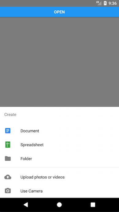
Modal bottom sheet component for Android and iOS that follows the guidelines of Material Design.
https://material.io/guidelines/components/bottom-sheets.html
Getting started
$ yarn add react-native-js-bottom-sheet
Usage
Code refers to the previous image example:
/* @flow */

import React, { Component } from 'react'
import { AppRegistry, StyleSheet, Text, View, Button } from 'react-native'
import BottomSheet from 'react-native-js-bottom-sheet'
import MaterialCommunityIcons from 'react-native-vector-icons/MaterialCommunityIcons'
import Entypo from 'react-native-vector-icons/Entypo'

export default class Example extends Component {
  bottomSheet: BottomSheet

  _onPressButton = () => {
    this.bottomSheet.open()
  }

  render() {
    return (
      <View style={styles.container}>
        <Button title="Open" onPress={this._onPressButton} />
        <BottomSheet
          ref={(ref: BottomSheet) => {
            this.bottomSheet = ref
          }}
          itemDivider={3}
          backButtonEnabled={true}
          coverScreen={false}
          title="Create"
          options={[
            {
              title: 'Document',
              icon: (
                <MaterialCommunityIcons
                  name="file-document-box"
                  color="#2186fa"
                  size={24}
                />
              ),
              onPress: () => null
            },
            {
              title: 'Spreadsheet',
              icon: <Entypo name="spreadsheet" color="#43a047" size={24} />,
              onPress: () => null
            },
            {
              title: 'Folder',
              icon: (
                <MaterialCommunityIcons name="folder" color="grey" size={24} />
              ),
              onPress: () => null
            },
            {
              title: 'Upload photos or videos',
              icon: (
                <MaterialCommunityIcons
                  name="cloud-upload"
                  color="grey"
                  size={24}
                />
              ),
              onPress: () => null
            },
            {
              title: 'Use Camera',
              icon: (
                <MaterialCommunityIcons name="camera" color="grey" size={24} />
              ),
              onPress: () => null
            }
          ]}
          isOpen={false}
        />
      </View>
    )
  }
}
API
| Prop | Type | Required | Description |
|---|---|---|---|
| coverScreen | bool | No | Will use RN Modal component to cover the entire screen wherever the modal is mounted in the component hierarchy |
| backButtonEnabled | bool | No | Close modal when receiving back button event |
| height | number | No | Height of the container. By default it has no height, due to container grows automatically depending of list of elements |
| title | string | Yes | Title displayed in top of list |
| options | Array | Yes | Array of objects to display options list |
| fontFamily | string | No | Used to display values. By default is Roboto |
| titleFontFamily | string | No | Title font family |
| isOpen | bool | No | Specifies if bottom sheet is open by default |
| itemDivider | number | No | Insert an item separator below the specified item number |
License
MIT License
Copyright (c) 2018 InterfaceKit
Author
Antonio Moreno Valls <amoreno at apsl.net>
Built with 💛 by APSL.
Note that the project description data, including the texts, logos, images, and/or trademarks,
for each open source project belongs to its rightful owner.
If you wish to add or remove any projects, please contact us at [email protected].

