iberHK / React Native Picker
纯JS实现的一个高效流畅的日期选择器和区域选择器,支持android、ios
Stars: ✭ 295
Programming Languages
javascript
184084 projects - #8 most used programming language
Labels
Projects that are alternatives of or similar to React Native Picker
dialogue-datasets
collect the open dialog corpus and some useful data processing utils.
Stars: ✭ 24 (-91.86%)
Mutual labels: dialog
SlidingUpMenu
🚀 A very customizable library that allows you to present menu items (from menu resource and/or other sources) to users as a bottom sheet.
Stars: ✭ 26 (-91.19%)
Mutual labels: dialog
Rflutter alert
RFlutter Alert is super customizable and easy-to-use alert / popup dialog library for Flutter. You may create reusable alert styles or add buttons as much as you want with ease.
Stars: ✭ 271 (-8.14%)
Mutual labels: dialog
Ngx Smart Modal
Modal/Dialog component crafted for Angular
Stars: ✭ 256 (-13.22%)
Mutual labels: dialog
Alertism
A Good Replacement For Default JavaScript Alerts Which Also Makes Good Pop-Ups
Stars: ✭ 19 (-93.56%)
Mutual labels: dialog
Gonorth
GoNorth is a story and content planning tool for RPGs and other open world games.
Stars: ✭ 289 (-2.03%)
Mutual labels: dialog
bootstrap-modal-wrapper
Bootstrap modal factory that supports dynamic modal creations and nested stacked modal features.
Stars: ✭ 18 (-93.9%)
Mutual labels: dialog
Vue Ydui
A mobile components Library with Vue2.js. 一只基于Vue2.x的移动端组件库。
Stars: ✭ 2,798 (+848.47%)
Mutual labels: dialog
Razor.SweetAlert2
A Razor class library for interacting with SweetAlert2
Stars: ✭ 98 (-66.78%)
Mutual labels: dialog
mobile-message
基于移动端的弹窗组件,默认提供info、success、warning、error、alert、confirm、multiple、vertical、bottomSheet、prompt,可自定义弹窗。它可以包含任何Html内容可以自定义弹窗的样式,也可以加入自定以的弹窗动画。
Stars: ✭ 13 (-95.59%)
Mutual labels: dialog
Md Date Time Picker
An implementation of Material Design Picker components in vanilla CSS, JS, and HTML
Stars: ✭ 272 (-7.8%)
Mutual labels: dialog
OkDialog
通用Dialog,适用于ProgressDialog,BuilderDialog,可以设置字体、进入退出动画等。
Stars: ✭ 15 (-94.92%)
Mutual labels: dialog
Longpresspopup
Make a Popup appear long pressing on a view and handle drag-release events on its elements
Stars: ✭ 256 (-13.22%)
Mutual labels: dialog
Rakugo Archive
Framework (inspired by Ren'Py) for story driven games in Godot.
Stars: ✭ 291 (-1.36%)
Mutual labels: dialog
Fancyalertdialog Android
Make your native android Dialog Fancy. A library that takes the standard Android Dialog to the next level with a variety of styling options. Style your dialog from code.
Stars: ✭ 260 (-11.86%)
Mutual labels: dialog
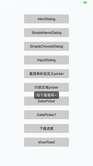
react-native-pickers
纯JS实现Picker,还是有点难度的,需要涉及到RN的性能优化(联动不能使用setState来更新)、
自定义手势、自定义点击以及动画等。
其他Dialog只是因为Picker是基于项目的BaseDialog扩展来的,就一并整理发布。
安装:
yarn add react-native-pickers
yarn add react-native-svg
react-native link react-native-svg
使用:
AreaPicker:| 属性 | 默认值 | 描述 | 截图 |
|---|---|---|---|
| selectedValue | ['香港', '香港', '中西區'] | 选中 |

|
| areaJson | null | 地址数据源 | |
| confirmText | '确定' | 确定选择文本 | |
| confirmTextSize | 14 | 确定选择文本字体大小 | |
| confirmTextColor | '#333333' | 确定选择字体颜色 | |
| cancelText | '取消' | 取消选择文本 | |
| cancelTextSize | 14 | 取消选择文本字体大小 | |
| cancelTextColor | '#333333' | 取消选择文本字体颜色 | |
| itemTextColor | 0x333333ff | item正常颜色,仅支持16进制数字
|
|
| itemSelectedColor | 0x1097D5ff | item选择颜色,仅支持16进制数字
|
|
| itemHeight | 40 | item高度 | |
| onPickerCancel | null | 取消选择回调 | |
| onPickerConfirm | null | 确认选择回调 |
DatePicker:
| 属性 | 默认值 | 描述 | 截图 |
|---|---|---|---|
| itemTextColor | 0x333333ff | item正常颜色,仅支持16进制数字
|
|
| itemSelectedColor | 0x1097D5ff | item选择颜色,仅支持16进制数字
|
|
| onPickerCancel | null | 取消选择回调 | |
| onPickerConfirm | null | 确认选择回调 | |
| unit | ['年', '月', '日'] | 单位 | |
| selectedValue | [
new Date().getFullYear() + '年', new Date().getMonth() + 1 + '月', new Date().getDate() + '日'] |
选中 | |
| startYear | 1990 | 起始年份 | |
| endYear | new Date().getFullYear() | 截至年份 | |
| cancelText | '取消' | 取消选择文本 | |
| cancelTextSize | 14 | 取消选择文本字体大小 | |
| cancelTextColor | '#333333' | 取消选择文本字体颜色 | |
| itemTextColor | 0x333333ff | item正常颜色,仅支持16进制数字
|
|
| itemSelectedColor | 0x1097D5ff | item选择颜色,仅支持16进制数字
|
|
| onPickerCancel | null | 取消选择回调 | |
| onPickerConfirm | null | 确认选择回调 | |
| confirmText | '确定' | 确定选择文本 | |
| confirmTextSize | 14 | 确定选择文本字体大小 | |
| confirmTextColor | '#333333' | 确定选择字体颜色 | |
| cancelText | '取消' | 取消选择文本 | |
| cancelTextSize | 14 | 取消选择文本字体大小 | |
| cancelTextColor | '#333333' | 取消选择文本字体颜色 | |
| itemHeight | 40 | item高度 | |
| HH | true | 是否显示小时 | |
| mm | true | 是否显示分钟 | |
| xx | false | 是否显示秒 |
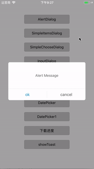
AlertDialog:
| 属性 | 默认值 | 描述 | 截图 |
|---|---|---|---|
| messageText | 'Alert Message' | 消息文本 |
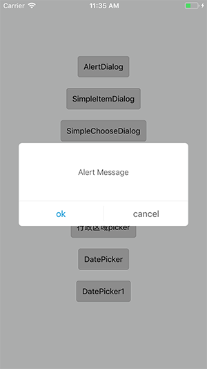
|
| messageTextColor | '#444444' | 消息文本字体颜色 | |
| messageTextSize | 14 | 消息文本字体大小 | |
| negativeText | 'cancel' | 取消文本 | |
| negativeColor | '#666666' | 取消文本颜色 | |
| negativeSize | 16 | 取消文本字体大小 | |
| positiveText | 'ok' | 确定文本 | |
| positiveColor | '#1097D5' | 确定文本颜色 | |
| positiveSize | 16 | 确定文本字体大小 | |
| onPress | null |
positive(确定)返回true or
negative(取消)返回false
|
SimpleItemsDialog:
| 属性 | 默认值 | 描述 | 截图 |
|---|---|---|---|
| items | ['a', 'b', 'c'] | 列表数据,可以string、object(需要指定itemKey) |
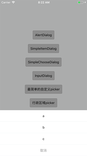
|
| itemKey | 'key' |
当item为object时,来指定显示的属性items:[{id:0, value: 'v1'},{id:0, value: 'v1'}]itemKey设为'value',则等同于
|
|
| itemStyle |
{ fontSize: 14, fontWeight: '400', color: '#333333' } |
列表文字样式 | |
| cancel | true | 是否在列表最后 增加 ‘取消’ 项 | |
| cancelText | '取消' | 取消项文本 | |
| cancelTextStyle |
{ fontSize: 14, fontWeight: '400', color: '#999999' } |
取消文本字体样式 | |
| onPress | null | 返回选中index |
SimpleChooseDialog:
| 属性 | 默认值 | 描述 | 截图 |
|---|---|---|---|
| items | ['a', 'b', 'c'] | 列表数据,可以string、object (需要指定itemKey) |

|
| itemKey | 'key' |
当item为object时,来指定显示的属性items:[{id:0, value: 'v1'},{id:0, value: 'v1'}]itemKey设为'value',则等同于
|
|
| itemStyle |
{ fontSize: 14, fontWeight: '400', color: '#333333' } |
列表文字样式 | |
| selectColor | '#1097D5' | 选中颜色 | |
| normalColor | '#666666' | 未选中颜色 | |
| pointSize | 18 | 左侧选中标识大小 | |
| pointBorderRadius | 9 | 左侧选中标识边框弧度 | |
| confirmText | '确定' | 确定选择文本 | |
| confirmBtnColor | '#1097D5' | 确定选择按钮颜色 | |
| confirmTextColor | '#ffffff' | 确定选择文本颜色 | |
| onPress | null | 返回选中index |
InputDialog:
| 属性 | 默认值 | 描述 | 截图 |
|---|---|---|---|
| title | '我要举报' | 标题文本 |
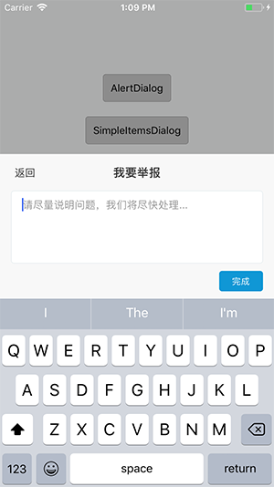
|
| titleSize | 16 | 标题文本字体大小 | |
| titleColor | '#333333' | 标题文本文本颜色 | |
| cancelText | '返回' | 取消文本 | |
| cancelSize | 14 | 取消文本字体大小 | |
| cancelColor | '#333333' | 取消文本字体颜色 | |
| btnText | '提交' | 提交文本 | |
| btnTextSize | 12 | 提交文本字体大小 | |
| btnTextColor | '#ffffff' | 提交文本字体颜色 | |
| btnBgColor | '#1097D5' | 提交按钮颜色 | |
| placeholder | '请尽量说明问题,我们将尽快处理...' | 输入框提示语 | |
| onSubmit | null | 返回输入的文本内容 | |
| InputDialog.show(text),显示dialog,text:用于编辑时,设置前值 | |||
DownloadDialog:
| 属性 | 默认值 | 描述 | 截图 |
|---|---|---|---|
| title | '视频下载' | 标题文本 |

|
| titleSize | 16 | 标题文本字体大小 | |
| titleColor | '#333333' | 标题文本文本颜色 | |
| active | false | 按钮是否可点击 | |
| actionText | '打开' | 按钮文本 | |
| onAction | null | 点击按钮回调 | |
| totalTextColor | '#666666' | 总数文本字体颜色 | |
| totalTextSize | 12 | 总数文本字体大小 | |
| DownloadDialog.setProcess(0, '4.24MB'),设置当前进度,及下载文件总数 | |||
ToastComponent:
| 属性 | 默认值 | 描述 | 截图 |
|---|---|---|---|
| duration | 1500 | 显示时长(自动隐藏) |
|
| fontSize | 14 | message字体大小 | |
| textColor | '#ffffff' | message字体颜色 | |
| lineHeight | 20 | message字体行高 | |
| paddingH | 10 | 水平padding | |
| paddingV | 5 | 上下padding | |
| borderRadius | 5 | 背景圆角 | |
| backgroundColor | 0x00000099 | 背景颜色 | |
| ToastComponent.show('message'),显示‘message’toast。应放在navigation同层,全局唯一 | |||
BaseDialog:
| 属性 | 默认值 | 描述 |
|---|---|---|
| removeSubviews | true | dismiss,是否回收前景控件,拓展出来的子控件,不要动态设置改属性 |
| coverClickable | ture | 背景点击隐藏 |
| onCoverPress | null | 点击背景,dismiss回调 |
| showAnimationType | null | 入场动画方式 spring timing |
PickerView:
| 属性 | 默认值 | 描述 |
|---|---|---|
| itemTextColor | 0x333333ff | item正常颜色,仅支持16进制数字
|
| itemSelectedColor | 0x1097D5ff | item选择颜色,仅支持16进制数字
|
| itemHeight | 40 | item高度 |
| onPickerSelected | null | 选中时回调 |
| selectedIndex | 0 | 选中 |
Note that the project description data, including the texts, logos, images, and/or trademarks,
for each open source project belongs to its rightful owner.
If you wish to add or remove any projects, please contact us at [email protected].