marudy / React Native Responsive Screen
Programming Languages
Projects that are alternatives of or similar to React Native Responsive Screen
Help with maintenance would be appreciated!
If interested please send me an email: [email protected]
Contents
- The package
- Installation
- Usage
- Examples
- How do I know it works for all devices ?
- License
- Pull Requests
react-native-responsive-screen

react-native-responsive-screen is a small library that provides 2 simple methods so that React Native developers can code their UI elements fully responsive. No media queries needed.
It also provides an optional third method for screen orientation detection and automatic rerendering according to new dimensions.
Give it a try and make your life simpler!
Check out this medium article to see the power of the library! 🚀

Installation
npm install react-native-responsive-screen --save
Usage
- After the package has installed, when application loads (in real device and/or emulator), it detects the screen's width and height. I.e. for Samsung A5 2017 model it detects
width: 360DPandheight: 640DP(these are the values without taking into account the device's scale factor). - The package exposes 2 basic methods:
widthPercentageToDPandheightPercentageToDP. Their names essentially mean that you can supply a "percentage like" string value to each method and it will return the DP (indipendent pixel) that correspond to the supplied percentage of current screen's width/height respectivelly. I.e. for Samsung A5 2017, if we supply to a CSS box:width: widthPercentageToDP('53%'), the rendered style will bewidth: 190.8DP. Check example number 1 for how to use them. - Methods
widthPercentageToDPandheightPercentageToDPcan be used for any style (CSS) property that accepts DP as value. DP values are the ones of typenumberover the props mentioned in RN docs: View style props, Text style props, Image style props, Layout props and Shadow props. Use the exposed methods for all of the typenumberproperties used in your app in order to make your app fully responsive for all screen sizes. - You can also provide decimal values to these 2 methods, i.e.
font-size: widthPercentageToDP('3.75%'). - The package methods can be used with or without flex depending on what you want to do and how you choose to implement it.
- The suggested approach is to start developing from larger screens (i.e. tablets). That way you are less prone to forget adding responsive values for all properties of type
number. In any case, when your screen development is done, you should test it over a big range of different screens as shown below in the How do I know it works for all devices ? section. - There are 2 more methods to use if you want to support responsiveness along with orientation change. These are
listenOrientationChangeandremoveOrientationListener. To see how to use them, check example number 3. - You can use this package along with
styled-components. To see how to do that, check example number 2.
Updates 🚀
-
v1.4.0onwards: The library now has flowtype support. Types should work out of the box, no additional setup needed. -
widthPercentageToDPandheightPercentageToDPmethods accept numeric values as well from version 1.2.1 onwards. That being said a width of 53% can now be written bothwidth: widthPercentageToDP('53%')andwidth: widthPercentageToDP(53).
Examples
1. How to use with StyleSheet.create() and without orientation change support
import {widthPercentageToDP as wp, heightPercentageToDP as hp} from 'react-native-responsive-screen';

class Login extends Component {
  render() {
    return (
      <View style={styles.container}>
        <View style={styles.textWrapper}>
          <Text style={styles.myText}>Login</Text>
        </View>
      </View>
    );
  }
}

const styles = StyleSheet.create({
  container: { flex: 1 },
  textWrapper: {
    height: hp('70%'), // 70% of height device screen
    width: wp('80%')   // 80% of width device screen
  },
  myText: {
    fontSize: hp('5%') // End result looks like the provided UI mockup
  }
});

export default Login;
You can find a working example of this over the related example repository
2. How to use with StyleSheet.create() and with orientation change support
Check the README of the related example repository
3. How to use with styled components
Check the README of the related example repository
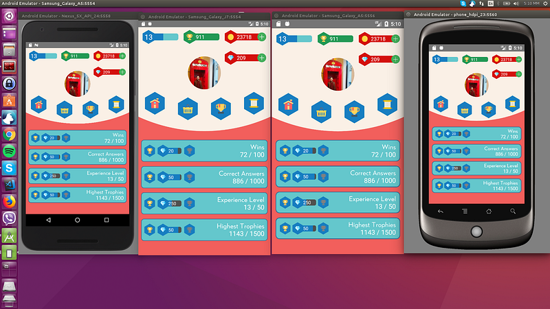
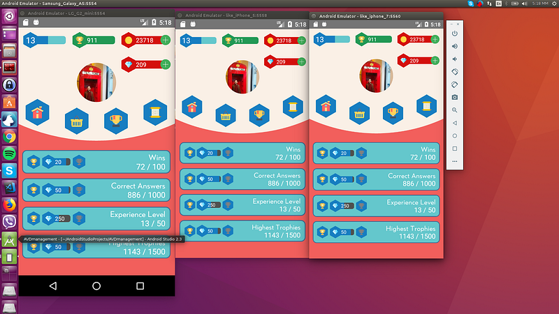
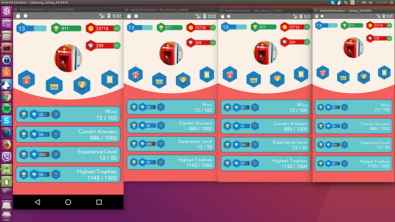
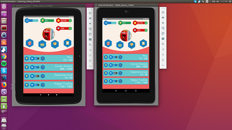
How do I know it works for all devices ?
As mentioned in "How to Develop Responsive UIs with React Native" article, this solution is already in production apps and is tested with a set of Android, iOS emulators of different screen specs, in order to verify that we always have the same end result.
Example:
The 4 blue tiles at the bottom half of the screen should take over 98% of the screen’s width in dp and 10% of the screen’s height in dp always:
Smartphones
Tablets
License
MIT
Pull
Pull requests are welcome! Please make the PR to development branch though and not master. Thanks.