
About
Our company provides custom UI design and development solutions for mobile applications and websites.
Need a team to create a project?
This project is developed and maintained by openGeeksLab LLC.

react-native-tab-navigator
Requirements
- React Native 0.50+
- iOS 9.0+
- Android 4.2+
Installation
Just run:
- npm i @opengeekslab/react-native-tab-navigator
Basic usage
import React, { Component } from 'react';
import { StyleSheet, View } from 'react-native';
import { TabNavigation, TabButton, TabIcons } from '@opengeekslab/react-native-tab-navigator';

import Screen1 from './screens/screen1';
import Screen2 from './screens/screen2';
import Screen3 from './screens/screen3';
import Screen4 from './screens/screen4';
import Screen5 from './screens/screen5';

const navigationRouter = {
  Screen_1: {
    screen: Screen1,
    screenOptions: {
      title: 'Item 1',
      showTitle: true,
      animated: true,
      tabIcon: TabIcons.Social,
      animation: [
        {
          name: 'rotationY',
          type: 'bouncing',
        },
      ],
    },
  },
  Screen_2: {
    screen: Screen2,
    screenOptions: {
      title: 'Item 2',
      showTitle: true,
      tabIcon: TabIcons.Message,
      animation: [
        'ripple',
        { name: 'scale' },
        {
          name: 'fume',
          duration: 700,
        },
        {
          name: 'fadeOut',
          duration: 700,
        },
      ],
    },
  },
  Screen_3: {
    screen: Screen3,
    screenOptions: {
      title: 'Item 3',
      tabIcon: TabIcons.TuneView,
      animated: true,
      animation: [],
    },
  },
  Screen_4: {
    screen: Screen4,
    screenOptions: {
      title: 'Item 4',
      tabIcon: TabIcons.Bell,
      animation: [
        {
          name: 'pendulum',
          duration: 700,
        },
      ],
    },
  },
  Screen_5: {
    screen: Screen5,
    screenOptions: {
      title: 'Item 5',
      tabIcon: TabIcons.Lever,
      animation: [
        {
          name: 'scale',
          type: 'bouncing',
        },
      ],
    },
  },
};

const defaultConfig = {
  lazy: true,
  defaultRoute: 'Screen_3',
  screenOptions: {
    showTitle: true,
    animated: true,
    buttonView: TabButton,
    activeTintColor: '#0579fc',
    inactiveTintColor: '#818692',
    animation: ['ripple', 'rotationZ'],
  },
};

const TabNavigation = TabNavigation(navigationRouter, defaultConfig);

type Props = {};
export default class App extends Component<Props> {
  render() {
    return (
      <View style={styles.container}>
        <TabNavigation />
      </View>
    );
  }
}

const styles = StyleSheet.create({
  container: {
    flex: 1,
    backgroundColor: '#F5FCFF',
  },
});
To add a screen to the tab bar, you need to create an object containing information about routers.
Screen_1: {
    screen: Screen1,
    screenOptions: {
      title: 'Item 1',
      showTitle: true,
      animated: true,
      tabIcon: TabIcons.Social,
      animation: [
        {
          name: 'rotationY',
          type: 'bouncing',
        },
      ],
    },
}-
screen - is the screen to display
-
screenOptions - is options for the screen, which could contain the following fields:
-
title - the name under the tab icon, if you do not specify it, then it will use as a default and will be equal to the key (as the example: Screen_1)
-
showTitle - is the flag, indicating the display of the name of the tab.
-
animated - is the flag, indicating whether the icon should be animated.
-
tabIcon - fields of the transfer picture or component, which is used as a tab icon.
-
animation - the field which is contain an array with the desired animations provided by the library.
-
activeTintColor - the color of active tab
-
inactiveTintColor - inactive tab color
-
iconStyle - custom Icon Style
-
textStyle - custom name style of the tab
-
textActiveStyle - custom name style for an active tab
-
textInactiveStyle - custom name style for inactive tab
-
Animations usage
The library provides animations fume, pendulum, rotationX, rotationY, rotationZ, opacity, scale, ripple. All animations can be combined.
  animation: [
    'ripple',
    'scale',
  ]
Also, animations can be additionally set aside. If you transfer an object to the animation array that consists of the field 'name' - the name of the animation and the type: "bouncing", the animation will have an "elastic effect" (except Ripple).
animation: [{
  name: 'scale',
  type: 'bouncing',
}]
In the field of durations, you specify the animation time in milliseconds (400ms by default)
animation: [
{
name: 'fume',
duration: 700,
},
{
name: 'fadeOut',
duration: 700,
},
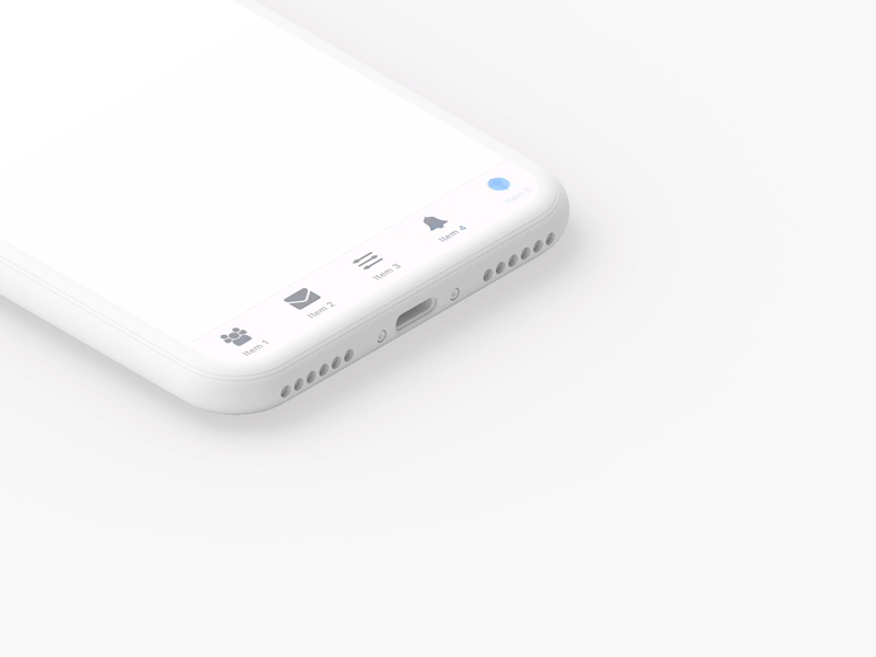
]The library provides built-in icons for Social, Message, TuneView, Bell, Lever, Tune.
They can be imported
import { TabIcons } from 'react-native-tab-navigator';
{
      title: 'Item 5',
      tabIcon: TabIcons.Lever
}
You can transfer your icon
const myIcon = require('./my-icon-file.png');
{
      title: 'Item 5',
      tabIcon: myIcon
}
You can send a component as an icon.
If the component implements internal animations, it must provide a callAnimations() method to call the animations.
Contact us if interested.
Inspired by @Ramotion
Licence
Expanding is released under the MIT license.